Photography: Surratt official photography. Images belong to their respective owners.
Surratt

hairline lettering over a violet teal applicator barrel
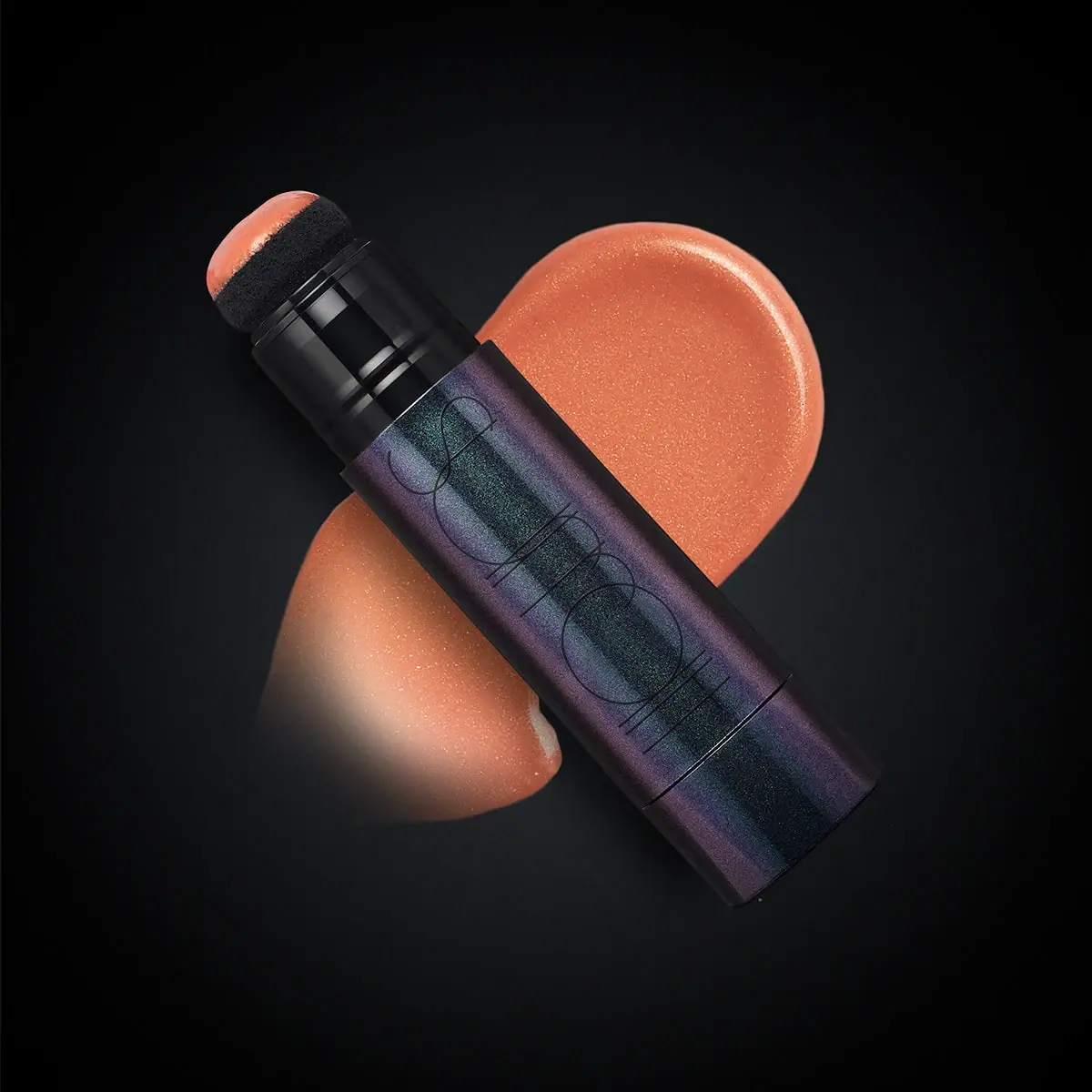
Artistique Liquid Blush is photographed open, with its loaded sponge tip facing the upper left and an oversized peach-coloured swatch behind it. The barrel is not simply flat black: violet and teal reflections give its fine-grained surface an iridescent-looking depth. A very large, extremely thin Surratt wordmark runs along the cylinder. The applicator, reflective body and quiet lettering carry the identity without a conventional front label.
- Make-up
- Dark pack
- Luxe monochrome
About this study
Selected open Artistique Liquid Blush applicator and peach-looking swatch. Shade is not assigned from screen colour; closed packaging and carton are not reviewed.
Sources & evidence · Reviewed 2026-10-19Color Palette
Approximate colours interpreted from photography. These are screen references, not official brand colours or print specifications.
Pack body
Dark barrel
#171B22
Approximate darkest body areas, distinct from the almost black background.
Ink
Low-contrast mark
#111317
Approximate dark hairline lettering. Peach product colour is deliberately excluded from the permanent packaging palette.
Accent
Violet sheen
#65516D
Approximate violet appearance on the barrel; not a fixed ink or coating specification.
Teal sheen
#3E6266
Approximate cooler reflected body appearance. The visible colour shift is not a verified manufacturing process.
Typography
Suggested visual alternatives, not confirmed brand typefaces. Any scale below is an illustrative estimate.
The maker is physically large but visually delicate. Its elongated lowercase geometry stretches along the barrel, with very thin dark strokes and close relationships between letterforms. There is no second clearly readable front voice to compete with it. Functional explanation comes instead from the exposed sponge and product swatch. This is a useful distinction between type size and visual emphasis: large lettering can remain quiet when stroke weight and contrast are low.
Fonts
Fine display alternative
Raleway
- Looks like
- Raleway as an independent visual alternative
- Type
- Sans serif
- Weight
- Thin 100 / Light 300
- Case
- Lowercase
- Tracking
- Airy but optically joined
- Fallback
- Arial, sans-serif
Use a short original name in a delicate geometric voice, but retain enough weight for the chosen print process. Do not reconstruct the distinctive elongated Surratt letterforms or assume hairlines will reproduce reliably on a reflective curved surface.
Supporting information alternative
Inter
- Looks like
- Inter as an independent visual alternative
- Type
- Sans serif
- Weight
- Regular 400 / Medium 500
- Case
- Mixed case
- Tracking
- Normal
- Fallback
- Arial, sans-serif
For a new design, use a separate readable voice for shade, quantity and instructions. Those information zones are proposed requirements, not transcriptions of unseen areas of the selected package.
Structure & Proportions
Visual proportions and finish previews are illustrative. Confirmed construction details and uncertainties are distinguished in the study notes.
Proportions
| Purpose | Value | Preview |
|---|---|---|
| Long identity axis | The wordmark uses much of the visible barrel length, following the object rather than the square image frame. | — |
| Compact applicator head | The sponge is broad enough to register as a dauber, with a smaller stepped neck below it. | — |
| Short base section | A circumferential seam divides a short lower section from the main branded barrel; function is not inferred from the seam alone. | — |
Shapes
| Element | Value | Preview |
|---|---|---|
| Barrel | Straight cylinder with a short segmented end. | |
| Sponge | Rounded broad application face with visible porous sidewall. | |
| Neck | Stacked glossy cylindrical steps beneath the sponge. |
Finishes
Iridescent-looking barrel
Violet and teal fine-grained reflections across the dark cylinder; process unverified. · pearlescent
Glossy connector
Dark neck components below the exposed sponge. · gloss
Formats and materials
| Formats | Selected open rigid cylindrical liquid-blush applicator with rounded sponge tip and a separate-looking short base section. Official fill is 8.10 grams. |
| Materials | The brand confirms a sponge applicator, but does not identify its foam chemistry or provide a component bill of materials., Barrel substrate, reflective decoration, internal reservoir and cap materials are unverified. A metallic-looking sheen does not prove metal construction. |
| Closures | The selected image exposes a dark rounded sponge with product across its upper face. Beneath it, glossy stepped cylindrical parts connect to the wider decorative barrel. The official page describes twisting the wand to present the liquid formula; this establishes the operating principle without exposing its internal mechanism. A seam near the lower end separates a short base section. The photograph does not establish which seam is the control, whether a cap is attached elsewhere, or how the tip is sealed for transport. |
| Decoration | One oversized thin wordmark along the cylinder., No visible broad opaque label panel or prominent front product descriptor., Surface sheen supplies colour while the wordmark remains dark. |
Front Panel
Schematic reading order. The diagram’s zone heights do not represent measured artwork proportions.
There is no conventional multi-zone paper-label composition in the selected view. The maker spreads lengthwise across the barrel in unusually fine, elongated lowercase strokes. Its dark linework merges with the deepest reflections and becomes clearer over lighter violet areas. The applicator head is left free of text, while the short base segment appears visually quieter. No readable shade name, quantity, ingredients or product-function line is visible here. Those items should not be invented as a hidden reverse layout merely to complete a standard label template.
| Zone | Content |
|---|---|
| Main barrel | Large low-contrast Surratt lettering running lengthwise. |
| Application end | Exposed sponge and glossy connector, without a readable information block. |
| Short base | Separate-looking end segment; no reliably readable text in the selected view. |
Range System
The official page lists four blush shades and identifies an 8.10 g fill. The selected peach-toned image does not provide a readable shade label, so it is not assigned a shade solely by matching screen colour to the current swatch names. The product smear is a presentation of liquid colour, not evidence that each shade has a differently coloured barrel. Extending this study to the powder blush, highlighter or other Surratt formats would require separate package references.
- Selected open liquid-blush applicator with peach-looking formula and dark reflective barrel.
- Four shades are listed by the brand; shade-specific packaging differences are not established here.
Back of Pack & Shelf
The underside, reverse, protective closure and any outer carton are absent. The image therefore cannot locate shade identification, fill declaration or ingredient information on the sold package. It also cannot show whether the applicator is removable, washable, refillable or replaceable.
- Verify the cap and travel seal from a closed product view.
- Inspect the base for shade and quantity markings.
- Obtain component documentation before identifying the reflective barrel material.
On shelf
Interpretation: silhouette and surface change will register before the very fine dark wordmark. This can feel quiet in a close editorial image but risks weak identification on a dark shelf. The open applicator makes function clearer than a closed cylinder would. An original design inspired by this principle should be tested both capped and uncapped, under diffuse retail lighting, with a separate readable shade identifier rather than relying on reflective effects alone.
Imagery
The diagonal object crosses a large luminous peach swatch against a dark field. The swatch has a rounded upper edge, a softer tapered lower area and visible reflective particles. This joins tool and result in one image: the loaded sponge and the separate smear demonstrate the product without adding explanatory graphics to the barrel. The warm cosmetic colour contrasts with the cooler violet and teal package reflections. Neither the diagonal pose nor the background swatch is a fixed label element, and the image does not establish a universal campaign system for the brand.
Guidelines
Editorial principles for an original design brief, not official brand guidelines.
Do
- Show the applicator when it explains a distinctive function.
- Separate formula swatches from permanent package colour.
- Test thin lettering under several lighting conditions.
- Provide readable shade identification in a complete new package system.
Don't
- Do not identify the pictured shade from colour alone.
- Do not call the reflective barrel aluminium without evidence.
- Do not assign the base seam a mechanism without inspection.
- Do not copy the elongated Surratt wordmark.
Sources & evidence
How this study was built
structure · Sourced fact
Brand describes a sponge inspired by a bingo dauber and a twist-operated liquid presentation.Surratt Beauty — Artistique Liquid Blushrange · Sourced fact
Official listing gives 8.10 g and four shades; no shade is assigned to this photo.Surratt Beauty — Artistique Liquid Blushtypography · Visual observation
Very thin oversized dark wordmark runs along the reflective barrel.Surratt Beauty — Artistique Liquid Blushpalette · Visual observation
Violet and teal body appearance is distinct from the peach formula swatch.Surratt Beauty — Artistique Liquid Blushstructure · Visual observation
Exposed porous sponge sits above glossy stepped neck components.Surratt Beauty — Artistique Liquid Blushshelf · Editorial interpretation
Low contrast needs capped-state and retail-light legibility checks.
What remains unverified
- Exact photographed shade, barrel material and reflective process are unknown.
- Protective cap, reverse, base markings and internal mechanism are unseen.
- Original wordmark construction and physical dimensions are unverified.
Give your AI
packaging taste
Give your design or image tool a packaging study: palette, type, structure, front panel and principles for an original brief.
Export this styleFree with an email. PACK.md works in Claude, ChatGPT, Cursor and image tools.
More like this

African Botanics
Technical black label with a low serif signature

al.ive body
warm architectural calm, built as a paired vanity object

bareMinerals
a restrained black compact framing the powder itself

BeautyPWR
Clear square shell, white cream cup, black serif identity

Christian Louboutin
Faceted turquoise base beneath an extreme silver taper
Clé de Peau Beauté
Faceted navy base, reflective gold barrel, discreet repeated emblem

Color Wow
Tall condensed naming on a broad reflective silver jar

Corpus
sage gloss with whispered gold lettering