Generation G

Photography: glossier.com. All imagery belongs to its respective owner.
What makes the design work
Glossier brand studyVisual observations across the brand’s packaging. Individual formats and editions may vary.
Vertical wordmark
Heavy black grotesque wordmark with a full stop, rotated 90 degrees to run about 70% of the length of a white wand, stick or gloss bottle.
Round monogram
Small black circle with a reversed G, used on caps, colour blocks and items too small for the wordmark.
Colour block
One flat colour on the top quarter of a tube, a band at its base or the whole cap, matched to the product inside.
Reading the label
Printed directly on the component: white or frosted body, one colour block at top or bottom, black text left-aligned or running vertically.
- Top or colour block
- G monogram or wordmark
- Middle
- Lowercase product name, descriptor and translation
- Base or cap
- Flavour or shade colour, volume
Typography & hierarchy
On narrow components the wordmark with its full stop is the main visual, set vertically along the length. On tubes it sits horizontally near the top under the colour block, followed by the lowercase product name, a one-line lowercase descriptor and the French translation, all left-aligned in small type, with the volume at the base.
Display
Custom heavy grotesque close to Graphik Black, Akzidenz-Grotesk Bold
Heavy neo-grotesque sans
Title case with a trailing full stop · ExtraBold, Black
Headline
Graphik Semibold
Neutral grotesque
Lowercase · SemiBold
Body
Graphik Regular
Neutral grotesque
Lowercase · Regular
Typeface suggestions based on visual similarity. These are not verified font identifications.
How the range holds together
Fixed white body and black type, with one solid colour block (cap, band or bottle) assigned to each product or flavour and matched to what is inside.
Shelf presence
On shelf the range reads as rows of white objects punctuated by single candy-coloured caps and bands, and the vertical black wordmarks on wands line up into a repeating column of type.
Related packaging
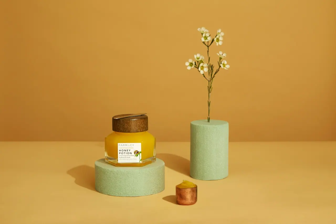
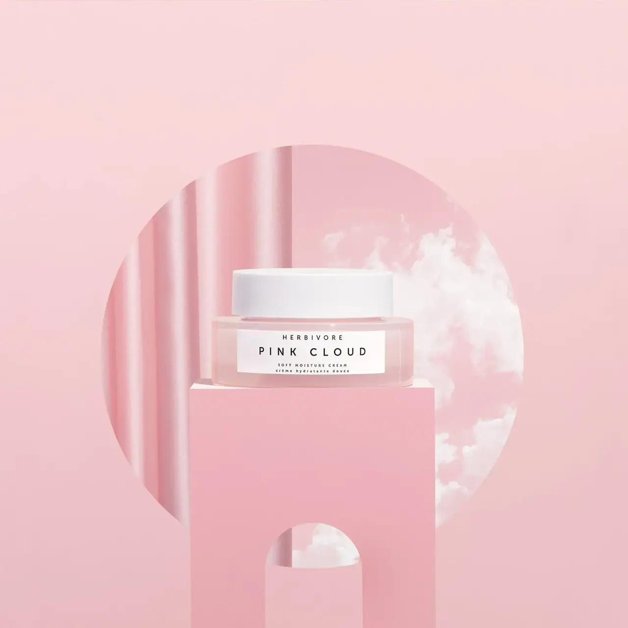
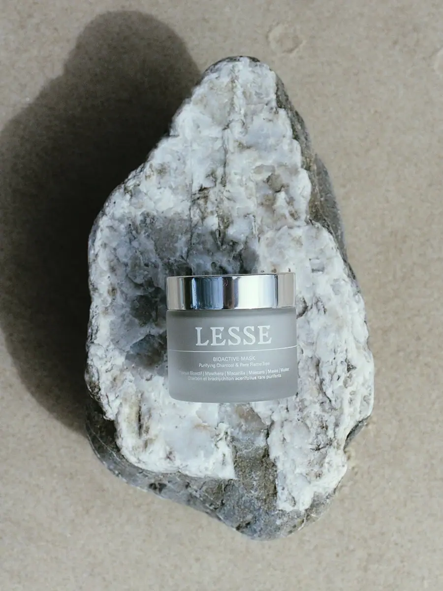
More curated references in skincare, matched by format and visual style.


Featured from Glossier
The selected packaging reference for this brand.
