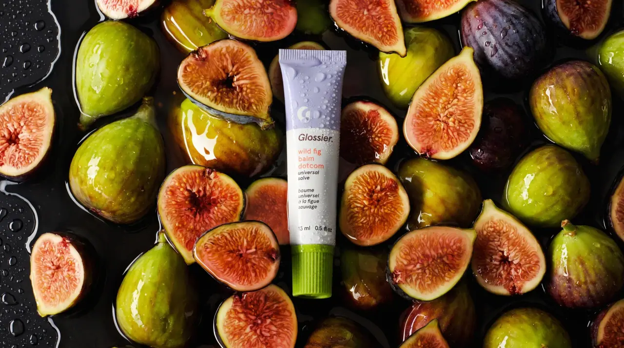
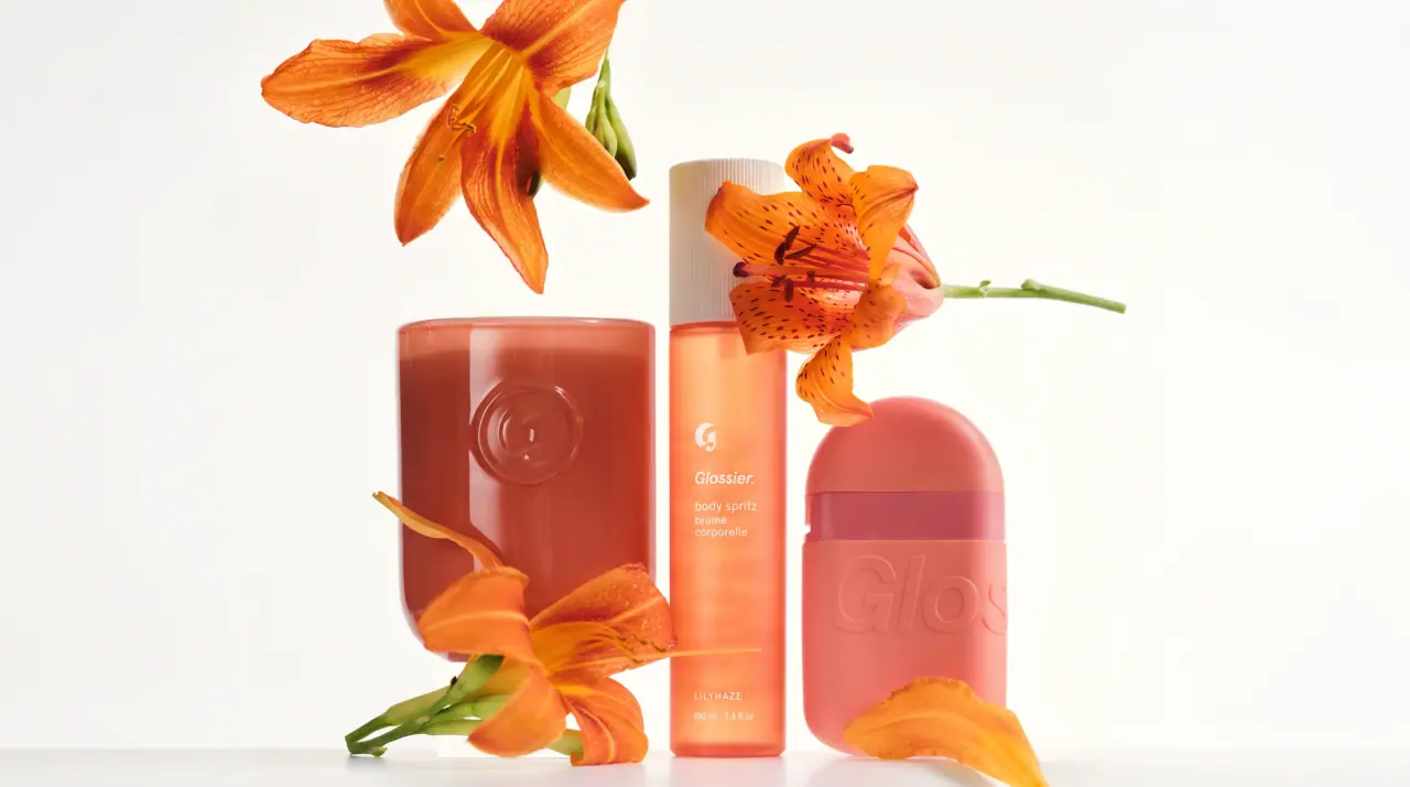
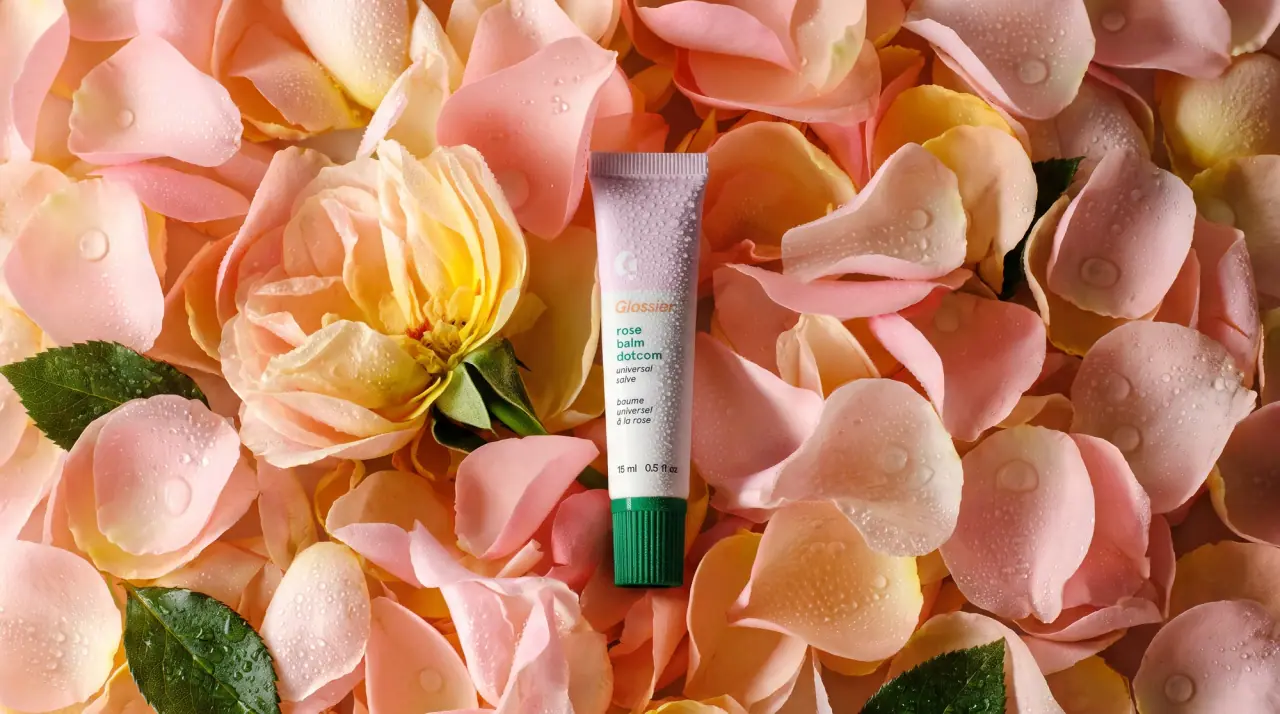
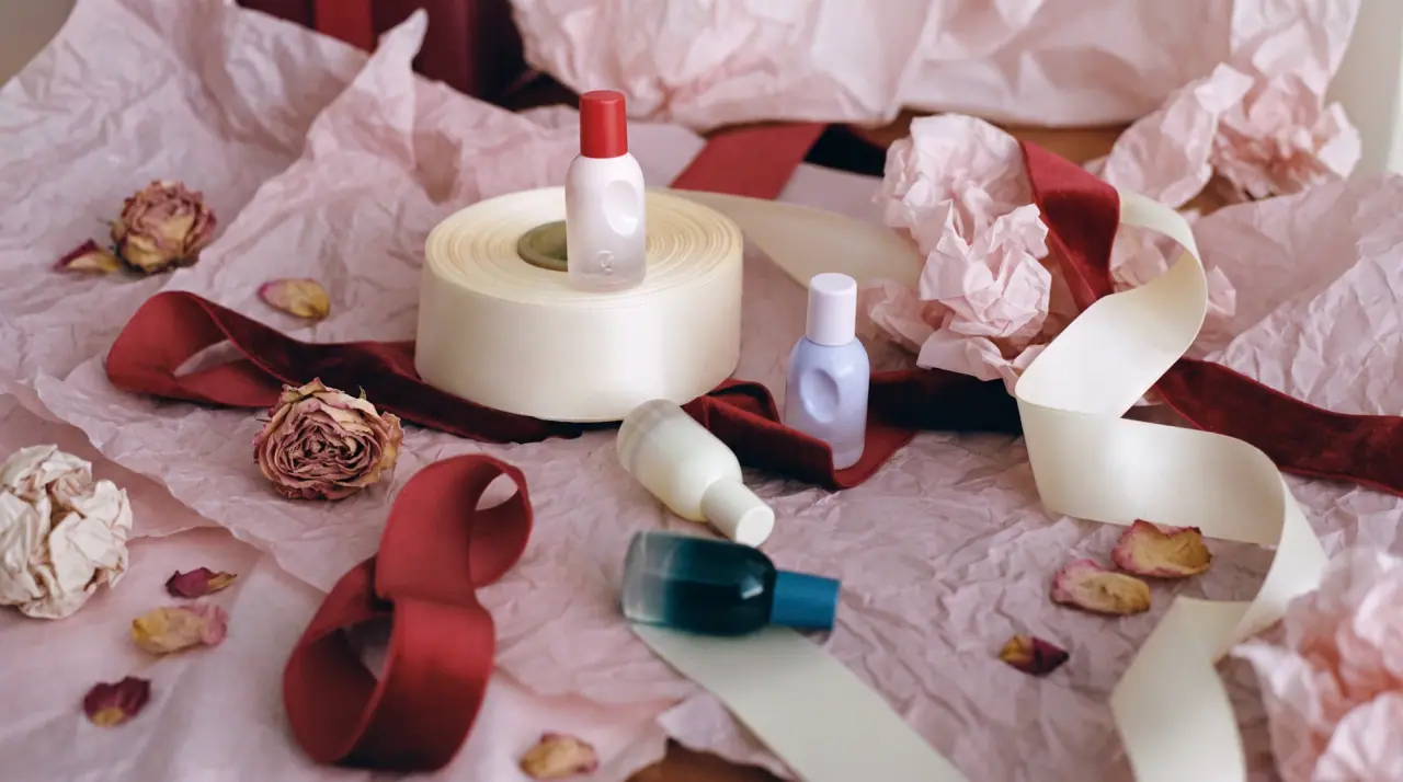
Glossier builds its packaging on a soft matte white base (#f6f6f4) with a heavy black grotesque wordmark ending in a full stop, often rotated 90 degrees to run the length of wands, sticks and gloss bottles, and a small round G monogram as the secondary mark on narrow items. Each product family adds one flat colour block, usually the cap or one end of a tube (a lilac top and lime ribbed cap on a balm, a coral band and cap on a brushed-silver cheek tint, a bubblegum bottle on a lip gloss), so colour does the naming while the white body keeps the range unified. Text is short, lowercase, left-aligned and set small, with product names written like casual nicknames and a French translation underneath. There is no illustration, pattern or gradient anywhere.
Approximate colours interpreted from photography. These are screen references, not official brand colours or print specifications.
Pack body
Gallery White
#f6f6f4
Default body of tubes, brow wands, pencils, stick cases and overcaps
Brushed Silver
#c9cbcd
Aluminium-look tube of the cheek tint
Label
Shade Copper
#e0603e
Product name text on the balm tube, picking up the flavour
Ink
Wordmark Black
#111111
Wordmark, G monogram and all small product text
Range coding
Fig Lilac
#c6c8e6
Upper colour block of the wild fig balm tube, behind the G monogram
Fig Lime
#8fb12b
Ribbed screw cap of the wild fig balm tube
Cheek Coral
#e9877b
Lower band and cap of the cheek tint tube, matched to the shade inside
Glaze Pink
#f87ea4
Gloss bottle of the lip glaze, seen through clear plastic
Glaze Blush
#f7d3dc
Pale pink overcap of the lip glaze and lip-liner cap
Brow Umber
#5a4a2a
Tinted product seen through the clear brow-gel tube under a white overcap
Typography
Suggested visual alternatives, not confirmed brand typefaces. Any scale below is an illustrative estimate.
On narrow components the wordmark with its full stop is the main visual, set vertically along the length. On tubes it sits horizontally near the top under the colour block, followed by the lowercase product name, a one-line lowercase descriptor and the French translation, all left-aligned in small type, with the volume at the base.
Type scale
Estimated cap size as a share of the panel · Front of the 15 ml balm tube, cap excluded, about 75 mm tall
vertical-wordmark
14% · Black · Display
Gleam.
tube-wordmark
5% · ExtraBold · Display
Gleam.
monogram
6% · Black · Display
M
product-name
3.5% · SemiBold · Headline
pear lip balm
descriptor
2.6% · Regular · Body
universal salve
translation
2.6% · Regular · Body
baume universel
Fonts
Display
Archivo
Looks like
Custom heavy grotesque close to Graphik Black, Akzidenz-Grotesk Bold
Type
Heavy neo-grotesque sans
Weight
ExtraBold, Black
Case
Title case with a trailing full stop
Tracking
Tight, about -2%
Fallback
Helvetica Neue Black, Arial Black
The wordmark only, horizontal on tubes or rotated 90 degrees on wands, sticks and bottles; a round G monogram stands in on very small items.
Headline
Inter
Looks like
Graphik Semibold
Type
Neutral grotesque
Weight
SemiBold
Case
Lowercase
Tracking
Normal
Fallback
Helvetica Neue Medium, Arial
Lowercase product name under the wordmark, in black or in the shade colour.
Body
Inter
Looks like
Graphik Regular
Type
Neutral grotesque
Weight
Regular
Case
Lowercase
Tracking
Normal
Fallback
Helvetica, Arial
Descriptor line, French translation, volume and all back-panel copy.
Structure & Proportions
Proportions
Purpose
Value
Preview
Colour block on tube
About 25% of tube height, top end
Vertical wordmark length
About 70% of component length on wands and sticks
Tube wordmark width
About 55% of tube width, left-aligned
Left margin
About 12% of tube width
White space
About 60% of the front left plain white
Colours per pack
Two or three: white body, black ink, one family colour
—
Density
Sparse: wordmark plus a four-line lowercase block
—
Shapes
Element
Value
Preview
Tube
Slim crimped squeeze tube
Monogram
Small solid circle with a G cut out
Wand and stick
Slim cylinder with rounded cap
Balm cap
Ribbed screw cap
Gloss applicator
Doe-foot wand in a short bottle
Finishes
Soft matte white
Tubes, wands, pencils and caps · matte
Brushed metallic laminate
Cheek tint tube · metallic
Glossy coloured plastic
Ribbed caps and gloss bottle · gloss
Clear plastic
Brow-gel and gloss bottles showing the product · transparent
Formats and materials
Formats
Squeeze tube, Brow wand and component, Slim pencil, Twist stick, Gloss bottle with doe-foot, Stubby flat tube
Materials
Plastic, Metallised laminate tube, Glass
Closures
Ribbed screw caps, flat stubby caps and pale overcaps, coloured to the product family
Decoration
Direct print in black, Colour-blocked cap or band, Vertical wordmark
Front Panel
Schematic reading order. The diagram’s zone heights do not represent measured artwork proportions.
Top or colour block
Middle
Base or cap
Printed directly on the component: white or frosted body, one colour block at top or bottom, black text left-aligned or running vertically.
Zone
Content
Top or colour block
G monogram or wordmark
Middle
Lowercase product name, descriptor and translation
Base or cap
Flavour or shade colour, volume
Range System
Fixed white body and black type, with one solid colour block (cap, band or bottle) assigned to each product or flavour and matched to what is inside.
Fig balm = lilac top + lime cap + copper name
Cheek tint = silver tube + coral band and cap
Lip glaze = pink bottle + pale pink cap
Brow gel = clear tube showing the tint + white overcap
Pencils = white body + tip colour
Back of Pack & Shelf
The back of tubes and cartons continues the same lowercase grotesque in black on white: a short how-to line, a full ingredient list in small type, then volume, batch, period-after-opening and recycling marks at the base, with no colour except the family block.
One-line how-to in lowercase
Full INCI ingredient list in small black type
Period-after-opening and recycling symbols
Volume in ml and fl oz
Batch code and country of manufacture
Barcode on the carton, white ground
On shelf
On shelf the range reads as rows of white objects punctuated by single candy-coloured caps and bands, and the vertical black wordmarks on wands line up into a repeating column of type.
Imagery
No illustration or photography on pack; the only graphic devices are the wordmark, the round G and flat colour blocks.
Guidelines
Do
Start every component white (#f6f6f4) and print the wordmark in solid black (#111111) with its full stop.
Run the wordmark vertically along about 70% of long thin components such as wands and sticks.
Add exactly one flat colour block per product, on the cap or one quarter of the tube.
Match that colour block to the shade or flavour inside.
Write product names and descriptors in lowercase, with a French line under the English.
Use the round G monogram where the full wordmark will not fit.
Don't
Don't use gradients, patterns or illustrations.
Don't set copy in serif or script faces.
Don't use more than one family colour on a single component (a contrasting cap counts as part of that family).
Don't use gold foil or dark luxury bodies.
Don't crowd the front with claims; keep it to name, descriptor, translation and volume.
Give your AI packaging taste
Give your design or image tool a packaging study: palette, type, structure, front panel and principles for an original brief.