“Frizzle” Squeeze - 1 Bottle

Photography: graza.co. All imagery belongs to its respective owner.
What makes the design work
Graza brand studyVisual observations across the brand’s packaging. Individual formats and editions may vary.
Wordmark band
Heavy slab-serif wordmark running the full label width at the base of every bottle label, in Deli Black on the label colour.
Nickname header
Quoted nickname in a bold condensed serif, legal name under it, both centred at the top of the label.
Cartoon scene
One loose single-weight ink drawing per product (a cook, a pan, an olive) filling the middle third of the label.
Reading the label
One tall wraparound label covering most of the bottle shoulder to base, flat colour field with dark ink only.
- Top
- Quoted nickname, legal product name, short typewriter copy
- Middle
- Ink cartoon: a cook, an olive, a pan; one scene per product
- Bottom
- Wordmark at full label width, use note ('Finishing oil', 'Cooking oil') in a small roundel
Typography & hierarchy
The wordmark is the loudest element and sits at the bottom of bottle labels but centred and huge on chip bags. Product nicknames in quotes (“Drizzle”, “Sizzle”) sit at the top in a condensed serif, followed by the legal name in the same face, then a typewriter-style paragraph of copy.
Display
Alfa Slab One
Heavy compressed slab serif with printed, slightly irregular edges
Uppercase · Black
Headline
Old Standard TT
Condensed transitional serif
Title case, nickname in quotes · Regular, Bold
Descriptor
Rye
Western circus display serif
Uppercase · Regular
Typeface suggestions based on visual similarity. These are not verified font identifications.
How the range holds together
Colour coding with a fixed structure: each product owns one label colour and matching cap, and every chip flavour owns one metallic pattern, while wordmark, illustration style and layout never move.
Shelf presence
On shelf the bottles read as flat blocks of lime and yellow on a dark body, so the brand billboards by colour rather than by logo; the colour-matched caps keep the colour code visible from above.
Related packaging
More curated references in pantry & sauces, matched by format and visual style.
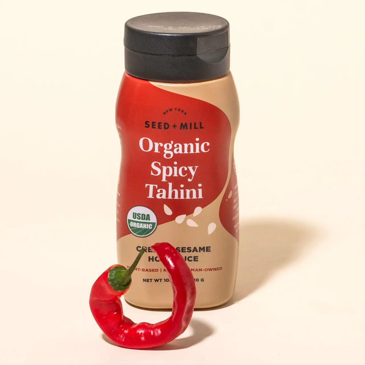
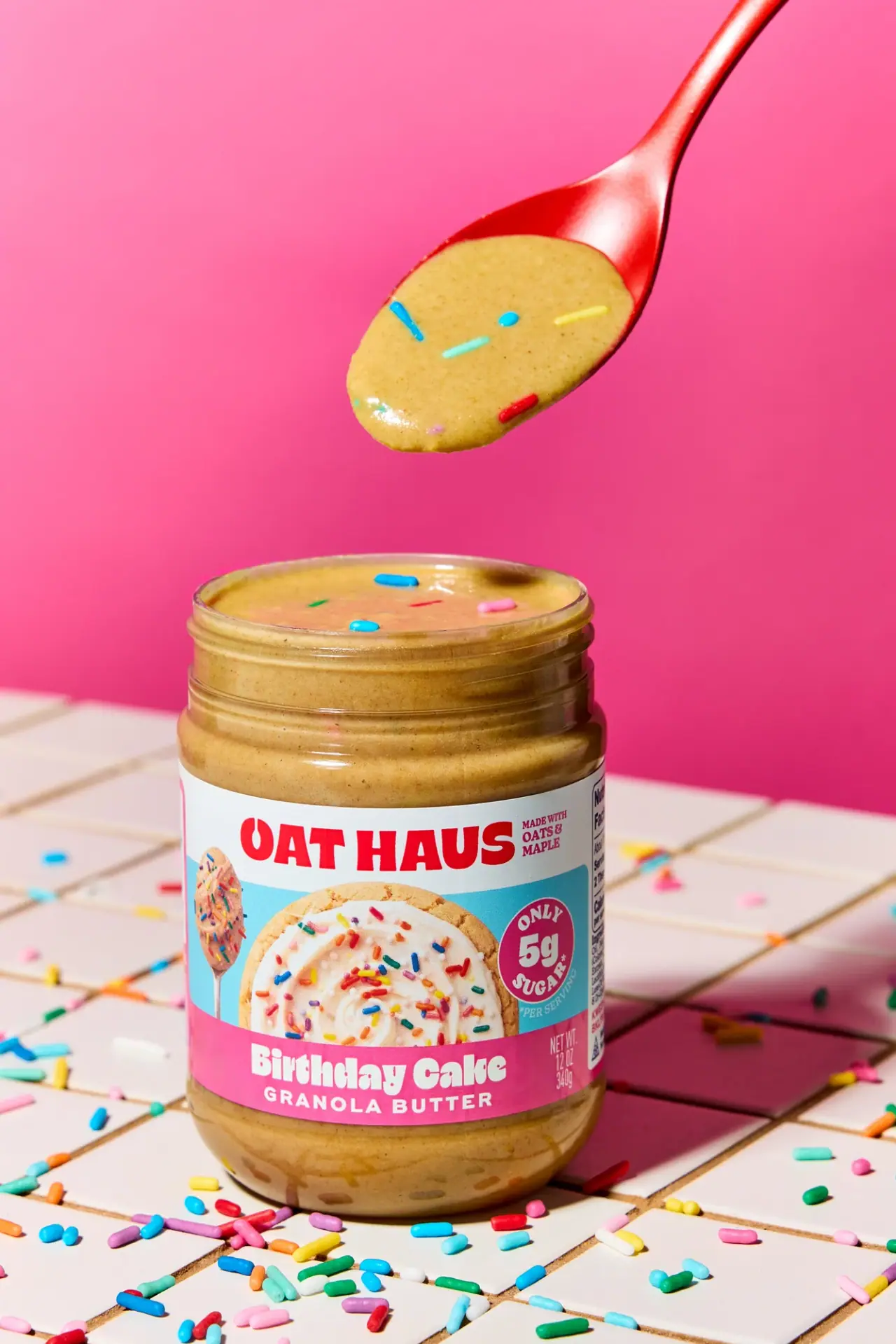


Featured from Graza
The selected packaging reference for this brand.
