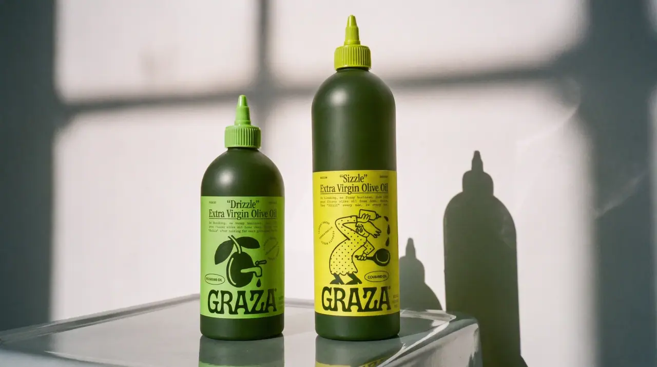
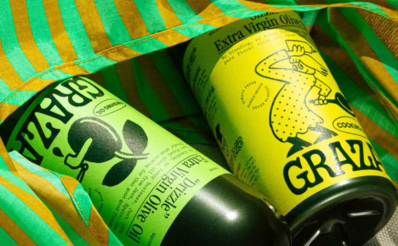
Graza packages olive oil like a corner-deli product rather than a gourmet one. Dark green glass and squeeze bottles carry a single wraparound label in acid lime or citrus yellow, drawn with a loose ink cartoon cook and stamped with a chunky slab-serif wordmark. The chips extend the system with a metallic flexible bag in a different patterned colour per flavour while the white oval label and cartoon stay fixed.
Approximate colours interpreted from photography. These are screen references, not official brand colours or print specifications.
Pack body
Bottle Green
#2b3a1e
Tinted PET and glass bottle body; the dark ground every label sits on
Label
Drizzle Lime
#a9d46f
Finishing-oil label and cap; the brand's signature colour on shelf
Sizzle Yellow
#d8de5a
Cooking-oil label and cap; separates the two oils at a glance
Chip White
#f4f1e8
Oval label panel on the chip bags, holding the wordmark and illustration
Ink
Deli Black
#1f2a14
Wordmark, cartoon line work and all label text, printed as one dark green-black
Range coding
Classic Gold
#c99a2e
Metallic gingham pattern on Classic Sea Salt chips
Hot Red
#b8432f
Metallic stripe pattern on Hot 'n Sweet chips
Vinegar Blue
#4a9ec4
Metallic harlequin pattern on Sea Salt & Vinegar chips
Typography
Suggested visual alternatives, not confirmed brand typefaces. Any scale below is an illustrative estimate.
The wordmark is the loudest element and sits at the bottom of bottle labels but centred and huge on chip bags. Product nicknames in quotes (“Drizzle”, “Sizzle”) sit at the top in a condensed serif, followed by the legal name in the same face, then a typewriter-style paragraph of copy.
Type scale
Estimated cap size as a share of the panel · Front label of the 500 ml Drizzle squeeze bottle, about 120 mm tall
wordmark
16% · Black · Display
OLIVE
chip-wordmark
12% · Black · Display
OLIVE
nickname
8% · Bold · Headline
“Drizzle”
flavour-name
7% · Regular · Descriptor
SEA SALT
product-name
5% · Regular · Headline
Extra Virgin Olive Oil
use-note
3.5% · Bold · Headline
FOR FINISHING
Fonts
Display
Alfa Slab One
Looks like
Alfa Slab One
Type
Heavy compressed slab serif with printed, slightly irregular edges
Weight
Black
Case
Uppercase
Tracking
Tight, about -1%
Fallback
Rockwell Extra Bold, Cooper Black, Georgia
The wordmark only. It runs the full label width at the base of bottles and sits huge and centred on chip bags, always in Deli Black.
Headline
Old Standard TT
Looks like
Old Standard TT
Type
Condensed transitional serif
Weight
Regular, Bold
Case
Title case, nickname in quotes
Tracking
Normal
Fallback
Century Schoolbook, Georgia
Quoted product nicknames (“Drizzle”, “Sizzle”) and the legal product name under them at the top of the label.
Descriptor
Rye
Looks like
Rye
Type
Western circus display serif
Weight
Regular
Case
Uppercase
Tracking
Wide, about +4%
Fallback
Clarendon, Georgia
Flavour names and 'Potato Chips' on chip bags, printed in the flavour colour.
Body
Courier Prime
Looks like
Courier Prime
Type
Typewriter monospace
Weight
Regular
Case
Sentence case
Tracking
Normal
Fallback
Courier, American Typewriter, monospace
The short conversational paragraph under the product name, and back-of-pack copy.
Structure & Proportions
Proportions
Purpose
Value
Preview
Label height
About 75% of bottle height, shoulder to base
Wordmark width
About 90% of label width
Illustration area
About 40% of label height, centre band
Side margin
About 5% of label width
Colours per label
Two: label field plus one dark ink
—
Density
Airy top and bottom, one busy drawing in the middle
—
Shapes
Element
Value
Preview
Bottle label
Tall rectangle, square corners, wraparound
Chip-bag label
White oval panel
Use-note badge
Small roundel
Callout
Starburst sticker
Cap
Pointed squeeze nozzle, colour-matched
Finishes
Uncoated paper-look label
Bottle labels · uncoated
Tinted dark PET / glass
Bottle body · gloss
Metallised film
Chip bags · metallic
Formats and materials
Formats
Squeeze bottle, Glass bottle, Refill can, Flexible chip bag
Materials
Dark green PET, Dark green glass, Tinplate can, Metallised film bag
Closures
Pointed squeeze nozzle caps (Drizzle, Sizzle) and flat screw caps, colour-matched to the label
Decoration
Wraparound printed label, Spot-colour line illustration, Starburst callout
Front Panel
Schematic reading order. The diagram’s zone heights do not represent measured artwork proportions.
Top
Middle
Bottom
One tall wraparound label covering most of the bottle shoulder to base, flat colour field with dark ink only.
Zone
Content
Top
Quoted nickname, legal product name, short typewriter copy
Middle
Ink cartoon: a cook, an olive, a pan; one scene per product
Bottom
Wordmark at full label width, use note ('Finishing oil', 'Cooking oil') in a small roundel
Range System
Colour coding with a fixed structure: each product owns one label colour and matching cap, and every chip flavour owns one metallic pattern, while wordmark, illustration style and layout never move.
Drizzle = lime label + lime cap
Sizzle = yellow label + yellow cap
Chips: gold gingham, red stripes, blue harlequin, green columns
Back of Pack & Shelf
The wraparound continues to the back with the same label colour: a typewriter paragraph about the oil, harvest and origin facts, then nutrition, barcode and recycling marks in a lower block, all in the single dark ink.
Story paragraph in the body typewriter face
Harvest date and origin (Spain), olive variety
Nutrition table in the same ink, no tint
Barcode on the label field, no white box
Recycling marks and volume in small type at the base
On shelf
On shelf the bottles read as flat blocks of lime and yellow on a dark body, so the brand billboards by colour rather than by logo; the colour-matched caps keep the colour code visible from above.
Imagery
Loose single-weight ink cartoons with a 1950s newspaper-comic feel, printed as one dark colour; no photography on pack.
Guidelines
Do
Keep the pack body dark (bottle green) so the bright label reads as a single flat block.
Print every label in two colours only: the label field and one dark ink.
Give each product its own label colour and match the cap to it.
Use a quoted nickname as the product's first line, above the legal name.
Draw illustrations as loose, single-weight ink line art with a cartoon character.
Let the wordmark run the full width of the label at the base.
Don't
Don't use photography or gradients on the label.
Don't add gold foil, embossing or other premium cues; the tone is deli, not gourmet.
Don't set product names in sans-serif.
Don't use a clear bottle; the oil is never shown.
Don't vary the layout between products; only the colour and the drawing change.
Give your AI packaging taste
Give your design or image tool a packaging study: palette, type, structure, front panel and principles for an original brief.