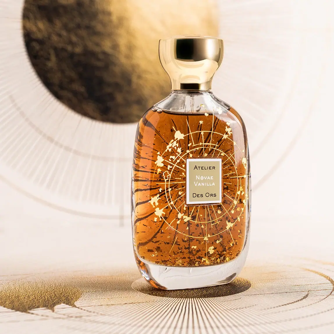
Photography: Atelier des Ors official photography. Images belong to their respective owners.
Atelier des Ors

Golden constellation framing a compact name on amber transparency
Novae Vanilla Artisanat d'Or surrounds a small rectangular name panel with fine gold-colored circles, rays and irregular fragments. A rounded transparent-looking bottle reveals amber contents and a substantial clear base, while a broad reflective cap gives the object a sculptural upper silhouette. The specific official edition is a 100 mL fragrance with a gold constellation treatment. This study distinguishes its observed decorative layers from the exact substrate and cap materials, which are not established by the selected image.
- Perfume
- Light pack
- Heritage label
About this study
Selected Novae Vanilla Artisanat d'Or constellation edition, 100 mL. Analysis does not generalize its decoration to standard editions or infer solid-gold construction.
Sources & evidence · Reviewed 2026-10-19Color Palette
Approximate colours interpreted from photography. These are screen references, not official brand colours or print specifications.
Pack body
Clear-base highlight
#E9E3D7
Approximate reflected light in the clear-looking lower vessel; not an opaque body paint or a glass specification.
Amber contents appearance
#B46B20
Visible liquid field behind the decoration. This is part of the photographed object's appearance, not a claim that the bottle itself is amber-tinted.
Ink
Dark brand lettering
#30291D
Small maker words on the central name panel, contrasting with its warm light field.
Pale border and name
#F3EEE3
Light rectangular border and fragrance-name lettering isolate a quiet reading area from the elaborate surrounding surface.
Accent
Warm gold reflection
#D3AE60
Shared visual family across cap, linework, fragments and name-panel field, with substantial changes between highlights and shadows.
Typography
Suggested visual alternatives, not confirmed brand typefaces. Any scale below is an illustrative estimate.
The central panel divides the maker name around the fragrance: Atelier above, Novae Vanilla in the middle, Des Ors below. The upper and lower maker lines are dark, while the fragrance name reads pale against the golden field. Small classical-looking capitals create a compact, formal voice. The decorative field is much larger than this text panel, so the label works as a stable reading island rather than a headline that dominates the whole bottle.
Fonts
Original fragrance identity
Marcellus
- Looks like
- Refined classical capitals
- Type
- Flared display serif
- Weight
- Regular
- Case
- Uppercase or small-cap-like treatment
- Tracking
- Moderately open
- Fallback
- Georgia, serif
Proposed for a short independent perfume name. Keep letterforms clear at the intended label size and avoid recreating the source's split maker-name arrangement.
Supporting information
Source Sans 3
- Looks like
- Quiet neutral sans-serif
- Type
- Humanist sans-serif
- Weight
- Regular, Medium
- Case
- Mixed case
- Tracking
- Natural spacing
- Fallback
- Arial, sans-serif
Alternative for capacity, concentration and technical copy on supporting packaging. Those information blocks are not clearly visible on the selected front and should not be invented as observed text.
Structure & Proportions
Visual proportions and finish previews are illustrative. Confirmed construction details and uncertainties are distinguished in the study notes.
Proportions
| Purpose | Value | Preview |
|---|---|---|
| Reading island | The central rectangle occupies a modest part of the broad bottle face; surrounding decoration has more area but less textual density. | — |
| Cap balance | The flared top is wider than the neck but narrower than the main body, providing a distinct upper mass without matching the full bottle width. | — |
| Base depth | A substantial clear-looking band separates the amber contents from the surface below. Its thickness is visually apparent but not measured. | — |
| Ornament spacing | Fine circular and radial marks have enough open intervals for the liquid color to remain visible between them. | — |
Shapes
| Element | Value | Preview |
|---|---|---|
| Main vessel | Broad rounded rectangular face with curved shoulders and softly curved lower corners. | |
| Flared cap | A narrow lower section expands into a rounded bowl-like top; the simple preview represents its curved mass. | |
| Name panel | Small upright rectangle with a pale frame, creating a geometric pause amid the radiating ornament. | |
| Constellation field | Fine concentric circles and radial marks surrounding the central panel rather than a single large filled symbol. |
Finishes
Reflective cap
Gold-colored upper closure; underlying material and coating sequence unknown. · metallic
Clear-looking vessel
Shoulders, sides and heavy-looking base reveal depth and refraction. · transparent
Golden decorative field
Constellation treatment described by the brand; exact manufacturing sequence is not reconstructed. · metallic
Formats and materials
| Formats | 100 mL limited-edition fragrance bottle with rounded shoulders, thick clear-looking base and broad sculptural cap |
| Materials | The product page describes a 24-carat gold edition and engraved constellation decoration associated with artisan gilders. This supports a gold decorative treatment, not a solid-gold bottle construction., The brand separately describes gold leaf in its fragrances. The visible fragments are part of the selected object's layered appearance, but their individual positions cannot be used to map a fixed printed pattern., Exact vessel substrate, cap composition and name-panel stock are not specified in the accessed edition details. |
| Closures | A broad gold-colored cap narrows toward the neck and flares into a rounded cup-like upper form. It remains fitted in the photograph, concealing the atomizer. Cap retention, liner construction, spray mechanism and any refill interface are not shown. |
| Decoration | Concentric circular lines and fine radial marks frame the center, Small rectangular identity panel interrupts the otherwise fluid decorative surface, Dark radial effects visible through the liquid are not assigned an unsupported printing process |
Front Panel
Schematic reading order. The diagram’s zone heights do not represent measured artwork proportions.
The central name rectangle is framed by radiating decoration that continues around and behind it. Its light border provides separation from amber liquid and bright fragments. The text remains centered inside that fixed boundary, so the viewer can locate the fragrance even where reflections make the surrounding linework complex. The photograph does not establish whether this panel is paper, a plate or another decoration construction.
| Zone | Content |
|---|---|
| Upper maker line | Atelier sits at the top of the compact panel, leaving a clear interval before the fragrance name. |
| Fragrance center | Novae Vanilla occupies two pale lines in the middle, differing in color from the maker words around it. |
| Lower maker line | Des Ors completes the identity below the fragrance, balancing the upper line rather than introducing a separate claim block. |
| Decorative perimeter | Circular and radial marks frame the rectangle while irregular fragments add variation. Their density changes with the visible liquid and reflections. |
Range System
This is a particular Artisanat d'Or limited edition, not a specification for standard Novae Vanilla or every Atelier des Ors fragrance. The selected reference demonstrates a compact identity panel surrounded by a more expansive decorative field. An original range could preserve that reading principle while changing motifs, but the study does not infer edition-wide color coding, universal cap materials or interchangeable bottles.
- For an independent limited edition, keep the main name readable while allowing the surrounding ornament to change.
- On a smaller bottle, simplify the number of fine radiating lines rather than scaling every detail down equally.
- Distinguish fixed exterior decoration from moving or irregular contents when preparing accurate product imagery.
Back of Pack & Shelf
The reverse is not directly shown. The product page's broader bottle description mentions embossed rear rays and a seahorse engraved on the cap, but this view cannot establish their complete arrangement or visibility on every surface.
- Acquire rear and cap-top views before documenting the exact relief or emblem placement.
- Treat dark rays seen through the liquid as optical evidence, not a complete reverse artwork map.
- Obtain underside and carton views for capacity, concentration and other retail information placement.
On shelf
Interpretively, the broad reflective cap and warm contents provide distant recognition, while the compact label asks for closer reading. Ornament has enough open space to avoid completely obscuring the liquid, but bright highlights may compete with the pale fragrance name. An original concept should be tested with several light directions and a simpler retail setting to verify that the name remains findable without the matching campaign backdrop.
Imagery
The bottle stands on a pale surface with circular radiating graphics, with another large dark-and-gold circular form behind it. The setting echoes the front constellation language and gives the clear body a warm reflected environment. Those large background circles are not part of the bottle. Directional lighting emphasizes the cap's curvature and the transparent base, while amber liquid and fragments complicate the view through the central body.
Guidelines
Editorial principles for an original design brief, not official brand guidelines.
Do
- Give small text a stable framed area within ornate decoration.
- Distinguish edition-specific craftsmanship claims from visual inference.
- Consider the cap silhouette as part of the full composition.
- Separate fixed graphics from irregular visible contents.
- Test reflective lettering under more than one light direction.
Don't
- Do not call the vessel solid gold.
- Do not infer cap composition from its reflective surface.
- Do not describe unseen rear detail as directly inspected.
- Do not copy the constellation pattern or maker-name arrangement.
- Do not merge the campaign backdrop's circles into the package artwork.
Sources & evidence
How this study was built
edition · Sourced fact
Official edition copy identifies 100 mL and a 24-carat gold constellation treatment with engraving and artisan gilders.Atelier des Ors — Novae Vanilla Édition Limitée Artisanat d'Orstructure · Sourced fact
Brand text separately discusses gold leaf in fragrances; this does not identify the cap or vessel substrate.Atelier des Ors — Novae Vanilla Édition Limitée Artisanat d'Orlabel · Visual observation
A pale-bordered compact rectangle holds the name within a much larger circular and radial decorative field.Atelier des Ors — Novae Vanilla Édition Limitée Artisanat d'Orstructure · Visual observation
Rounded shoulders, thick clear-looking base and flared reflective cap define the photographed silhouette.Atelier des Ors — Novae Vanilla Édition Limitée Artisanat d'Orpalette · Visual observation
Amber contents, gold-colored reflections and a pale border define the object; large background circles belong to the set.Atelier des Ors — Novae Vanilla Édition Limitée Artisanat d'Ortypography · Editorial interpretation
Proposed fonts provide independent classical identity and supporting information roles without claiming exact attribution.range · Editorial interpretation
A stable name panel surrounded by variable ornament is an adaptation principle, not a universal brand rule.
What remains unverified
- Exact vessel substrate, cap composition and name-panel construction unknown.
- Rear and cap-top motifs described by the source are not fully visible in the selected view.
- Atomizer, underside and carton absent.
- Fonts, dimensions and exact process sequence not established.
- Colors and reflections vary with lighting and visible contents.
Give your AI
packaging taste
Give your design or image tool a packaging study: palette, type, structure, front panel and principles for an original brief.
Export this styleFree with an email. PACK.md works in Claude, ChatGPT, Cursor and image tools.
More like this

Aerangis
a quiet numbered object, an intimate scent memory

Alexander McQueen
An oval flacon crowned with dense black relief
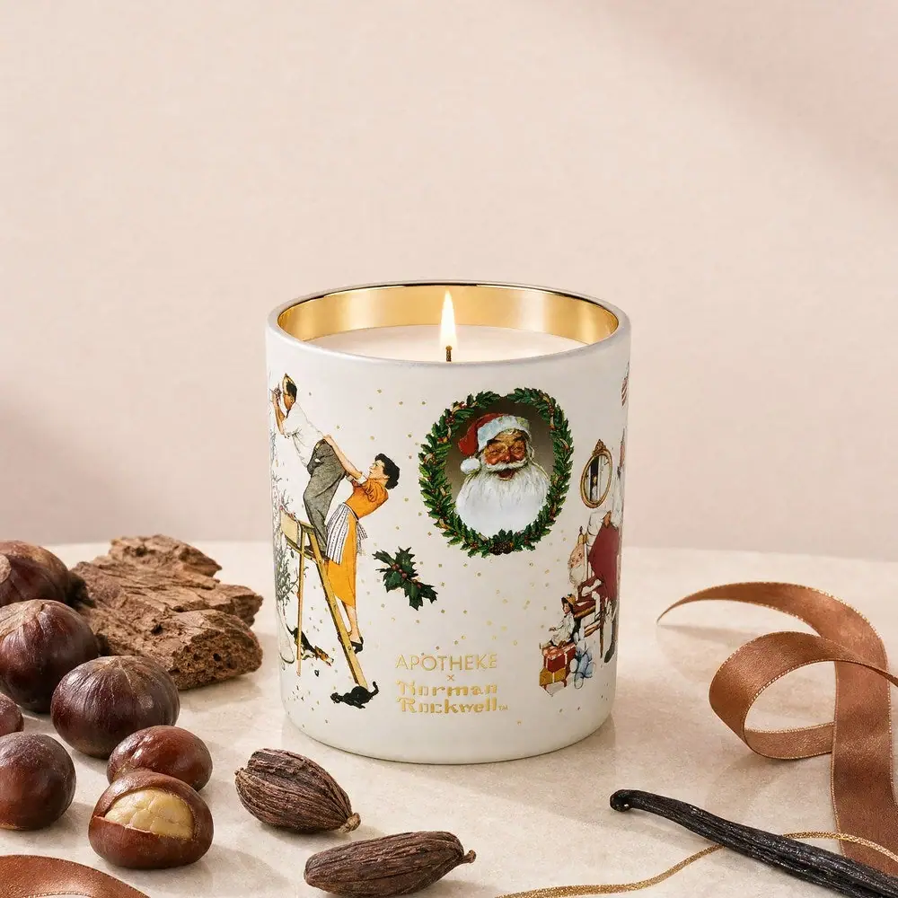
Apotheke
White holiday vignettes with a warm golden interior

Arquiste
blush transparency, white lettering and a stepped gold cap
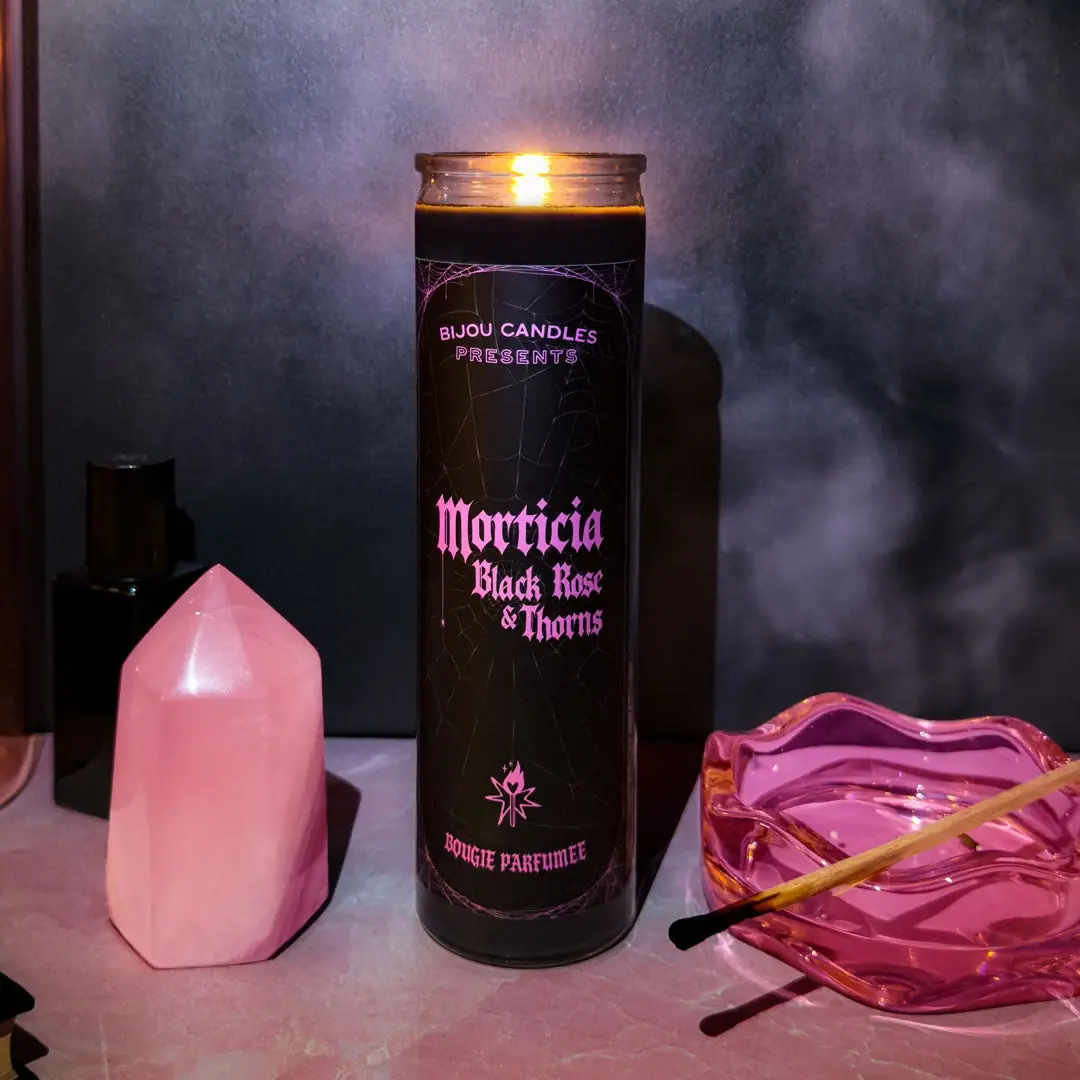
Bijou Candles
Pink blackletter and fine webs on a tall dark candle

Chabaud
A framed perfume label beneath a clear architectural cap
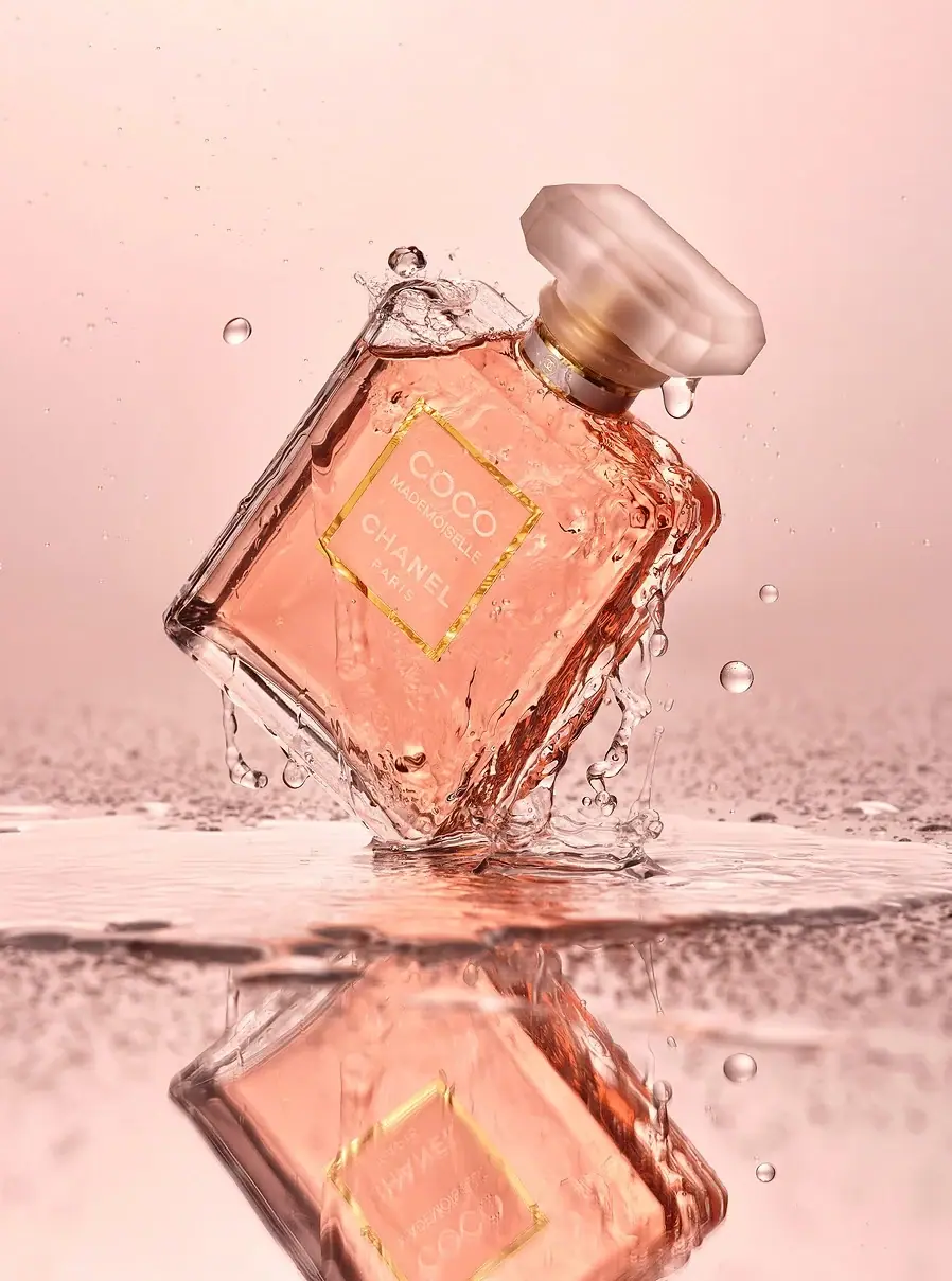
Chanel
Bevelled clear flacon with peach label and faceted cap
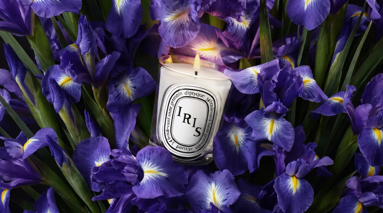
Diptyque
engraved oval labels on clear glass