
Photography: Josh Caudwell — fragrance still-life photography. Images belong to their respective owners.
Chabaud

A framed perfume label beneath a clear architectural cap
The selected earlier Chic et Bohème bottle combines a transparent-looking cylindrical body with a wide rectangular clear cap. A pale bordered label interrupts the optical surface, giving the serif house name and fragrance title a stable reading plane. A small key-like divider sits between the upper identity and lower scent name. The pale yellow contents provide the only substantial warm colour in Josh Caudwell’s graphic grey-and-white photograph. This study remains tied to the earlier cylindrical presentation; current product sizes and images are context, not proof of this specimen’s volume, construction or edition date.
- Perfume
- Light pack
- Heritage label
- Luxe monochrome
About this study
Earlier cylindrical Chic et Bohème bottle photographed by Josh Caudwell. Current official size options are context only and do not identify this image’s volume or edition date.
Sources & evidence · Reviewed 2026-10-19Color Palette
Approximate colours interpreted from photography. These are screen references, not official brand colours or print specifications.
Pack body
Pale yellow optical field
#DAD99C
Approximate colour visible through the liquid chamber. It is not assigned to a tinted bottle wall or a precise formula colour outside the selected lighting.
Label
Soft white panel
#EEEFEC
Approximate opaque label ground. Its fine-looking surface contrasts with the reflective bottle, giving the serif text a comparatively stable background.
Ink
Dark grey lettering and border
#4C4D4E
Approximate dark label details. Some elements appear silver-grey in the light, but a metallic printing process is not verified.
Accent
Silver-tone hardware
#B4B5B7
Visual reference for the reflective spray assembly beneath the clear cap. Actual metal, plating and component composition remain unspecified.
Typography
Suggested visual alternatives, not confirmed brand typefaces. Any scale below is an illustrative estimate.
A broad serif house name leads the label, with a small widely spaced descriptor directly beneath. The thin key-like divider creates a pause before the lower fragrance name, which uses a related serif voice at a smaller size. The frame encloses these elements without becoming another headline. The hierarchy is restrained but complete: producer, house descriptor, divider and fragrance each have a separate position.
Fonts
House name and fragrance
Cormorant Garamond
- Looks like
- Cormorant Garamond
- Type
- Serif
- Weight
- Medium 500 / SemiBold 600
- Case
- Uppercase and small-cap-like presentation
- Tracking
- Neutral to slightly open
- Fallback
- serif
A proposed alternative for elegant contrast and serif detail. Use a new producer and fragrance name, and check the fine strokes on the curved label rather than treating a large screen rendering as production proof.
Small house descriptor
Libre Baskerville
- Looks like
- Libre Baskerville
- Type
- Serif
- Weight
- Regular 400
- Case
- Uppercase
- Tracking
- Generous for a short descriptor
- Fallback
- serif
A slightly sturdier alternative for the small line beneath the house name. Keep it secondary through scale and spacing, while avoiding overly thin lettering that disappears in highlights.
Structure & Proportions
Visual proportions and finish previews are illustrative. Confirmed construction details and uncertainties are distinguished in the study notes.
Proportions
| Purpose | Value | Preview |
|---|---|---|
| Body and cap contrast | The cylindrical body is vertically substantial, while the cap is a wide shallow block above a narrow neck. Their different geometries create the main silhouette contrast. | — |
| Label position | The pale label sits on the lower-middle front, with visible liquid above and a clear base below. It does not extend across the shoulders. | — |
| Border spacing | A narrow margin separates the frame from the label edge, while larger internal gaps separate name, divider and fragrance. No numerical measurements are inferred. | — |
Shapes
| Element | Value | Preview |
|---|---|---|
| Bottle body | Circular cylinder with rounded shoulders and a visibly deep-looking base. | |
| Clear cap | Wide rectangular block with crisp outer edges, contrasting with the rounded vessel. | |
| Label | Rectangular panel curved around the cylinder, with a thin inset frame. | |
| Divider motif | A fine horizontal ornament with a small key-like central form. Its exact proprietary artwork should not be copied. |
Finishes
Optical clear surfaces
Bottle and rectangular cap; composition unknown. · transparent
Reflective silver-tone hardware
Visible spray assembly beneath the cap, with plating and substrate unverified. · metallic
Quiet pale label
Bordered front panel; low-sheen appearance only. · matte
Formats and materials
| Formats | An earlier cylindrical perfume vessel with rounded shoulders, a pronounced circular-looking clear base and a broad rectangular transparent-looking cap. The exact capacity is not legible in the selected image. |
| Materials | Neither inspected source provides a component specification for this earlier photographed edition. Bottle and cap materials are not inferred from transparency; label stock and hardware substrate are also unverified. |
| Closures | The clear rectangular cap encloses a silver-tone spray assembly, whose cylindrical structure remains visible. The source confirms the fragrance is sold as a spray, but current specifications do not establish this older cap’s fastening or the pump’s internal construction. |
| Decoration | A thin rectangular border frames the label. Serif naming and a central key-like line motif provide the main decoration, leaving the outer vessel largely transparent-looking. |
Front Panel
Schematic reading order. The diagram’s zone heights do not represent measured artwork proportions.
The label creates a bounded, nearly monochrome reading plane within the transparent cylinder. Its frame follows the curved surface in the photograph, so the apparent bowing of horizontal lines should not be mistaken for a deliberately arched flat-artwork shape.
| Zone | Content |
|---|---|
| House identity | The large serif producer name occupies the upper central area. Its breadth gives the label a formal top anchor while leaving space around the letters. |
| Small descriptor | A short spaced line sits close beneath the producer. It reads as part of the upper identity group rather than a separate product claim. |
| Fine divider | A key-like motif and thin horizontal strokes separate upper identity from the fragrance. This is a small ornamental pause, not a certification or functional symbol. |
| Fragrance name | The scent sits in the lower half with a clear interval above it. A similar serif voice keeps the panel coherent while size and position distinguish its role. |
| Inset frame | The thin border gathers all information into one panel. It is strong enough to define an edge against clear surroundings without overwhelming the small text. |
Range System
The current official page identifies Chic et Bohème and lists 30 ml, 100 ml and 100 ml LUX choices. Those options are not mapped to the earlier cylindrical bottle, whose capacity remains unknown. This study therefore treats the selected label and cap as an archived design reference rather than a current catalogue specification.
- For an original perfume family, a stable bordered panel can separate a consistent house identity from changing fragrance names. Each name still needs individual fitting within the lower field.
- A cap or vessel redesign changes the overall identity even when the fragrance name remains the same. Keep edition-specific geometry attached to the correct images instead of blending older and current packaging into one description.
Back of Pack & Shelf
The reverse, underside and uncovered spray mechanism are absent. No carton or secondary packaging is shown.
- Verify the actual older edition before assigning volume, batch marks or ingredient placement.
- Do not use current product imagery to reconstruct the older label’s reverse or cap attachment.
- A proposed rear label should be checked for curvature and visibility through the clear bottle rather than assumed to match the front frame.
On shelf
The wide clear cap would likely be the strongest silhouette cue, followed by the framed label. The cylinder’s gentle shoulders soften the geometry, preventing the whole object from reading as a stack of rectangles. This is a visual interpretation rather than measured retail evidence. The pale label offers more stable text contrast than lettering placed directly over the liquid, although glare can still affect its fine details.
Imagery
A hard-edged patch of light crosses a grey-and-white architectural corner around the bottle. The cap casts a distinctive rectangular shadow, while transmitted light through the body produces a pale curved highlight on the surface. This makes the object’s contrast between block and cylinder visible beyond its outline. Josh Caudwell’s portfolio identifies the matching Chabaud refraction study. The grey setting is not a package colour, and the dramatic shadow does not establish the cap material or manufacturing process.
Guidelines
Editorial principles for an original design brief, not official brand guidelines.
Do
- Keep the earlier cylindrical edition distinct from current product variants.
- Use the frame to organise the label while leaving generous space inside it.
- Balance the broad rectangular cap against the softer cylindrical body.
- Test fine serif strokes and border contrast on the actual curved panel.
Don't
- Do not assign a current 30 ml or 100 ml size to this image without an edition match.
- Do not infer glass, acrylic, foil or plating from optical and silver-tone appearance.
- Do not copy the proprietary key-like ornament or producer wordmark into an original concept.
- Do not mistake perspective curvature on the label for a verified arched dieline.
Sources & evidence
- Chic et Bohème — Chabaud Parfumproduct
- Josh Caudwell — Chabaud fragrance refraction photographyphotographer
How this study was built
edition · Sourced fact
Current official page lists 30 ml, 100 ml and 100 ml LUX; no exact match to the earlier image is asserted.Chic et Bohème — Chabaud Parfumimagery · Sourced fact
Josh Caudwell portfolio identifies the matching Chabaud photograph and its light-refraction treatment.Josh Caudwell — Chabaud fragrance refraction photographystructure · Visual observation
Round cylinder and broad clear rectangular cap create contrasting geometries.label · Visual observation
Pale bordered panel contains producer, small descriptor, key-like divider and fragrance name.typography · Visual observation
Serif naming and spacing create a restrained hierarchy; original font identities are unverified.palette · Visual observation
Pale yellow liquid, white label, dark details and silver-tone hardware are separated from grey scenery.range · Editorial interpretation
Proposed family guidance concerns stable framed hierarchy; current and earlier geometry are kept distinct.
What remains unverified
- Older bottle capacity and production date are unknown.
- Bottle, cap, label and hardware materials/processes are not established for this specimen.
- Reverse, underside, carton and open assembly are unseen.
- Fonts are alternatives; colours and proportions are visual references rather than production measurements.
Give your AI
packaging taste
Give your design or image tool a packaging study: palette, type, structure, front panel and principles for an original brief.
Export this styleFree with an email. PACK.md works in Claude, ChatGPT, Cursor and image tools.
More like this

Aerangis
a quiet numbered object, an intimate scent memory

Alexander McQueen
An oval flacon crowned with dense black relief

Arquiste
blush transparency, white lettering and a stepped gold cap
Diptyque
engraved oval labels on clear glass
Eight & Bob
Ribbed red flacon, pale label and polished black cap
Jimmy Choo
Blush transparency, staggered flutes and a silver square cap
Lumière de Lily
Banded onyx framed by a black label and golden emblem
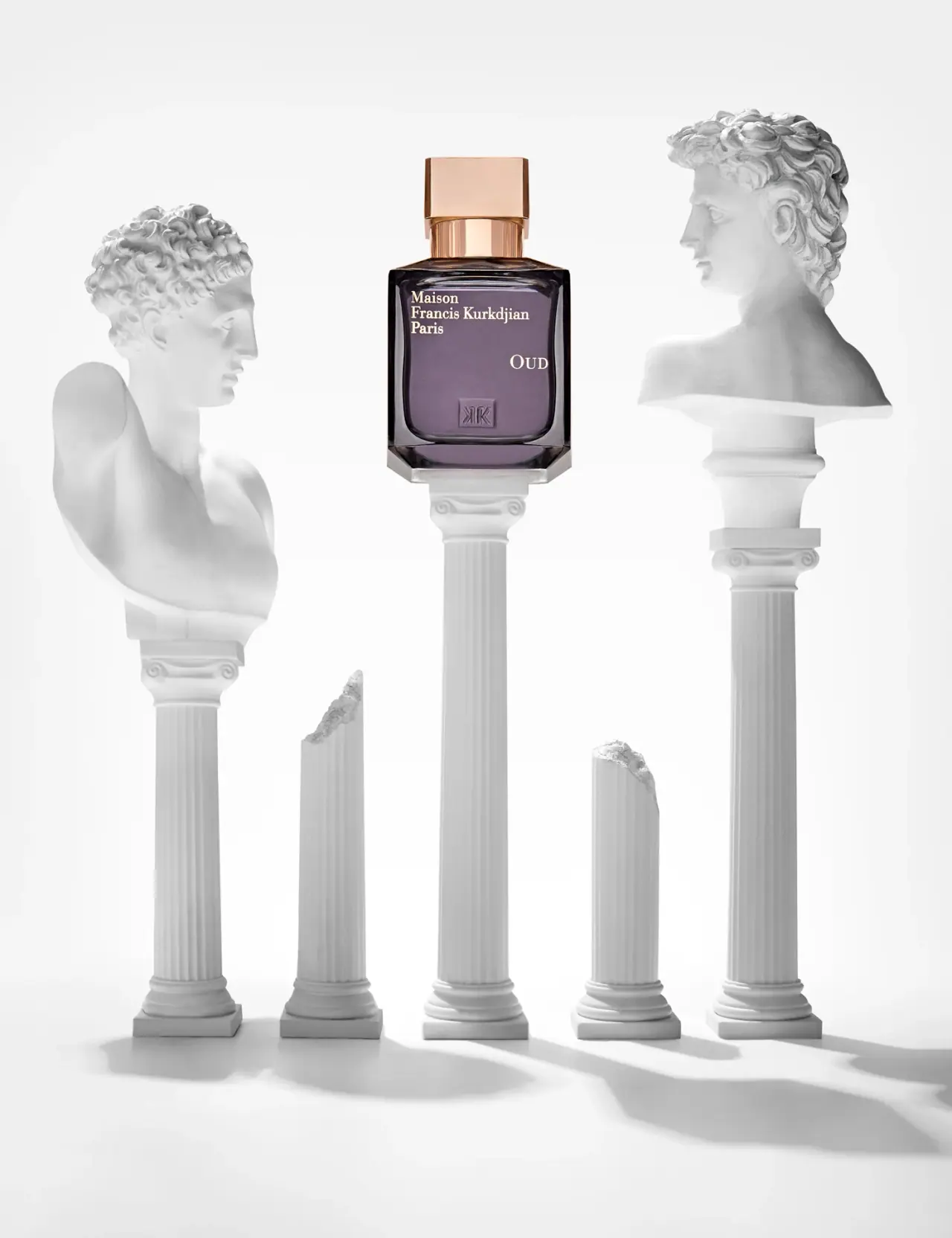
Maison Francis Kurkdjian
offset ivory serif names on plum flacon beneath warm cap