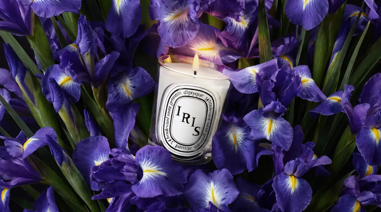
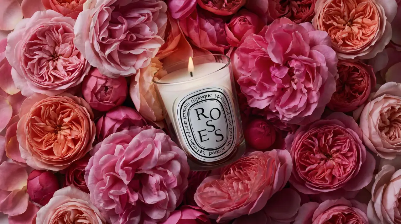
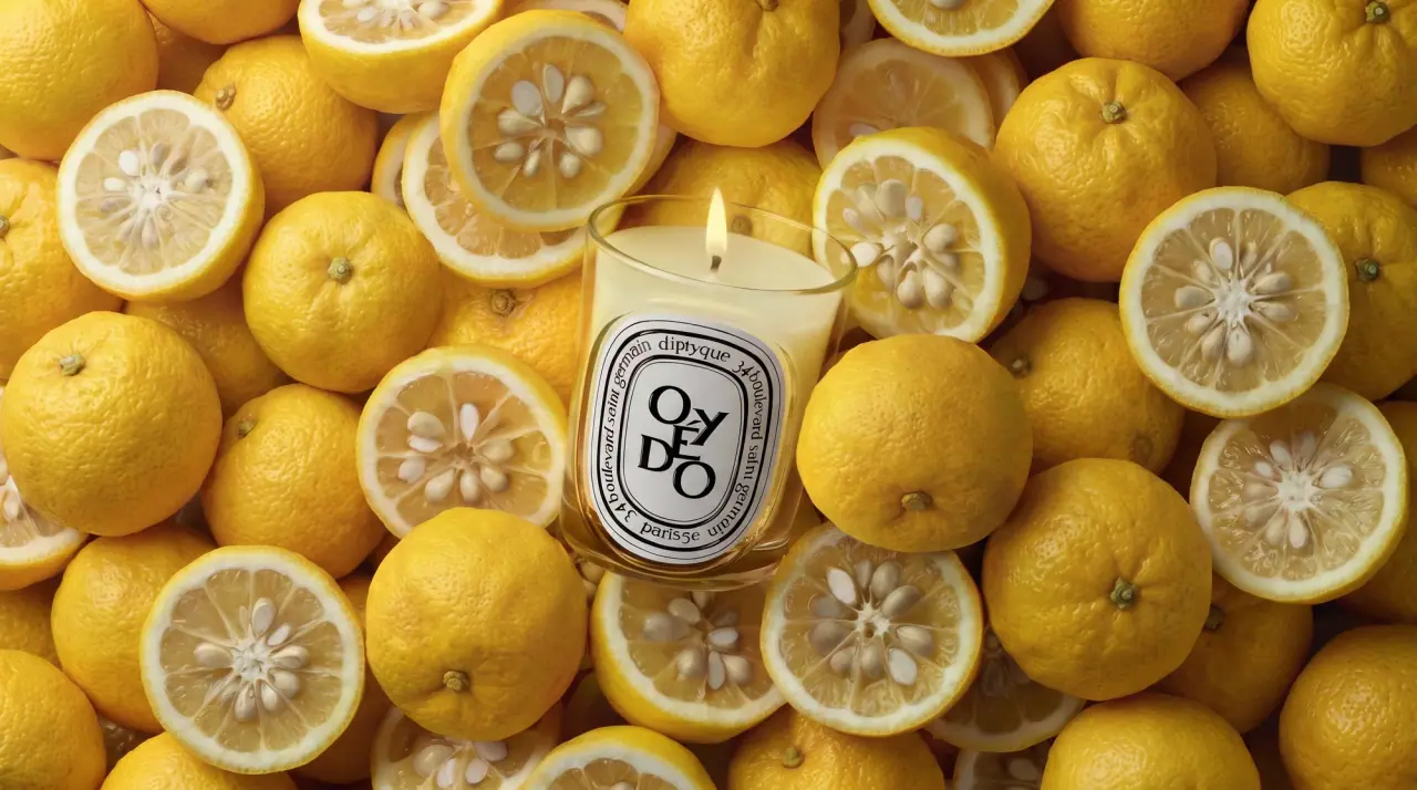
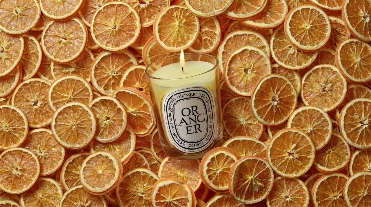
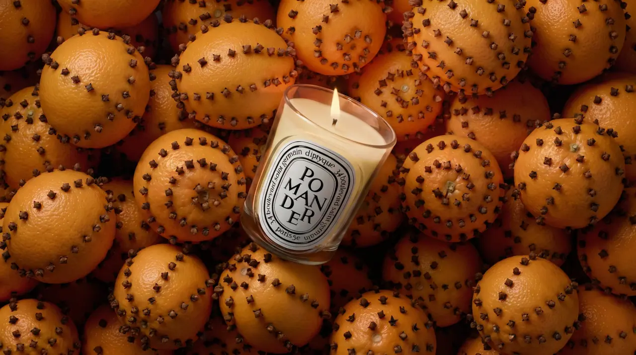
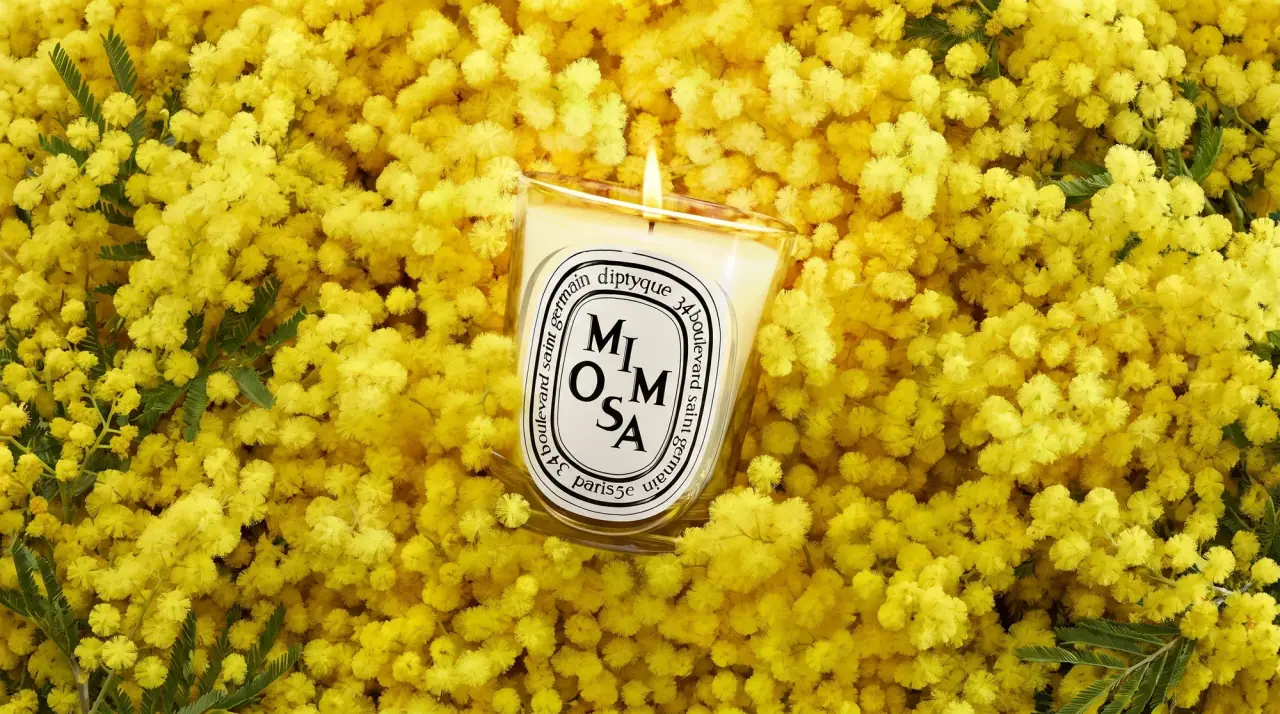
Campaign images © Diptyque, from diptyqueparis.com
Diptyque

engraved oval labels on clear glass
diptyque hangs its whole system on one device: an upright oval label with a double-rule border, the house name and street address running around the ring, and the product name stacked in staggered high-contrast serif capitals in the centre, often among fine black line engravings. The oval sits on clear candle tumblers, on oval perfume flacons with dark wood-look caps, on white hatboxes and on outer cartons, so a product can change colour and still be recognised instantly. The core range is strictly black ink (#151515) on off-white paper over clear glass. Seasonal and premium editions invert the oval to gold on black, add a navy starred carton, or press the oval into tinted glass as an embossed relief.
- Candles & home scent
- Perfume
- Light pack
- Heritage label
- Luxe monochrome
Color Palette
Approximate colours interpreted from photography. These are screen references, not official brand colours or print specifications.
Pack body
Clear Flint
#e9e9e7
Clear candle tumbler and oval perfume flacon glass
Wax White
#f2f0ea
Candle wax seen through the clear tumbler, and the white hatbox body
Ebony Cap
#262422
Dark wood-grain-look cap on the perfume flacons and body oil
Label
Paper Oval
#f7f6f1
Ground of the classic oval label on candles, flacons and hatboxes
Edition Black
#1a1816
Black oval ground on festive perfume flacons and cartons
Ink
Engraving Black
#151515
Double-rule border, ring text, staggered product name and line engravings
Accent
Engraved Gold
#c9a54e
Gold line art and lettering on black ovals for festive editions
Range coding
Midnight Star
#2b3a5c
Navy carton with scattered gold stars for the holiday edition
Amber Glass
#b3612f
Tinted ribbed vessel with an embossed oval lid on exceptional candles
Rosewood Glass
#7a4848
Plum-tinted version of the same embossed vessel
Typography
Suggested visual alternatives, not confirmed brand typefaces. Any scale below is an illustrative estimate.
The product name dominates the centre of the oval, its letters broken across two or three lines and offset like a typographic puzzle to fill the shape. The house name and address circle it in smaller lowercase on the ring, and a bilingual descriptor and the weight sit outside the oval at the base in small italic and roman.
Type scale
Estimated cap size as a share of the panel · Oval label on the 190 g classic candle, about 75 mm tall
product-name
16% · Regular · Display
FIG
hatbox-name
12% · Regular · Display
CEDAR
ring-address
5% · Regular · Label
12 rue des jardins
ring-city
4% · Regular · Label
paris 6e
format-fr
3% · Regular · Body
bougie parfumée
format-en
2.6% · Italic · Body
scented candle
Fonts
Display
Bodoni Moda
- Looks like
- Didot, Engravers Roman
- Type
- High-contrast didone-style serif
- Weight
- Regular, Medium
- Case
- Uppercase
- Tracking
- Variable; letters spaced to fill the oval
- Fallback
- Didot, Bodoni 72, Georgia
The staggered product name stacked inside the oval, two or three letters per line.
Label
Cormorant Garamond
- Looks like
- Trajan, Adobe Garamond
- Type
- Classical roman serif set along a curve
- Weight
- Regular
- Case
- Lowercase address with lowercase house name
- Tracking
- Slightly open, about +3%
- Fallback
- Garamond, Times New Roman
House name, street number and street running continuously around the oval ring, plus 'paris' at the base of the ring.
Body
EB Garamond
- Looks like
- Garamond Italic, Caslon Italic
- Type
- Old-style serif with italic
- Weight
- Regular, Italic
- Case
- Sentence case
- Tracking
- Normal
- Fallback
- Garamond, Georgia, serif
Bilingual format line under the oval (roman for French, italic for English), weight and net weight, carton copy.
Structure & Proportions
Proportions
| Purpose | Value | Preview |
|---|---|---|
| Oval height | About 75% of candle tumbler height | |
| Oval width | About 55% of the visible tumbler width | |
| Ring band | About 12% of oval width each side, holding the address | |
| Product name block | About 55% of oval height, centre | |
| Flacon oval | About 65% of flacon face height, centred | |
| Colours per pack | One ink on paper (core) or one gold on black (editions) | — |
| Density | Calm outside the oval; dense, carefully filled lettering inside it | — |
Shapes
| Element | Value | Preview |
|---|---|---|
| Label | Upright oval with double-rule border | |
| Perfume flacon | Flat oval bottle with tall cylindrical cap | |
| Candle vessel | Straight-walled tumbler | |
| Hatbox | Round drum with lift-off lid | |
| Premium lid | Rounded-square glass lid with embossed oval |
Finishes
Clear glass
Candle tumblers and flacons · transparent
Matte paper label
Classic oval · matte
Gold foil line art
Festive black ovals and cartons · foil
Embossed relief
Tinted glass lids of exceptional candles · emboss
Formats and materials
| Formats | Candle tumbler, Very large candle in hatbox, Oval perfume flacon, Body oil bottle, Tinted glass vessel with lid, Folding carton |
| Materials | Glass, Tinted glass, Paperboard, Wood-look cap |
| Closures | Tall dark wood-look caps on flacons, flat embossed glass lids on premium vessels, lift-off lids on hatboxes |
| Decoration | Oval label, Fine line engraving, Curved border text, Star pattern on carton |
Front Panel
Schematic reading order. The diagram’s zone heights do not represent measured artwork proportions.
A single upright oval with a double-rule border, address text running around the ring, product name stacked in the centre; descriptor and weight outside below.
| Zone | Content |
|---|---|
| Outer ring | House name and street address running around the oval |
| Centre | Staggered capital product name, sometimes framed by a line engraving of the scent's subject |
| Below oval | Bilingual format line, weight or volume |
Range System
The oval never changes; editions vary by ink inversion (black on white vs gold on black), carton pattern, vessel tint and the engraving inside the oval.
- Classic candles = black on white oval on clear glass
- Morning/evening pair = matching ovals with different line scenes
- Festive perfumes = gold-on-black oval + navy starred carton
- Exceptional candles = amber or plum tinted glass with embossed oval lid
- Very large candle = oval printed on a white hatbox
Back of Pack & Shelf
Small round sticker under the candle base and a side panel on cartons, in the same black serif: bilingual product description, burning advice, safety pictograms, then batch, barcode and recycling marks.
- Short bilingual description of the scent in serif italic
- Burning advice and safety pictograms (candles)
- Ingredient list and allergen notice (fragrances)
- Batch number and barcode on a base sticker
- Recycling and sorting marks for glass and carton
On shelf
On a shelf the identical black-on-white ovals repeat like a row of name plates; the only variation is the shape of each name, so the brand is recognised long before the scent is read.
Imagery
Fine black or gold line engravings in an old etching style (botanicals, figures, sun and moon, animals) contained inside the oval, never full-bleed; festive cartons add a scattered field of small gold stars.
Guidelines
Do
- Put one upright oval label at the centre front of every pack, bordered by a double rule, about 75% of vessel height.
- Run the house name and address continuously around the oval ring in the Label serif.
- Stack the product name in staggered high-contrast Display capitals inside the oval, two or three letters per line.
- Keep the core palette to black ink (#151515) on off-white paper (#f7f6f1) over clear glass.
- For premium editions invert to gold (#c9a54e) line work on black, or emboss the oval into tinted glass.
- Place the bilingual descriptor and weight outside the oval, small and centred, French roman over English italic.
- Keep every engraving inside the oval border.
Don't
- Don't use sans-serif type anywhere on the front.
- Don't let illustrations escape the oval or run full-bleed on the glass.
- Don't use bright flat colours on the core range; colour comes from glass tint or seasonal cartons.
- Don't replace the oval with a rectangle or circle.
- Don't set the product name on one straight line; it should be stacked and staggered.
- Don't add a second logo or badge outside the oval.
Give your AI
packaging taste
Give your design or image tool a packaging study: palette, type, structure, front panel and principles for an original brief.
Export this styleFree with an email. PACK.md works in Claude, ChatGPT, Cursor and image tools.
More like this

Aerangis
a quiet numbered object, an intimate scent memory

Alexander McQueen
An oval flacon crowned with dense black relief

Arquiste
blush transparency, white lettering and a stepped gold cap

Chabaud
A framed perfume label beneath a clear architectural cap
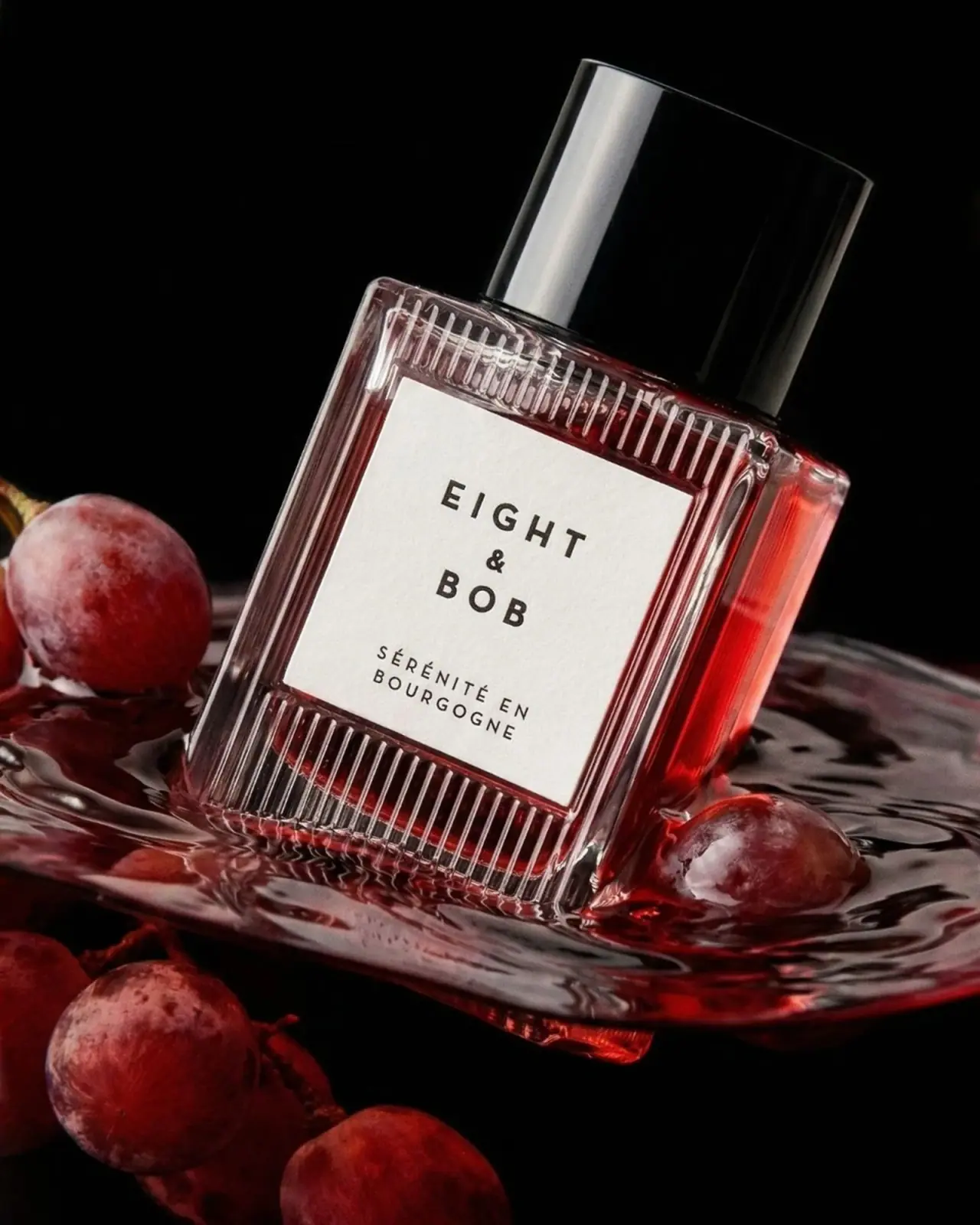
Eight & Bob
Ribbed red flacon, pale label and polished black cap
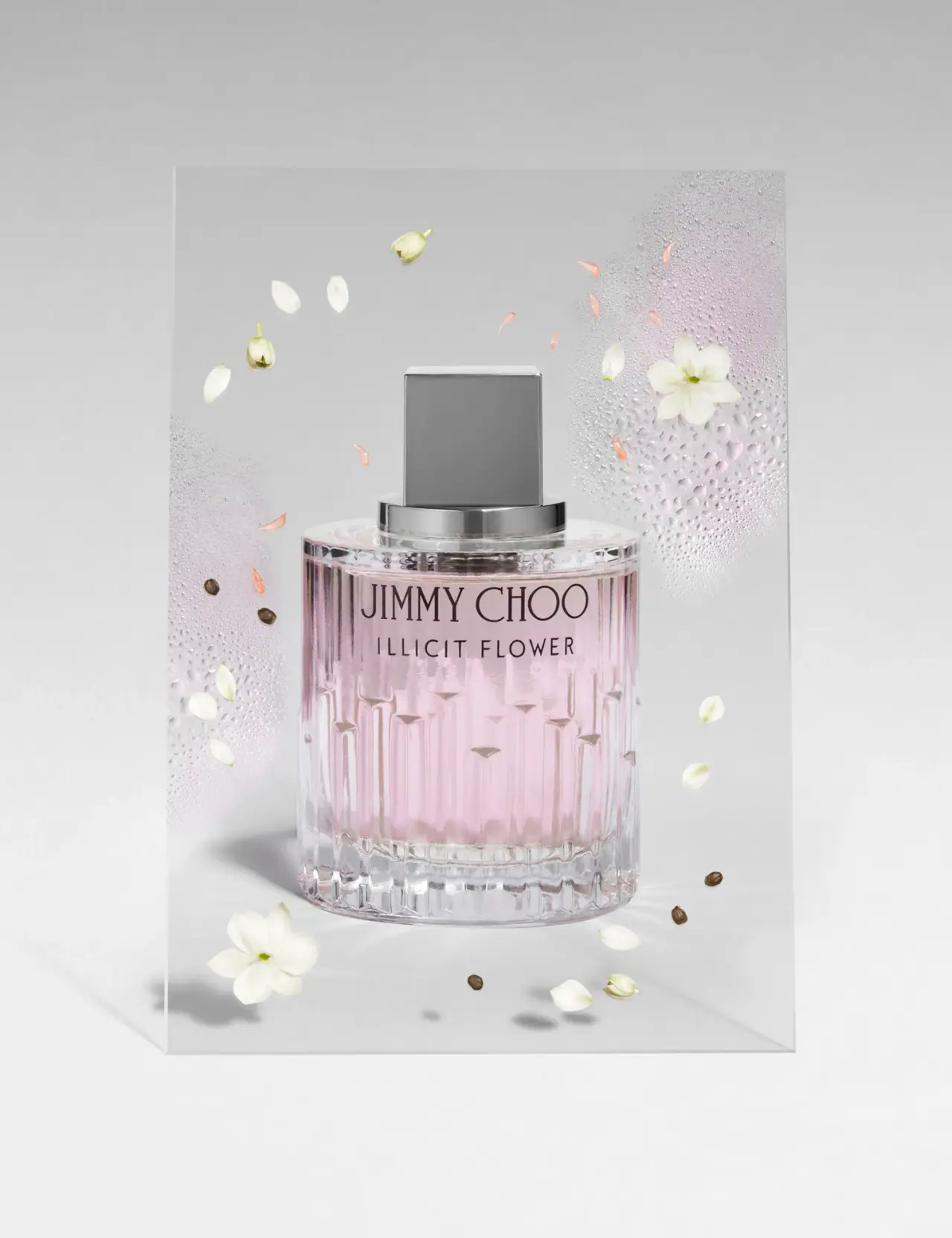
Jimmy Choo
Blush transparency, staggered flutes and a silver square cap
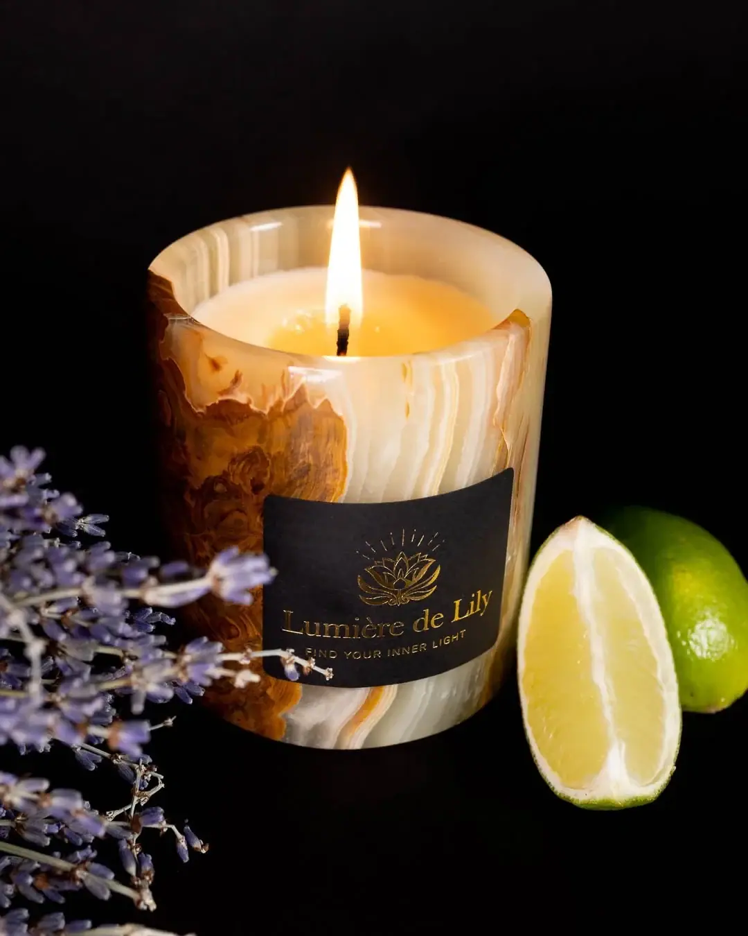
Lumière de Lily
Banded onyx framed by a black label and golden emblem
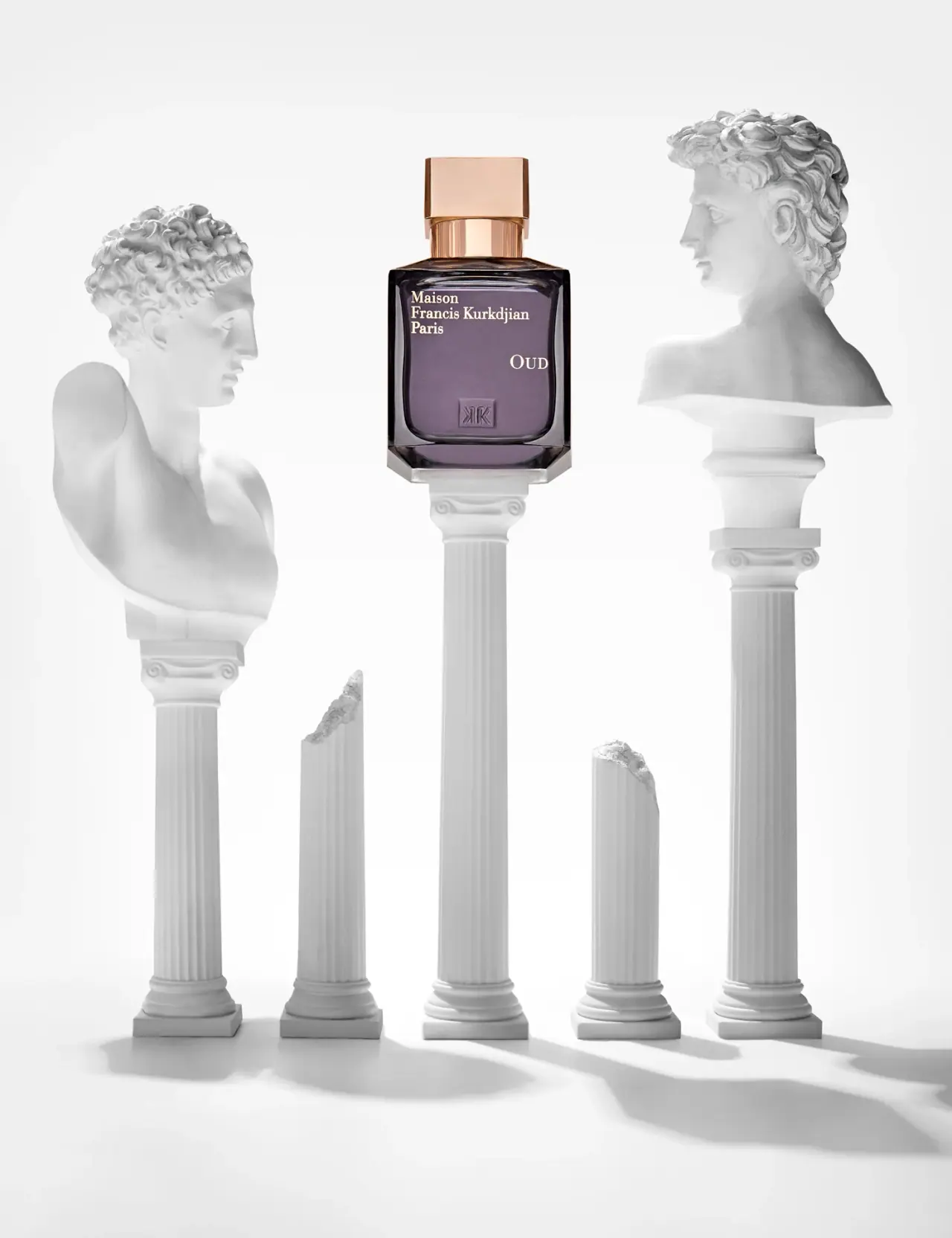
Maison Francis Kurkdjian
offset ivory serif names on plum flacon beneath warm cap