
Photography: Josh Caudwell — fragrance still-life photography. Images belong to their respective owners.
Alexander McQueen

An oval flacon crowned with dense black relief
The archived McQueen Eau de Parfum bottle combines a broad transparent oval body with a densely textured black cap. Two black identity panels, one around the neck and one on the front, share gold-coloured borders and serif lettering. Their crisp rectangles sit against smooth curved shoulders, while the cap supplies the strongest surface detail. Josh Caudwell's 2017 Alien Landscape photograph surrounds the object with a purple imagined terrain, but that photographic world should not be confused with a purple printed packaging system. This study concerns the pictured Eau de Parfum edition, not a differently decorated Parfum bottle.
- Perfume
- Dark pack
- Luxe monochrome
- Heritage label
About this study
Archived Eau de Parfum bottle in Josh Caudwell's June 2017 Alien Landscape image. Not a study of the more elaborate Parfum edition or of current availability.
Sources & evidence · Reviewed 2026-10-19Color Palette
Approximate colours interpreted from photography. These are screen references, not official brand colours or print specifications.
Pack body
Cap black
#111219
Approximate dark cap appearance. Small cool highlights articulate the repeated relief without turning it into a separate blue decorative colour.
Scene-tinted transparency
#B294AA
Illustrative pink-lilac appearance through the bottle in this photograph. It is not a verified liquid specification, glass tint or reusable brand colour.
Label
Plaque black
#101013
Approximate ground of both the collar and front panel. It makes their lettering and narrow frames read as a linked information system.
Ink
Warm gold appearance
#D6AD68
Approximate frame and lettering colour. Its reflective appearance does not establish foil, precious metal or a specific coating process.
Typography
Suggested visual alternatives, not confirmed brand typefaces. Any scale below is an illustrative estimate.
The McQueen identity repeats on the collar and the larger body plaque. Its serif capitals, distinctive Q and compact word length make the repetition coherent despite the different panel sizes. The front adds EAU DE PARFUM below in smaller, simpler uppercase letters. The hierarchy therefore moves from a repeated identity to concentration information rather than from a corporate brand to a separate scent name. The thin gold-coloured frame gives both panels a clear edge against the transparent body.
Fonts
Original display alternative
Cormorant Garamond
- Looks like
- Formal high-contrast serif capitals
- Type
- Display serif
- Weight
- Medium, Semibold
- Case
- Uppercase for a new short identity
- Tracking
- Moderately open, tested within the frame
- Fallback
- Georgia, serif
A starting point for an original fragrance name with elegant contrast. Develop a distinct word shape instead of imitating the photographed Q or its exact spacing.
Concentration-copy alternative
Source Sans 3
- Looks like
- Simple compact uppercase sans serif
- Type
- Sans serif
- Weight
- Regular, Medium
- Case
- Uppercase for short functional information
- Tracking
- Gently open
- Fallback
- Arial, sans-serif
Support the display identity with a small but readable product-type line. The reference's contrast of formal name and plain descriptor matters more than matching a specific font.
Structure & Proportions
Visual proportions and finish previews are illustrative. Confirmed construction details and uncertainties are distinguished in the study notes.
Proportions
| Purpose | Value | Preview |
|---|---|---|
| Primary volume | The rounded body dominates the overall width. Its curved shoulders narrow sharply into a much smaller collar, making the top assembly read as a crown. | — |
| Cap emphasis | The cap is taller than the visible collar and visually dense despite its smaller width. Texture increases its presence without requiring a large graphic mark. | — |
| Plaque placement | The small front panel sits below the widest shoulder region, leaving a generous transparent area above. A dark thick-looking base anchors the lower silhouette. | — |
Shapes
| Element | Value | Preview |
|---|---|---|
| Body | Broad oval outline with curved shoulders and a rounded lower edge, flattened enough to carry a front-facing panel. | |
| Cap silhouette | Rounded dome-like form tapering toward a gently flattened top, covered in many small repeated raised elements. | |
| Front plaque | Horizontal rectangle with a narrow contrasting frame, centred on the lower-middle body. | |
| Collar panel | Short dark cylindrical band, bounded above and below by fine warm-coloured lines. |
Finishes
Optical body
The transparent vessel reflects and transmits the photographed landscape; actual liquid colour is not calibrated · transparent
Raised cap surface
Repeated dark relief across the cap; preview describes topography, not a verified embossing process · emboss
Metallic-looking edging
Warm frames and identity lettering; foil or metal composition is not confirmed · metallic
Formats and materials
| Formats | Rounded oval fragrance flacon with a substantial visible base, Short cylindrical collar and rounded textured cap |
| Materials | A transparent rigid vessel is visible; exact glass composition, thickness and colouring were not established from a primary construction source for this edition., The cap has a dark raised exterior, but its material and manufacture remain unverified., Front plaque and collar have black grounds and gold-coloured details; their substrates and attachment methods are not documented here. |
| Closures | The closed cap has a rounded taper above the collar and a dense pattern of repeated raised forms. It hides the atomiser and attachment mechanism. The image does not establish whether the closure is magnetic, friction-fit or otherwise retained, nor whether the bottle can be refilled. The visible collar is a separate visual band, not evidence of an exposed screw thread. |
| Decoration | A repeated serif identity on collar and front, A narrow gold-coloured frame surrounding the front panel, Dense small elongated rounded relief elements across the cap; no feather wreath is present on this selected bottle |
Front Panel
Schematic reading order. The diagram’s zone heights do not represent measured artwork proportions.
Two separate identity locations align along the bottle's vertical axis. The collar presents the name inside a narrow black band; the front repeats the name in a broader framed rectangle and adds the concentration below. Neither panel fills the whole transparent surface. Their shared border treatment connects the cap assembly to the lower body, while the visible liquid and curved walls remain part of the composition.
| Zone | Content |
|---|---|
| Neck band | McQueen identity centred across a black collar with warm-coloured upper and lower edging. |
| Front display line | Repeated McQueen identity in serif capitals, larger than the concentration line below. |
| Front descriptor | EAU DE PARFUM in smaller uppercase lettering; it identifies the selected edition explicitly. |
| Frame margin | A narrow black inset between the lettering and the gold-coloured outer rectangle preserves a clear interior reading area. |
Range System
Kering's 2016 report excerpt names McQueen Parfum and Eau de Parfum as distinct launches. The selected image visibly identifies the latter. This limited evidence supports an edition boundary rather than a full range map. Construction or decoration described elsewhere for a more elaborate Parfum bottle cannot be transferred to this clear flacon without an exact match.
- Observed: the selected Eau de Parfum carries a black textured cap and two black-and-gold identity locations.
- Edition distinction: no gold feather ornament appears around this bottle's neck in the approved cover.
- Original-design interpretation: maintain a consistent frame and name treatment across sizes while allowing the concentration line to identify each product clearly.
Back of Pack & Shelf
The bottle is photographed from the front with its cap in place. No reverse label, underside marking, spray mechanism or retail carton is visible. A dark base and reflected landscape do not reveal hidden regulatory text or a material code.
- Obtain separate rear and base views before describing actual information placement.
- Keep the concentration label distinct from volume, ingredient and other product information that may appear elsewhere.
- Do not add a feather-pattern carton to the study without reviewing that exact edition's packaging.
On shelf
Interpretation: the cap can provide recognition before the small front lettering is readable. Its dense relief contrasts with the generous smooth body, avoiding competition between two equally detailed surfaces. Repeated dark panels then give the eye a route down the bottle. In a neutral retail environment the transparent body would reflect different surroundings, so this photographic colour balance should not be treated as an invariant shelf appearance.
Imagery
Caudwell's primary project entry dates this composition to June 2017 and describes a landscape created to accompany the fragrance. The bottle stands in cracked purple ground below a star-filled sky. Broad reflections make parts of the imagined environment appear inside the clear body, linking product and scene. Those purple areas dominate a colour extraction but are not proof of purple package printing. The dark textured cap remains legible against the lighter horizon, while the gold-coloured frame provides a small warm focus within the cool image.
Guidelines
Editorial principles for an original design brief, not official brand guidelines.
Do
- Concentrate detailed relief in one small structural component.
- Repeat a frame treatment to connect separated information areas.
- Keep the concentration readable so archive editions remain distinguishable.
- Evaluate transparent packaging under neutral light as well as an atmospheric scene.
- Document the precise photographed edition before applying construction facts.
Don't
- Do not treat the purple landscape as a printed label palette.
- Do not assign the separate Parfum's feather ornament to this bottle.
- Do not equate metallic appearance with verified foil or precious metal.
- Do not infer cap retention or refillability from a closed front view.
Sources & evidence
- Kering 2016 Reference Document — indexed page 36 excerptbrand
- Alien Landscape — Josh Caudwell, June 23, 2017photographer
How this study was built
edition · Sourced fact
The report excerpt names both Parfum and Eau de Parfum in the 2016 launch; the image itself identifies the selected concentration.Kering 2016 Reference Document — indexed page 36 excerpt · Alien Landscape — Josh Caudwell, June 23, 2017imagery · Sourced fact
Caudwell's dated project entry identifies the exact image and his created landscape setting.Alien Landscape — Josh Caudwell, June 23, 2017structure · Visual observation
The smooth oval transparent body contrasts with a densely raised black cap, without a visible feather wreath.Alien Landscape — Josh Caudwell, June 23, 2017label · Visual observation
Both collar and body repeat the McQueen identity; the front adds the concentration line.Alien Landscape — Josh Caudwell, June 23, 2017palette · Visual observation
Black grounds and warm frames are graphic pack colours, while much of the purple appearance comes from the photographed setting.Alien Landscape — Josh Caudwell, June 23, 2017range · Editorial interpretation
The observed framing principle may support a family, but this single edition does not establish the full range's construction or artwork rules.Kering 2016 Reference Document — indexed page 36 excerpt · Alien Landscape — Josh Caudwell, June 23, 2017
What remains unverified
- Full Kering PDF exceeded the browser size limit; only its indexed launch excerpt is used.
- No primary construction specification for this precise bottle was verified.
- Reflections and the composited-looking landscape prevent reliable liquid or glass colour identification.
- Rear, base markings, atomiser and carton are unseen; actual fonts and calibrated dimensions remain unknown.
Give your AI
packaging taste
Give your design or image tool a packaging study: palette, type, structure, front panel and principles for an original brief.
Export this styleFree with an email. PACK.md works in Claude, ChatGPT, Cursor and image tools.
More like this

Aerangis
a quiet numbered object, an intimate scent memory

Arquiste
blush transparency, white lettering and a stepped gold cap

Chabaud
A framed perfume label beneath a clear architectural cap
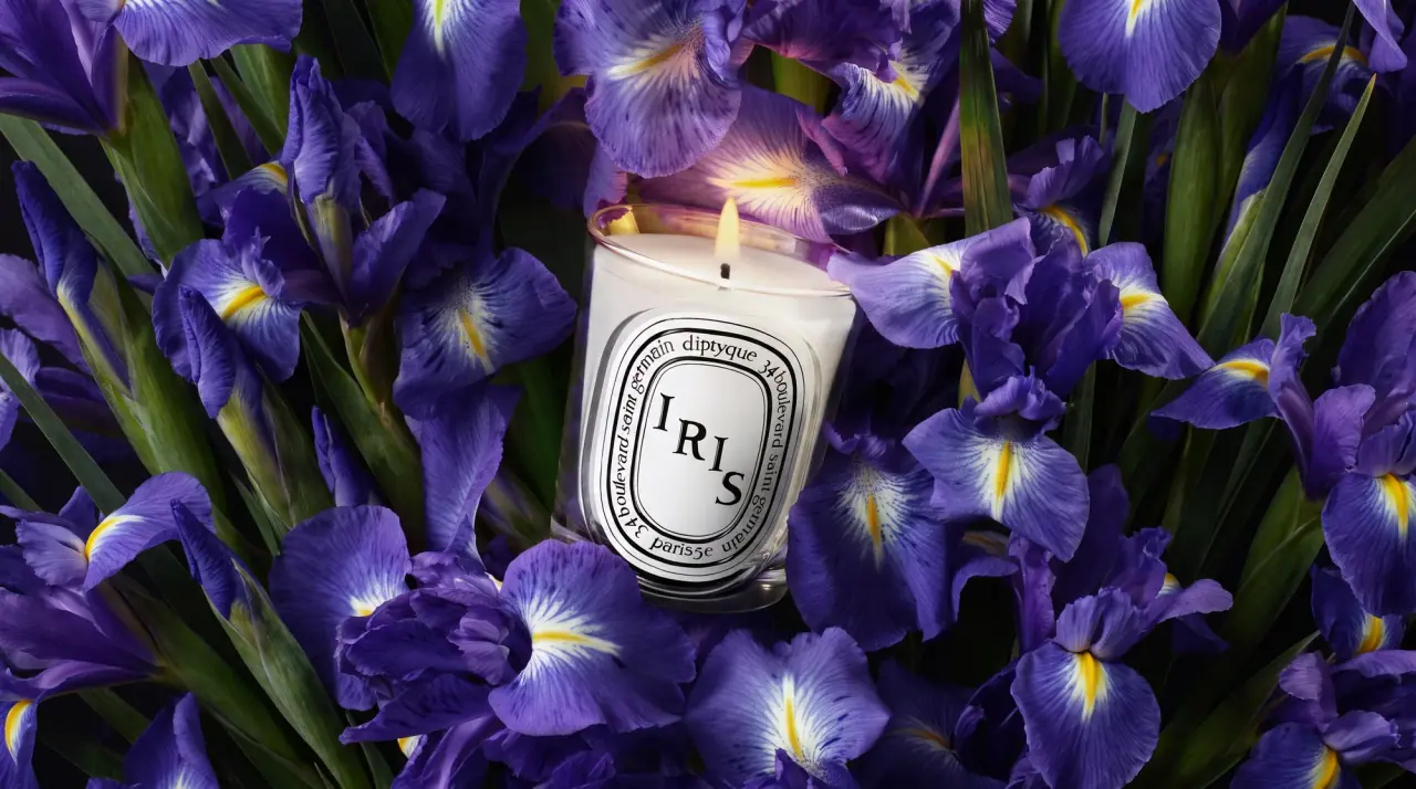
Diptyque
engraved oval labels on clear glass
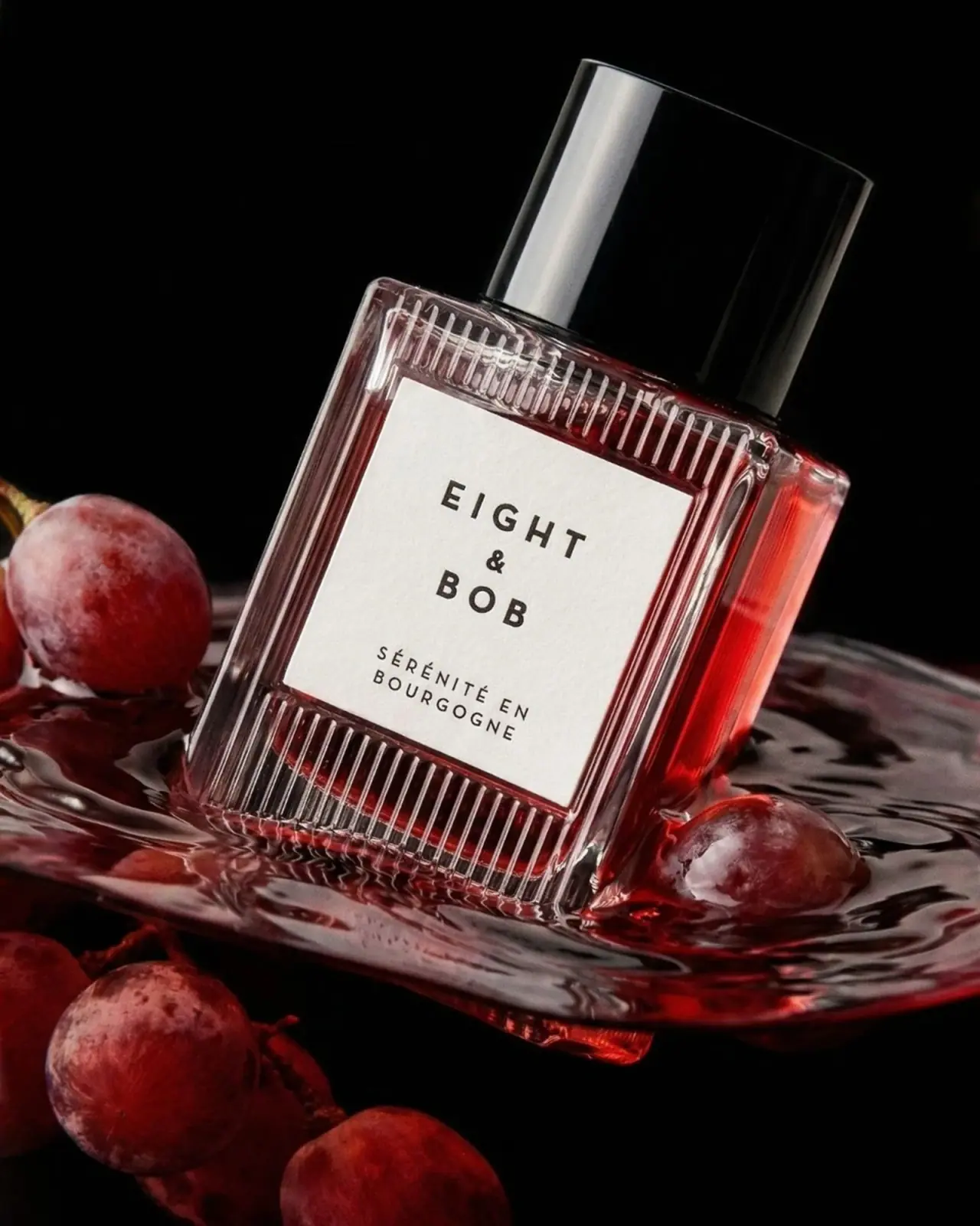
Eight & Bob
Ribbed red flacon, pale label and polished black cap
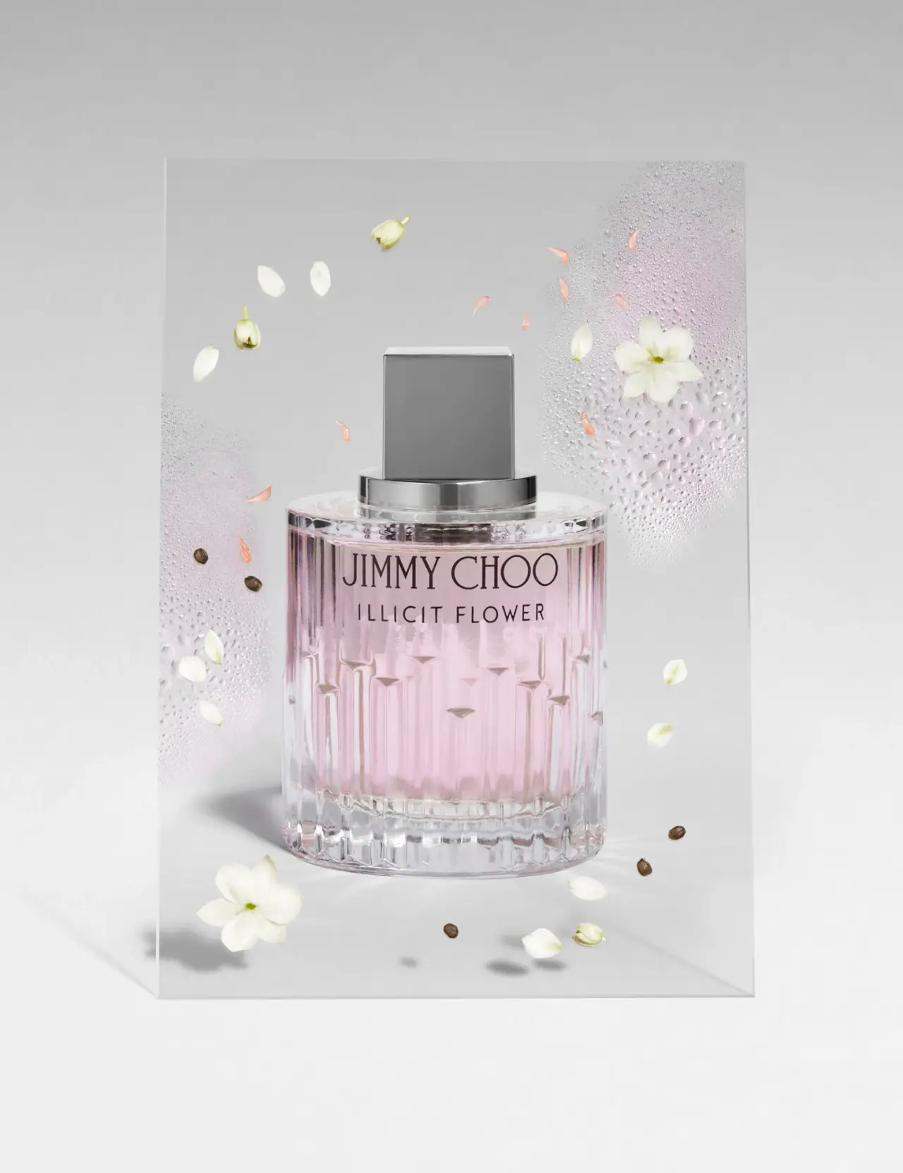
Jimmy Choo
Blush transparency, staggered flutes and a silver square cap
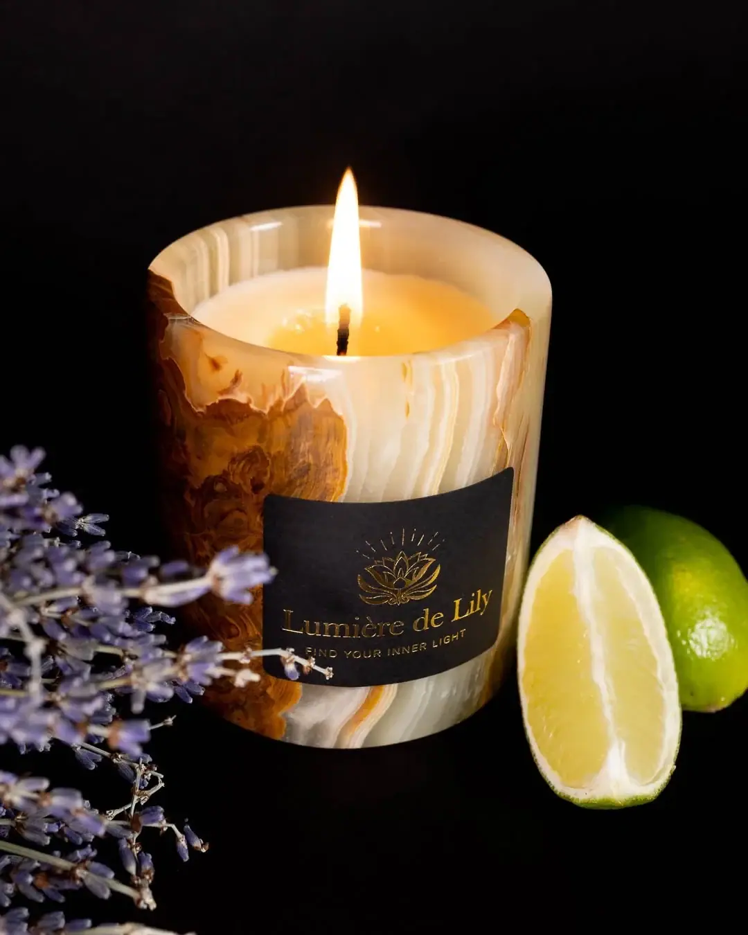
Lumière de Lily
Banded onyx framed by a black label and golden emblem
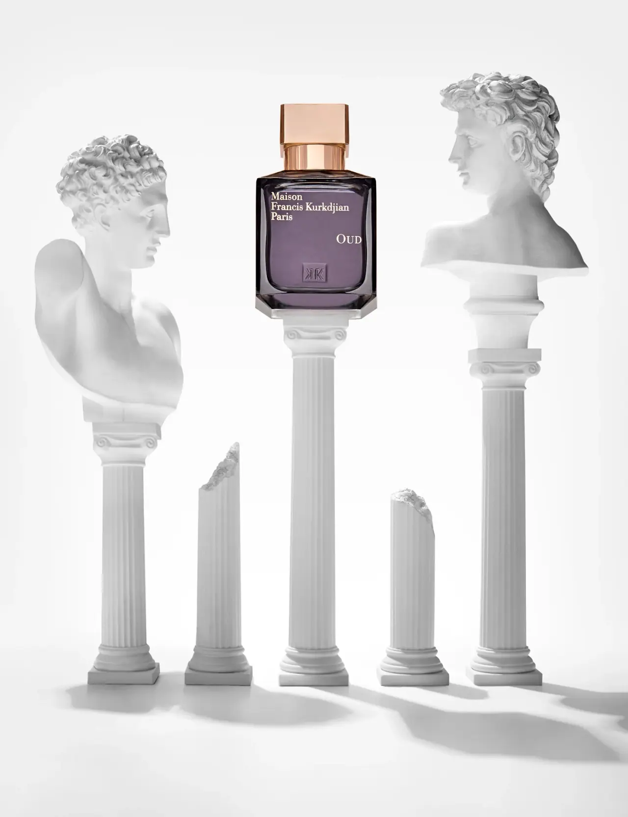
Maison Francis Kurkdjian
offset ivory serif names on plum flacon beneath warm cap