
Photography: Arquiste official photography. Images belong to their respective owners.
Arquiste
blush transparency, white lettering and a stepped gold cap
Venice Rococo combines a broad rounded flacon with two contrasting white typographic voices. The flowing fragrance name sits above the larger stencil-like ARQUISTE capitals, while a reflective stepped cap gives the otherwise soft silhouette a crisp architectural top. Pink appearance and curved transparent edges supply colour and depth without a printed illustration. The selected photograph extends the historical mood through pale architectural fragments, leaving the bottle itself comparatively spare. This study concerns the shown Venice Rococo presentation, with material details explicitly sourced from its official listing.
- Perfume
- Light pack
- Luxe monochrome
- Heritage label
About this study
Venice Rococo flacon in the approved official architectural photograph. Material facts come from the exact product listing; colours and proportions remain visual observations.
Sources & evidence · Reviewed 2026-10-19Color Palette
Approximate colours interpreted from photography. These are screen references, not official brand colours or print specifications.
Pack body
Blush transparent appearance
#D6A9A0
Approximate warm pink appearance through the selected flacon. The source does not establish whether the hue belongs to the contents, glass or another treatment, and reflections influence it.
Ink
White front lettering
#F4EEE4
Approximate script title and stencil-like house identity. The printing or transfer process is unverified; pale blue background is not a pack colour.
Accent
Warm metallic cap
#B18B5D
Approximate midtone of the gold-coloured cap. Metal is brand-confirmed; alloy, plating and exact colour specification are not.
Typography
Suggested visual alternatives, not confirmed brand typefaces. Any scale below is an illustrative estimate.
Venice Rococo appears as a flowing, inclined title above a larger uppercase ARQUISTE line. The house lettering has conspicuous breaks and high stroke contrast, giving it a stencil-like character rather than a plain classical serif. The title is more fluid and decorative; the house name is broader and structurally firmer. Both are white, so differentiation comes from form and scale rather than multiple ink colours. The front contains very little other visible copy.
Fonts
Fragrance-title alternative
Parisienne
- Looks like
- Parisienne for a flowing script title
- Type
- Formal handwritten script
- Weight
- Regular
- Case
- Title case
- Tracking
- Natural connected spacing
- Fallback
- cursive
Explore an original fragrance name with flowing capitals and restrained flourishes. Keep counters open at print size and avoid tracing the Venice Rococo letterforms.
House-identity alternative
Stardos Stencil
- Looks like
- Stardos Stencil as a contrasting stencil-serif direction
- Type
- Stencil display serif
- Weight
- Regular
- Case
- Uppercase
- Tracking
- Moderately open
- Fallback
- Georgia, serif
Use only as a broad stylistic alternative for an independent identity; its heavier structure differs from the reference. Develop original stencil cuts and spacing rather than copying the distinctive ARQUISTE lettering.
Structure & Proportions
Visual proportions and finish previews are illustrative. Confirmed construction details and uncertainties are distinguished in the study notes.
Proportions
| Purpose | Value | Preview |
|---|---|---|
| Front area | The bottle is broad relative to its visible body height, giving the two-line identity generous space without needing a large label panel. | — |
| Curved perimeter | Rounded shoulders and lower corners frame a comparatively calm central face. Thick-looking edge reflections should not be converted into a measured wall thickness. | — |
| Stepped closure | The cap’s upper section projects beyond the lower cylinder, producing a clear horizontal ledge and an architectural top. | — |
| Graphic restraint | The two white lines occupy a modest central zone, leaving the curved edges and pink appearance visible around them. No numerical ratios are measured. | — |
Shapes
| Element | Value | Preview |
|---|---|---|
| Flacon | Broad rounded body with curved shoulders and a flat base; the brand describes its bottle as round. | |
| Cap | Two stacked cylindrical widths, wider above and narrower below. | |
| House lettering | High-contrast uppercase forms with visible stencil-like breaks. |
Finishes
Transparent glass appearance
Rounded bottle perimeter and body; glass is confirmed, pink colour source is not. · transparent
Reflective metal cap
Stepped closure; metal is source-backed, alloy and plating are unverified. · metallic
White graphic appearance
Two front text lines; no embossing or foil treatment inferred. · matte
Formats and materials
| Formats | Selected broad rounded fragrance flacon with a flat standing base and stepped cylindrical cap. |
| Materials | The official listing specifies a glass bottle made in Parma, Italy, and an engraved metal cap. It does not identify the glass composition, cap alloy or colour-treatment method. |
| Closures | The cap presents two stacked widths: a broad upper cylinder and narrower lower section. The brand specifies a fine-mist pump beneath it. The selected photograph is closed, so the engraving and dispenser are source-backed details rather than directly inspected features; attachment and internal liner remain unknown. |
| Decoration | Flowing fragrance title above a larger stencil-like house identity., No visible printed illustration on the front., Cap geometry and optical reflections provide much of the object’s ornament. |
Front Panel
Schematic reading order. The diagram’s zone heights do not represent measured artwork proportions.
The front reads as white lettering directly against the transparent-looking pink field, without an obvious contrasting label rectangle. A centred script fragrance title sits above the larger house identity. The space around this small group lets reflections and curved glass remain visible. Unseen product and regulatory details are not assumed to share this face.
| Zone | Content |
|---|---|
| Fragrance title | Venice Rococo in flowing white lettering, giving the specific scent its own decorative voice. |
| House identity | Larger ARQUISTE capitals beneath, with stencil-like interruptions and a more structured silhouette. |
| Clear surrounding area | The broad unprinted-looking body reveals light, colour and curved-edge reflections around the text. |
| Closure accent | The stepped reflective cap completes the composition above the lettering without a visible front emblem in this view. |
Range System
The official page describes a signature Arquiste bottle design, supporting the idea that the vessel is an established house element. This study does not compare every fragrance or size, so fixed colour, title style and cap-finish rules are not asserted. The useful interpretation is to distinguish a stable house identity from a more expressive individual scent name.
- Venice Rococo: flowing title above a structured stencil-like house name.
- Official house context: the product page identifies the round vessel as a signature design.
- Interpretation: a new fragrance family could retain its own vessel and house-name treatment while allowing titles to vary, provided legibility and long-name fit are tested.
Back of Pack & Shelf
Neither the reverse nor the underside is visible. Volume, ingredients, batch coding and other required product information cannot be located from this front image. The cap is closed, so its top engraving is also not visually analysed here.
- Inspect reverse, base and cap-top views before creating a complete technical record.
- For an original perfume, reserve a practical information area without forcing it into the decorative front.
- Do not infer refillability, magnetic attachment or a cap mechanism from the stepped silhouette.
On shelf
Interpretation: the stepped metal cap and broad rounded flacon could remain distinctive even when white front text becomes less readable against reflections. White on a transparent-looking field is sensitive to background, so a new design using this principle needs tests on light and dark shelves. The image demonstrates an elegant lighting arrangement rather than proving universal legibility or ergonomic comfort.
Imagery
Pale architectural fragments and a cool pastel background surround the bottle, which stands on a reflective surface. The mirror repeats the rounded form and pink appearance below, increasing its visual presence. The official fragrance narrative references eighteenth-century Venice and pastel interiors, so the setting has a documented thematic connection. The props are not part of the packaging, and the pale blue backdrop should not dominate the extracted pack palette. The photograph uses context to express historical richness while keeping the actual front sparse.
Guidelines
Editorial principles for an original design brief, not official brand guidelines.
Do
- Separate house identity from fragrance personality through contrasting letterforms.
- Let structural details and transparent edges supply ornament when the front is sparse.
- Verify materials from primary specifications rather than reflections alone.
- Test white lettering against several backgrounds and lighting conditions.
Don't
- Do not identify the blush hue as tinted glass without evidence.
- Do not call the cap solid gold or assign a plating process.
- Do not copy Arquiste stencil cuts or the Venice Rococo script.
- Do not treat architectural props as included packaging elements.
Sources & evidence
How this study was built
structure · Sourced fact
Official listing specifies glass vessel, metal cap and fine-mist pump; mechanism and alloy remain unknown.Arquiste — Venice Rococo Eau de Parfum, official product and packaging descriptionedition · Sourced fact
Exact product page ties Venice Rococo to a historical Venetian interior narrative.Arquiste — Venice Rococo Eau de Parfum, official product and packaging descriptiontypography · Visual observation
White flowing title sits above larger stencil-like house capitals; fonts are not identified.Arquiste — Venice Rococo Eau de Parfum, official product and packaging descriptionlabel · Visual observation
Two front text lines sit without a visible contrasting paper-label field.Arquiste — Venice Rococo Eau de Parfum, official product and packaging descriptionpalette · Visual observation
Blush optical appearance, warm cap and white text form approximate pack colours; blue scenery is excluded.Arquiste — Venice Rococo Eau de Parfum, official product and packaging descriptionrange · Sourced fact
The brand calls its round vessel a signature design, without proving identical treatment across all products.Arquiste — Venice Rococo Eau de Parfum, official product and packaging descriptionimagery · Editorial interpretation
Reflection and architectural props extend the mood while leaving the physical front restrained.
What remains unverified
- Cap alloy, plating, glass colour treatment and decoration process are unverified.
- Original fonts, physical dimensions and wall thickness are not established.
- Reverse, underside, cap engraving and exposed pump were not visually inspected.
- Pink appearance may involve contents, glass and lighting; no single cause is assigned.
Give your AI
packaging taste
Give your design or image tool a packaging study: palette, type, structure, front panel and principles for an original brief.
Export this styleFree with an email. PACK.md works in Claude, ChatGPT, Cursor and image tools.
More like this

Aerangis
a quiet numbered object, an intimate scent memory

Alexander McQueen
An oval flacon crowned with dense black relief

Chabaud
A framed perfume label beneath a clear architectural cap
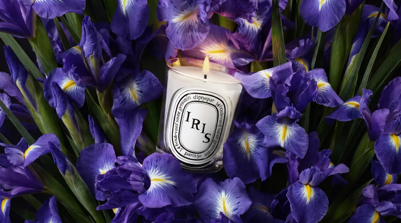
Diptyque
engraved oval labels on clear glass
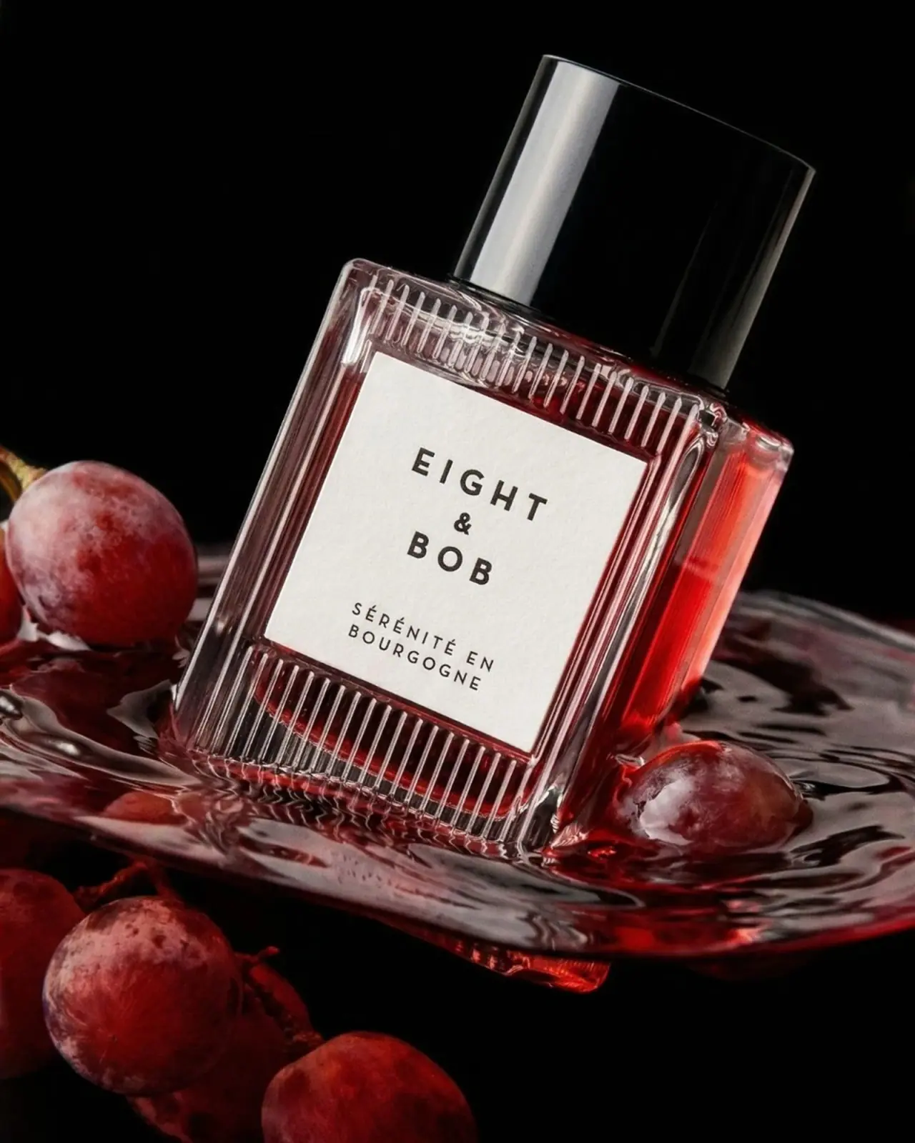
Eight & Bob
Ribbed red flacon, pale label and polished black cap
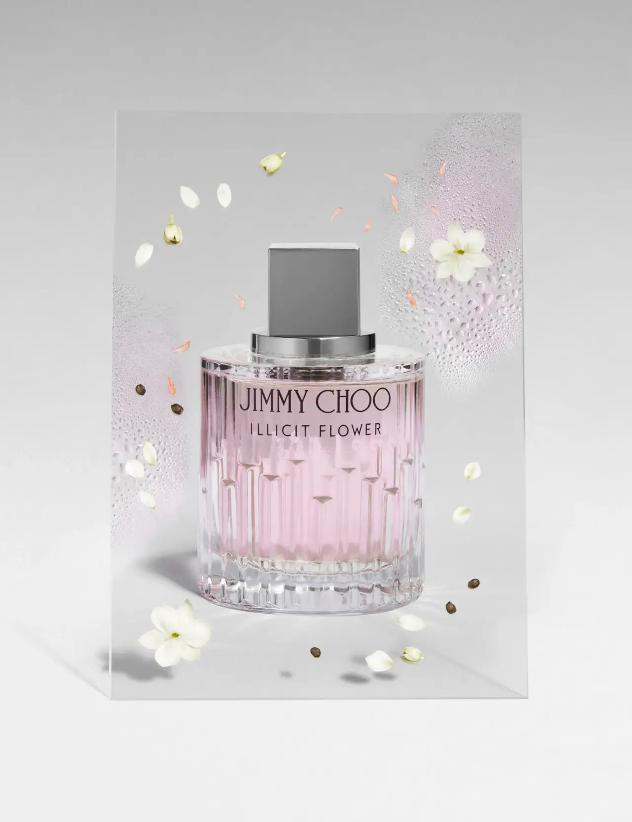
Jimmy Choo
Blush transparency, staggered flutes and a silver square cap
Lumière de Lily
Banded onyx framed by a black label and golden emblem
Maison Francis Kurkdjian
offset ivory serif names on plum flacon beneath warm cap