
Photography: Cut By Fred official photography. Images belong to their respective owners.
Cut By Fred

Orange gel, cropped geometry and bold bilingual utility
Vegan Curl Gel combines a transparent rounded bottle with a graphic white wrap label and a black pump. Orange appears twice on the pack: through the clear vessel as the visible gel, and as an opaque cropped disc printed at the label's right. A large rotated CUT BY FRED wordmark anchors the opposite edge. Between those poles, a compact product title and bilingual description stay straightforward. The photograph amplifies the color through sliced oranges and glossy gel-like pools, but those props should not be mistaken for printed illustration.
- Hair
- Light pack
- Bold typographic
- Playful colour
About this study
Selected Vegan Curl Gel clear pump bottle with orange disc label. Current official 290 mL context; no complete range history inferred from the image filename.
Sources & evidence · Reviewed 2026-10-19Color Palette
Approximate colours interpreted from photography. These are screen references, not official brand colours or print specifications.
Pack body
Visible orange gel
#EF8A0B
Approximate warm translucent color seen through the bottle; it shifts with depth, reflections and the orange surroundings rather than behaving like flat opaque ink.
Label
Warm white label
#F0EBE6
Quiet rectangular reading field around the title, vertical maker name and small ingredient marker.
Ink
Near-black text and pump
#22201F
Strong text contrast and a dark closure silhouette above the exposed clear shoulders.
Accent
Printed orange disc
#F05B05
More opaque orange shape entering from the label's right, echoed by the small aloe-vera badge.
Typography
Suggested visual alternatives, not confirmed brand typefaces. Any scale below is an illustrative estimate.
The rotated maker name is the tallest and heaviest typographic element. VEGAN CURL GEL forms two compact horizontal lines to its right, followed by smaller French and English descriptions. A small orange ingredient badge and a mixed-case line create a separate lower module. Weight, orientation and line breaks do most of the work; the photograph does not show a need for a second decorative type genre. The product title sits within the usable area to the right of the maker strip, rather than being centered across the entire wrap.
Fonts
Large maker and product headings
Archivo
- Looks like
- Heavy compact sans capitals
- Type
- Grotesque sans-serif
- Weight
- Bold, ExtraBold
- Case
- Uppercase
- Tracking
- Compact optical spacing
- Fallback
- Arial, sans-serif
Use a heavy weight for an original vertical maker name and a slightly smaller product heading. Compare the line lengths against the chosen bottle curve instead of copying the source's exact breaks.
Bilingual descriptors and detail
Roboto Condensed
- Looks like
- Plain narrow utility sans
- Type
- Condensed sans-serif
- Weight
- Regular, Bold
- Case
- Sentence case for descriptors; uppercase badge
- Tracking
- Natural spacing
- Fallback
- Arial, sans-serif
A practical alternative for the paired language lines and small ingredient module. Its compact width can help preserve a clear gap from the colored disc without reducing text to unreadable sizes.
Structure & Proportions
Visual proportions and finish previews are illustrative. Confirmed construction details and uncertainties are distinguished in the study notes.
Proportions
| Purpose | Value | Preview |
|---|---|---|
| Clear windows | The wrap occupies the middle-to-lower body while leaving a broad shoulder window and a smaller transparent band above the base. These are visual relationships, not measured label dimensions. | — |
| Graphic opposition | The vertical maker strip occupies a narrow left zone; the orange disc consumes much of the upper-right zone, leaving a white pocket for information between them. | — |
| Pump silhouette | A relatively wide collar joins a narrower rising stem and long horizontal actuator, giving three clear steps in the upper outline. | — |
| Copy density | The lower ingredient module is much smaller than the product title and separated by white space, avoiding a single uninterrupted column of equally weighted text. | — |
Shapes
| Element | Value | Preview |
|---|---|---|
| Bottle | Round-shouldered cylindrical vessel with a visibly rounded lower edge. | |
| Color field | Large circle cropped by the upper and right bounds of the wrap, retaining a strong curved inner edge. | |
| Ingredient badge | Small horizontal orange rectangle below the descriptor. | |
| Dispensing top | Long black actuator above a ribbed screw-collar appearance; mechanism unverified. |
Finishes
Transparent vessel
Exposed shoulders and base reveal gel color and small bubbles; glass confirmed by brand. · transparent
Quiet label field
White wrap appears comparatively low-glare in this scene; no matte coating specification verified. · matte
Reflective black top
Small highlights catch the actuator while the collar ribs produce fine shadow bands. · gloss
Formats and materials
| Formats | Rounded cylindrical pump bottle; official product page identifies the Vegan Curl Gel size as 290 mL |
| Materials | The brand specifies a glass bottle and plastic pump. The image shows the clear wall, visible contents and substantial-looking base, but does not establish glass weight or wall thickness., The white label's substrate, adhesive, laminate and exact printing process are not specified. Its opaque appearance should not be converted into a paper or waterproof-film claim. |
| Closures | A black pump rises above a broad vertically ribbed collar. The long actuator projects sideways and gives the top a distinct horizontal line against the rounded shoulders. Its internal mechanism, dose and locking system are not shown. The brand instructs users to separate bottle and pump after use and sort through appropriate local collection systems; that is not evidence of a refill mechanism. |
| Decoration | Large vertical maker wordmark on the label's left, Oversized cropped orange disc on the right, Bold two-line product name above bilingual supporting copy, Small orange ingredient badge with a separate plain-text line below |
Front Panel
Schematic reading order. The diagram’s zone heights do not represent measured artwork proportions.
The layout behaves as three interacting areas rather than a centered label: a vertical maker spine, a practical horizontal reading block and a cropped circle entering from the right. The product wording sits near the circle's inner boundary, with a little text extending over orange in the selected perspective. The ingredient badge repeats the orange at a much smaller scale. This echo makes the large decorative field and the small information module feel related without requiring a border around the complete label.
| Zone | Content |
|---|---|
| Maker spine | CUT BY FRED reads upward along the left side in large black capitals. Its visual weight remains distinct from the smaller product block. |
| Product name | VEGAN on the first line and CURL GEL below form a short, bold block in the central-right reading area. |
| Bilingual description | French wording precedes the English descriptor in smaller mixed-case type, retaining the same reading direction and left alignment. |
| Ingredient marker | ALOE VERA appears inside a small orange rectangle, with a plain mixed-case line underneath. The orange styling does not turn this into a citrus ingredient badge. |
| Curved accent | The large orange disc extends beyond the visible right boundary; its curve is a graphic interruption rather than an illustration of a fruit slice. |
Range System
This study covers one curl-gel pack. The product page places it alongside a curl cream, but the neighboring packaging has not been visually studied here. A family could preserve the maker spine and functional text module while varying an accent, yet that is a proposed design principle, not proof of a complete CUT BY FRED coding system.
- For an original family, keep the product type explicit even when two formulas share a color.
- A changed content color can alter the whole pack impression through clear glass; evaluate it alongside the printed accent rather than in isolation.
- If a refill or different size is introduced, adapt the label's useful reading area to the new form instead of stretching the original composition mechanically.
Back of Pack & Shelf
The label wraps around the bottle, but its reverse and seam are outside this view. Online ingredient and sorting information cannot establish their exact location or typography on the physical rear.
- Obtain a rear view before documenting full instructions and ingredient layout.
- Confirm the wrap seam and adhesive system before specifying production artwork.
- Keep separation guidance component-specific and appropriate to the intended market.
On shelf
Interpretively, the white rectangular label provides a stable reading surface against the variable transparency of the contents. The black maker spine can remain recognizable at small sizes while the product block supplies function on closer inspection. In an upright retail row the bottle loses the dramatic diagonal of the campaign image, so the pump silhouette and opposing text/circle arrangement matter more than the surrounding fruit. Thumbnail tests should include a plain background to judge that independent performance.
Imagery
The bottle lies diagonally among sliced oranges and glossy orange gel-like pools on a pale textured surface. Wet highlights, bubbles and clear glass create tactile detail around an otherwise flat printed label. Citrus notes are described by the official page, but the photograph is not an ingredient audit. Its orange dominance is partly a staging decision: a neutral shelf shot would remove the surrounding fruit and pools while retaining the orange gel and label disc. Keep that distinction when choosing reference colors.
Guidelines
Editorial principles for an original design brief, not official brand guidelines.
Do
- Separate photographed contents from printed colors.
- Use one directional maker anchor and a clear product-reading direction.
- Preserve the bilingual hierarchy with intentional line lengths.
- Repeat a large accent in a small meaningful information module.
- Test the pack outside its highly colored campaign scene.
Don't
- Do not equate orange props with the complete ingredient list.
- Do not describe the product block as centered over the full wrap.
- Do not claim waterproof paper or a verified matte laminate.
- Do not infer a refill system from the pump.
- Do not copy the maker lettering and cropped-disc arrangement exactly.
Sources & evidence
- CUT BY FRED — Vegan Curl Gelproduct
How this study was built
edition · Sourced fact
Official page identifies Vegan Curl Gel in 290 mL and citrus fragrance context.CUT BY FRED — Vegan Curl Gelstructure · Sourced fact
Brand specifies glass bottle and plastic pump with separation guidance.CUT BY FRED — Vegan Curl Geltypography · Visual observation
Vertical heavy maker name contrasts with a compact horizontal two-line title and bilingual descriptions.CUT BY FRED — Vegan Curl Gellabel · Visual observation
Cropped orange disc occupies the right; a small aloe-vera badge repeats its accent below the title.CUT BY FRED — Vegan Curl Gelpalette · Visual observation
Translucent orange contents and opaque printed orange are distinct color surfaces.CUT BY FRED — Vegan Curl Gelimagery · Visual observation
Fruit slices and glossy pools surround the diagonal bottle but are not printed motifs.CUT BY FRED — Vegan Curl Gelrange · Editorial interpretation
Retaining directional maker and product hierarchy while changing accents is proposed guidance, not a verified brand-wide rule.
What remains unverified
- Original fonts, dimensions, label substrate and print/coating processes unverified.
- Reverse, label seam, internal pump and dose not shown.
- Photographed oranges are styling, not a complete ingredient declaration.
- No universal range code or refill mechanism established.
Give your AI
packaging taste
Give your design or image tool a packaging study: palette, type, structure, front panel and principles for an original brief.
Export this styleFree with an email. PACK.md works in Claude, ChatGPT, Cursor and image tools.
More like this

ACURE
Iridescent spectacle with practical, tightly ordered type

Bask
sunny yellow with a playful turquoise signature

Beame
Orange bubble lettering, pink mascot, clear product badge

Bread Beauty Supply
bubblegum pumps and a fat black wordmark

Dune Suncare
Coral bottle with striped vertical identity and small left-aligned copy

e.l.f. Cosmetics
Pink tube, black cap, oversized thin lowercase signature
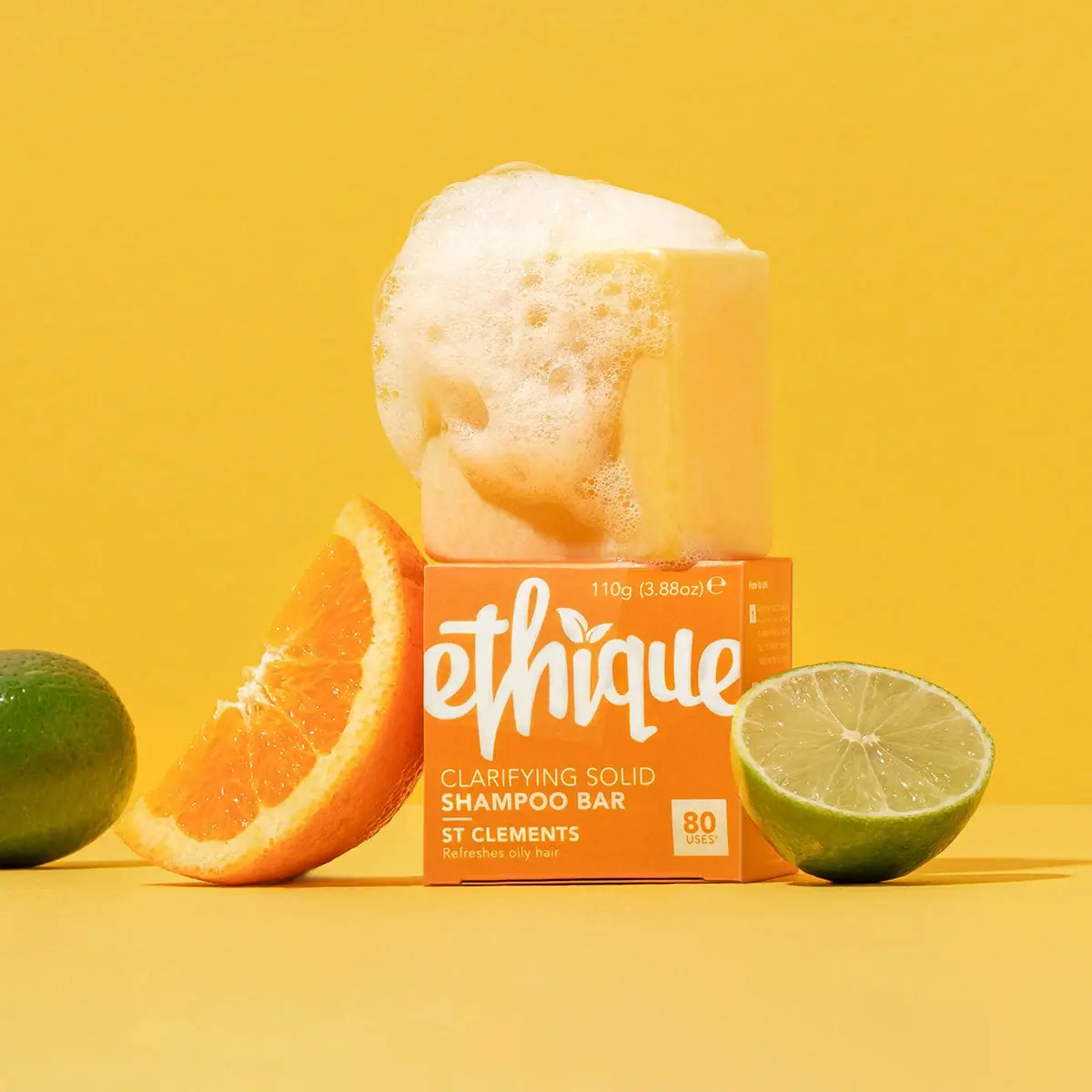
Ethique
Orange carton, oversized white script and a lathered square bar
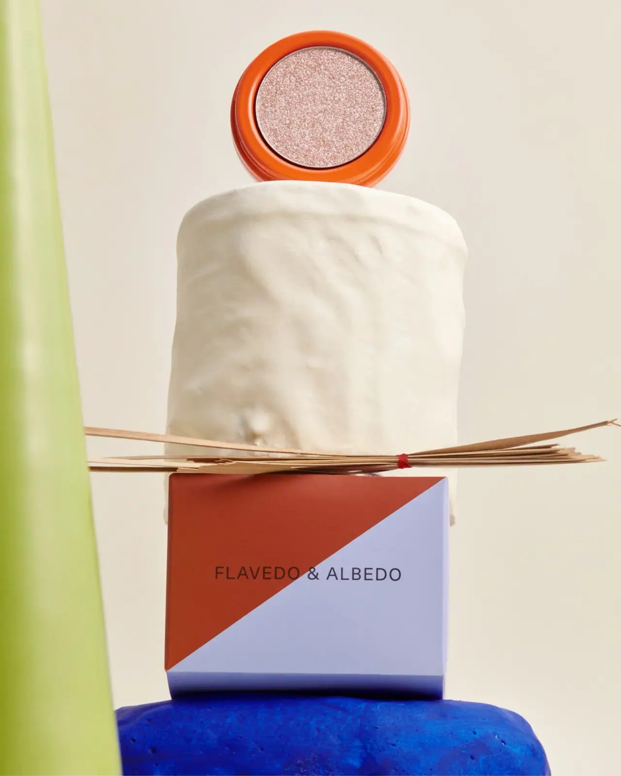
Flavedo & Albedo
An orange pan above a sharply divided two-colour carton