
Photography: Alana Tyler Slutsky / ATS Studio — product photography. Images belong to their respective owners.
e.l.f. Cosmetics

Pink tube, black cap, oversized thin lowercase signature
Glow Reviver Melting Lip Balm in Pink Lemonade pairs a narrow pink tube with a broad black cylindrical cap. A large thin e.l.f. mark gives the front its primary identity, while smaller heavier uppercase wording carries the product and shade. The lettering follows the long axis of the tube rather than forming a tall stack of short lines. ATS Studio's citrus-and-ice setting adds a playful flavor story around the simple object; the lemon, straw and condensation are not printed package graphics.
- Make-up
- Light pack
- Bold typographic
- Playful colour
About this study
Selected Pink Lemonade tube in ATS Studio's citrus-and-ice still life. Current general page defaults to another flavor; only product-family applicator context is used from it.
Sources & evidence · Reviewed 2026-10-19Color Palette
Approximate colours interpreted from photography. These are screen references, not official brand colours or print specifications.
Pack body
Pink tube
#ED8FA1
Approximate body color seen through the wet still-life setting. Refraction, highlights and surrounding pink alter its apparent saturation.
Black cap
#1B151B
Dark cylindrical closure creates a distinct visual endpoint against the lighter tube.
Ink
Dark lettering
#24151C
Large thin wordmark and small bold descriptors share a dark visual tone, separating hierarchy through size and weight rather than extra colors.
Typography
Suggested visual alternatives, not confirmed brand typefaces. Any scale below is an illustrative estimate.
The e.l.f. mark is far larger than the remaining text but uses thin open letterforms. GLOW REVIVER MELTING LIP BALM appears in a compact bold uppercase line, with PINK LEMONADE beneath it. Both smaller lines follow the tube's length, continuing the reading direction established by the logo. This allows a long product name to occupy a narrow object without excessive stacking. The thin-versus-bold contrast matters as much as the difference in size: the logo supplies openness while the detail supplies density.
Fonts
Independent display identity
Raleway
- Looks like
- Light open geometric sans-serif
- Type
- Geometric display sans-serif
- Weight
- Light, Regular
- Case
- Lowercase for a newly named identity
- Tracking
- Optically spaced
- Fallback
- Arial, sans-serif
An alternative for a short original maker name with generous counters. Avoid the source's exact letter sequence, punctuation pattern and oversized logo proportions.
Long product and shade lines
Inter
- Looks like
- Firm compact neutral sans-serif
- Type
- Neo-grotesque sans-serif
- Weight
- Medium, Bold
- Case
- Uppercase
- Tracking
- Natural to slightly open
- Fallback
- Arial, sans-serif
Proposed for a clear product descriptor and smaller shade line aligned along the tube length. Test the longest intended name on the usable face before fixing a range-wide layout.
Structure & Proportions
Visual proportions and finish previews are illustrative. Confirmed construction details and uncertainties are distinguished in the study notes.
Proportions
| Purpose | Value | Preview |
|---|---|---|
| Long reading direction | The product wording runs along the tube's length, using a longer text path than a conventional short crosswise label. | — |
| Identity contrast | The short wordmark has much larger letter height than the full product name, while its thinner strokes prevent it from becoming a solid dark block. | — |
| End differentiation | The cylindrical cap is visually rounded and dark; the opposite end is a broad flat pink crimp. Their difference makes the tube format immediately apparent. | — |
| Usable face | Copy remains inside the central flexible area and does not extend into the visibly ridged sealing region. No print-safe measurement is inferred. | — |
Shapes
| Element | Value | Preview |
|---|---|---|
| Tube body | Narrow elongated flexible-looking form transitioning toward a flattened end seam. | |
| Cap | Broad dark cylindrical closure with a smooth curved side. | |
| Crimp | Straight flat sealing band with repeated fine ridges. | |
| Information block | Two long aligned lines beside the larger short identity, using the length of the object. |
Finishes
Smooth tube appearance
Pink body; highlights are visible but the wet scene prevents a confident dry-finish specification. · gloss
Dark closure
Black cap under droplets and reflections; no soft-touch coating is established. · gloss
Formats and materials
| Formats | Closed narrow squeeze-tube lip balm with a broad black cylindrical cap and flattened ridged end seam |
| Materials | The flexible-looking pink tube, dark cap and crimp are visible, but their substrate, laminate structure and resin types are not specified by the consulted sources., Water-like droplets and the surrounding transparent scene make surface sheen ambiguous. Bright specks do not establish a metallic, pearlescent or glitter coating on the packaging. |
| Closures | The cap covers the dispensing end in the selected photograph. The current product-family page describes a soft, flexible angled applicator, but its default imagery is another flavor. This is line-level context only; the hidden Pink Lemonade tip's exact geometry, material and attachment are not independently visible here. |
| Decoration | Large thin lowercase brand mark, Two compact dark uppercase information lines, No lemon drawing, striped motif or separate front label border visible |
Front Panel
Schematic reading order. The diagram’s zone heights do not represent measured artwork proportions.
The front is a sparse typographic arrangement on pink, with no obvious separate label panel. The identity and descriptor are both oriented along the long axis, which the diagonal photograph makes appear tilted. The permanent print direction should be understood relative to the tube, not the page. A strong black cap and flat crimp frame the information at opposite ends without extra ornamental graphics.
| Zone | Content |
|---|---|
| Primary wordmark | The short lowercase identity is the largest graphic element, using open thin strokes and its distinctive punctuation. It must remain a reference, not artwork for an original design. |
| Product descriptor | The long uppercase product name uses heavier letters to remain distinct at a much smaller size. |
| Shade line | Pink Lemonade sits as a subordinate line beneath the descriptor, providing explicit variant identification rather than relying on tube color alone. |
| Sealed end | The crimp is left as a clear structural boundary. Fine manufacturing marks cannot be read reliably through the staged condensation. |
Range System
The official shade guide confirms Pink Lemonade among multiple named flavors and shades. This study inspects only the selected pink tube and does not derive exact packaging colors or graphic dimensions for the rest. The current general product page defaults to Birthday Cake, so its promotional color and imagery are not substituted for this reference. The following are design principles for an independent range rather than a complete e.l.f. specification.
- Reserve a consistent shade-name position when a fictional range uses colored tube bodies.
- Check long and short flavor names against the same available longitudinal text area before finalizing a layout.
- Let campaign styling vary around a restrained pack, but ensure the shade can still be identified in a plain isolated photograph.
Back of Pack & Shelf
The reverse, exposed applicator, cap interior and any retail outer packaging are absent. Net quantity, ingredients and other regulatory copy cannot be mapped from the selected face.
- Use a dry rear view to document full information without condensation distortion.
- Confirm the actual applicator on the selected edition before describing detailed component geometry.
- Do not infer carton construction or material recycling from the tube's familiar format.
On shelf
Interpretively, the dark cap and oversized short identity can give a small pink tube a clear visual anchor. The longitudinal information rewards turning the object to read it, which may work differently in a hanging display or carton. An independent adaptation should be reviewed in both horizontal and vertical orientations and in a plain packshot, where the citrus story is absent and the shade line must do the identification work.
Imagery
The tube is tilted within a tall transparent drink-like arrangement of ice, lemon slices and a yellow-striped straw. Droplets cover the foreground and package, while a pink background echoes the tube color. This makes the flavor name tangible without placing citrus illustration on the pack. The staging does not demonstrate waterproof labeling, a storage recommendation or a permanent frosted finish; it is an advertising composition.
Guidelines
Editorial principles for an original design brief, not official brand guidelines.
Do
- Use the long axis intentionally for long product names.
- Pair an expressive identity scale with practical supporting type.
- Keep variant naming explicit on a colored tube.
- Distinguish advertising condensation from a package finish.
- Inspect dry and open views before specifying materials and applicators.
Don't
- Do not copy the e.l.f. letterforms or punctuation arrangement.
- Do not import Birthday Cake imagery into this Pink Lemonade study.
- Do not count lemon yellow or straw stripes as pack colors.
- Do not infer waterproofness from wet photography.
- Do not assign a shimmering coating based on reflected highlights.
Sources & evidence
- e.l.f. — Glow Reviver Melting Lip Balm Shadesbrand
- e.l.f. — Glow Reviver Melting Lip Balmproduct
- ATS Studio — Alana Tyler Slutsky portfoliophotographer
How this study was built
edition · Sourced fact
Official shade guide confirms Pink Lemonade within the named balm range.e.l.f. — Glow Reviver Melting Lip Balm Shadesstructure · Sourced fact
General product page describes a flexible angled applicator but defaults to another flavor, so this is qualified line-level context.e.l.f. — Glow Reviver Melting Lip Balmstructure · Visual observation
The selected tube has a black cylindrical cap and flattened ridged opposite end.ATS Studio — Alana Tyler Slutsky portfoliotypography · Visual observation
Large thin lowercase identity contrasts with smaller bold uppercase descriptor and shade lines along the tube length.ATS Studio — Alana Tyler Slutsky portfoliopalette · Visual observation
Pink body and dark cap/type define the package; lemon yellow and straw stripes belong to the scene.ATS Studio — Alana Tyler Slutsky portfolioimagery · Visual observation
Ice, citrus and droplets build flavor context without proving a printed motif, waterproofness or dry coating specification.ATS Studio — Alana Tyler Slutsky portfoliorange · Editorial interpretation
A consistent longitudinal shade line could support an original colored-tube range; unseen variants are not reconstructed.
What remains unverified
- Substrate, laminate, cap resin and decoration process unknown.
- Wet staging complicates exact color and dry-finish assessment.
- Applicator remains covered in the selected image.
- Reverse, net quantity and retail outer packaging unseen.
- No exact font identity or range-wide packaging color rules established.
Give your AI
packaging taste
Give your design or image tool a packaging study: palette, type, structure, front panel and principles for an original brief.
Export this styleFree with an email. PACK.md works in Claude, ChatGPT, Cursor and image tools.
More like this

ACURE
Iridescent spectacle with practical, tightly ordered type

Bask
sunny yellow with a playful turquoise signature

Beame
Orange bubble lettering, pink mascot, clear product badge

Bread Beauty Supply
bubblegum pumps and a fat black wordmark

Cut By Fred
Orange gel, cropped geometry and bold bilingual utility

Dune Suncare
Coral bottle with striped vertical identity and small left-aligned copy
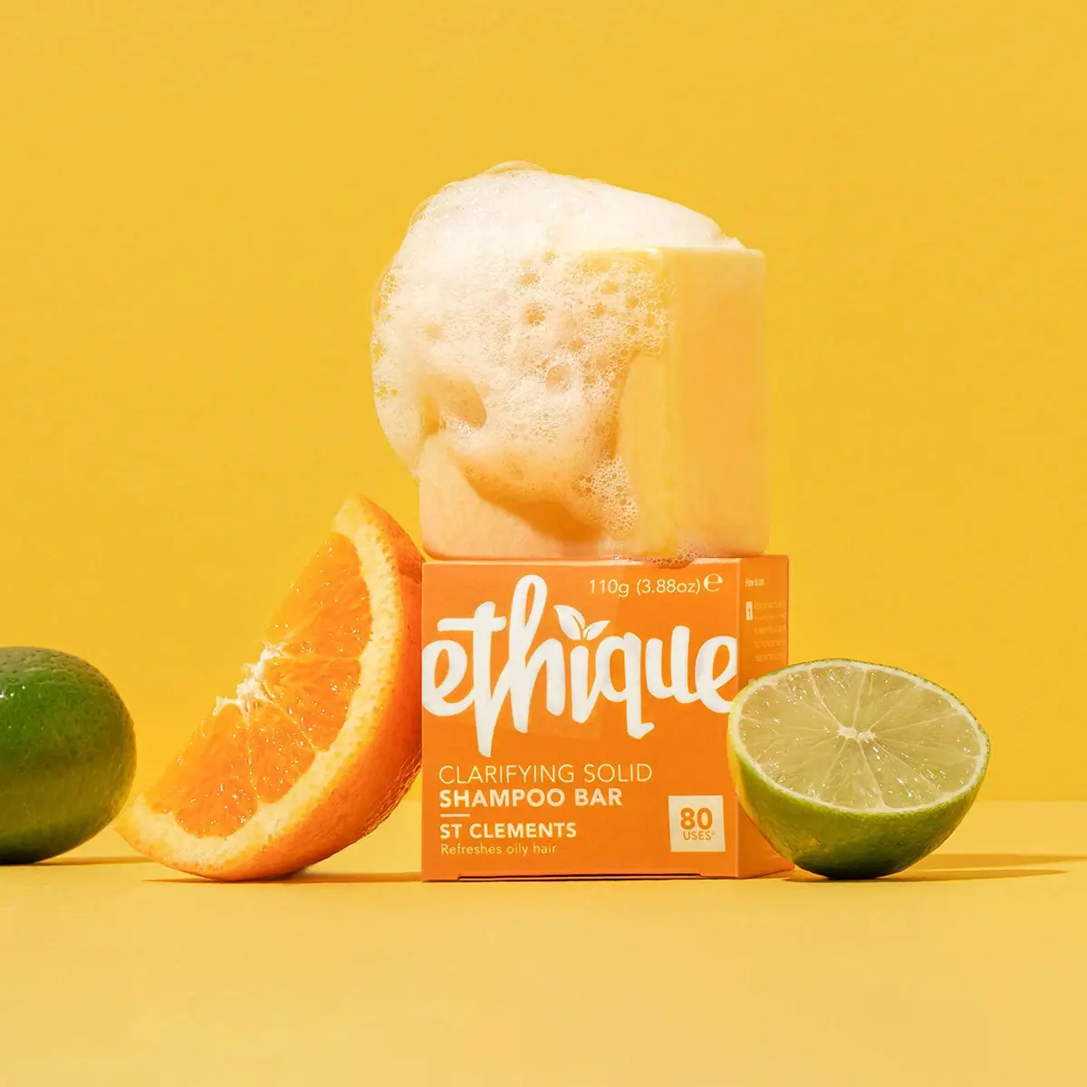
Ethique
Orange carton, oversized white script and a lathered square bar
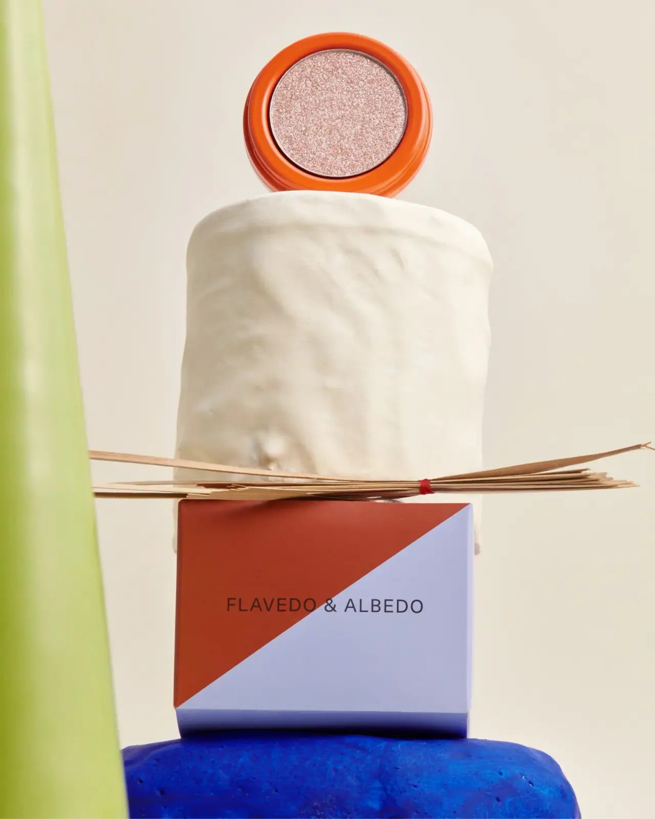
Flavedo & Albedo
An orange pan above a sharply divided two-colour carton