Photography: Ethique official photography. Images belong to their respective owners.
Ethique

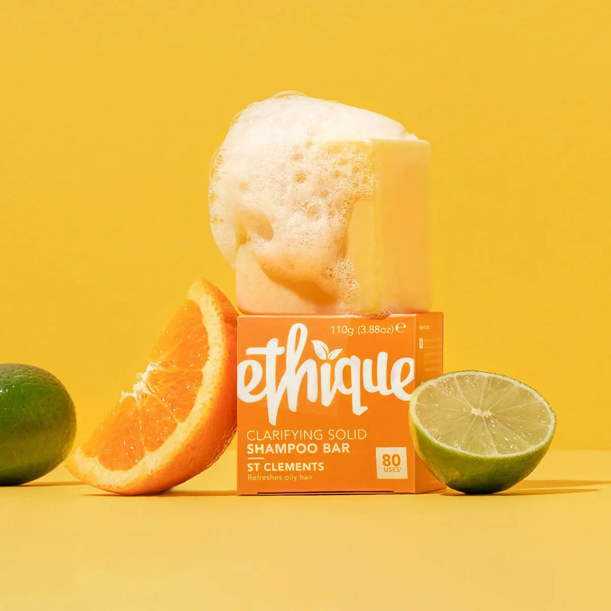
Orange carton, oversized white script and a lathered square bar
The selected St Clements presentation shows a pale yellow square shampoo bar, covered partly in foam, resting on a bright orange carton. An oversized white script producer mark spans almost the entire upper front. Smaller left-aligned product and variant lines sit below, while a separate pale square isolates the 80-use claim at the lower right. The visible 110 g line sits near the top edge. This is the photographed earlier script-logo edition: Ethique’s later rebrand documentation describes changed names and bar shapes, which should not be projected onto this specimen.
- Hair
- Light pack
- Bold typographic
- Playful colour
About this study
Earlier photographed orange St Clements script-logo carton and square bar. Later renamed/crescent-bar presentations are outside this visual audit.
Sources & evidence · Reviewed 2026-10-19Color Palette
Approximate colours interpreted from photography. These are screen references, not official brand colours or print specifications.
Label
Orange carton field
#F58B24
Approximate saturated orange front and side. It creates the main package colour; the much larger yellow photographic background is a separate scene element.
Ink
Warm white lettering
#FFF0CC
Approximate flowing producer, product lines and small type. Warm lighting and orange reflection influence its appearance.
Accent
Pale use-count panel
#F7DDA4
Approximate light square behind the orange 80-use claim. It provides a bounded practical-information field beneath the large identity.
Typography
Suggested visual alternatives, not confirmed brand typefaces. Any scale below is an illustrative estimate.
The flowing white producer name is much larger than any functional text and extends close to both front edges. Its leaf-like detail belongs to the identity. Below it, the product category is split into a lighter first line and a heavier shampoo-bar line. A short rule precedes the bold St Clements variant, with a smaller hair-use line beneath. The 80-use square sits separately at the lower right, while net weight is small near the upper edge. The layout is predominantly left-aligned in its lower information area, rather than centred beneath the script.
Fonts
Expressive identity alternative
Caveat
- Looks like
- Caveat
- Type
- Handwritten script
- Weight
- Bold 700
- Case
- Lowercase-led original name
- Tracking
- Natural joining rhythm
- Fallback
- cursive
A proposed handwritten direction for an original identity. It is not a close attribution of Ethique’s custom brush lettering; develop a unique word shape and avoid copying its leaf detail or edge-spanning proportions exactly.
Functional carton information
Nunito Sans
- Looks like
- Nunito Sans
- Type
- Sans serif
- Weight
- Regular 400 / Bold 700
- Case
- Uppercase category and variant; sentence-case support
- Tracking
- Neutral
- Fallback
- sans-serif
Use weight contrast to distinguish product format from variant and small support. Keep the use-count digits strong inside their own panel, with the qualification readable at actual carton size.
Structure & Proportions
Visual proportions and finish previews are illustrative. Confirmed construction details and uncertainties are distinguished in the study notes.
Proportions
| Purpose | Value | Preview |
|---|---|---|
| Box and bar | The exposed square bar is close in apparent width to the carton front and sits directly above it. Perspective is not used to calculate fit or internal clearance. | — |
| Producer scale | The script occupies most of the upper front width, making the identity a graphic shape rather than a small label heading. | — |
| Lower information | A left-aligned text cluster and a separate right-hand use-count square divide the lower face into two functional areas. | — |
Shapes
| Element | Value | Preview |
|---|---|---|
| Carton | Compact straight-edged box with a square-looking front. | |
| Shampoo bar | Thick square solid with softly rounded edges, partly covered in foam. | |
| Use-count badge | Small pale square at the lower right. | |
| Category divider | Short horizontal rule above the variant name. |
Finishes
Flat orange graphic appearance
Carton front and side; precise print finish unknown. · matte
Opaque pale lettering
Script and functional copy; ink system unverified. · matte
Formats and materials
| Formats | A compact folded carton with a nearly square front, paired in the photograph with an exposed square solid shampoo bar. The front reads 110 g / 3.88 oz. |
| Materials | The official packaging FAQ describes the relevant packaging programme as home-compostable, recyclable and forestry-certified. These are brand statements; the selected carton’s exact board grade, coating, adhesive and certification mark are not independently identified., No rigid bottle is shown. The visible product is a solid bar, but the image alone does not establish the full supplied packing sequence or whether any unseen inner wrap was used. |
| Closures | A narrow folded seam is visible along the carton’s lower edge. The carton is closed, with no demonstrated opening action, inner support or fastening detail. The bar is staged outside it rather than shown being removed. |
| Decoration | Large white script dominates the orange face. Functional text, net weight and a separate use-count square supply practical information without a printed citrus illustration on the visible main panel. |
Front Panel
Schematic reading order. The diagram’s zone heights do not represent measured artwork proportions.
The main front is a full orange field. A large script identity spans the top, while the product, variant and hair-use wording form a compact left-hand block below. The separate 80-use square aligns near the bottom right. Small net-weight text occupies an upper corner. The visible side carries additional small information, but it is not readable enough to reconstruct.
| Zone | Content |
|---|---|
| Oversized producer | Flowing white lettering and a small leaf-like detail supply the strongest recognition cue. Its scale takes priority over a conventional empty margin. |
| Product format | Clarifying solid and shampoo bar are split into two lines with differing weights. The explicit format wording helps distinguish a shampoo bar from ordinary soap. |
| Variant and use case | St Clements appears in bold capitals beneath a short rule, with a small line indicating oily-hair use. The variant is secondary to the product format. |
| Use-count square | The 80-use claim is enclosed in a pale square with orange text. It is a claim printed on this edition, not an independently measured guarantee of washes. |
| Net weight | 110 g / 3.88 oz. is readable near the upper edge. It provides an amount independent of the estimated-use claim. |
Range System
Ethique’s official packaging FAQ explains that an earlier redesign used colour, bar shape and practical callouts to help distinguish products. A later official rebrand article describes changed names and crescent shampoo shapes. This study remains tied to the square St Clements bar and script-logo carton shown, without assigning later foil, geometry or formulation details to it.
- The selected front separates measurable quantity from an estimated-use statement, which is a useful distinction for a solid product replacing a familiar liquid format. Both should remain legible and appropriately qualified in original work.
- Colour and explicit category wording can help differentiate bars, but an actual range audit would be needed before claiming that orange consistently means clarifying across every Ethique edition or market.
Back of Pack & Shelf
The rear, top opening and interior are unseen. A narrow right-side panel is visible at an angle, but its small text cannot be read reliably.
- Do not reconstruct ingredients, use-count footnotes or disposal icons from the blurred side panel.
- Verify the exact edition before copying current packaging guidance into an archive description.
- Do not treat the wet styled carton as proof of water resistance or suitability for shower storage.
On shelf
The oversized script and orange field should register before the smaller format and variant wording. At closer range, the pale 80-use square offers a practical comparison cue, while the net weight remains a separate factual amount. This is visual interpretation, not a shopper test. Showing the bar outside its carton is particularly helpful for a new-format catalogue because the closed box alone could resemble many other small personal-care products.
Imagery
An orange wedge and cut lime flank the carton, with another lime near the image edge. The pale yellow bar above is covered in lather, making the use of a solid format understandable without a person in frame. A saturated yellow background extends the citrus colour story but is not part of the carton palette. Foam overlaps the bar and approaches the carton top; that is a campaign arrangement, not a recommended storage method or a demonstration of the box’s wet strength.
Guidelines
Editorial principles for an original design brief, not official brand guidelines.
Do
- Keep this square-bar script-logo edition distinct from later rebranding.
- State the solid product format explicitly on the front.
- Separate net weight from estimated-use claims.
- Show the actual bar when explaining the package system.
Don't
- Do not import later crescent shapes or foil claims into this specimen.
- Do not treat the styled foam as evidence that the carton is waterproof.
- Do not reproduce the custom script or leaf identity.
- Do not assign precise board, adhesive or coating specifications without evidence.
Sources & evidence
How this study was built
range · Sourced fact
Earlier packaging FAQ explains category differentiation through colour, shapes and practical callouts.Ethique New Packaging FAQedition · Sourced fact
Later rebrand article describes new naming and crescent shampoo shapes, requiring edition separation.The New Face of Ethiquestructure · Visual observation
Square solid bar sits above a compact closed carton.typography · Visual observation
Large white script dominates left-aligned sans-serif format/variant information.label · Visual observation
110 g / 3.88 oz. and a separate 80-use field are visible.palette · Visual observation
Orange/pale carton graphics differ from yellow backdrop and fruit colours.imagery · Editorial interpretation
Lather communicates use but does not establish carton wet strength.
What remains unverified
- Original US single-product URL failed; exact visible name, weight and count read from approved image.
- Brand packaging statements are not a complete selected-carton material specification.
- Later rebrand information used only to establish edition limits.
- Fonts are alternatives; side, rear and interior information not reconstructed.
Give your AI
packaging taste
Give your design or image tool a packaging study: palette, type, structure, front panel and principles for an original brief.
Export this styleFree with an email. PACK.md works in Claude, ChatGPT, Cursor and image tools.
More like this

ACURE
Iridescent spectacle with practical, tightly ordered type

Bask
sunny yellow with a playful turquoise signature

Beame
Orange bubble lettering, pink mascot, clear product badge

Bread Beauty Supply
bubblegum pumps and a fat black wordmark

Cut By Fred
Orange gel, cropped geometry and bold bilingual utility

Dune Suncare
Coral bottle with striped vertical identity and small left-aligned copy

e.l.f. Cosmetics
Pink tube, black cap, oversized thin lowercase signature
Flavedo & Albedo
An orange pan above a sharply divided two-colour carton