Photography: Dasique official photography. Images belong to their respective owners.
Dasique

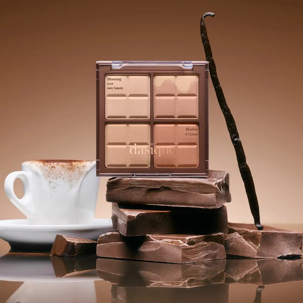
Chocolate-segment powders visible beneath a clear serif-marked lid
Melted Choco turns the contents of a four-pan cheek compact into its main decorative surface. A clear closed lid reveals square powders pressed with chocolate-segment-like relief, while a cocoa-brown frame and central dividers organise them into a two-by-two grid. Pale serif branding crosses the lower pans and small dark copy sits in separate upper-left and right-side areas. The upper-right pan adds an irregular pale shape that visually suggests a melted topping. The approved photograph reinforces this interpretation with chocolate pieces and a café-like setting, but the package itself communicates through visible powder, geometry and light typography.
- Make-up
- Light pack
- Playful colour
About this study
The approved closed-front image of Blending Mood Cheek 20 Melted Choco. No other compact variants, underside, open interior or carton are visually reviewed.
Sources & evidence · Reviewed 2026-10-19Color Palette
Approximate colours interpreted from photography. These are screen references, not official brand colours or print specifications.
Pack body
Cocoa frame
#795448
Approximate brown compact frame and dividers. It provides a darker boundary around the warm powder colours without covering them.
Ink
Cream brand lettering
#EAD0B3
Approximate pale wordmark on the clear lid, allowing the product to remain visible beneath the letters.
Dark brown small copy
#35271E
Approximate functional and phrase lettering in small corner areas. It supplies a different contrast strategy from the pale brand mark.
Accent
Pale peach powder
#DEB59D
Approximate light upper-left powder appearance. Product colours contribute to the closed package's visible palette; this is not a calibrated shade specification.
Soft rose-cocoa powder
#B77D69
Approximate warmer, deeper powder appearance, most evident in the lower-right area. Lighting and relief shadows affect the photographed tone.
Typography
Suggested visual alternatives, not confirmed brand typefaces. Any scale below is an illustrative estimate.
The lowercase dasique identity is the largest text, but it sits across the lower portion of the lid rather than dominating a solid central label. Its fine serif strokes let the powders show through the surrounding area. Small dark serif copy at the upper left forms a three-line brand phrase, while a compact right-side block identifies the product as a four-colour blusher. These separated placements create an asymmetrical overlay on an otherwise rigid symmetrical grid. No individually printed shade names are legible over the four pans.
Fonts
Original identity alternative
Bodoni Moda
- Looks like
- Fine high-contrast lowercase serif
- Type
- Display serif
- Weight
- Regular
- Case
- Lowercase for an original short brand name
- Tracking
- Close with optical adjustment
- Fallback
- Didot, Georgia, serif
Create a light signature that can overlay visible product without becoming a large opaque panel. Develop different letter geometry and placement from the reference.
Small-copy alternative
Libre Caslon Text
- Looks like
- Compact traditional text serif
- Type
- Text serif
- Weight
- Regular
- Case
- Sentence case for brief phrases and function
- Tracking
- Normal
- Fallback
- Georgia, serif
Keep functional wording readable across changing colours beneath a transparent lid. Test dark text over the palest and deepest pan areas rather than assuming one contrast value will work everywhere.
Structure & Proportions
Visual proportions and finish previews are illustrative. Confirmed construction details and uncertainties are distinguished in the study notes.
Proportions
| Purpose | Value | Preview |
|---|---|---|
| Grid structure | Four similarly sized square pans form a two-by-two arrangement. Narrow central dividers and a wider outer frame keep the assortment ordered without large gaps. | — |
| Visible colour area | Most of the front face is occupied by the powders themselves. The transparent lid preserves that display when the package is closed. | — |
| Typography footprint | The main wordmark crosses the lower pair of pans, leaving their relief and colour visible around it. Small copy occupies selected corners rather than a continuous banner. | — |
| Pattern within pattern | Each square pan contains smaller segment-like forms, producing a repeated rhythm at two scales: the compact grid and the powder relief. | — |
Shapes
| Element | Value | Preview |
|---|---|---|
| Compact outline | Near-square frame with restrained corner rounding, a clear upper hinge and small lower closure feature. | |
| Pan layout | Four square openings separated by a cross-shaped brown divider. | |
| Pressed segments | Small bevel-like subdivisions across each powder surface, visually recalling a segmented chocolate tablet. | |
| Pale irregular area | A softly dipping shape along the upper portion of the top-right pan; its exact formula construction is not established. |
Finishes
Clear display cover
Closed lid, with reflections and visible transparent hinge components · transparent
Pressed product relief
The four powder surfaces; preview indicates relief rather than a verified embossing operation · emboss
Quiet powder appearance
Warm cheek colours visible beneath the lid, without a large metallic sheen in this photograph · matte
Formats and materials
| Formats | Square compact containing four square powder pans, Transparent hinged lid shown closed over the product grid |
| Materials | Clear lid and opaque brown frame are visually distinguishable, but their exact polymers or other material specifications are not stated in the consulted page text., Pressed powder surfaces carry visible relief. This decorative surface is part of the product, not a printed liner or food insert., The internal pan substrates, hinge pin and any retail carton are not identified by the selected image. |
| Closures | A clear hinge assembly spans part of the upper edge, and a small centred closure feature is visible at the bottom. The lid is closed, allowing the powder grid and its surface pattern to be read through it. The photograph does not establish the latch mechanism, opening angle, replaceable-pan construction or refill compatibility. No interior mirror or included brush is visible. |
| Decoration | Powder relief divided into small chocolate-bar-like sections, Pale irregular topping-like area within the upper-right pan, Pale lowercase serif identity and smaller dark copy on the lid; exact decoration process is unknown |
Front Panel
Schematic reading order. The diagram’s zone heights do not represent measured artwork proportions.
The lid acts as a transparent typography layer over the colour grid. It does not contain one opaque rectangular label. A small phrase at upper left and a functional block on the right balance the larger pale identity below. The wordmark overlaps the lower powders, making the graphic and product layers interact. Because the powder colours are the background, both light and dark lettering have to be judged against the actual contents rather than a single uniform printed field.
| Zone | Content |
|---|---|
| Upper-left lid | Small three-line brand phrase printed in dark serif lettering over the lightest visible area. |
| Right-side lid | Small Blusher / 4 Colors wording, placed near the upper edge of the lower-right pan. |
| Lower lid identity | Pale lowercase dasique wordmark spanning the lower pair of pans, rather than vertically centred on the overall compact. |
| Powder surfaces | Segmented relief and warm colours remain the primary visual content beneath the transparent cover. |
Range System
The official listing confirms Blending Mood Cheek 20 Melted Choco as the selected variant. The accessible page does not provide a complete packaging specification or a verified mapping of this artwork across other shades. The current Choco collection route also cannot be used to reconstruct an earlier palette range. Guidance here therefore concerns the principle of product-visible packaging, not a claim that all Dasique compacts use the same frame or embossing.
- Observed: four distinct powder areas are presented as one coordinated warm assortment through a clear lid.
- Observed: the chocolate-segment concept appears in the product relief and is reinforced by the selected photograph's food props.
- Original-design interpretation: retain a regular grid while changing the frame colour and pressed motif for a genuinely different theme, keeping function copy readable in every variation.
Back of Pack & Shelf
Only the closed front face and small edge details are visible. The underside, full hinge interior, any shade stickers and retail carton are absent. Ingredient lists on the website do not reveal their printed position, and the four-pan display does not prove whether the pans can be removed or replaced.
- Review the underside before documenting product number, net weight or ingredient placement.
- Check the opened compact separately before claiming a mirror, accessory space or refill feature.
- For original development, plan technical copy on an appropriate supporting surface without obscuring the colour display.
On shelf
Interpretation: a transparent cover lets the assortment sell through its actual colours and relief, reducing dependence on printed swatches. That advantage also creates a challenge: reflections and branding can obscure the product if they become too dominant. The pale wordmark has a different contrast over each underlying pan, so a new design should be tested closed, open and at an oblique viewing angle. The brown frame provides a stable boundary even as lighting changes across the clear lid.
Imagery
The compact stands on a stack of broken chocolate pieces, with a white cup and saucer to the left and a dark pod-like prop rising beside it. A brown backdrop and reflective tabletop connect these props to the frame and powder colours. The food styling explains the Melted Choco name immediately, but it does not establish chocolate ingredients, flavour or fragrance in the cosmetics. The visible raised pan pattern is the package-and-product feature; the large broken slabs underneath are separate scene objects.
Guidelines
Editorial principles for an original design brief, not official brand guidelines.
Do
- Use the actual product colours as part of the closed-package composition.
- Keep supporting copy clear over the specific pan beneath it.
- Distinguish pressed product relief from decoration on the lid.
- Use a stable frame to organise a multi-shade assortment.
- Test transparent packaging for reflections at different viewing angles.
Don't
- Do not mistake food props for cosmetic ingredients.
- Do not claim a mirror or removable pans from a closed front view.
- Do not call the wordmark vertically centred when it sits across the lower pans.
- Do not infer clear plastic resin or printing technology from appearance.
Sources & evidence
How this study was built
edition · Sourced fact
The official listing identifies the exact product and number 20 Melted Choco; alternate URLs lead to the same source.Blending Mood Cheek 20 Melted Choco — official product listingstructure · Visual observation
Four square pans sit behind a closed clear hinged lid within a brown frame.Blending Mood Cheek 20 Melted Choco — official product listinglabel · Visual observation
The pale identity crosses the lower pair of pans, with small dark text at upper left and on the right.Blending Mood Cheek 20 Melted Choco — official product listingstructure · Visual observation
Segment-like relief decorates the powders, and the upper-right pan includes a pale irregular area.Blending Mood Cheek 20 Melted Choco — official product listingpalette · Visual observation
Brown framing and warm powders form the package appearance; chocolate props and backdrop are not separate package colours.Blending Mood Cheek 20 Melted Choco — official product listingimagery · Editorial interpretation
The food setting reinforces the name's theme but does not establish food ingredients or scent in the cosmetic.Blending Mood Cheek 20 Melted Choco — official product listing
What remains unverified
- The product description is largely image-based; accessible text confirms identity but not component materials or print specifications.
- Exact font attribution, compact dimensions, pan construction and refillability are unverified.
- The pale irregular area in one pan is observed visually; its formulation or manufacturing method is not inferred.
- Current collection contents do not establish a historical range map; shade colours are photographic approximations.
Give your AI
packaging taste
Give your design or image tool a packaging study: palette, type, structure, front panel and principles for an original brief.
Export this styleFree with an email. PACK.md works in Claude, ChatGPT, Cursor and image tools.
More like this

ACURE
Iridescent spectacle with practical, tightly ordered type

Bask
sunny yellow with a playful turquoise signature
Bathing Culture
Flowing rainbow bands on dark refillable glass

Beame
Orange bubble lettering, pink mascot, clear product badge

Bread Beauty Supply
bubblegum pumps and a fat black wordmark

Byoma
candy-coloured barrier science on a shelf

Cut By Fred
Orange gel, cropped geometry and bold bilingual utility

Dune Suncare
Coral bottle with striped vertical identity and small left-aligned copy