Photography: Each & Every official photography. Images belong to their respective owners.
Each & Every

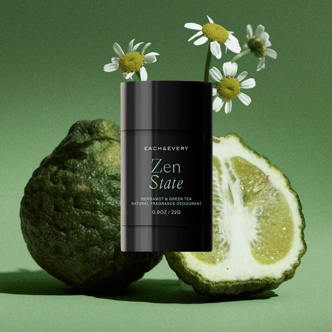
Pale green scent typography on a compact black stick
Zen State places a delicate two-line scent name at the center of a compact dark deodorant stick. A small spaced maker line sits above, while the scent pairing, product category and quantity remain below in plain type. Pale green lettering carries nearly all the visible graphic identity. The broad cap and shorter lower segment continue the same dark surface, so the package reads as one quiet object. This study concerns the mini marked 0.8 oz / 22 g, not a full-size container.
- Body & bath
- Dark pack
- Luxe monochrome
About this study
Selected Zen State mini marked 0.8 oz / 22 g. Exact geometry, full-size packaging and other scent color systems are not generalized.
Sources & evidence · Reviewed 2026-10-19Color Palette
Approximate colours interpreted from photography. These are screen references, not official brand colours or print specifications.
Pack body
Near-black case
#111412
Approximate opaque-looking cap, body and lower segment. Vertical reflections create tonal variation without establishing multiple permanent colors.
Ink
Pale mint lettering
#BCDCC9
Shared light green for the maker line, scent name and supporting copy, providing a restrained contrast against the dark case.
Typography
Suggested visual alternatives, not confirmed brand typefaces. Any scale below is an illustrative estimate.
EACH&EVERY appears as a small spaced uppercase line. The larger Zen State name breaks into two lines, with a thin refined serif character and a visibly more slanted lower word. Beneath it, BERGAMOT & GREEN TEA and the deodorant descriptor form a compact plain uppercase pair, followed by the weight. The scent name occupies the most expressive role; the maker does not dominate by size. This keeps a small front readable without adding a badge, illustration or several competing weights.
Fonts
Scent name
Cormorant Garamond
- Looks like
- Fine literary serif with an elegant italic
- Type
- Display serif
- Weight
- Regular, Medium
- Case
- Title case
- Tracking
- Natural optical spacing
- Fallback
- Georgia, serif
Proposed for an original two-word scent name. Compare roman and italic variants carefully rather than mechanically slanting all letters; the source combines different movement across its two lines.
Maker and detail
DM Sans
- Looks like
- Quiet evenly spaced sans-serif
- Type
- Geometric sans-serif
- Weight
- Regular, Medium
- Case
- Uppercase
- Tracking
- Open for the short maker line; natural for small detail
- Fallback
- Arial, sans-serif
Alternative for a concise maker name, scent ingredients and weight. Keep these lines plainer than the scent title, with enough spacing to remain readable on a small curved face.
Structure & Proportions
Visual proportions and finish previews are illustrative. Confirmed construction details and uncertainties are distinguished in the study notes.
Proportions
| Purpose | Value | Preview |
|---|---|---|
| Three-part silhouette | The cap forms a broad upper section, the text-bearing body is the largest visible section, and the lower segment is noticeably shorter. No exact part heights are inferred. | — |
| Scent emphasis | The two-line name has much larger letter height than the maker and supporting copy, but its thin strokes keep it visually light. | — |
| Side margins | The centered information leaves clear dark space on both sides, allowing reflections near the curved edges without fully obscuring the reading area. | — |
| Lower information gap | Scent details and quantity have their own compact spacing beneath the title; the weight remains above the mechanical-looking lower seam. | — |
Shapes
| Element | Value | Preview |
|---|---|---|
| Overall case | Compact upright form with a broad front and softly curved sides; exact footprint unresolved from the frontal image. | |
| Cap | Broad smooth upper component with a subtly curved top edge and nearly straight horizontal lower seam. | |
| Lower segment | Short dark section sharing the front width, divided from the printed body by a fine horizontal line. | |
| Information group | Centered text stack without a surrounding border, badge or botanical illustration. |
Finishes
Softly reflective dark shell
Cap, body and lower segment; broad highlights are visible without proving a particular varnish. · gloss
Quiet reading face
Central dark area behind the lettering appears lower-glare in this light, not necessarily a separate material. · matte
Formats and materials
| Formats | Closed compact deodorant stick marked 0.8OZ / 22G on the selected front |
| Materials | The brand states that its deodorant packaging uses recycled materials, but the consulted passage does not specify resin type, recycled-content percentage or every internal component., The dark opaque-looking surface and reflected highlights do not establish a particular polymer, coating or soft-touch treatment. |
| Closures | A broad upper cap meets the body at a thin horizontal seam. A second seam separates the shorter lower segment. The selected view does not show the interior, opening action or product-raising mechanism. The frontal silhouette is rounded and compact, but its exact circular or oval cross-section is not measured. |
| Decoration | Small uppercase maker line, Large two-line serif scent name with contrasting slant, Plain uppercase scent and category descriptors, Compact weight line above the lower seam |
Front Panel
Schematic reading order. The diagram’s zone heights do not represent measured artwork proportions.
The decoration is a centered typographic stack directly against the dark-looking case, with no obvious pale label panel. The name provides the main visual event. Supporting copy is grouped closely enough to remain subordinate but separated into clear lines. The front has no illustrated leaves or scent ingredient drawings; those associations are supplied by the surrounding photograph.
| Zone | Content |
|---|---|
| Maker line | Small spaced uppercase letters identify the brand just below the cap seam, leaving a generous transition to the larger name. |
| Scent title | Zen sits above State, whose more slanted forms add movement. This is the strongest typographic contrast on the object. |
| Scent pairing | Bergamot & Green Tea appears in small plain capitals, making the evocative name more specific without another decorative device. |
| Category | A plain deodorant descriptor follows the scent pairing, clarifying the product type despite the perfume-like name treatment. |
| Quantity | The photographed 0.8OZ / 22G marking is centered above the lower segment. It is recorded as printed rather than replaced by another conversion elsewhere on the page. |
Range System
The official page offers several named mini scents, but only Zen State's actual package is inspected here. The study does not establish a universal lettering color or typography rule for those other variants. A transferable idea is to use an expressive scent title with a plain descriptive pairing below it, while maintaining enough product-category information to distinguish a deodorant from another scented body product.
- For an original range, keep scent pairing and product category in fixed positions even when evocative names have different lengths.
- A longer fictional name may need a different line break rather than shrinking all typography to fit a uniform word width.
- If color differentiates variants, retain written scent names so identification does not depend only on subtle pale ink shifts.
Back of Pack & Shelf
No rear, underside, open cap or exposed product is shown. The official page gives cap-attached recycling directions, but the selected view does not show whether those directions appear on the case itself.
- Inspect the rear and underside before locating ingredients, directions or batch markings.
- Keep the brand's recycling guidance attributed and distinguish it from acceptance by every local collection system.
- Do not infer a refill cup or removable internal carrier from the lower seam alone.
On shelf
Interpretively, the quiet dark shell can give a small everyday product a fragrance-like presence. The larger scent title is likely to attract attention before the category line, which makes the plain deodorant wording useful. Thin strokes and pale ink need careful actual-size evaluation against curved reflections. The campaign's large citrus props create scale and atmosphere, but they do not establish the pack's exact dimensions or store visibility.
Imagery
The dark stick is centered in front of whole and cut textured citrus, with small white-petaled flowers rising behind the cap. A green backdrop connects the props with the pale green lettering. These large botanical forms provide texture while the case remains restrained. Their surfaces and the brighter fruit flesh are not permanent package colors. The composition places the product prominently above the lower ground rather than documenting an ordinary upright countertop view.
Guidelines
Editorial principles for an original design brief, not official brand guidelines.
Do
- Pair evocative naming with a specific scent descriptor.
- Use typographic contrast before adding decorative elements.
- Separate printed colors from photographic botanicals.
- Document the selected mini's visible quantity marking.
- Keep environmental material statements specific and attributed.
Don't
- Do not assume a particular resin or recycled-content percentage.
- Do not describe botanical props as printed illustrations.
- Do not infer the internal raising or refill mechanism from seams.
- Do not treat a frontal view as an exact cross-section drawing.
- Do not copy the brand name or exact Zen State lettering.
Sources & evidence
How this study was built
edition · Sourced fact
Official page identifies Zen State as a Bergamot & Green Tea mini deodorant.Each & Every — Zen State Mini Deodorantstructure · Sourced fact
Brand attributes recycled materials and cap-attached recycling directions to its deodorant packaging, without specifying every component here.Each & Every — Zen State Mini Deodoranttypography · Visual observation
Small uppercase maker text leads a larger two-line serif name, with a more slanted lower word.Each & Every — Zen State Mini Deodorantpalette · Visual observation
Near-black case and pale-green lettering form a two-color visual system; the green backdrop and citrus are separate.Each & Every — Zen State Mini Deodorantlabel · Visual observation
Scent pairing, category and 0.8OZ / 22G marking appear below the main title.Each & Every — Zen State Mini Deodorantstructure · Visual observation
Cap, central body and lower segment are separated by two horizontal seams; exact operation is unseen.Each & Every — Zen State Mini Deodorantrange · Editorial interpretation
A consistent evocative-name and scent-descriptor hierarchy could guide an original range, without claiming unseen variant rules.
What remains unverified
- Exact resin and recycled-content percentage not specified in accessed passage.
- Front view does not establish circular versus oval footprint or internal mechanism.
- Reverse, underside and open product absent.
- Exact fonts and decoration method unknown.
- Page contains both 22.6 g and 22 g; study records the selected image's 22G marking.
Give your AI
packaging taste
Give your design or image tool a packaging study: palette, type, structure, front panel and principles for an original brief.
Export this styleFree with an email. PACK.md works in Claude, ChatGPT, Cursor and image tools.
More like this

African Botanics
Technical black label with a low serif signature

al.ive body
warm architectural calm, built as a paired vanity object

bareMinerals
a restrained black compact framing the powder itself

BeautyPWR
Clear square shell, white cream cup, black serif identity

Christian Louboutin
Faceted turquoise base beneath an extreme silver taper
Clé de Peau Beauté
Faceted navy base, reflective gold barrel, discreet repeated emblem

Color Wow
Tall condensed naming on a broad reflective silver jar

Corpus
sage gloss with whispered gold lettering