Photography: Goldfield & Banks official photography. Images belong to their respective owners.
Goldfield & Banks

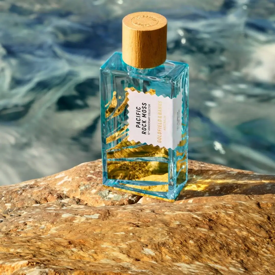
Aqua flacon with gold waves and a scalloped label
The selected Pacific Rock Moss Collector Edition places a pale scalloped-edge label over a transparent aqua-looking rectangular flacon. Black scent lettering is rotated along the label’s vertical direction, while gold producer text and sweeping metallic decoration extend the anniversary treatment across the bottle. A tall tan cylindrical cap adds a warm, grain-like texture. The official edition page confirms gold foil detailing and an ocean-inspired redesign; it does not establish the photographed cap’s material or every bottle component.
- Perfume
- Light pack
- Heritage label
About this study
Selected 100 ml Pacific Rock Moss tenth-anniversary Collector Edition. Official gold foil and ocean inspiration distinguished from visual cap/material guesses.
Sources & evidence · Reviewed 2026-10-19Color Palette
Approximate colours interpreted from photography. These are screen references, not official brand colours or print specifications.
Pack body
Aqua transparent appearance
#49B4C2
Approximate cool appearance of vessel and contents together. This image does not isolate the colour contribution of wall, liquid and coastal reflections.
Warm tan cap
#C7934D
Approximate cylindrical cap appearance. Grain-like texture is visible, but wood species and even complete material construction remain unverified.
Label
Pale scalloped panel
#EFEAE5
Opaque-looking light label field that protects text from the transparent and reflective background.
Ink
Black scent lettering
#242323
Strongest text contrast on the pale panel, reserved for scent and small anniversary naming.
Accent
Collector gold
#C4A243
Gold foil detailing confirmed by the official edition page; reflections range from pale yellow to deep brown without representing different inks.
Typography
Suggested visual alternatives, not confirmed brand typefaces. Any scale below is an illustrative estimate.
PACIFIC ROCK MOSS is split into short lines and rotated so the words read along the bottle’s vertical direction. A small anniversary collector line follows the same orientation. GOLDFIELD & BANKS and AUSTRALIA appear separately in gold, creating a secondary attribution within the pale field. The scent is darker and more immediately readable than the producer, while the decorative gold work outside the label communicates the special-edition treatment. A circular mark is visible on the cap top but is not sufficiently clear for a full transcription.
Fonts
Scent-name alternative
Barlow Condensed
- Looks like
- Barlow Condensed
- Type
- Condensed sans serif
- Weight
- Medium 500 / SemiBold 600
- Case
- Uppercase
- Tracking
- Neutral to modestly open
- Fallback
- sans-serif
A compact alternative for an original short multi-line scent name. Rotate the text as a coherent block and test the resulting reading direction on a physical mock-up.
Producer and edition alternative
Roboto Condensed
- Looks like
- Roboto Condensed
- Type
- Condensed sans serif
- Weight
- Regular 400 / Medium 500
- Case
- Uppercase
- Tracking
- Slightly open
- Fallback
- sans-serif
Use a quieter narrow voice for producer and anniversary text. Gold text on a pale label needs contrast checks under several angles; reflective brightness should not be treated as guaranteed legibility.
Structure & Proportions
Visual proportions and finish previews are illustrative. Confirmed construction details and uncertainties are distinguished in the study notes.
Proportions
| Purpose | Value | Preview |
|---|---|---|
| Rectangular body | A tall broad front and narrow visible side create a flat display area while keeping the vessel three-dimensional. | — |
| Cap height | The tan cylinder is substantial relative to the neck and narrower than the bottle shoulders, forming a distinct warm top element. | — |
| Central label | The pale panel occupies the middle of the bottle and leaves large gold-decorated transparent regions visible above, beside and below it. | — |
Shapes
| Element | Value | Preview |
|---|---|---|
| Flacon outline | Tall rectangular body with crisp shoulder edges and a thick-looking base. | |
| Overcap | Tall cylinder with a flat circular top. | |
| Scalloped label edge | Repeated shallow notches soften an otherwise rectangular panel. | |
| Gold decoration | Flowing strokes and broad curved areas extend across the vessel. |
Finishes
Transparent aqua appearance
Vessel and visible contents; exact colour contribution unverified. · transparent
Gold foil detailing
Collector-bottle decorative work, confirmed by official edition page. · foil
Muted tan cap
Cylindrical top with grain-like texture; material unknown. · matte
Formats and materials
| Formats | A rectangular fragrance flacon with a broad flat front, angular shoulders and a tall cylindrical overcap. The official collection identifies the Collector Edition as 100 ml; that quantity is not clearly readable on this front photograph. |
| Materials | The official edition page confirms gold foil detailing. It does not provide a complete component specification for this selected bottle, cap, label stock or internal atomiser., The transparent thick-edged vessel and grain-like tan cap are described visually. No wood species, certified sourcing, refillability or precise glass specification is inferred from those appearances. |
| Closures | The cylindrical cap is fitted over the neck, concealing the spray assembly. A small circular identity mark appears on its top. The photograph does not show cap retention, atomiser attachment, opening method or any refill access. |
| Decoration | Sweeping gold forms extend beyond the central label around the visible vessel. The official page links the redesign to Pacific Ocean movement, so the study does not label the artwork as confirmed botanical illustration., The pale label has a repeated scalloped or notched edge and continues towards the right side. Its opaque field separates text from the busy reflective decoration. |
Front Panel
Schematic reading order. The diagram’s zone heights do not represent measured artwork proportions.
A pale scalloped panel interrupts the aqua and gold flacon, creating a stable location for rotated naming. Black scent text and smaller collector wording share a direction, while gold producer attribution sits alongside. The edge treatment adds an ornamental outline without filling the panel with extra illustration. The panel is on the visible bottle surface, not a loose object floating inside the fragrance.
| Zone | Content |
|---|---|
| Black scent block | The multi-line Pacific Rock Moss name has the strongest contrast and leads the reading sequence despite its rotated orientation. |
| Anniversary identification | A much smaller 10th anniversary collector line sits adjacent to the scent block. It explains the special edition without needing another badge. |
| Gold producer attribution | Goldfield & Banks and Australia are lighter in contrast than the black title. Their reflective colour relates to the surrounding vessel decoration. |
| Scalloped perimeter | The irregular repeated edge separates the pale label from the flowing metallic artwork and wraps towards the visible side. |
Range System
The official collection distinguishes the 100 ml Collector Edition from standard Pacific Rock Moss and the related Pacific Rock Swell and Pacific Rock Flower listings. The edition page identifies a tenth-anniversary redesign and says the fragrance remains unchanged. That makes this reference an example of packaging-led commemoration, not evidence that every product in the collection shares the same gold artwork or scalloped label.
- An original anniversary edition can retain a recognisable scent name while changing its decorative frame and material accents. Keep the edition designation readable so collectors can distinguish it from the regular presentation.
- Do not infer an entire brand’s palette from one commemorative bottle. Here the gold is central to the selected edition, while the official collection contains separately named formats that require their own visual review.
Back of Pack & Shelf
The bottle reverse, base, exposed atomiser and outer carton are not shown. The source mentions redesigned packaging, but that does not establish the unseen carton design or where the numbered collector information appears.
- Obtain the reverse and base before documenting serial numbering, ingredients or quantity placement.
- Verify the cap and atomiser construction separately before describing refilling or component separation.
- Do not infer a matching gold carton from the decorated bottle alone.
On shelf
The pale label provides the most reliable text field, with black scent lettering more stable than the gold attribution under changing light. The rectangular body, tall warm cap and bright metallic sweep give the edition a strong silhouette and colour contrast. This is visual interpretation rather than a consumer test. A neutral front and side rotation would help separate actual foil coverage from reflections and show how the scalloped panel continues around the bottle.
Imagery
The upright bottle stands on a sunlit coastal rock with clear blue-green water behind it. Warm rock tones echo the tan cap and gold decoration, while the water reinforces the aqua body appearance. Sunlight creates moving-looking reflections through the vessel and bright gold highlights. Those environmental reflections should not be treated as additional printed colours or a fixed liquid gradient. The coastal setting is consistent with the product name and official ocean-inspired design explanation.
Guidelines
Editorial principles for an original design brief, not official brand guidelines.
Do
- Separate confirmed gold foil from unverified cap construction.
- Use an opaque field to preserve text over transparent decoration.
- Record 100 ml as source-listed rather than front-readable.
- Check rotated naming and metallic text under multiple light angles.
Don't
- Do not describe the label as floating inside the bottle.
- Do not turn ocean-inspired strokes into a verified botanical drawing.
- Do not claim wood species, refillability or hidden numbering placement.
- Do not include rock colours as extra printed inks.
Sources & evidence
- Pacific Rock Collection — Goldfield & Banksproduct
- Pacific Rock Moss Collector Edition — Goldfield & Banksproduct
How this study was built
edition · Sourced fact
Official collection lists 100 ml Collector Edition and tenth-anniversary context.Pacific Rock Collection — Goldfield & Banksstructure · Sourced fact
Exact edition page confirms gold foil detailing without a full component specification.Pacific Rock Moss Collector Edition — Goldfield & Banksrange · Sourced fact
Official page identifies ocean-inspired redesign and unchanged fragrance in commemorative edition.Pacific Rock Moss Collector Edition — Goldfield & Bankstypography · Visual observation
Rotated black scent block contrasts with smaller gold producer attribution.label · Visual observation
Pale scalloped panel sits over the bottle surface and extends towards the right side.palette · Visual observation
Cool aqua, pale panel, gold, tan cap and black naming define the photographed pack.imagery · Editorial interpretation
Rock and water echo package colour but create reflections rather than additional print specifications.
What remains unverified
- Non-US product URL failed; official US exact product page succeeded.
- Complete bottle/cap/label component specification unverified.
- No exposed atomiser, carton, reverse, base or collector-number position inspected.
- Aqua appearance combines vessel, liquid and scene reflections.
- Fonts are proposed alternatives; colours approximate.
Give your AI
packaging taste
Give your design or image tool a packaging study: palette, type, structure, front panel and principles for an original brief.
Export this styleFree with an email. PACK.md works in Claude, ChatGPT, Cursor and image tools.
More like this

Aerangis
a quiet numbered object, an intimate scent memory

Alexander McQueen
An oval flacon crowned with dense black relief
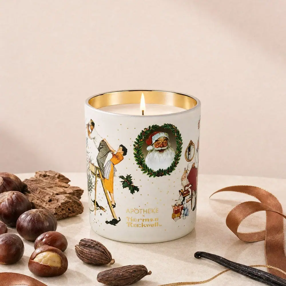
Apotheke
White holiday vignettes with a warm golden interior

Arquiste
blush transparency, white lettering and a stepped gold cap
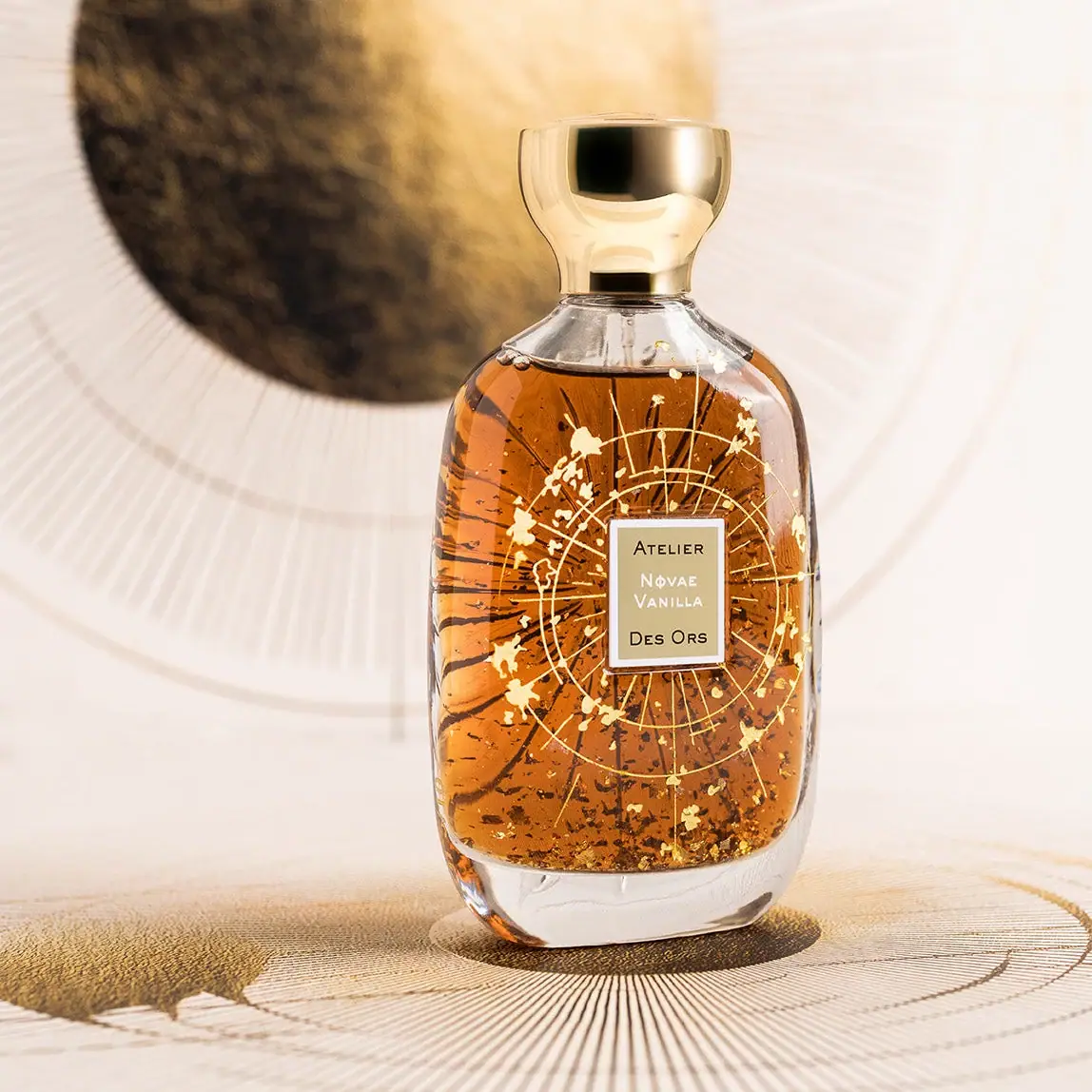
Atelier des Ors
Golden constellation framing a compact name on amber transparency
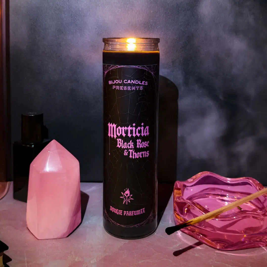
Bijou Candles
Pink blackletter and fine webs on a tall dark candle

Chabaud
A framed perfume label beneath a clear architectural cap
Chanel
Bevelled clear flacon with peach label and faceted cap