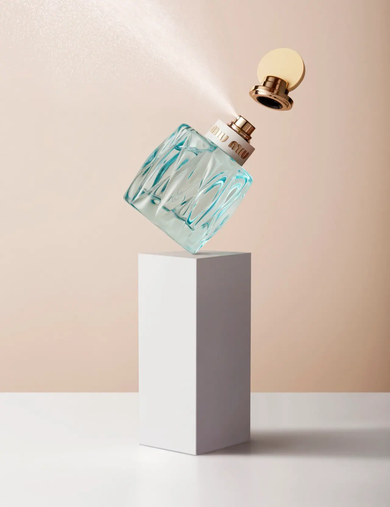
Photography: Josh Caudwell — fragrance still-life photography. Images belong to their respective owners.
Miu Miu

aqua relief, ivory neck band and a yellow disc
L’Eau Bleue separates three kinds of decoration: a transparent-looking body with flowing diagonal relief, a quiet ivory neck band carrying the house name, and a pale yellow circular cap element above reflective gold-coloured steps. Josh Caudwell’s selected balancing composition shows the cap detached and the atomizer exposed, making these parts readable as a sequence. The exact photograph appears in his May 2017 project, so this study records that photographed presentation rather than assuming that current packaging specifications apply to it.
- Perfume
- Light pack
- Maximalist pattern
- Heritage label
About this study
L’Eau Bleue in Josh Caudwell’s exact Balancing Cosmetics photograph, published May 9, 2017. The official 100 ml listing supplies product context, not a verified size for the photographed unit.
Sources & evidence · Reviewed 2026-10-19Color Palette
Approximate colours interpreted from photography. These are screen references, not official brand colours or print specifications.
Pack body
Aqua optical edge
#6DB8BD
Approximate cyan-blue appearance concentrated in curved body edges and relief. Tint source, wall composition and contents are not independently identified; this is not a uniform coating colour.
Label
Ivory neck band
#EEE9DB
Approximate opaque-looking band behind the house signature. Its substrate is unknown; the Label group describes its information-bearing role, not an adhesive-paper construction.
Accent
Warm metallic reflection
#B38A55
Illustrative midtone of the raised-looking lettering, exposed dispenser and cap steps. A gold-coloured appearance does not establish gold content or plating.
Pale yellow disc
#ECDCAA
Approximate colour of the circular closure element, visually distinct from the brighter reflective hardware below it.
Typography
Suggested visual alternatives, not confirmed brand typefaces. Any scale below is an illustrative estimate.
The house name is the only clearly legible text on the visible object. Rounded, vertically extended lowercase forms repeat as miu miu across the ivory neck band. Their gold-coloured faces and fine shadows make the lettering appear dimensional. The band gives these forms a calmer background than the deeply patterned body would provide. No fragrance title, size or concentration line is legible in this view, so a complete information hierarchy cannot be reconstructed from the photograph alone.
Fonts
Rounded display alternative
MuseoModerno
- Looks like
- MuseoModerno for independently drawn geometric lowercase
- Type
- Geometric display sans serif
- Weight
- Medium 500
- Case
- Lowercase
- Tracking
- Deliberately spaced to keep repeated arches distinct
- Fallback
- Arial, sans-serif
Explore an original short identity using rounded vertical forms. This font differs from the custom-looking signature; do not duplicate the repeated name, specific arches or letter spacing of Miu Miu.
Secondary copy proposal
Manrope
- Looks like
- Manrope for compact supporting information
- Type
- Contemporary sans serif
- Weight
- Regular 400 / Medium 500
- Case
- Sentence case
- Tracking
- Normal with sufficient space at small sizes
- Fallback
- Arial, sans-serif
Use for a hypothetical fragrance name, capacity and supporting copy on a new package. The photograph does not show those lines, and this choice is not claimed as part of Miu Miu’s established typography.
Structure & Proportions
Visual proportions and finish previews are illustrative. Confirmed construction details and uncertainties are distinguished in the study notes.
Proportions
| Purpose | Value | Preview |
|---|---|---|
| Body as primary patterned field | The relief occupies most of the visible body, leaving the neck band as a clearly separate, relatively narrow information zone. | — |
| Quiet band against complex body | The smooth-looking ivory strip gives the small house-name group a stable background above the optically busy relief. | — |
| Closure sequence | Exposed spray head, detached stepped socket and pale disc align roughly along the bottle axis in the photograph. Their apparent spacing is staging, not assembly clearance. | — |
| Relief rhythm | Long diagonal curves are interrupted by broader clear-looking areas. Perspective and refraction prevent reliable measurement of their pitch or depth. | — |
Shapes
| Element | Value | Preview |
|---|---|---|
| Bottle body | Broad rounded vessel with repeated elongated diagonal relief; exact plan shape and dimensions are not established. | |
| Neck identity band | Wide pale ring forming a calm strip between patterned body and dispenser. | |
| Cap accent | Pale yellow circular element combined with stepped reflective socket geometry. | |
| Relief lines | Curving diagonal paths that create a quilt-like optical pattern rather than a flat printed grid. |
Finishes
Transparent sculpted appearance
Aqua-looking bottle body; forming method and substrate remain unverified. · transparent
Warm reflective accents
House lettering, atomizer and stepped cap components; colour observed without assigning an alloy or plating. · metallic
Quiet pale accent
Ivory neck strip and pale yellow disc; exact coatings and tactile qualities are unknown. · matte
Formats and materials
| Formats | Transparent-looking fragrance vessel with a broad neck band, exposed atomizer and separate sculptural cap in the selected image. |
| Materials | The rigid transparent-looking body has substantial optical depth; exact substrate and composition are not established by the inspected primary product information., Neck-band substrate, cap components, inner socket and dispenser materials remain unverified. Reflective gold colour is not a material declaration. |
| Closures | The cap floats above the exposed spray head in the constructed still life. Its underside presents a dark cavity surrounded by stepped reflective rings, with a pale yellow circular element extending above. This view provides more component separation than a closed-bottle shot, but it does not establish snap fit, magnetic attachment, internal liner or removability of the pump assembly. The emitted mist is part of the image, not a measured dispensing test. |
| Decoration | Elongated diagonal curves form a repeating quilt-like rhythm across the body., Dimensional-looking house lettering is concentrated on the upper band., Closure geometry supplies a circular accent without adding an illustration to the bottle face. |
Front Panel
Schematic reading order. The diagram’s zone heights do not represent measured artwork proportions.
The information-bearing zone is a broad neck band rather than a rectangular front label. The house signature sits on this calm strip while the body carries relief. Keeping the two functions apart allows a small amount of lettering to remain visible without flattening the patterned surface. This is a conceptual layout description, not a verified decoration template or dieline.
| Zone | Content |
|---|---|
| Upper closure accent | Pale yellow circular shape and reflective stepped underside, shown separately from the vessel. |
| Exposed dispensing point | Gold-coloured spray head and collar visible above the neck band; mist extends diagonally into the scene. |
| House identity strip | Gold-coloured miu miu signature against an opaque ivory-looking band. |
| Patterned optical body | Transparent-looking aqua relief occupies the main lower volume without inspected front copy. |
Range System
The official listing identifies L’Eau Bleue in a 100 ml format, but the photograph has no readable size marking. No range-wide rule about cap colours, body opacity or relief is inferred from this single edition. The reusable design principle is a division between expressive body texture and a calmer identity band, which can be explored independently without reproducing the house’s signature bottle.
- Observed presentation: aqua-looking relief body, ivory band, gold-coloured identity and pale yellow disc.
- Unverified comparison: other sizes and fragrances would need separate photographs before establishing common structural dimensions or colour codes.
- Original-design exercise: vary surface rhythm while retaining an independent, legible identity zone; test the result on both clear and opaque prototypes.
Back of Pack & Shelf
Neither the reverse nor the underside is documented. The selected open view reveals the cap cavity and dispenser but does not disclose product-information placement, batch coding or retail carton design. A photograph with separated components is still not a complete technical record.
- Inspect the base and reverse to locate capacity and concentration information.
- Obtain a closed front and side view before documenting the cap’s normal relationship to the body.
- For a new concept, reserve space for essential copy without assuming it can be hidden inside the cap.
On shelf
Interpretation: the textured transparent body could create a recognisable pattern of highlights as the viewer moves, while the pale neck band provides a steadier place to find the name. That benefit depends on lighting; dense reflections could also compete with the small gold-coloured letters. Test an original design in flat light as well as dramatic side light, and evaluate the closed object rather than relying entirely on an exploded campaign composition.
Imagery
Caudwell places the tilted bottle at the edge of a tall white pedestal, with its cap suspended above and a fine spray extending toward the upper left. His dated Balancing Cosmetics project presents this as an intentionally impossible composition. The peach background warms the gold-coloured accents while contrasting with the aqua body. The pedestal’s straight edges also contrast with the bottle’s flowing relief. Neither the precarious balance nor suspended closure should be treated as evidence of real stability, magnetic behaviour or product engineering.
Guidelines
Editorial principles for an original design brief, not official brand guidelines.
Do
- Separate a highly active surface pattern from the area that must carry a readable name.
- Use changes in geometry and reflectivity to create hierarchy before adding more printed elements.
- Document the photographed edition and distinguish a listing size from an observed size marking.
- Test both assembled and separated component views when studying a sculptural closure.
Don't
- Do not interpret a gold-coloured reflection as solid gold or a verified plating method.
- Do not copy the Miu Miu lettering, signature relief or pale-disc closure combination.
- Do not infer magnetic suspension, balance or measured spray performance from the constructed photograph.
- Do not treat the peach scene and white pedestal as additional package colours or included accessories.
Sources & evidence
- Miu Miu — L’Eau Bleue Eau de Parfum, 100 ml official listingproduct
- Josh Caudwell — Balancing Cosmetics, May 9, 2017photographer
How this study was built
edition · Sourced fact
Photographer’s dated project contains the exact selected image; its third image was separately inspected to confirm the match.Josh Caudwell — Balancing Cosmetics, May 9, 2017context · Sourced fact
Official listing title identifies L’Eau Bleue Eau de Parfum in a 100 ml format. Detailed follow-up requests timed out, so no construction specification is adopted.Miu Miu — L’Eau Bleue Eau de Parfum, 100 ml official listingstructure · Visual observation
Relief body, ivory neck band, exposed atomizer and detached disc-bearing cap are separately visible.Josh Caudwell — Balancing Cosmetics, May 9, 2017typography · Visual observation
Rounded gold-coloured house lettering sits on the pale neck band; no fragrance-title hierarchy is reconstructed.Josh Caudwell — Balancing Cosmetics, May 9, 2017palette · Visual observation
Aqua optical edges, ivory band, warm reflections and yellow disc are separated from the peach backdrop and white pedestal.Josh Caudwell — Balancing Cosmetics, May 9, 2017imagery · Sourced fact
The photographer presents the balancing series as deliberately impossible; suspension is not product-performance evidence.Josh Caudwell — Balancing Cosmetics, May 9, 2017shelf · Editorial interpretation
The quiet band may help identity compete with complex reflections, but retail readability requires separate testing.
What remains unverified
- Exact substrates, relief-forming process, plating, coatings and refill mechanism remain unverified.
- The photograph has no readable capacity marking; the current 100 ml listing does not establish the photographed size.
- Original lettering, physical dimensions and relief depth are not measured or attributed.
- Reverse, underside, retail carton and normal closed side profile are not inspected; colour values are approximate.
Give your AI
packaging taste
Give your design or image tool a packaging study: palette, type, structure, front panel and principles for an original brief.
Export this styleFree with an email. PACK.md works in Claude, ChatGPT, Cursor and image tools.
More like this
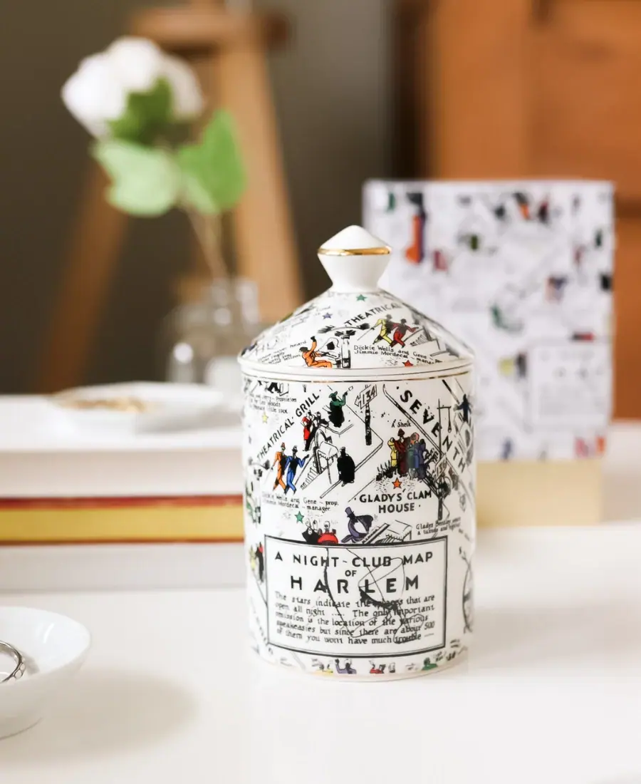
Harlem Candle Company
Illustrated ceramic map jar with coordinated lid and gold trim
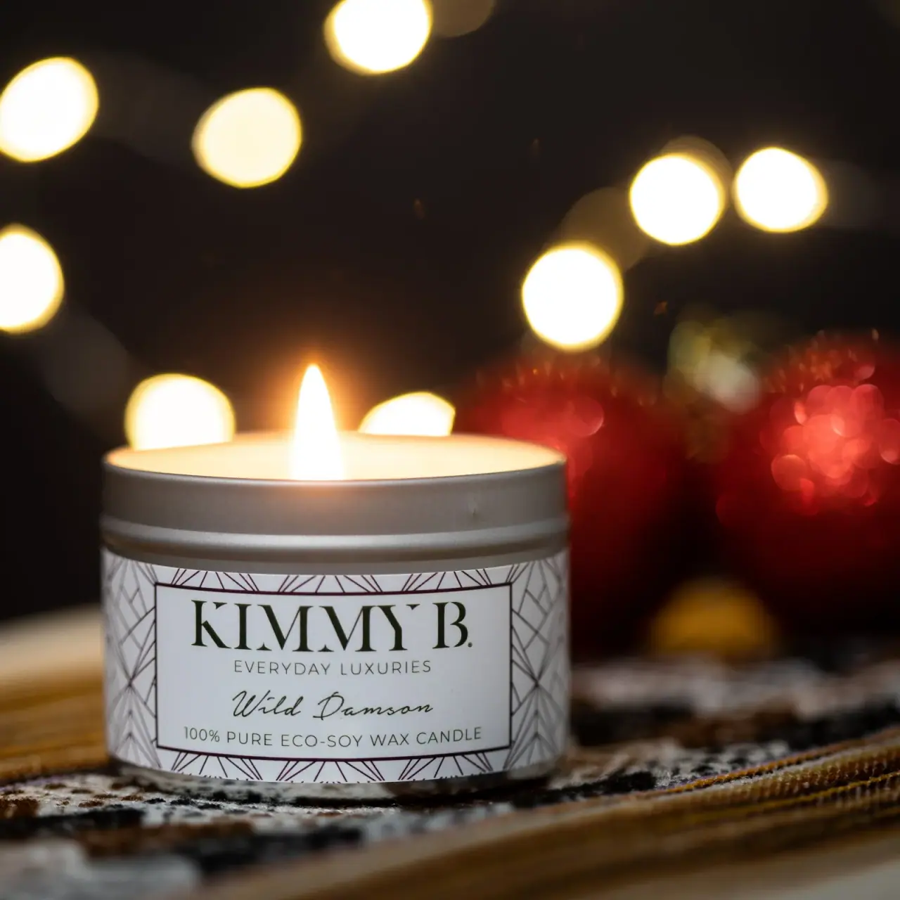
KimmyB
Silver tin, geometric frame and handwritten damson scent
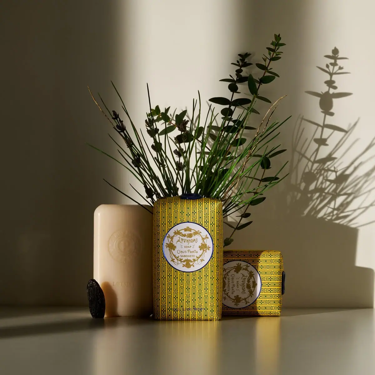
Claus Porto
Golden geometric wrapping around a pale floral medallion
ISAMAYA
Gold horse medallion with crystal-like mane and red eye

Aerangis
a quiet numbered object, an intimate scent memory

Alexander McQueen
An oval flacon crowned with dense black relief
Apotheke
White holiday vignettes with a warm golden interior

Arquiste
blush transparency, white lettering and a stepped gold cap