Photography: Ricardo Lozano — product photography. Images belong to their respective owners.
Kate Somerville

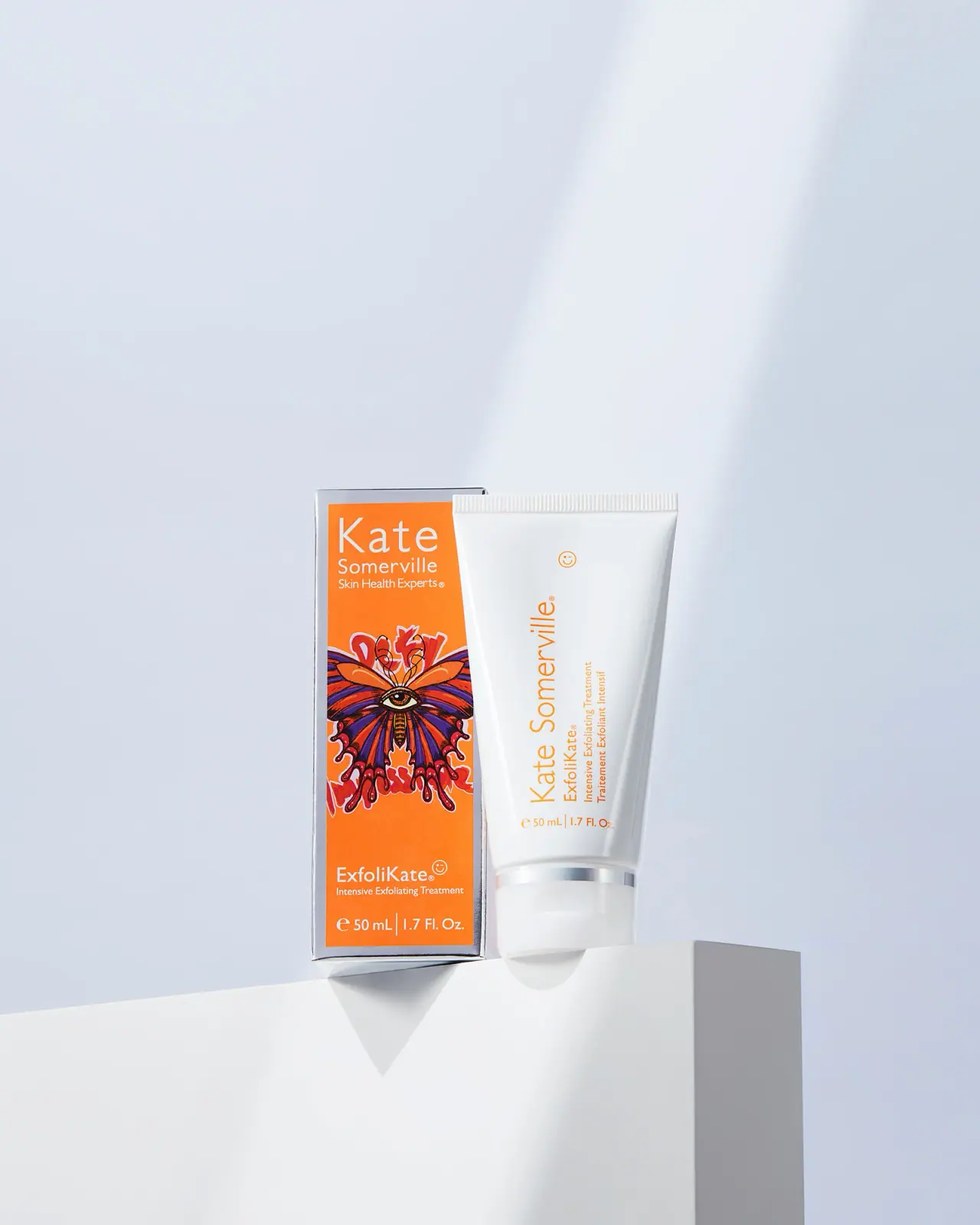
Orange artist carton beside a clean white vertical-text tube
The 2022 Foster Nation ExfoliKate edition pairs an expressive orange carton with a much quieter white tube. An eye-centered butterfly artwork fills the carton's middle, between horizontal maker and product naming. The tube repeats orange through vertically oriented text and a small smiley symbol, while a reflective collar links it visually to the carton's silver-looking border. A brand-issued 2022 announcement confirms Laura Bush as the artist. The photographed 50 mL / 1.7 fl oz edition is studied separately from the current standard product.
- Skincare
- Light pack
- Maximalist pattern
- Bold typographic
- Playful colour
About this study
Documented 2022 Foster Nation ExfoliKate edition with Laura Bush artwork, selected 50 mL / 1.7 fl oz carton-and-tube photograph. Current formula, sizes and availability not substituted.
Sources & evidence · Reviewed 2026-10-19Color Palette
Approximate colours interpreted from photography. These are screen references, not official brand colours or print specifications.
Pack body
Clean white tube
#EEF0EE
Pale primary-pack field and matching cap create a quiet counterpart to the saturated carton.
Label
Bright orange carton field
#F88B22
Dominant edition color behind the artwork, echoed in the tube's maker and product lettering.
Ink
Artwork purple
#613D86
Dark violet wing areas create contrast inside the central illustration, not a separate product-code system.
Artwork red
#B93039
Red flourishes and wing detail add warmth and visual density against orange, with pale outlines separating forms.
Dark artwork outline
#332927
Fine contours and the eye motif organize the illustrated centerpiece at close viewing distance.
Accent
Silver-looking frame
#BDC2C7
Carton border and tube collar share a cool reflective appearance; no metal, foil or metallization specification established.
Typography
Suggested visual alternatives, not confirmed brand typefaces. Any scale below is an illustrative estimate.
The carton gives Kate the largest maker line at its top, with Somerville and a small positioning phrase below. ExfoliKate anchors the lower region, followed by a compact category line and quantity. On the tube, the maker and product/function lines rotate together along the long axis, while the bottom quantity remains horizontal. This is a genuine orientation change, unlike lettering stacked character by character. Both pieces use a restrained sans voice so the artwork, rather than a competing decorative font, carries the edition's expressive role.
Fonts
Maker and product naming
Lato
- Looks like
- Light open humanist sans
- Type
- Humanist sans-serif
- Weight
- Light, Regular
- Case
- Title case
- Tracking
- Natural open spacing
- Fallback
- Arial, sans-serif
A proposed alternative for an original maker name and readable product title. Preserve clear counters when rotating a line along a tube, and avoid reproducing the source's exact wordmark proportions.
Functional and bilingual detail
Source Sans 3
- Looks like
- Compact neutral sans
- Type
- Humanist sans-serif
- Weight
- Regular, SemiBold
- Case
- Title and sentence case
- Tracking
- Natural spacing
- Fallback
- Arial, sans-serif
Use for category, translation and quantity information on both components. Keep the small language lines subordinate but readable, using consistent alignment rather than adding decorative treatments.
Structure & Proportions
Visual proportions and finish previews are illustrative. Confirmed construction details and uncertainties are distinguished in the study notes.
Proportions
| Purpose | Value | Preview |
|---|---|---|
| Paired vertical forms | Carton and tube have similar overall height in the photograph, allowing their top and bottom zones to relate despite different silhouettes. | — |
| Carton art center | The illustration occupies the middle between clear maker and product regions, giving the artwork a defined stage without replacing the product name. | — |
| Tube restraint | A narrow rotated information column leaves much of the white tube empty, reducing visual density beside the illustrated carton. | — |
| Reflective accents | The carton perimeter is a narrow frame and the tube collar a thin band; neither becomes a large competing metallic-looking field. | — |
Shapes
| Element | Value | Preview |
|---|---|---|
| Outer carton | Tall rectangular box with an orange inset front field and pale reflective-looking border. | |
| Primary tube | Broad sealed top, softly tapering sides and rounded lower cap. | |
| Artwork centerpiece | Wing-like bilateral composition around a central eye with flowing peripheral flourishes. | |
| Small smiley device | Simple fine-line circular face repeated as a minor graphic cue. |
Finishes
Reflective silver appearance
Outer-carton perimeter and narrow tube collar; no verified foil or metal process. · metallic
Smooth white tube
Broad primary-pack front shows gentle highlights; exact coating and gloss level unknown. · gloss
Formats and materials
| Formats | Illustrated rectangular outer carton paired with a closed white treatment tube; both visible fronts state 50 mL / 1.7 fl oz |
| Materials | The carton has a reflective silver-looking perimeter around an orange front field. Exact board, laminate, foil and coating construction are not established by the available sources., The tube and cap appear opaque white with a reflective narrow collar. Exact tube layers, cap resin, metal content and surface processes remain unverified. |
| Closures | The tube has a broad flattened ribbed sealed end and a rounded white lower cap separated by a narrow reflective band. It stays closed, so nozzle, hinge, thread and internal seal are not directly shown. The carton is also closed, with only a slight edge visible; its opening style and interior support are not established. The paired photograph is not a full unboxing reference. |
| Decoration | Artist-created butterfly and eye composition on orange, Horizontal maker and product zones on outer carton, Rotated orange maker and bilingual function text on tube, Small smiley marks adding a light secondary gesture, Horizontal quantity lines on both components |
Front Panel
Schematic reading order. The diagram’s zone heights do not represent measured artwork proportions.
The carton divides into maker at top, artwork through the center and product/category/quantity at bottom. The tube adopts a different reading direction, rotating its main text column to exploit height while leaving quantity horizontal. Orange is the connection between the two pieces: it is a background outside and lettering inside. The narrow reflective frame and collar provide a second relationship. The photograph partly overlaps the carton with the tube, so the full artwork perimeter and side copy are not available for precise mapping.
| Zone | Content |
|---|---|
| Carton maker header | White Kate Somerville naming and smaller positioning copy appear at the top of the orange field. |
| Attributed art | The central butterfly/eye image provides the edition's expressive identity. The brand's 2022 announcement credits Laura Bush rather than leaving the artwork anonymous. |
| Carton product footer | ExfoliKate, the treatment descriptor and 50 mL / 1.7 fl oz quantity remain legible below the illustration. |
| Tube information column | Orange maker, product and English/French category text rotate along the long tube axis, with a small smiley above. |
| Tube quantity baseline | A horizontal volume line sits above the reflective collar, giving a normal-orientation factual anchor beside the rotated copy. |
Range System
This is a documented 2022 campaign edition of an established treatment. The current official page confirms the underlying ExfoliKate identity, while the historical brand release establishes the special artwork and 1.7 fl oz launch. The artwork should not be generalized across all Kate Somerville packaging or treated as evidence of current availability, donation terms or an ongoing edition. Adaptation concerns the relationship between temporary outer expression and a more restrained primary pack.
- For an original collaboration, place credited artwork in a defined carton zone while retaining clear maker and product identifiers.
- Echo a campaign color on the primary container without duplicating the complete illustration.
- Keep archival edition metadata separate from current product specifications and partnership claims.
Back of Pack & Shelf
Carton sides/reverse, tube reverse and open closure are not inspected. No full campaign explanation, ingredient list or usage panel can be mapped from the front pair.
- Obtain historical edition panels before describing the complete collaboration story on pack.
- Verify artwork credit and permission separately from the underlying product name.
- Use current directions only for the current product, not as a reconstructed historical reverse.
On shelf
Interpretively, the orange carton and detailed artwork can create a distinctive first impression, while the white tube carries a calmer identity after the outer package is removed. The product name remains discoverable on both, so the special edition does not depend entirely on its art for recognition. The rotated tube text may require turning the object for comfortable reading; an original design should test that interaction alongside the carton rather than assuming a paired promotional image resolves every orientation issue.
Imagery
Ricardo Lozano's selected photograph places the carton and tube on a white architectural block against a pale blue-gray backdrop. Large negative space and clean shadows make the small orange area stand out. The tube partly overlaps the carton, reinforcing their shared product identity while exposing enough illustration to establish the edition. This clean scene lets the artwork supply the expressive detail; there are no ingredient props competing with it. The blue-gray background is not part of the pack palette.
Guidelines
Editorial principles for an original design brief, not official brand guidelines.
Do
- Attribute the edition artwork to its documented creator.
- Keep product names clear on outer and primary packs.
- Use one color in different roles to connect components.
- Separate historical partnership context from current claims.
- Test rotated tube copy as an actual reading interaction.
Don't
- Do not describe the 2022 artwork as unverified after locating the release.
- Do not transfer current product sizes into the historical edition.
- Do not infer metal or foil from reflective silver appearance.
- Do not reuse the artist's butterfly/eye composition as generic decoration.
- Do not imply a charity affiliation for an unrelated concept.
Sources & evidence
- Kate Somerville — Current ExfoliKate Intensive Exfoliating Treatmentproduct
- Kate Somerville — 2022 Foster Nation limited-edition artwork announcementbrand
- Ricardo Lozano — Cosmetics Photographyphotographer
How this study was built
edition · Sourced fact
Brand-issued 2022 announcement confirms the Foster Nation edition, Laura Bush artwork and 1.7 fl oz format.Kate Somerville — 2022 Foster Nation limited-edition artwork announcementstructure · Visual observation
Orange illustrated carton pairs with white closed tube, both showing 50 mL / 1.7 fl oz.Ricardo Lozano — Cosmetics Photographytypography · Visual observation
Carton information is horizontal; tube's main orange column rotates while quantity stays horizontal.Ricardo Lozano — Cosmetics Photographylabel · Sourced fact
Release attributes the butterfly and eye motifs to Laura Bush's themes of transformation, freedom and a future-facing outlook.Kate Somerville — 2022 Foster Nation limited-edition artwork announcementpalette · Visual observation
Orange connects carton field and tube lettering; silver-looking border and collar provide a second visual link.Ricardo Lozano — Cosmetics Photographyimagery · Visual observation
Pale architectural setting leaves the carton artwork as the main expressive detail.Ricardo Lozano — Cosmetics Photographyrange · Editorial interpretation
A credited expressive outer edition can coexist with a restrained primary pack; this is not a rule for the entire brand.
What remains unverified
- Exact board, tube layers, cap material and reflective processes unknown.
- Original typefaces and dimensions unverified.
- Artwork partially occluded by tube; rear and opening not shown.
- Historical release does not establish current availability or partnership terms.
Give your AI
packaging taste
Give your design or image tool a packaging study: palette, type, structure, front panel and principles for an original brief.
Export this styleFree with an email. PACK.md works in Claude, ChatGPT, Cursor and image tools.
More like this
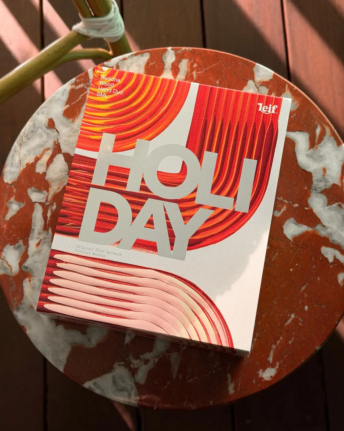
Leif
Huge silver holiday type over vivid plotted paint curves

ACURE
Iridescent spectacle with practical, tightly ordered type

Bask
sunny yellow with a playful turquoise signature

Beame
Orange bubble lettering, pink mascot, clear product badge

Bomba Curls
tropical foliage gathered around a bold yellow nameplate

Bread Beauty Supply
bubblegum pumps and a fat black wordmark

Cut By Fred
Orange gel, cropped geometry and bold bilingual utility

Dune Suncare
Coral bottle with striped vertical identity and small left-aligned copy