
Photography: Bomba Curls official photography. Images belong to their respective owners.
Bomba Curls

tropical foliage gathered around a bold yellow nameplate
Forbidden Hair Mask turns a broad treatment jar into a compact tropical poster. Pink flowers and bright green leaves sit on a dark wrap, while a saturated yellow circle gives the condensed product name a stable centre. The white lid provides a strong horizontal pause above the busy artwork. A small brand mark leads into the title, then ingredient wording, a script descriptor and volume complete the front. This study reads the selected photographed label rather than treating its scenery or current website claims as part of the physical package.
- Hair
- Light pack
- Botanical
- Bold typographic
- Maximalist pattern
About this study
Forbidden Hair Mask jar in the approved wet botanical photograph, with the shown 6.0 fl oz / 170 mL label. Current website ingredient emphasis is not substituted for photographed copy.
Sources & evidence · Reviewed 2026-10-19Color Palette
Approximate colours interpreted from photography. These are screen references, not official brand colours or print specifications.
Pack body
Pale white lid
#EBEEEB
Approximate closure colour affected by cool scene reflections. Water droplets are not an intrinsic package texture.
Label
Deep near-black ground
#16180F
Approximate dark printed field behind the foliage. Clear-looking margins above and below indicate this should not automatically be called the jar-body colour.
Accent
Vivid yellow circle
#F3DA18
Approximate central nameplate colour; a high-contrast area that protects the title from surrounding artwork.
Bright botanical green
#24B77F
Approximate printed foliage, separate from the darker photographic leaves behind the jar.
Petal pink
#E999AF
Approximate printed flowers and related footer lettering; it balances the green without becoming the main title field.
Typography
Suggested visual alternatives, not confirmed brand typefaces. Any scale below is an illustrative estimate.
A small Bomba Curls mark sits above the yellow circle. DOMINICAN forms a modest top line inside it, followed by the much larger, tightly stacked FORBIDDEN HAIR MASK title. Narrow heavy characters fit the short circular field without becoming a wide horizontal banner. A smaller ingredient line sits below. Outside the circle, a pink script descriptor adds a softer voice before the volume. The system is busy, but each voice occupies a specific zone.
Fonts
Condensed title alternative
Oswald
- Looks like
- Oswald for a tall compact title
- Type
- Condensed sans serif
- Weight
- Bold
- Case
- Uppercase
- Tracking
- Tight to normal without touching letters
- Fallback
- Arial Narrow, sans-serif
Build a strong product title within a compact shape. Break lines around meaning and maintain an inner margin rather than forcing long words against the badge edge.
Utility alternative
DM Sans
- Looks like
- DM Sans for short supporting lines
- Type
- Low-contrast sans serif
- Weight
- Regular and Medium
- Case
- Uppercase or sentence case by role
- Tracking
- Normal
- Fallback
- Arial, sans-serif
Use for ingredient references, product category and volume, keeping these quieter than the title. Test the smallest text on the actual curved container.
Script descriptor alternative
Courgette
- Looks like
- Courgette for a flowing secondary accent
- Type
- Informal script
- Weight
- Regular
- Case
- Title case
- Tracking
- Natural connected rhythm
- Fallback
- cursive
Reserve for one short secondary phrase on a new design. Avoid copying the photographed wording or using script for essential instructions.
Structure & Proportions
Visual proportions and finish previews are illustrative. Confirmed construction details and uncertainties are distinguished in the study notes.
Proportions
| Purpose | Value | Preview |
|---|---|---|
| Wide format | The jar is broad relative to its visible height, so the label needs to work horizontally around a curved surface rather than as a tall bottle panel. | — |
| Central anchor | The yellow circle occupies the central face, with enough dark space around it for flowers and leaves to remain distinct. | — |
| Lid versus label | The white closure forms a thick horizontal upper band, providing an unprinted break above the saturated artwork. | — |
| Side information | Pale copy panels begin toward the turning edges. They are visibly separate from the main illustration, but their complete widths are not measured. | — |
Shapes
| Element | Value | Preview |
|---|---|---|
| Jar | Broad low cylinder with a wide circular lid. | |
| Nameplate | Yellow circular field enclosing the main product text. | |
| Botanical artwork | Flat stylised leaf and flower silhouettes cropped by the wrap edges. | |
| Side copy fields | Pale vertical panels at the left and right turning edges. |
Finishes
Reflective staged appearance
Droplets on lid and body; this is photographic wet styling, not a verified permanent coating. · gloss
Flat-colour graphics
Foliage, flowers and name circle; print method is unverified. · matte
Formats and materials
| Formats | Selected broad cylindrical treatment jar, front marked 6.0 fl oz / 170 mL. |
| Materials | Jar, lid and label materials are not verified in the official source. Transparent-looking margins do not by themselves establish glass or a particular plastic. |
| Closures | A broad white lid spans the jar width and has a smooth visible sidewall. The closed photograph does not reveal threading, liner, seal or the interior. Its large diameter provides a clear structural contrast to the lower wrap but does not establish a specific closure mechanism. |
| Decoration | Bright foliage and flowers arranged around a central yellow circle., Condensed black product title and small brand mark., Pale side information fields visible at the edges of the wrap. |
Front Panel
Schematic reading order. The diagram’s zone heights do not represent measured artwork proportions.
A dark wrap contains a distinct central identification zone and larger decorative forms toward the edges. The yellow circle establishes a reading island within the artwork. The brand mark sits above it, a script phrase below it, and volume along the base. Pale side panels keep dense information visually separate from the central poster-like composition.
| Zone | Content |
|---|---|
| Small masterbrand | Bomba Curls mark sits above the yellow circle rather than competing with the larger product title. |
| Yellow identity circle | DOMINICAN above the stacked FORBIDDEN HAIR MASK title, with a smaller ingredient-oriented line below. |
| Botanical perimeter | Green foliage and pink flower shapes frame the central text and continue toward the curved sides. |
| Lower descriptor | A pink script line identifies an intense curl-hydration treatment in the photographed wording. This is a packaging observation, not an independently verified benefit. |
| Volume and side details | The base states 6.0 fl oz / 170 mL. Narrow pale text areas turn away at both sides; complete copy is not reconstructed. |
Range System
Only this selected mask jar is visually studied. No universal Bomba Curls colour code or fixed badge size is asserted. The transferable principle is to use a stable high-contrast text field within expressive botanical artwork, adapting the field and typography to each future format.
- Selected mask: circular yellow identification against dark foliage graphics.
- Interpretation: a taller bottle would need a different relationship between badge and title rather than stretching the jar artwork vertically.
- Interpretation: keep product function readable when changing decorative colours; illustration alone cannot distinguish a mask from another treatment.
Back of Pack & Shelf
The photograph reveals only partial pale side panels. Some instruction-like text is visible, but the full reverse, ingredient panel, barcode and manufacturing code cannot be located or transcribed reliably. The website provides directions and ingredients separately; that is not a physical label map.
- Inspect the complete wrap before assigning copy or regulatory areas.
- Keep any original formula claims verified independently of the reference artwork.
- Reserve a clear information zone that remains readable on the curved side rather than squeezing everything into the front circle.
On shelf
Interpretation: the white lid and yellow circle form two simple recognition anchors within a detailed scene. The condensed title could remain readable at smaller sizes than a fine script title, while the botanical perimeter provides character. A new system should test how much detail survives shelf distance and ensure that side copy remains accessible. No retail or handling study was consulted.
Imagery
The jar is surrounded by large dark leaves and orange tropical flower shapes, with droplets across the set and a bright turquoise surface below. The photographic greenery extends the printed botanical idea into the environment, while the yellow circle and white lid keep the package identifiable. The turquoise ground dominates parts of the image but is not a major printed pack colour. Wet styling suggests freshness and richness visually; it does not prove water resistance, coating durability or product performance.
Guidelines
Editorial principles for an original design brief, not official brand guidelines.
Do
- Protect a busy label with one clearly bounded high-contrast title zone.
- Assign condensed, utility and script type to separate jobs.
- Use pale side panels for dense information when the front is expressive.
- Separate wet photographic styling from permanent surface finishes.
Don't
- Do not mistake the dark wrap for a verified dark jar material.
- Do not import the turquoise scene ground into the core pack palette.
- Do not reproduce Bomba Curls lettering, artwork or benefit claims.
- Do not infer a screw thread, seal or liner from the closed lid.
Sources & evidence
How this study was built
edition · Sourced fact
Official page confirms the product and 6 fl oz format; the selected front shows its own ingredient wording.Bomba Curls — Forbidden Hair Mask, official product and photographystructure · Visual observation
White lid, broad jar and transparent-looking margins surround a dark wrap; substrate is unknown.Bomba Curls — Forbidden Hair Mask, official product and photographytypography · Visual observation
Condensed title, smaller utility text and script footer occupy separate visible zones.Bomba Curls — Forbidden Hair Mask, official product and photographylabel · Visual observation
Yellow circle anchors the title within botanical graphics, with pale side-copy fields.Bomba Curls — Forbidden Hair Mask, official product and photographypalette · Visual observation
Dark ground, yellow, green, pink and pale lid are pack colours; turquoise scene ground is excluded.Bomba Curls — Forbidden Hair Mask, official product and photographyimagery · Visual observation
Water droplets and surrounding tropical props belong to the selected shoot, not verified surface technology.Bomba Curls — Forbidden Hair Mask, official product and photographyrange · Editorial interpretation
High-contrast nameplate within expressive artwork is a transferable design principle, not a documented brand-wide rule.
What remains unverified
- Jar, lid, liner and label materials are unverified.
- Original fonts, printing technology and coating cannot be established from wet photography.
- Only partial side copy is visible; reverse, base and open closure are unseen.
- No efficacy, hair-growth or environmental claim is independently assessed in this design study.
Give your AI
packaging taste
Give your design or image tool a packaging study: palette, type, structure, front panel and principles for an original brief.
Export this styleFree with an email. PACK.md works in Claude, ChatGPT, Cursor and image tools.
More like this
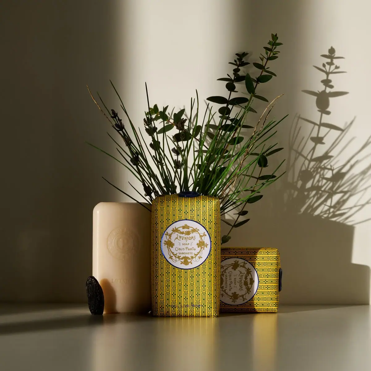
Claus Porto
Golden geometric wrapping around a pale floral medallion
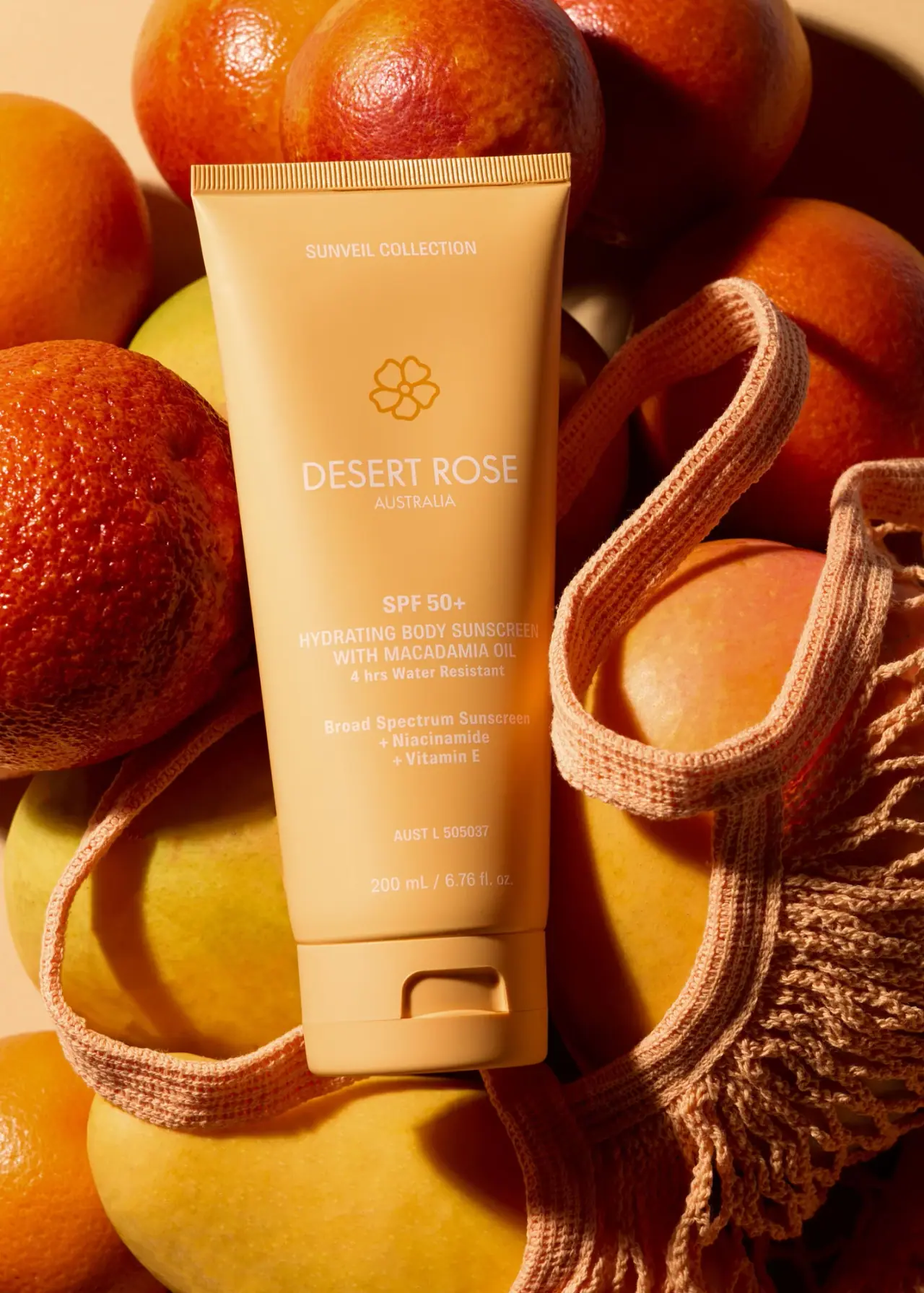
Desert Rose Australia
Apricot sunscreen tube with white type and ochre flower
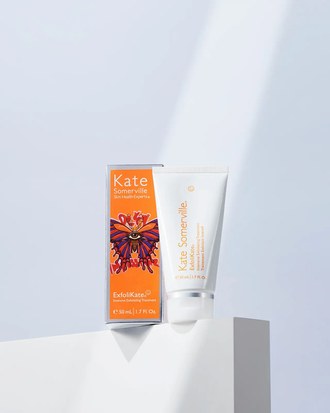
Kate Somerville
Orange artist carton beside a clean white vertical-text tube
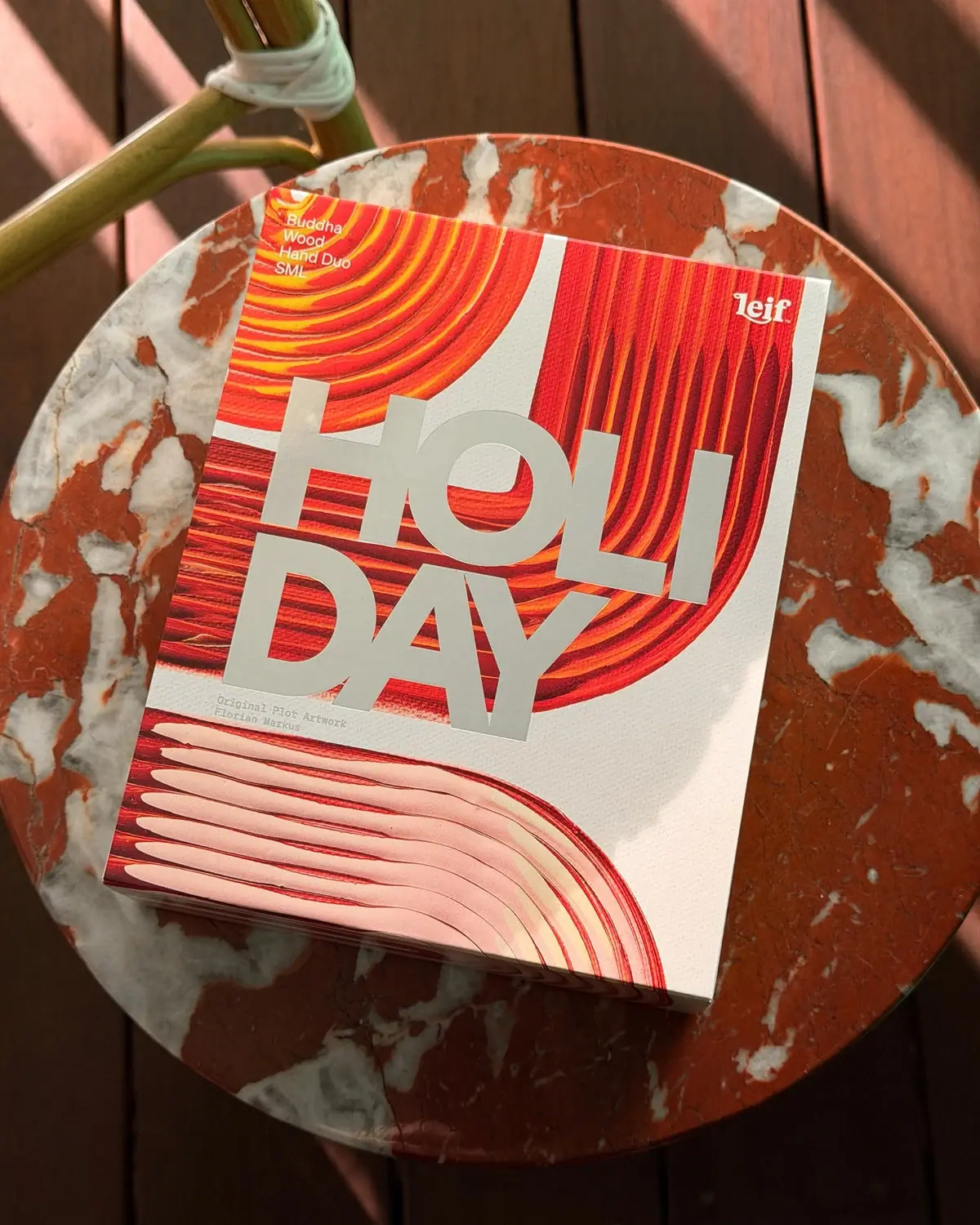
Leif
Huge silver holiday type over vivid plotted paint curves
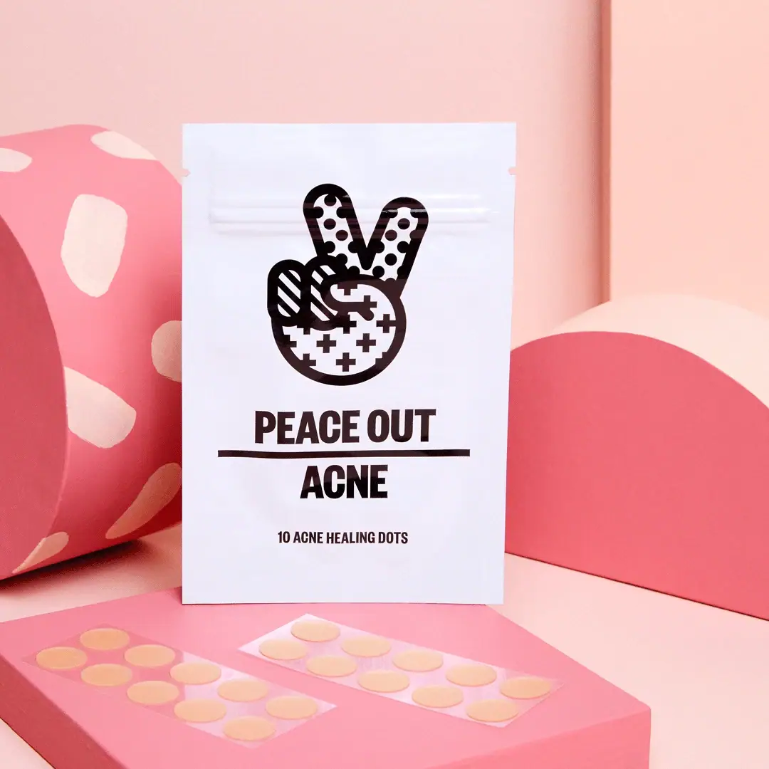
Peace Out Skincare
Patterned peace hand over forceful black pouch typography
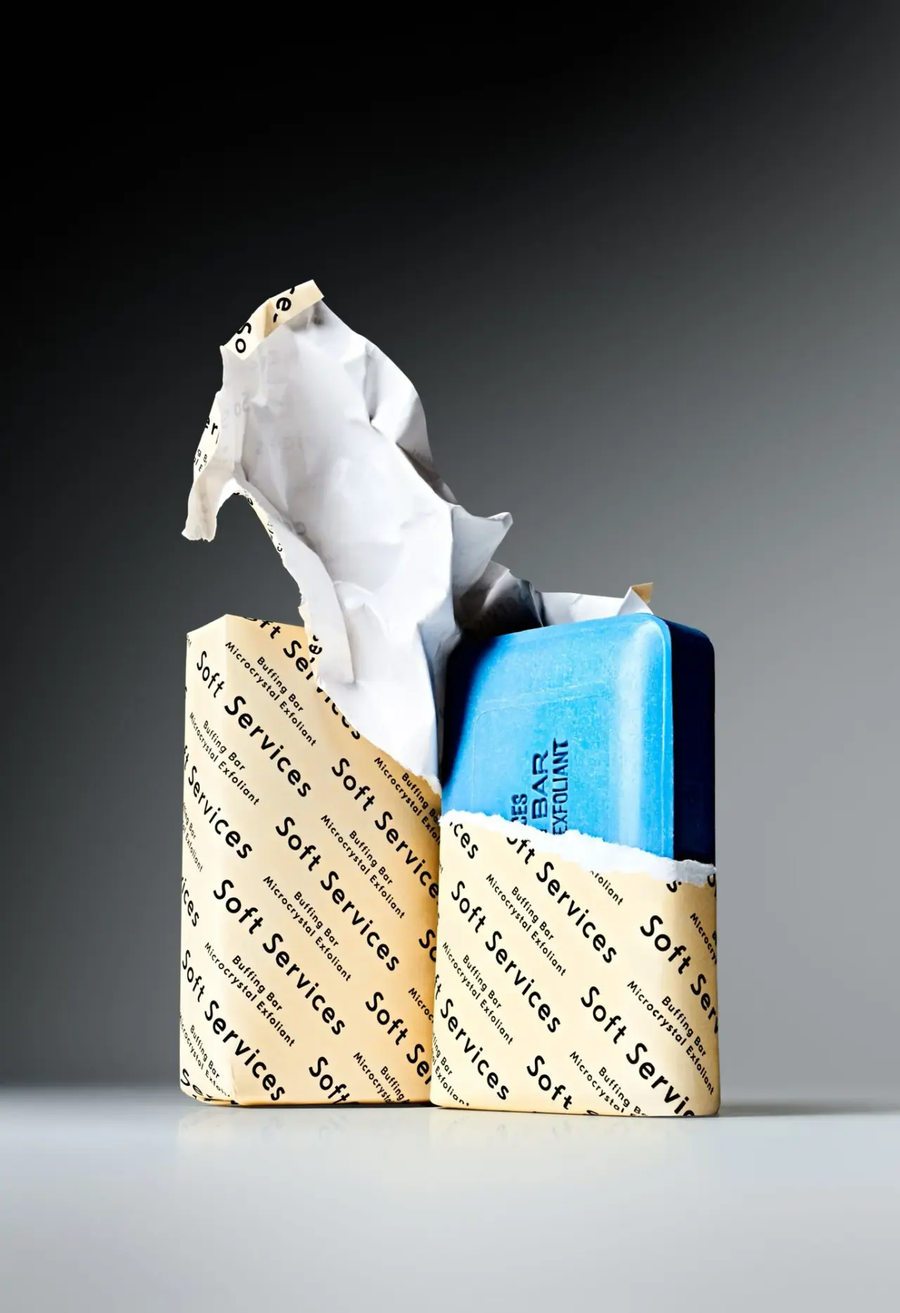
Soft Services
Diagonal cream paper type revealing a vivid blue bar
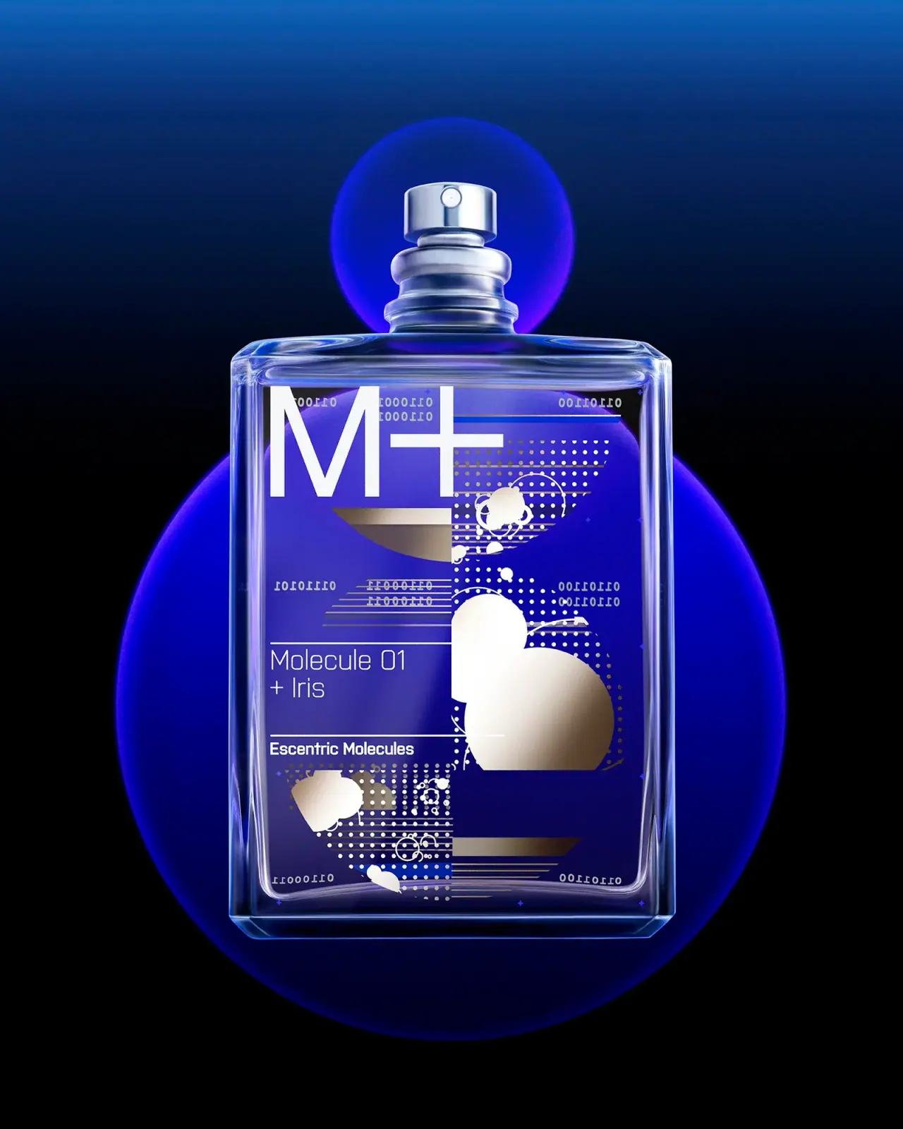
Escentric Molecules
Clear rectangular fragrance with giant symbol and layered coded graphics
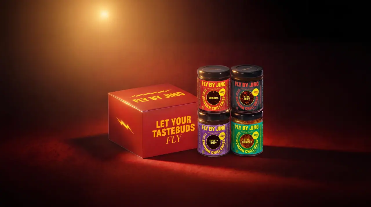
Fly By Jing
sichuan street poster, turned up loud