Photography: Leif official photography. Images belong to their respective owners.
Leif

Huge silver holiday type over vivid plotted paint curves
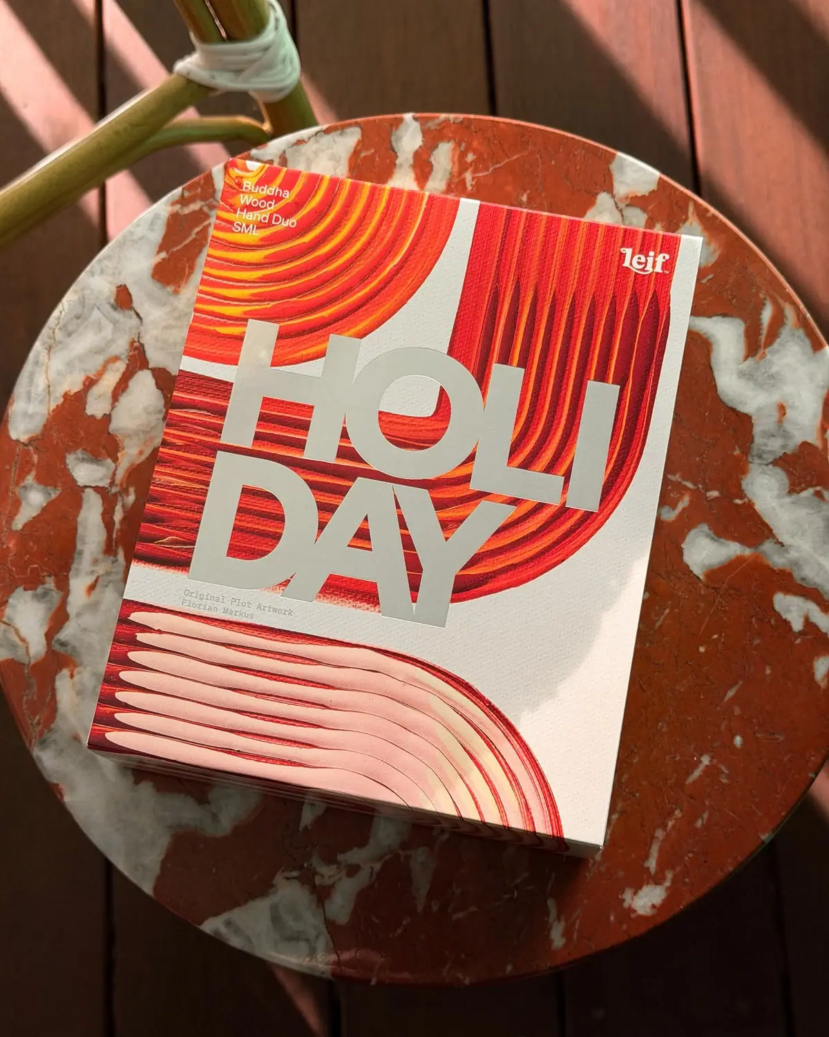
The selected Buddha Wood Hand Duo SML gift pack turns its outer face into a cropped art composition. Red, orange and yellow brush bands curve across a cream field, interrupted by enormous pale HOLI / DAY lettering. Small set information and the Leif mark occupy the upper corners, while an artist credit sits below the headline. The official Holiday '26 story connects these images to Florian Markus's Brush Plot paintings. This study concerns that decorative outer package, not the unseen hand-care containers inside.
- Body & bath
- Light pack
- Bold typographic
- Maximalist pattern
- Playful colour
About this study
Selected Holiday '26 Buddha Wood Hand Duo SML outer gift pack with Florian Markus art. Inner containers, reverse and exact board/printing construction not inspected.
Sources & evidence · Reviewed 2026-10-19Color Palette
Approximate colours interpreted from photography. These are screen references, not official brand colours or print specifications.
Label
Cream art ground
#E9E4D4
Light background gives the cropped painted bands room to turn and keeps the composition from becoming an uninterrupted red field.
Ink
Vermilion bands
#D93D23
Dominant printed-art color, with darker red grooves and brighter edges creating dimensional-looking movement.
Silver-looking headline
#C4C6B7
Large cool pale capitals sit over the warm artwork. Their photographed appearance does not by itself verify foil, metallic ink or embossing.
Accent
Orange-yellow streaks
#F49A29
Thin warm highlights within the upper curves create fine rhythm rather than separate information zones.
Pale blush sweep
#E8B9A5
Broad lower curved marks soften the red/orange intensity and leave a different scale of movement near the base.
Typography
Suggested visual alternatives, not confirmed brand typefaces. Any scale below is an illustrative estimate.
HOLIDAY dominates, broken into HOLI and DAY on two tight lines. The heavy geometric sans capitals stretch across the central artwork, creating a second graphic layer rather than a conventional small product title. The set name is a compact upper-left block; the white Leif wordmark balances it at upper right. A much smaller artist credit sits below the headline, separate from both. This hierarchy makes occasion the first read, then maker and set, with attribution as a close-reading detail.
Fonts
Oversized occasion headline
Archivo Black
- Looks like
- Heavy geometric display sans
- Type
- Grotesque display sans-serif
- Weight
- Regular
- Case
- Uppercase
- Tracking
- Tight optical spacing
- Fallback
- Arial, sans-serif
Use for an original short celebration word at very large scale. Check counters and line breaks over active artwork, preserving enough open space that the letters do not dissolve into the image.
Set identity and attribution
IBM Plex Sans
- Looks like
- Neutral compact information sans
- Type
- Grotesque sans-serif
- Weight
- Regular, Medium
- Case
- Title case and compact supporting text
- Tracking
- Natural spacing
- Fallback
- Arial, sans-serif
A proposed readable alternative for corner identifiers and small credits. Keep the artist credit distinct from product specifications and avoid pretending this family is the source's exact small type.
Structure & Proportions
Visual proportions and finish previews are illustrative. Confirmed construction details and uncertainties are distinguished in the study notes.
Proportions
| Purpose | Value | Preview |
|---|---|---|
| Poster-like face | The broad rectangular front gives the artwork and seasonal word a display surface much larger than an individual bottle label. | — |
| Headline mass | The two-line occasion word occupies a substantial central area, with near-touching large letterforms crossing both colored and cream regions. | — |
| Corner information | Set and maker details stay small near opposite upper corners, providing orientation without requiring a dedicated header strip. | — |
| Art scale changes | Tight concentric bands at upper left shift into longer vertical/curved marks and a broad lower sweep, creating several viewing scales within one face. | — |
Shapes
| Element | Value | Preview |
|---|---|---|
| Gift face | Rectangular closed outer panel with a narrow lower edge visible in perspective. | |
| Painted paths | Concentric and sweeping curved bands with fine parallel pigment marks. | |
| Headline block | Oversized two-line capitals crossing the art without a separate enclosing panel. | |
| Small identifiers | Compact independent blocks anchored near corners and below the headline. |
Finishes
Textured cream appearance
Unprinted-looking gaps around artwork; physical stock and reproduced texture are not fully separable from this photo. · uncoated
Silver-looking display letters
Large HOLI / DAY word; optical appearance only, with no confirmed metallic application method. · metallic
Formats and materials
| Formats | Closed rectangular outer gift package labeled Buddha Wood Hand Duo SML; official collection identifies hand wash and hand balm as the paired products |
| Materials | The official collaboration feature describes decorative sleeves carrying photographed artwork. Exact board stock, weight, coating, adhesives and internal support are not established for this selected object., The cream field has a visibly textured appearance, while the painted bands contain their own reproduced texture. The image cannot reliably separate all physical paper relief from texture embedded in the artwork. |
| Closures | The outer package is closed, with a narrow lower edge visible in perspective. This view does not reveal whether the complete assembly opens through a drawer, lid, sleeve removal or tuck flap. No interior tray, securing insert or bottle closure is inspected. The front's SML designation identifies its size tier without providing measured external dimensions. |
| Decoration | Cropped curved bands from an attributed artwork, Oversized two-line seasonal headline, Upper-left set and size-tier information, Upper-right maker mark, Small artist attribution below the headline |
Front Panel
Schematic reading order. The diagram’s zone heights do not represent measured artwork proportions.
The whole front acts as an art-and-type field. The artwork reaches the edges, while large occasion letters overlay it directly rather than sitting in a quiet rectangle. Small upper-corner blocks provide the practical identifiers. Below the headline, the credit lies in a comparatively calm cream passage, allowing it to remain discoverable at close range. This balances a strongly expressive first impression with a few fixed reading points, although the smallest white copy can be affected by the artwork behind it.
| Zone | Content |
|---|---|
| Upper-left contents identity | Buddha Wood Hand Duo SML appears as a short stacked block. The photographed size tier should not be confused with another duo configuration listed online. |
| Upper-right maker | The white Leif mark remains compact and independent of the huge seasonal word. |
| Central occasion | HOLI / DAY spans the middle in cool pale heavy capitals, giving gifting occasion more scale than the product category. |
| Artist credit | The Florian Markus attribution sits below the large word toward the left, not in the upper corners. |
| Artwork field | Layered red/orange curves and the pale lower sweep continue around the headline and beyond the visible panel edges. |
Range System
The official Holiday '26 feature explains that four paintings were photographed and cropped across eight limited gift sets. This supports a collection-level principle of related source art with distinct crops. It does not prove that every color belongs to a particular scent or that all sets share the selected SML construction. The current gifting page contains multiple Buddha Wood duo configurations, making clear set identification especially important.
- Use different crops of commissioned original art to create family resemblance without repeating an identical face.
- Keep the exact set and size tier in a predictable location when the seasonal headline dominates.
- Carry artist attribution through every relevant adaptation, while separately validating each format's construction and contents.
Back of Pack & Shelf
Reverse and interior are not visible. The front identifies the set and artist but does not show the complete contents list, ingredient information or opening instructions.
- Inspect the selected SML reverse rather than substituting another duo size.
- Obtain an open view before documenting tray or sleeve mechanics.
- Keep art attribution distinct from regulatory and product information in any original adaptation.
On shelf
Interpretively, the immense occasion word and warm art can give a gift set impact at a distance, while the small maker and contents blocks handle closer selection. The composition prioritizes celebration over quick ingredient or format reading. For an original system, inspect the corner text at thumbnail scale and under glare from the pale headline. A dynamic campaign scene is useful for mood, but a straight-on view is still needed to evaluate alignment and practical product differentiation.
Imagery
The closed pack rests diagonally on a round red-and-white marbled surface, with a green chair frame and warm wooden boards behind it. Strong directional light creates shadows that make the flat printed face feel like a physical gift object. The tabletop repeats the artwork's red/cream family but has a different irregular mineral pattern. Those exterior textures should not be sampled as additional printed colors or confused with the package's own photographed paint. No bottles are visible in this scene.
Guidelines
Editorial principles for an original design brief, not official brand guidelines.
Do
- Attribute commissioned artwork accurately.
- Distinguish artwork creation from package printing.
- Keep set and size tier readable despite a large occasion word.
- Use quiet art passages for small credits.
- Study the exact outer edition before inferring inner formats.
Don't
- Do not call the credit an upper-corner label.
- Do not assign all Buddha Wood duo contents to the SML image.
- Do not infer foil or emboss from silver-looking letters.
- Do not treat visible paint ridges as proof of physical paint on each pack.
- Do not copy the artist's composition and seasonal lettering arrangement.
Sources & evidence
How this study was built
edition · Sourced fact
Official feature identifies Holiday '26 and Florian Markus collaboration; collection confirms Buddha Wood hand-care duos.Leif — Gifting Collection · Leif — Plot Twist: Holiday '26 artist Florian Markusstructure · Visual observation
Closed rectangular outer face is marked SML; inner containers are absent.Leif — Gifting Collectiontypography · Visual observation
Huge two-line occasion capitals contrast with small corner identifiers and lower artist credit.Leif — Gifting Collectionlabel · Visual observation
Artist attribution sits below the headline; Leif mark and set name occupy opposite upper corners.Leif — Gifting Collectionimagery · Sourced fact
Official feature describes paintings photographed wet and cropped into decorative gift sleeves; it does not specify package printing processes.Leif — Plot Twist: Holiday '26 artist Florian Markuspalette · Visual observation
Red/orange artwork and cool pale letters belong to the pack; marble and wood belong to the set.Leif — Gifting Collectionrange · Sourced fact
Four artworks were translated across eight limited gift sets, supporting related crops without establishing a universal scent-color code.Leif — Plot Twist: Holiday '26 artist Florian Markus
What remains unverified
- Exact product URL inaccessible; current collection includes multiple duo configurations.
- Interior, reverse and closure construction unseen.
- Paper stock, foil, emboss and print method unverified.
- Original fonts and dimensions unknown.
- Art texture cannot all be separated from substrate texture in this photo.
Give your AI
packaging taste
Give your design or image tool a packaging study: palette, type, structure, front panel and principles for an original brief.
Export this styleFree with an email. PACK.md works in Claude, ChatGPT, Cursor and image tools.
More like this
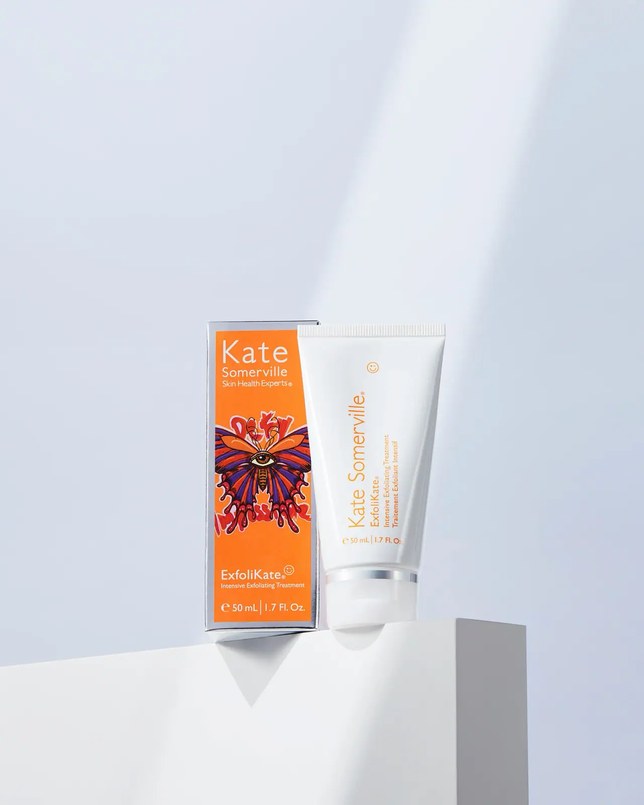
Kate Somerville
Orange artist carton beside a clean white vertical-text tube

ACURE
Iridescent spectacle with practical, tightly ordered type

Bask
sunny yellow with a playful turquoise signature

Beame
Orange bubble lettering, pink mascot, clear product badge

Bomba Curls
tropical foliage gathered around a bold yellow nameplate

Bread Beauty Supply
bubblegum pumps and a fat black wordmark

Cut By Fred
Orange gel, cropped geometry and bold bilingual utility

Dune Suncare
Coral bottle with striped vertical identity and small left-aligned copy