Photography: Koala Eco official photography. Images belong to their respective owners.
Koala Eco

Naturalist botanical drawing on a generous white household label
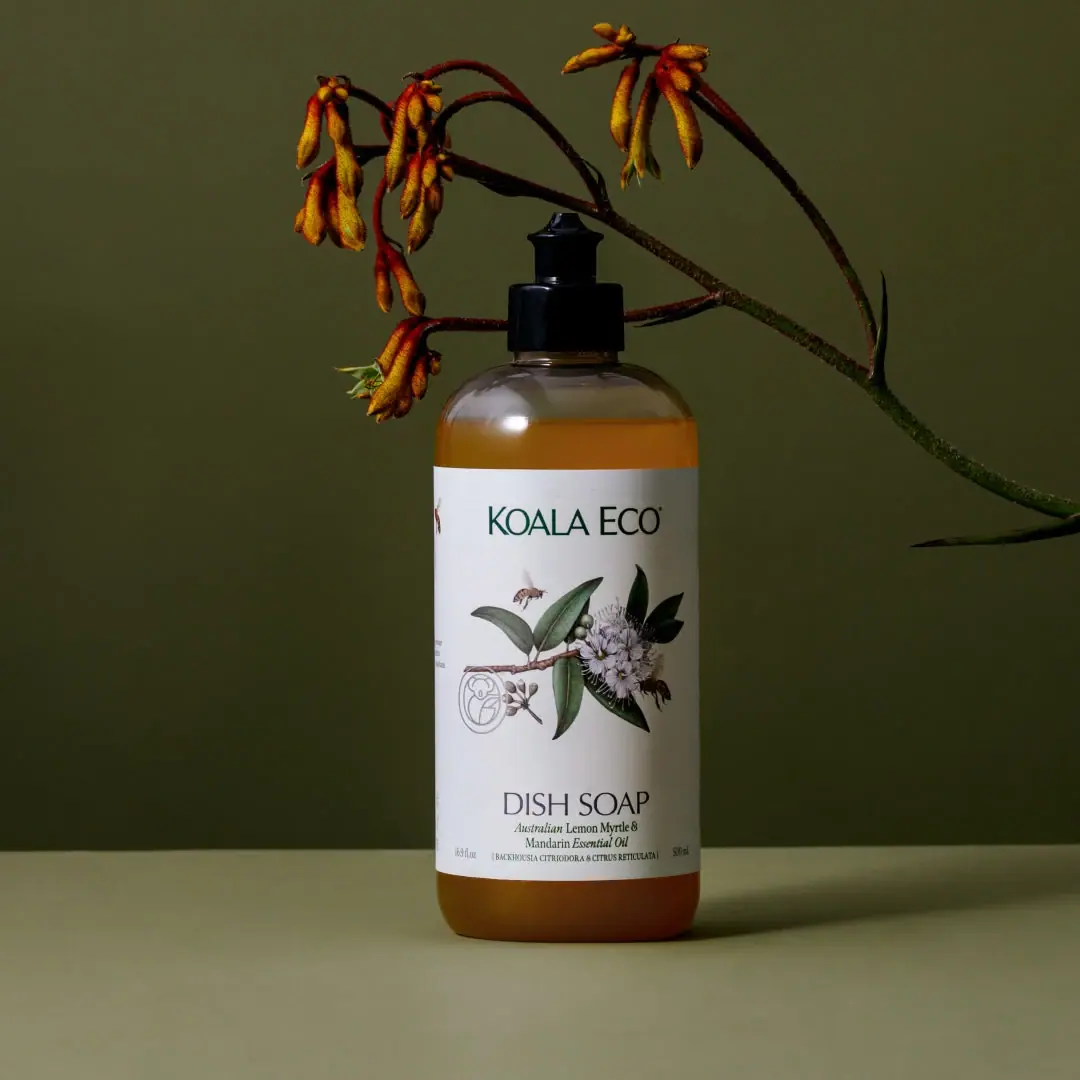
Lemon Myrtle & Mandarin Dish Soap places a detailed flowering branch and small insects between a restrained upper brand name and a clear lower product descriptor. A large white wrap gives the illustration space while golden liquid remains visible above and below. The simple bottle and short dark dispensing closure keep attention on the label rather than hardware. This study examines the selected 16.9 oz presentation, including the specific cap visible in its official photograph; it does not assume that other Koala Eco formats share the same dispenser.
- Cleaning & laundry
- Light pack
- Botanical
- Heritage label
About this study
Selected 16.9 oz Lemon Myrtle & Mandarin Dish Soap bottle in official photography. The short dark dispensing tip is described neutrally because its mechanism is not established; analysis covers visible front only.
Sources & evidence · Reviewed 2026-10-19Color Palette
Approximate colours interpreted from photography. These are screen references, not official brand colours or print specifications.
Pack body
Golden visible liquid
#AA681B
Warm contents visible through exposed bottle areas. This is not proof of an amber-tinted vessel or a printed package accent.
Label
Botanical-paper white
#EEEDE7
Approximate opaque label ground. The name describes its visual character, not verified paper stock.
Ink
Deep leaf green
#244B3C
Brand and darker botanical elements provide a restrained naturalist register without saturating the full bottle.
Dark charcoal
#272B24
Lower typography and black-looking dispensing closure; reflected light can make these appear different in the scene.
Accent
Soft leaf gray-green
#819386
Lighter leaf shading within the illustration gives depth and variation at close viewing distance.
Typography
Suggested visual alternatives, not confirmed brand typefaces. Any scale below is an illustrative estimate.
The upper brand uses relatively light, distinctive uppercase lettering with open space around it. Dish Soap appears much lower in larger serif capitals, followed by a smaller italic scent descriptor and a tiny botanical-name line near the base. The central illustration is given a territory of its own between maker and function. This ordering lets decorative detail coexist with practical household identification instead of reducing the function to a minor caption.
Fonts
Brand identity
Tenor Sans
- Looks like
- Light open capitals with custom details
- Type
- Humanist display sans-serif
- Weight
- Regular
- Case
- Uppercase
- Tracking
- Open and optically balanced
- Fallback
- Arial, sans-serif
Alternative for an independent brand name above a botanical plate. Keep the identity short and calm; do not reconstruct the existing letter combinations or custom terminals.
Product function
Libre Baskerville
- Looks like
- Restrained classical serif capitals
- Type
- Transitional serif
- Weight
- Regular
- Case
- Uppercase
- Tracking
- Normal to slightly open
- Fallback
- Georgia, serif
Proposed for a direct household-task name beneath the illustration. Its serif structure can provide warmth without requiring a heavy display font.
Scent descriptor
Lora
- Looks like
- Small narrow italic serif
- Type
- Contemporary serif
- Weight
- Regular Italic
- Case
- Title case
- Tracking
- Normal; avoid spreading italic letters excessively
- Fallback
- Georgia, serif
Alternative for a compact two-line fragrance descriptor. Use the change to italic as a secondary voice, while keeping size large enough to remain readable against white.
Structure & Proportions
Visual proportions and finish previews are illustrative. Confirmed construction details and uncertainties are distinguished in the study notes.
Proportions
| Purpose | Value | Preview |
|---|---|---|
| Label coverage | The white wrap covers most of the straight body but leaves an exposed shoulder and lower liquid window. No precise percentage is measured. | — |
| Illustration field | A broad middle interval is reserved for the branch, allowing leaves and blossoms to spread without colliding with large text. | — |
| Front alignment | Major text elements share a centered axis, while the branch creates organic asymmetry within it. | — |
| Closure emphasis | The short dark fitting is small relative to the body, acting as a quiet top anchor rather than an elaborate feature. | — |
Shapes
| Element | Value | Preview |
|---|---|---|
| Bottle | Straight-sided body with rounded shoulders, a short neck and softened base corners. | |
| White wrap | Tall rectangular panel following the bottle curvature with a clean upper and lower edge. | |
| Small seal | Fine outlined circular mark beside the botanical drawing, supporting the heritage register without becoming the main logo. | |
| Dispensing tip | Narrow upright tip above a broad black base; opening mechanism unverified. |
Finishes
Visible-content vessel
Exposed shoulder and base around the white wrap; apparent liquid color must not be confused with verified vessel tint. · transparent
Quiet white label appearance
Main information panel; no coating or paper finish is established from the photo. · matte
Dark closure highlight
Small dispenser at the top, with a smooth reflective response. · gloss
Formats and materials
| Formats | Bottle with short dispensing closure; official 16.9 oz size, with 500 mL visible at the label edge |
| Materials | Koala Eco states that its bottles use 100% post-consumer recycled material. The extracted product page does not identify the resin or closure composition., Label substrate, adhesive and print process are unverified; the white panel is described by appearance. |
| Closures | The selected photo shows a short black cylindrical base with a narrower upright dispensing tip. It does not show the conventional long lateral nozzle of a standard pump. The exact opening action is not established, so this study uses the neutral term dispensing closure rather than assigning a pump, pull-top or twist mechanism. |
| Decoration | Upper green wordmark, Central naturalist-style flowering branch with insects and a small outlined seal, Lower serif product name, italic scent description and fine botanical nomenclature |
Front Panel
Schematic reading order. The diagram’s zone heights do not represent measured artwork proportions.
A naturalist illustration occupies the middle of a generous white label, framed by brand above and product function below. The structure is not a dense all-over botanical pattern: much of the white remains open, making the fine drawing feel like a specimen plate. Small botanical terms reinforce that register near the bottom without replacing the plain-language task name.
| Zone | Content |
|---|---|
| Maker | A single green wordmark high on the white field. Its moderate scale permits the detailed drawing to share attention rather than becoming a tiny supporting icon. |
| Botanical plate | A flowering leafy branch and small insects form a composed vignette. Fine tonal shading, thin stems and overlapping leaves supply depth without a colored background rectangle. |
| Task and scent | The serif Dish Soap line leads the lower group; a smaller italic descriptor names the scent beneath. This is a practical function-first hierarchy at the point where consumers need to identify the household use. |
| Fine baseline | Small botanical naming and capacities sit near the lower boundary. Some edge details curve away, so their complete arrangement cannot be reconstructed from the front. |
Range System
The official listing pairs the standard bottle with a larger refill. This supports a replenishment relationship, while the selected image establishes only one front-label composition. An original range could keep maker, illustration and task in stable zones while changing a verified botanical subject or scent descriptor. That proposed method is not proof of every Koala Eco label's rules.
- For an original kitchen-cleaner companion, keep the task name prominent enough to distinguish it from dish soap before the scent is read.
- For a larger refill, preserve the illustration's line clarity instead of automatically scaling all text and art in equal proportion.
- Use a new botanical drawing for a different scent only when its identity and relevance are supported; do not let decorative plants imply unverified ingredients.
Back of Pack & Shelf
Only the front and narrow edge fragments of the wrap are visible. Directions, ingredients, warning text and barcode placement remain undocumented. The source's bottle-material statements do not establish how disposal guidance is printed on the pack.
- Inspect a complete wrap before recording side-column organization.
- Do not infer closure recyclability from the recycled-content statement about bottles.
- Keep functional instructions distinct from the illustrative scent narrative in an original label plan.
On shelf
Interpretively, the broad white label makes this bottle easier to locate in a darker domestic setting, and the botanical image rewards close inspection. The plain task name remains essential because similar naturalist styling could otherwise suggest body care or fragrance. An original design should test whether the lower function is readable when the bottle sits below eye level and the detailed illustration occupies most of the visible face.
Imagery
The bottle stands against an olive ground beneath a curving branch with warm-colored flowers. That external botanical arrangement differs from the printed vignette and should not be used to identify the label's plant species. The dark set makes the white panel a bright central anchor, while warm liquid and a modest surface reflection connect the object to its surroundings.
Guidelines
Editorial principles for an original design brief, not official brand guidelines.
Do
- Give fine botanical art enough surrounding white space to remain legible.
- Make the household task clearer than the scent at the lower reading point.
- Separate observed closure geometry from an unverified mechanism name.
- Attribute recycled-content statements to the bottle specification supplied by the brand.
- Keep campaign plants and printed botanical subjects distinct in documentation.
Don't
- Do not call the selected closure a conventional pump without evidence.
- Do not infer amber glass from warm liquid visible through a bottle.
- Do not copy the botanical illustration, seal or wordmark.
- Do not fill the white label with an all-over pattern when the reference relies on open space.
- Do not extend the bottle's material claim automatically to its cap or label.
Sources & evidence
How this study was built
structure · Sourced fact
Official page offers 16.9 oz and a larger refill and states 100% post-consumer recycled bottles; no closure composition follows from that statement.Koala Eco USA — Lemon Myrtle & Mandarin Dish Soapstructure · Visual observation
The approved image has a short black base and upright narrow dispensing tip, without the clear lateral nozzle of a conventional pump.Koala Eco USA — Lemon Myrtle & Mandarin Dish Soaplabel · Visual observation
A broad white wrap separates upper maker, central botanical vignette and lower household-task naming.Koala Eco USA — Lemon Myrtle & Mandarin Dish Soaptypography · Visual observation
Lower serif task lettering leads a smaller italic scent descriptor; suggested fonts are alternatives.Koala Eco USA — Lemon Myrtle & Mandarin Dish Soappalette · Visual observation
White, leaf greens, dark text and visible golden liquid explain the object; olive background is excluded.Koala Eco USA — Lemon Myrtle & Mandarin Dish Soapimagery · Visual observation
External flowering branch and dark olive set frame the bottle but are not evidence of the printed plant species or formula.Koala Eco USA — Lemon Myrtle & Mandarin Dish Soaprange · Editorial interpretation
Stable task naming with varied botanical subjects is proposed guidance for an original family, not a verified universal label rule.
What remains unverified
- Dispensing action and internal closure components unverified.
- Brand states PCR bottle material, but exact resin, cap and label composition are not detailed in extracted source.
- Exact fonts, dimensions, label stock and illustration production method unknown.
- Reverse and complete wrap unseen; golden appearance may come from liquid rather than bottle tint.
Give your AI
packaging taste
Give your design or image tool a packaging study: palette, type, structure, front panel and principles for an original brief.
Export this styleFree with an email. PACK.md works in Claude, ChatGPT, Cursor and image tools.
More like this

Benamôr
Ornamental lilac medallion suspended above golden botanical oil
Burlap & Barrel
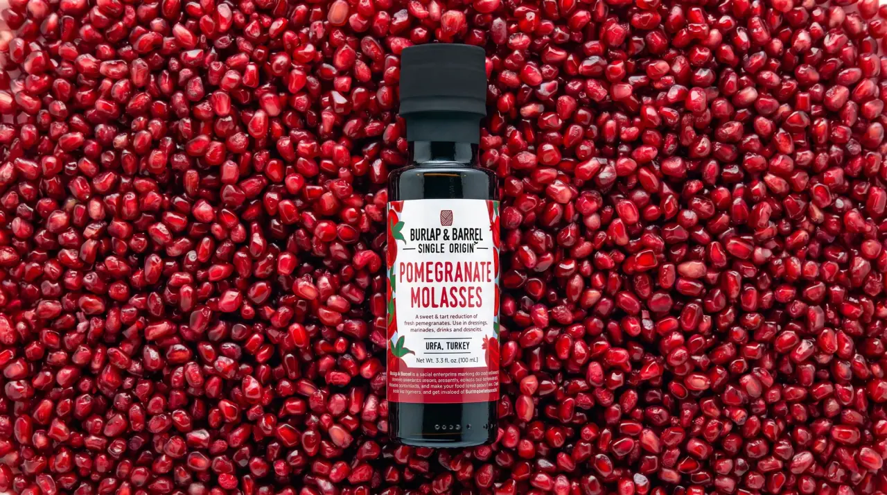
field-guide labels on clear spice jars
Claus Porto
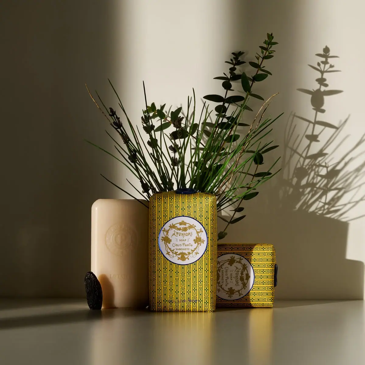
Golden geometric wrapping around a pale floral medallion
Flamingo Estate
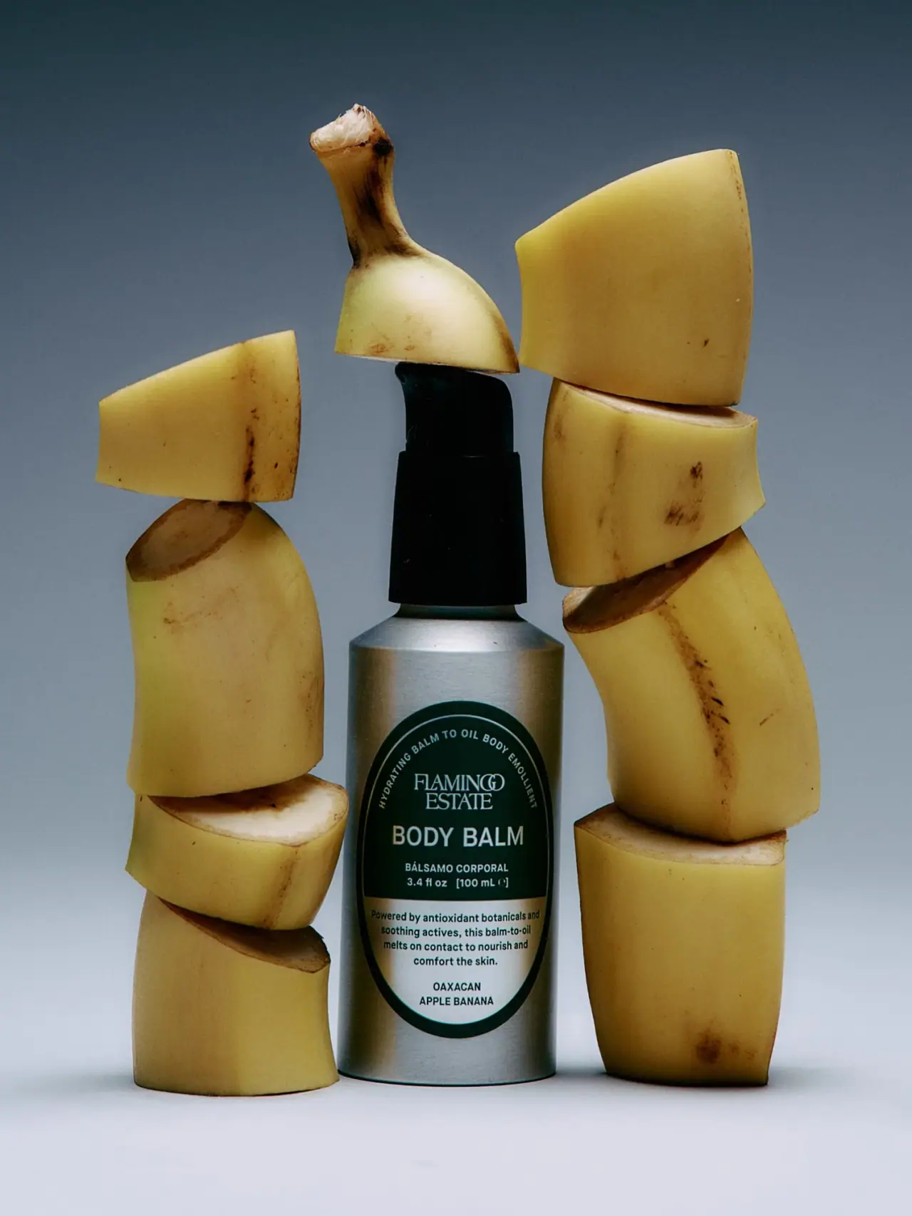
A green oval turns silver utility into botanical character
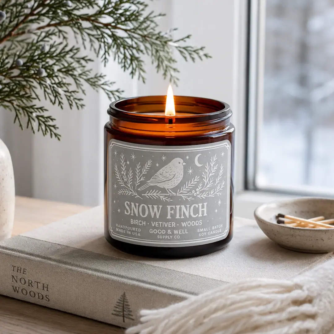
Good & Well Supply Co.
Pale winter bird illustration on a grey amber-jar label
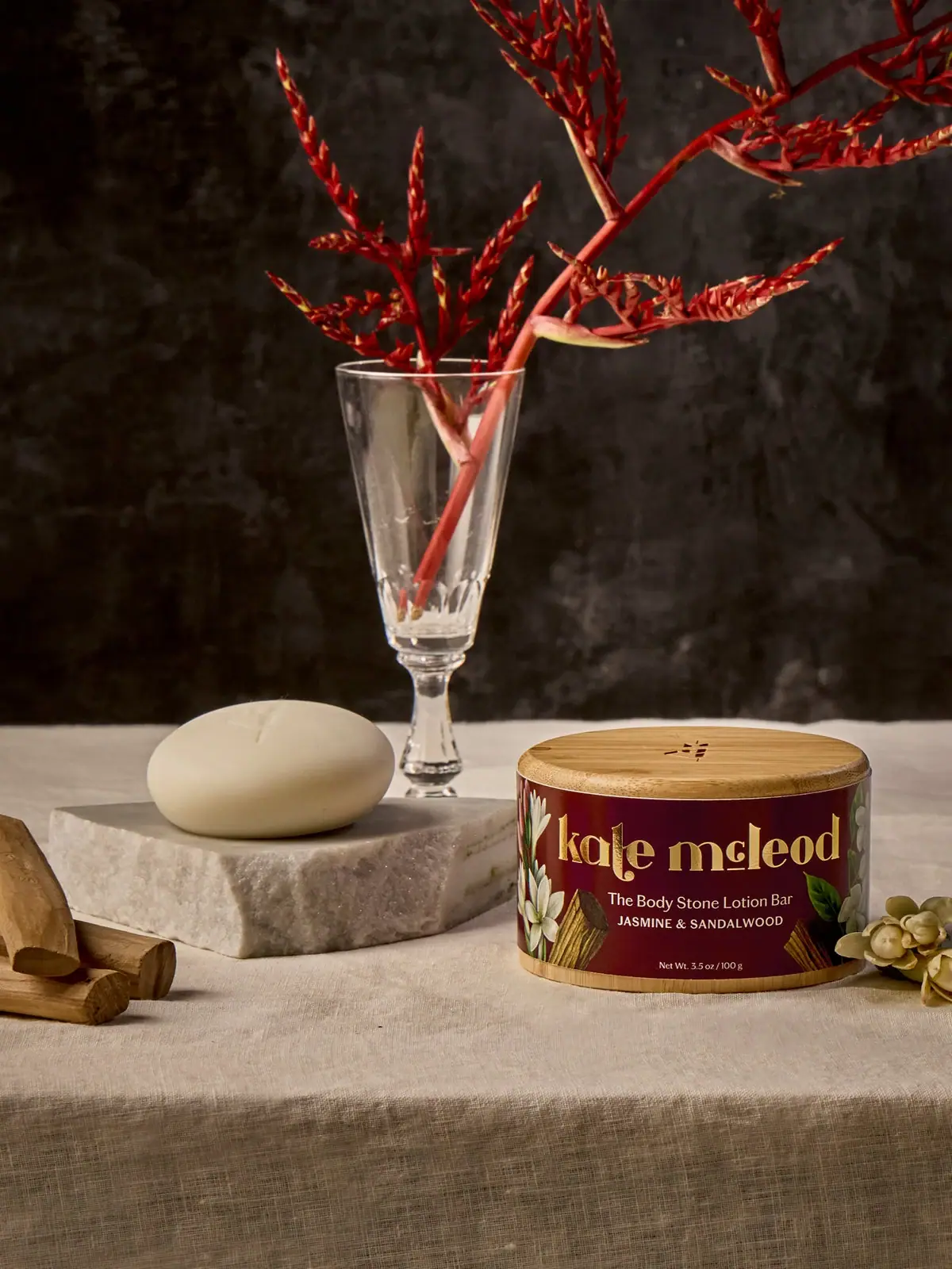
Kate McLeod
A burgundy botanical wrap around a reusable bamboo case
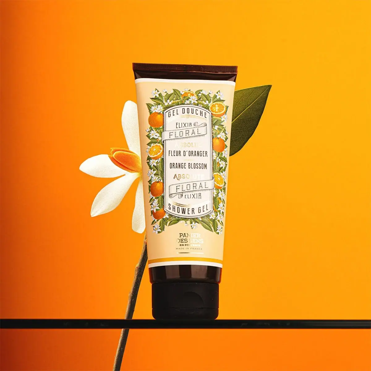
Panier des Sens
Botanical orange-blossom tube with a framed bilingual cartouche

Aerangis
a quiet numbered object, an intimate scent memory