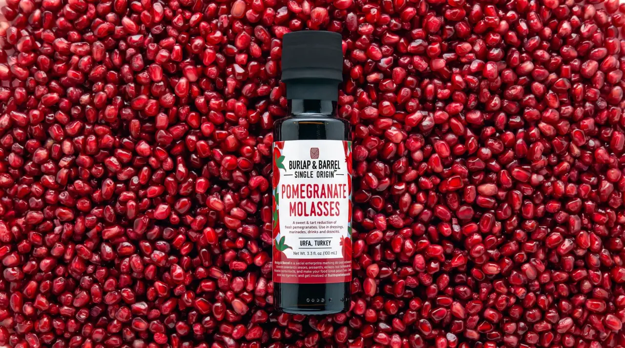
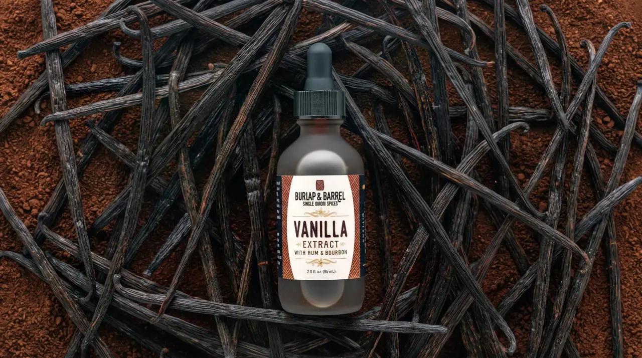
Campaign images © Burlap & Barrel, from burlapandbarrel.com
Burlap & Barrel

field-guide labels on clear spice jars
Burlap & Barrel puts every spice, sugar and honey in a clear glass jar so the ingredient becomes the pack colour, then wraps it in a paper label with an off-white centre panel (#f6f3ec) framed by product-specific illustration down both edges. The centre panel never moves: a small brick-red square logo, a condensed bold wordmark with 'Single Origin' between thin rules, a huge two-line condensed product name in a colour taken from the ingredient (oxblood #7a1c10 for chilis, orange #d0701c for honey, blue #2b4e8f for panela), a title-case descriptor and a line naming the growing region and country. The border artwork changes per product (chili-pod pattern, sugarcane stalks, flowering trees with animals), while narrow side strips carry tasting notes and the nutrition panel vertically.
- Pantry & sauces
- Light pack
- Heritage label
- Botanical
- Colour-coded range
Color Palette
Approximate colours interpreted from photography. These are screen references, not official brand colours or print specifications.
Pack body
Clear Jar
#e7e4dd
Clear glass jar wall; the spice, sugar or honey behind it supplies the actual pack colour
Label
Ledger White
#f6f3ec
Centre label panel behind the logo, wordmark, product name and origin line
Ink
Logo Brick
#9c2b22
Small square logo tile above the wordmark
Ledger Black
#2a2623
Wordmark, 'Single Origin' rules, descriptor, partner line and net weight
Accent
Tin Lid Silver
#c9c7c2
Ribbed metal screw caps on spice and sugar jars
Honey Lid Black
#24221f
Black lug caps on the honey jars
Range coding
Chili Oxblood
#7a1c10
Product name and the chili-pod pattern borders on ground chilis
Comb Orange
#d0701c
Product name and side strip on woodland honey and golden turbinado sugar
Cane Blue
#2b4e8f
Product name and globe icon on panela cane sugar
Origin Green
#2f6b2e
Reversed-out origin band on chili labels and leaf line work in the borders
Strip Violet
#5b4a8e
Vertical tasting-notes strip on the panela label
Typography
Suggested visual alternatives, not confirmed brand typefaces. Any scale below is an illustrative estimate.
The product name is loudest, stacked over two lines of condensed capitals in the ingredient colour across the middle of the panel. Above it the brand block is small and fixed (square logo, wordmark, 'Single Origin' between rules); below it a title-case descriptor ('Ground', 'Amber', 'Cane Sugar'), then the origin line and net weight.
Type scale
Estimated cap size as a share of the panel · Front panel of the 2 oz chili jar label, about 70 mm tall
product-name
13% · Regular · Headline
ANCHO CHILI
wordmark
5% · Bold · Display
FIELD & SACK
descriptor
4.5% · Regular · Body
Ground
single-origin
2.8% · SemiBold · Display
SINGLE ORIGIN
origin-band
2.6% · SemiBold · Label
HEIRLOOM CHILIS FROM OAXACA, MEXICO
tasting-notes
2.2% · Medium · Label
RAISIN · COCOA · SMOKE
Fonts
Display
Oswald
- Looks like
- Trade Gothic Bold Condensed No. 20
- Type
- Condensed bold grotesque
- Weight
- SemiBold, Bold
- Case
- Uppercase
- Tracking
- Normal to slightly tight
- Fallback
- Arial Narrow Bold, Impact, sans-serif
The wordmark under the square logo and 'SINGLE ORIGIN' set between two thin rules beneath it, always in Ledger Black.
Headline
Bebas Neue
- Looks like
- Knockout HTF Middleweight, Bebas Neue
- Type
- Tall condensed display sans with slightly rough print edges
- Weight
- Regular (single heavy weight)
- Case
- Uppercase
- Tracking
- Normal
- Fallback
- Impact, Oswald, sans-serif
The product name stacked on two lines and coloured per ingredient.
Body
Barlow
- Looks like
- Barlow, DIN Next
- Type
- Soft grotesque
- Weight
- Regular, Medium
- Case
- Title case
- Tracking
- Normal
- Fallback
- Helvetica Neue, Arial, sans-serif
Descriptor under the product name ('Ground', 'Turbinado Sugar'), partner lines and net weight.
Label
Barlow Condensed
- Looks like
- Trade Gothic Condensed Medium
- Type
- Condensed grotesque
- Weight
- Medium, SemiBold
- Case
- Uppercase
- Tracking
- Slightly wide, about +3%
- Fallback
- Arial Narrow, sans-serif
Origin line (often reversed out of a coloured band) and tasting notes running vertically up the side strip.
Structure & Proportions
Proportions
| Purpose | Value | Preview |
|---|---|---|
| Label height | About 65% of jar height on spice jars, leaving clear glass above and below | |
| Centre panel width | About 60% of the front label face; borders take the rest | |
| Product name width | About 85% of the centre panel width | |
| Border width | About 15% of label face on each side | |
| Product colour visible | About 35% of the front is the ingredient seen through glass | |
| Inks per label | Four to six: black, brick logo, one product colour plus the full-colour border art | — |
| Density | Calm centre panel framed by busy illustrated edges | — |
Shapes
| Element | Value | Preview |
|---|---|---|
| Jar | Straight-sided round jar with a wide mouth | |
| Centre panel | Upright rectangle with square corners | |
| Logo tile | Small square with a patterned fill | |
| Origin icon | Small globe roundel | |
| Cap | Ribbed metal screw cap |
Finishes
Uncoated paper label
All labels · uncoated
Clear glass
Jar body · transparent
Brushed tin
Screw caps · metallic
Formats and materials
| Formats | Straight-sided spice jar, Squat sugar jar, Honey jar, Small saffron jar, Stand-up pouch |
| Materials | Clear glass, Ribbed metal screw cap, Uncoated paper label, Flexible film pouch |
| Closures | Ribbed silver metal screw caps on spices and sugars; black lug caps on honey; gold-tone cap on the small saffron jar |
| Decoration | Wraparound printed label, Botanical line illustration borders, Repeating pattern borders, Globe origin icon, Vertical side strips |
Front Panel
Schematic reading order. The diagram’s zone heights do not represent measured artwork proportions.
A wraparound label with an off-white centre panel framed by illustration down both edges; side panels carry tasting notes and the nutrition table vertically.
| Zone | Content |
|---|---|
| Edge borders | Product-specific illustration or pattern: chili pods, sugarcane stalks, flowering branches with people and animals |
| Top of panel | Square logo, condensed wordmark, 'Single Origin' between rules |
| Centre | Large coloured product name and smaller descriptor |
| Bottom of panel | Origin region and country, globe icon or coloured band, net weight |
| Side strip | Tasting notes or claims set vertically in a colour band |
Range System
Fixed centre panel and type system; the border illustration, product-name colour and side strip change with each ingredient, and the jar contents supply the background colour.
- Chili powders = oxblood name, red chili-pod pattern borders, green origin band
- Turbinado sugar = orange name, sugarcane drawing, globe icon
- Panela cane sugar = blue name, sugarcane drawing, violet side strip
- Woodland honey = orange name, flowering trees and animals, black lid
- Masala sub-line = coloured vertical stripe pair per blend
Back of Pack & Shelf
The label wraps almost all the way round: one side strip holds the nutrition facts set vertically, the other runs tasting notes and serving ideas up a coloured band, with barcode and producer partner lines on the narrow back gap.
- Vertical nutrition facts panel in black on white
- Tasting notes and use ideas in condensed capitals up a coloured strip
- Farm or partner name and harvest region
- Barcode on the white label near the seam
- Packed-by line, website and net weight
On shelf
A row of jars reads as a gradient of real spice colours behind identical off-white panels, so the system billboards through the repeated panel and condensed names while the contents do the colour work.
Imagery
Detailed coloured line illustrations in a botanical field-guide manner (pods, cane stalks, flowering trees, sometimes people and animals) confined to the label edges; pack shots are styled on a bed of the ingredient itself.
Guidelines
Do
- Use clear glass so the ingredient colour becomes the pack colour.
- Frame an off-white (#f6f3ec) centre panel with ingredient-specific illustration about 15% wide on each side.
- Stack the product name in two lines of tall condensed capitals at about 13% of label height, coloured to match the ingredient.
- Keep the brand block small and fixed: square logo, condensed wordmark, 'Single Origin' between hairline rules.
- Name the growing region and country on every front, in a coloured band or beside a globe icon.
- Run tasting notes vertically up a coloured side strip.
- Close spice jars with ribbed silver metal caps.
Don't
- Don't use opaque or tinted jars that hide the product.
- Don't let the illustration cross into the centre panel.
- Don't set the product name in a serif or script.
- Don't leave out the origin line.
- Don't reuse one product-name colour for two different ingredients in the same family.
- Don't add gold foil or embossing; the label stays uncoated paper.
Give your AI
packaging taste
Give your design or image tool a packaging study: palette, type, structure, front panel and principles for an original brief.
Export this styleFree with an email. PACK.md works in Claude, ChatGPT, Cursor and image tools.
More like this

Bachan's
octopus mascot on a red-capped squeeze

Kettle & Fire
farmhouse animal badges on black cartons
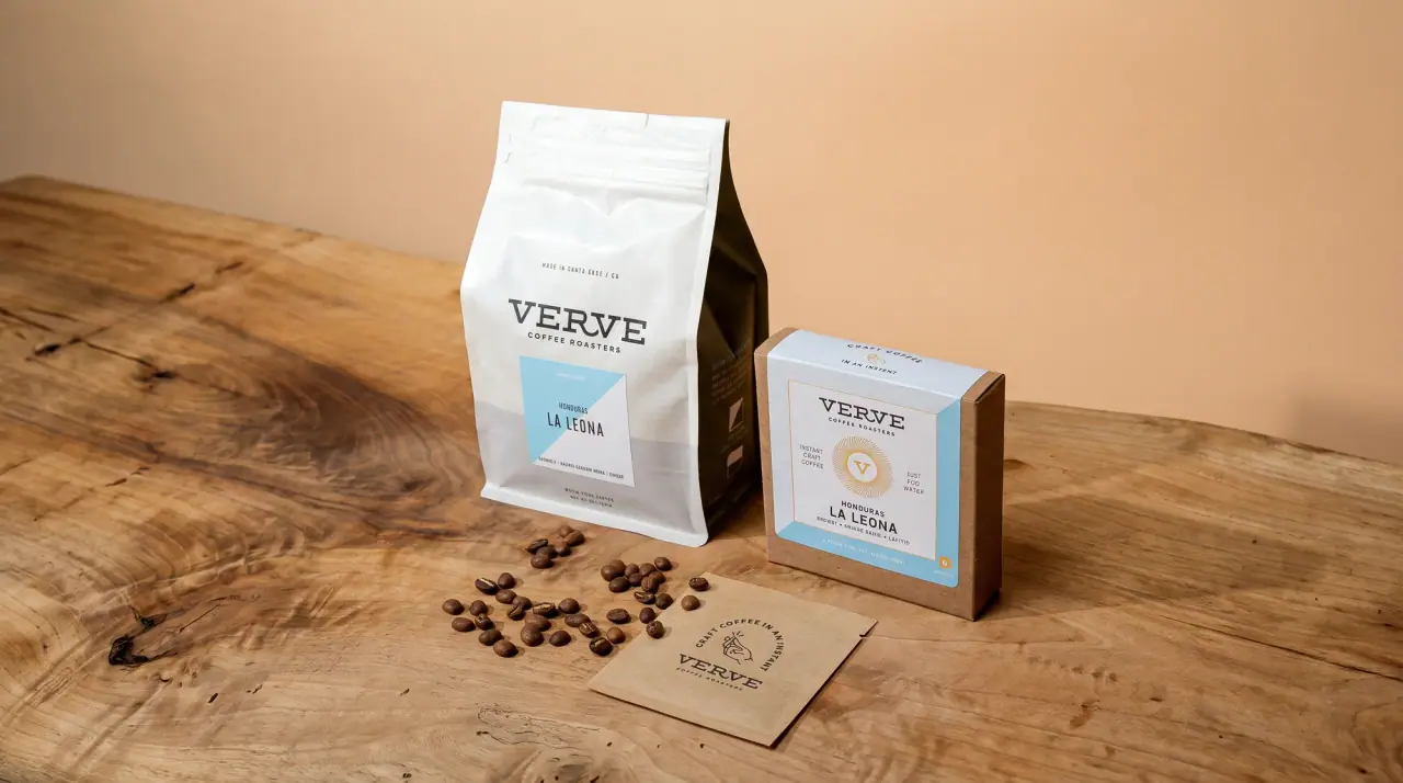
Verve Coffee
cream coffee bags sliced by a regional diagonal

Benamôr
Ornamental lilac medallion suspended above golden botanical oil
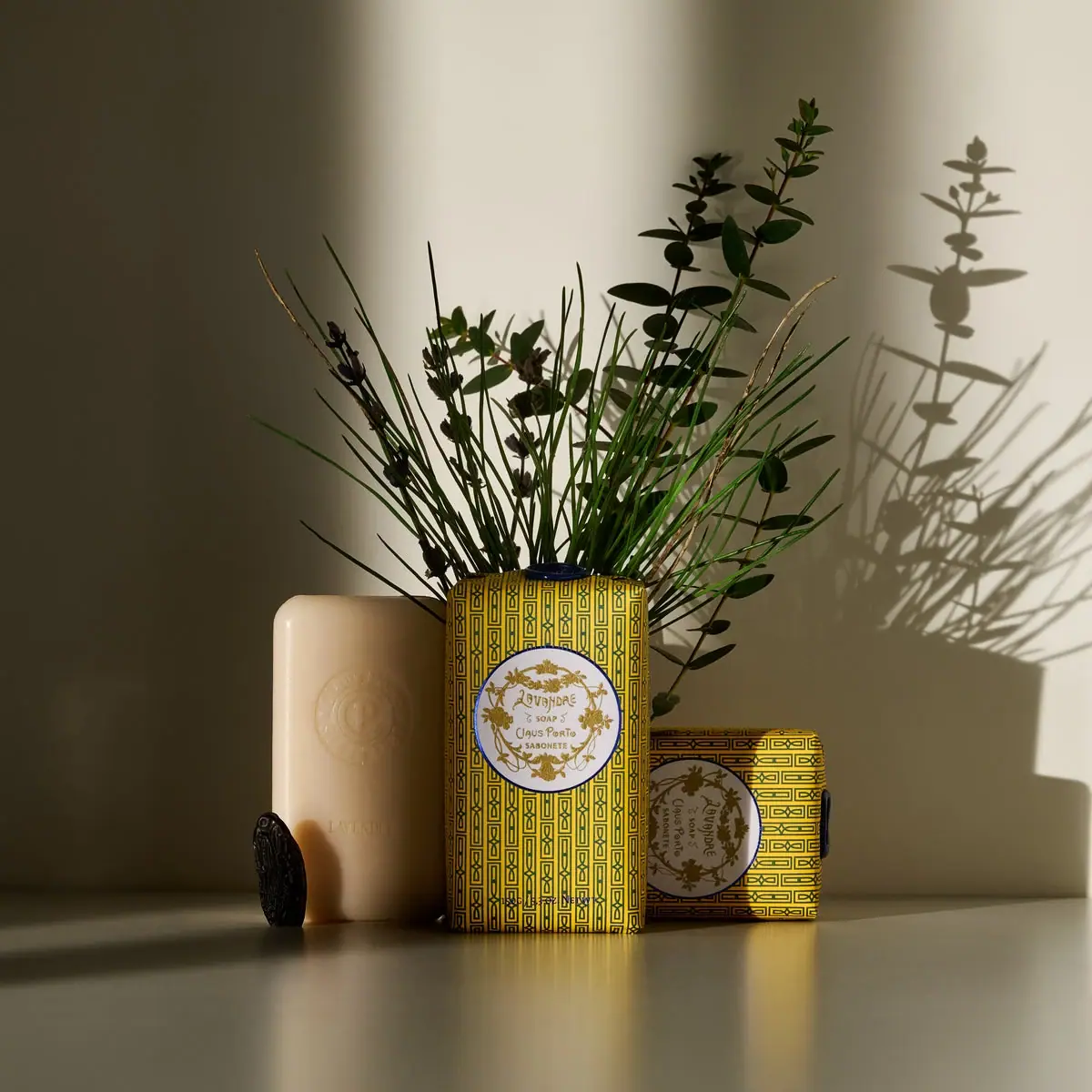
Claus Porto
Golden geometric wrapping around a pale floral medallion

Dr. Bronner’s
A bright soap wrapper with a densely ordered voice
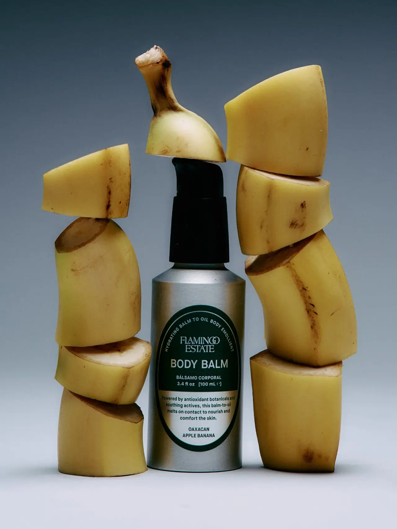
Flamingo Estate
A green oval turns silver utility into botanical character
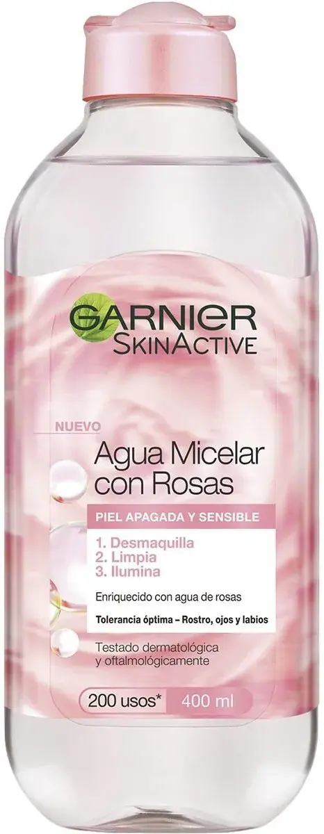
Garnier
green-leaf mark over fruit-bright sub-brand bottles