Photography: Le Rub official photography. Images belong to their respective owners.
Le Rub

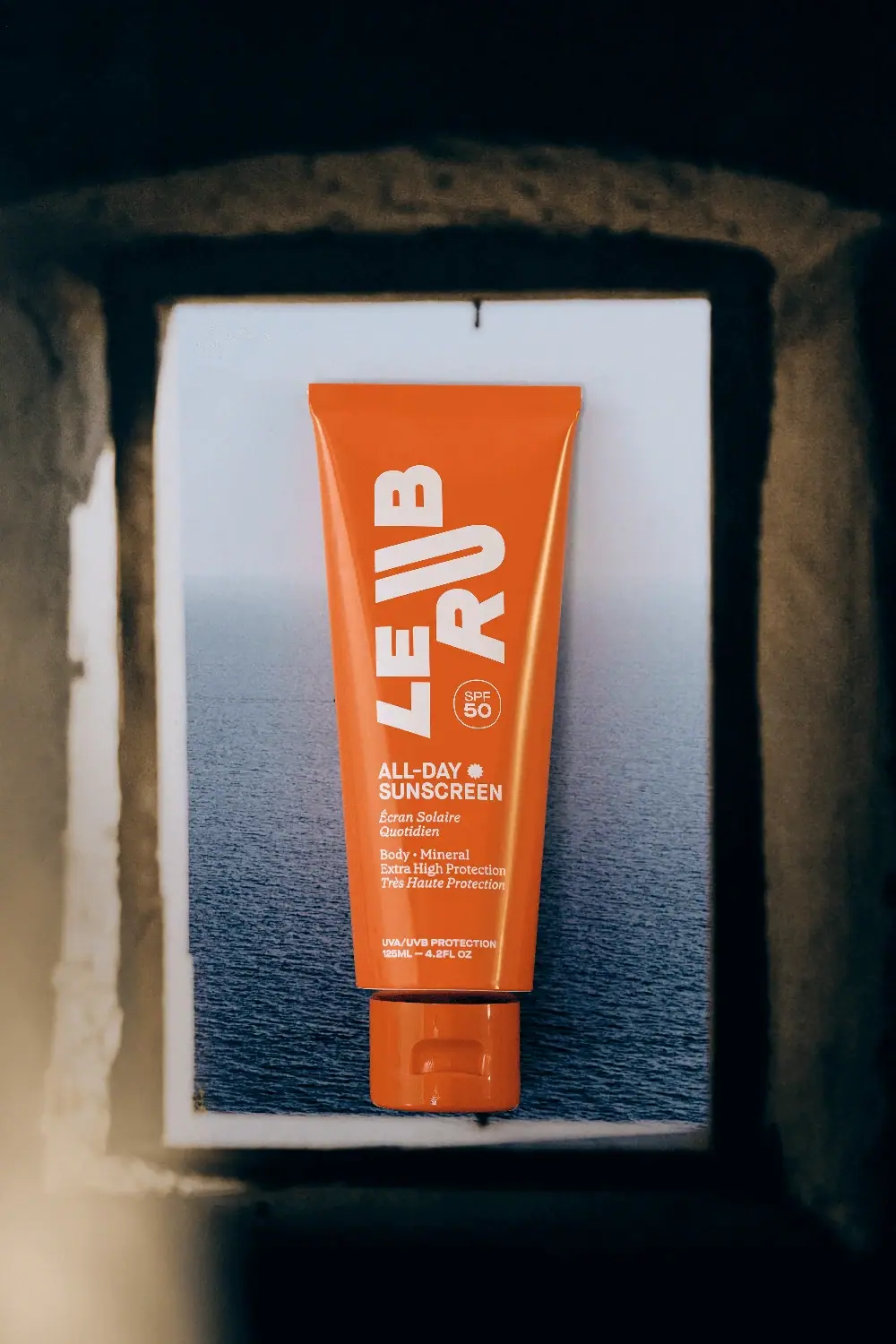
Orange tube with directional cream lettering and compact SPF badge
The selected All-Day Sunscreen SPF50 tube uses a saturated orange body and matching cap as a single strong silhouette. Large cream LE RUB letterforms change direction across the upper face, creating a graphic composition rather than a simple rotated line. A small circular protection marker occupies a pocket beside the lower maker letters. Practical product information then changes to horizontal left-aligned blocks, with bold sans titles and quieter serif wording. The dark window-like frame and sea behind it belong to the campaign scene, not the packaging palette.
- Suncare
- Light pack
- Bold typographic
- Playful colour
About this study
Selected orange All-Day Sunscreen SPF50 tube, 125 mL / 4.2 fl oz front. Current aluminum packaging statement not automatically assigned to this photographed edition or cap.
Sources & evidence · Reviewed 2026-10-19Color Palette
Approximate colours interpreted from photography. These are screen references, not official brand colours or print specifications.
Pack body
Saturated orange
#E75F1C
Approximate shared tube and cap hue, with brighter highlights on the tube sides and a deeper cap shadow. No exact production color is claimed.
Ink
Warm cream lettering
#F1E1C9
Large maker shapes, protection circle and all functional copy. Warm light may influence the off-white appearance.
Typography
Suggested visual alternatives, not confirmed brand typefaces. Any scale below is an illustrative estimate.
The upper identity is an arrangement of large heavy capitals with changing directions and unusual spatial relationships. It should not be flattened into one conventional vertical wordmark. Below it, ALL-DAY SUNSCREEN becomes a compact horizontal bold sans block, followed by a smaller italic serif French category. Further body/mineral and protection wording changes weight and posture again, ending in tiny sans information near the base. The outlined SPF50 circle remains distinct from both the maker composition and the lower product name.
Fonts
Independent display and product titles
Archivo
- Looks like
- Heavy compact grotesque capitals
- Type
- Grotesque sans-serif
- Weight
- Bold, Black
- Case
- Uppercase
- Tracking
- Compact optical spacing for display; natural title spacing
- Fallback
- Arial, sans-serif
A starting point for an original expressive maker treatment and a clear horizontal product heading. Design a different composition rather than copying the exact orientation of the source's letters.
Secondary bilingual wording
Lora
- Looks like
- Practical serif with lively italic
- Type
- Contemporary serif
- Weight
- Regular, Medium
- Case
- Sentence case
- Tracking
- Natural spacing
- Fallback
- Georgia, serif
Use an actual italic style for a secondary language or explanatory line, retaining a shared left edge with the sans title. The serif adds texture at small scale without requiring another color.
Structure & Proportions
Visual proportions and finish previews are illustrative. Confirmed construction details and uncertainties are distinguished in the study notes.
Proportions
| Purpose | Value | Preview |
|---|---|---|
| Tapered silhouette | The sealed upper edge is broad and the body narrows toward the cap, giving the maker composition more width above the compact information area. | — |
| Upper display dominance | The large identity occupies most of the upper front, while the horizontal function blocks cluster in the lower portion. | — |
| SPF pocket | The small outlined circle fits beside the lower maker letters rather than consuming a separate full-width band. | — |
| Matching base | The cap is narrower than the upper seam and close in hue to the body, continuing the orange silhouette despite a visible component gap. | — |
Shapes
| Element | Value | Preview |
|---|---|---|
| Tube body | Broad sealed top and tapering sides ending in a narrower rounded lower body. | |
| Closed cap | Short matching lower component with a tab-like front recess. | |
| Protection marker | Thin outlined circle containing two compact lines for SPF and number. | |
| Directional identity | Large heavy letterforms arranged at different orientations without an enclosing badge. |
Finishes
Smooth reflective orange
Long highlights along the tube sides; exact coating or substrate not established for this photographed edition. · gloss
Matching glossy cap
Bright reflections on the front tab and lower edge; resin and finish specification unknown. · gloss
Formats and materials
| Formats | Tapered orange squeeze-tube appearance with matching closed lower cap; photographed front identifies 125 mL / 4.2 fl oz |
| Materials | The current official page describes aluminum tubes using 95% post-consumer and 5% post-industrial recycled aluminum. This is a current brand statement, not an independent material determination for the selected orange photographed edition., The cap's material and recycled content are not specified by that tube statement. Exact tube layers, coating, decoration method and component compatibility remain unverified here. |
| Closures | The matching cap has a front tab-like recess and seam consistent with a flip-top-style closure. It is closed, so hinge construction, dispensing aperture and neck attachment are not visible. A narrow dark gap between cap and tube separates the components in the image. No leakproof performance, dosing precision or refillability is inferred from the external shape. |
| Decoration | Oversized directional maker letters, Small outlined SPF circle, Bold horizontal product name with small sun-like symbol, Serif and italic bilingual supporting text, Low protection and quantity block |
Front Panel
Schematic reading order. The diagram’s zone heights do not represent measured artwork proportions.
The front changes from expressive identity above to practical text below. The maker letters use height and direction freely; the product block returns to a stable horizontal left edge. An outlined circle isolates the rating without a large contrasting patch. The cream palette stays consistent across all levels, so scale, font voice and spacing carry the distinctions. The long gap before the lowest protection/quantity block prevents the bottom area from becoming one dense paragraph.
| Zone | Content |
|---|---|
| Maker composition | Large cream LE RUB shapes dominate the upper front, with directional changes that create a graphic rhythm. |
| Rating circle | SPF50 sits inside a thin circular outline beside the lower maker area; it is an observed product statement, not a reusable decorative number. |
| English product title | ALL-DAY SUNSCREEN appears in two bold horizontal lines with a small sun-like symbol near the first line. |
| Bilingual support | Italic French naming and smaller body/mineral/protection wording follow a common left edge, using serif texture to distinguish secondary reading. |
| Bottom information | A small sans block gives UVA/UVB wording and the photographed 125 mL / 4.2 fl oz quantity. |
Range System
The study covers the orange All-Day body-sunscreen tube shown in this specific image. The official page also references other face and protection options, but their packs are not visually assessed here. Orange is therefore treated as the selected object's defining color, not a proven universal body-care or SPF50 code. Current material statements remain distinct from photographic edition evidence.
- For an original family, separate a large maker gesture from a stable horizontal category block.
- Keep function and numerical specifications explicit if multiple variants share one strong shell color.
- Use a component-specific material record when packaging changes, rather than transferring old photographs into new construction claims.
Back of Pack & Shelf
Reverse, underside and open cap are unseen. The front's All-Day wording is a product name and does not establish directions or eliminate the need to consult the actual product instructions.
- Inspect the reverse before documenting full use information or ingredients.
- Keep protection statements tied to the actual product and market.
- Obtain edition-specific component specifications before making material claims.
On shelf
Interpretively, the orange body and large pale letter shapes can remain recognizable when the product is small in a photograph. The actual category and rating require a second look, which the lower horizontal block and circle make more structured. An independent design should test whether expressive maker letters remain readable when the tube is squeezed or curved, and whether the fine cream serif copy survives reflections. A single atmospheric scene does not prove retail performance under different lighting.
Imagery
The tube is centered in a bright rectangular opening surrounded by dark rough architecture, with a sea horizon behind it. Orange contrasts strongly with the blue-gray water and shadowed frame. The package appears suspended or carefully positioned, but the support and image-production method are not shown. This creates a travel-and-sun atmosphere without literal beach props on the label. The dark border, stone tones and blue sea should be excluded from a palette intended to describe the package itself.
Guidelines
Editorial principles for an original design brief, not official brand guidelines.
Do
- Separate expressive maker layout from stable product reading.
- Keep key specifications visually distinct.
- Use a small serif voice to add hierarchy without more colors.
- Treat current material statements as edition-specific evidence.
- Test legibility on a deformed tube as well as a pristine packshot.
Don't
- Do not reduce the identity to one simple rotated word.
- Do not describe the lower product block as centered.
- Do not apply tube recycled-content claims to the cap.
- Do not interpret All-Day naming as complete use guidance.
- Do not copy the source letter arrangement or unsupported SPF claims.
Sources & evidence
How this study was built
edition · Sourced fact
Official page identifies All-Day body sunscreen SPF50 and separately states current recycled-aluminum tube construction.Le Rub — All-Day Sunscreen SPF50structure · Visual observation
Orange tapered tube has a matching closed flip-top-style cap and visible 125 mL / 4.2 fl oz front quantity.Le Rub — All-Day Sunscreen SPF50typography · Visual observation
Directional heavy maker lettering changes to horizontal left-aligned sans and serif product blocks.Le Rub — All-Day Sunscreen SPF50label · Visual observation
Outlined SPF circle sits beside maker letters; practical information clusters below.Le Rub — All-Day Sunscreen SPF50palette · Visual observation
Orange and cream define the pack; blue sea and dark architecture belong to the photo setting.Le Rub — All-Day Sunscreen SPF50imagery · Visual observation
Window-like framing and sea horizon establish atmosphere without adding printed motifs.Le Rub — All-Day Sunscreen SPF50range · Editorial interpretation
A stable product block can balance expressive maker geometry in an independent family; no universal color code inferred.
What remains unverified
- Photographed edition's exact construction not independently confirmed.
- Cap material, internal mechanism and decoration method unknown.
- Original fonts, dimensions and reverse not established.
- Protection and environmental statements recorded as brand/pack claims, not independently evaluated.
Give your AI
packaging taste
Give your design or image tool a packaging study: palette, type, structure, front panel and principles for an original brief.
Export this styleFree with an email. PACK.md works in Claude, ChatGPT, Cursor and image tools.
More like this

ACURE
Iridescent spectacle with practical, tightly ordered type

Bask
sunny yellow with a playful turquoise signature

Beame
Orange bubble lettering, pink mascot, clear product badge

Bread Beauty Supply
bubblegum pumps and a fat black wordmark

Cut By Fred
Orange gel, cropped geometry and bold bilingual utility

Dune Suncare
Coral bottle with striped vertical identity and small left-aligned copy

e.l.f. Cosmetics
Pink tube, black cap, oversized thin lowercase signature
Ethique
Orange carton, oversized white script and a lathered square bar