Photography: Naked Sundays official photography. Images belong to their respective owners.
Naked Sundays

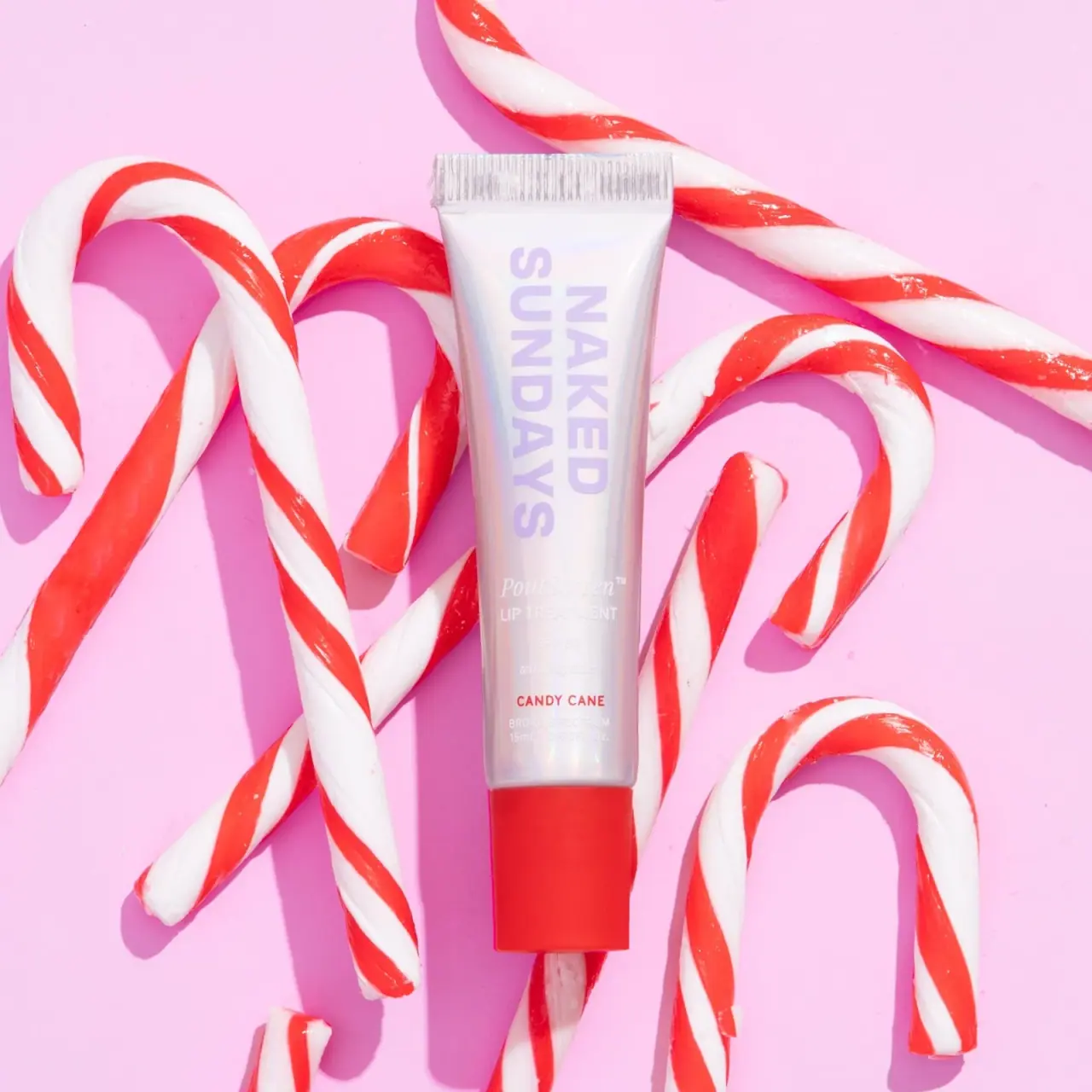
Lilac vertical wordmark, reflective silver tube and red cap
Candy Cane PoutScreen combines a reflective silver-looking tube with a vivid red cap and large lilac maker lettering. The maker runs along the tube in a rotated two-line arrangement, leaving a smaller lower area for the treatment name, SPF wording and red variant label. Unlike a clear gloss pack, this photographed body does not reveal its contents. The brand identifies Candy Cane as a limited-edition sheer red tint, while striped candy props and a pink background supply the seasonal campaign setting. The study distinguishes those source facts from the metallic-looking surface and its unresolved construction.
- Suncare
- Light pack
- Bold typographic
- Playful colour
About this study
The selected Candy Cane PoutScreen tube in official seasonal photography. The US official product page confirms edition identity; physical material, applicator construction and unseen panels are unverified.
Sources & evidence · Reviewed 2026-10-19Color Palette
Approximate colours interpreted from photography. These are screen references, not official brand colours or print specifications.
Pack body
Reflective pale silver
#DAD7DC
Approximate dominant body value, with soft coloured reflections. This does not identify aluminium, metallised film or a specific reflective coating.
Ink
Pale lilac maker
#C9B0E0
Approximate oversized rotated maker lettering, low in tonal contrast against the pale tube but large enough to remain recognisable in this view.
White lower copy
#F5F1EF
Approximate treatment and SPF information, visibly affected by glare and low contrast against the silver-looking body.
Accent
Vivid Candy Cane red
#EE333C
Approximate cap and small variant-name accent. The red is a package cue, not a sample proving the formula's exact lip colour.
Typography
Suggested visual alternatives, not confirmed brand typefaces. Any scale below is an illustrative estimate.
NAKED SUNDAYS is exceptionally large relative to the rest of the front and rotated along the tube's length. Its two-line lilac sans-serif block dominates the upper and middle body. The lower copy returns to a horizontal reading direction: PoutScreen appears in a smaller italic serif-like voice, followed by compact treatment and SPF lines. Candy Cane stands out again through red uppercase lettering, with smaller white technical detail below. This is an orientation-led hierarchy rather than a uniformly stacked front, and the smallest pale copy is difficult to read in the selected bright lighting.
Fonts
Original large maker alternative
Archivo
- Looks like
- Heavy straightforward sans capitals
- Type
- Grotesque sans serif
- Weight
- Bold, ExtraBold
- Case
- Uppercase
- Tracking
- Compact to normal
- Fallback
- Arial, sans-serif
Explore a new maker hierarchy with different orientation and proportions. Test light-coloured lettering on reflective substrates in varied lighting instead of relying on size alone for recognition.
Treatment-title alternative
Libre Baskerville
- Looks like
- Small italic serif contrast
- Type
- Transitional serif
- Weight
- Italic
- Case
- Title case
- Tracking
- Normal
- Fallback
- Georgia, serif
Use sparingly for a short original product-family name. Its fine strokes should not carry essential information where pale ink and reflections reduce contrast.
Structure & Proportions
Visual proportions and finish previews are illustrative. Confirmed construction details and uncertainties are distinguished in the study notes.
Proportions
| Purpose | Value | Preview |
|---|---|---|
| Maker dominates body length | The lilac identity occupies most of the upper and middle tube, while functional and variant information is concentrated toward the lower end. | — |
| Solid coloured endpoint | The red cap is visually substantial and wider-looking than the narrow tube neck above it, anchoring the reflective body without revealing its contents. | — |
| Fine upper seal | A narrow crimp band spans the broad top edge and provides a textured ending to the otherwise smooth reflective face. These are visual proportions, not tooling dimensions. | — |
Shapes
| Element | Value | Preview |
|---|---|---|
| Tube silhouette | Broad straight sealed top tapering toward the capped lower end. | |
| Red closure | Broad flat-sided cap with softly rounded corners in the front view. | |
| Rotated maker block | Two large parallel lines running along the body length. | |
| Upper crimp | Fine repeated vertical ridges across a narrow horizontal seal. |
Finishes
Silver reflective appearance; substrate unverified
Main tube body · metallic
Soft coloured reflection appearance
Highlights across the pale body; process unverified · pearlescent
Smooth red closure appearance
Lower cap · matte
Formats and materials
| Formats | Slim tapered lip-treatment squeeze-tube presentation, Straight sealed upper edge with fine crimp texture, Broad red cap at the lower dispensing end, Visible 15 mL capacity line near the tube base |
| Materials | The reflective body looks silver and picks up pale coloured bands, but neither the photo nor the inspected product text establishes its laminate layers or exact substrate., Opaque reflections hide the product; the tube should not be described as transparent or as showing red contents., Cap material, barrier construction and decorative application remain unverified. A metallic appearance does not establish a metal tube or recyclable mono-material pack. |
| Closures | The red cap is fitted and appears broad and fairly flat-sided from the front. It forms a strong solid end to the narrower lower tube. The cap is not removed, so the thread, seal and actual applicator shape are not visible. The official page mentions application with an applicator, but that wording does not identify a doe-foot, angled nozzle or other specific component in this closed view. No detachable wand is established. |
| Decoration | Large rotated two-line maker identity, Small horizontal treatment and SPF text below, Red Candy Cane title matching the cap's colour family, No candy-stripe pattern visibly printed on the tube |
Front Panel
Schematic reading order. The diagram’s zone heights do not represent measured artwork proportions.
The surface uses lettering directly against a reflective field, without a contrasting opaque information panel. The maker reads in one orientation and the smaller lower lines in another. Red links the variant name to the closure, while the lilac maker remains a separate identity colour. White lower text can merge into the bright silver reflections, so the design's visual excitement and its functional readability should be assessed separately. The term label here describes the information layout, not a verified adhesive label or print technology.
| Zone | Content |
|---|---|
| Upper and middle maker field | Oversized lilac NAKED SUNDAYS in a rotated two-line block. |
| Treatment and protection area | Smaller horizontal PoutScreen, LIP TREATMENT and SPF50 wording, pale and relatively low-contrast in this photograph. |
| Variant marker | CANDY CANE in small red uppercase lettering above the cap. |
| Lower technical detail | Pale broad-spectrum and capacity wording, including visible 15 mL, near the lower body edge. |
Range System
The official page identifies Candy Cane as a limited-edition shade and describes it as a sheer red tint. The cap and small red name therefore provide a plausible visible connection to the variant, without acting as a calibrated shade sample. This selected edition does not establish the colours or construction of every PoutScreen product. The package itself uses no literal candy stripes; the campaign props carry that seasonal motif. A future original edition could vary one clear accent while preserving a readable product hierarchy, but it should not depend on seasonal props to identify its function.
- Candy Cane wording and a red cap connect the selected edition's physical package cues.
- The official source supplies the sheer-red description; the closed reflective tube does not expose the formula.
- A hypothetical original range should retain legible treatment information even when photographed without candy props or a pink background.
Back of Pack & Shelf
The reverse, opened cap and any outer carton are absent. No full ingredient, directions or warning panel is visible in the selected front.
- The official site's product information is not evidence of the exact printed reverse arrangement.
- Do not invent a regulatory panel or infer compliance from a visible SPF number.
- For an original design, establish its own substantiated claims and readable information separately from the seasonal visual concept.
On shelf
As a visual interpretation, the red cap and oversized lilac identity offer recognition before the small treatment lines become readable. The reflective body can look lively as the viewing angle changes, but its contrast is unstable: a bright highlight can remove the separation between white lettering and background. The red variant name is comparatively more robust in this selected view. A useful practical review would compare the pack in diffuse daylight, direct light and a neutral retail setting, checking the important product information independently of the campaign's seasonal story.
Imagery
The tube lies vertically among oversized red-and-white candy canes on a pale pink ground. Curves and diagonals in the props surround the straight pack without obscuring the main maker block. Strong light creates compact shadows and bright reflections, adding a glossy confectionery character to the scene. This lighting also washes out some white lower copy. Pink dominates the photograph's area but is not a verified printed tube colour. The candy canes communicate the edition name; they do not establish that candy, sugar or peppermint is an ingredient in the formula.
Guidelines
Editorial principles for an original design brief, not official brand guidelines.
Do
- Distinguish reflective opacity from transparency.
- Link a limited-edition accent to a readable variant name.
- Test small copy against changing reflections.
- Keep seasonal props separate from physical package graphics.
- Treat branded SPF wording as documented communication rather than an invented claim for new work.
Don't
- Do not describe visible red contents through this opaque-looking tube.
- Do not identify a metallic substrate from its reflective appearance.
- Do not claim that all front lines share one orientation.
- Do not equate confectionery styling with ingredients.
- Do not copy the lilac rotated maker layout or add an unsupported SPF value to a fictional product.
Sources & evidence
How this study was built
edition · Sourced fact
The official US page identifies the limited Candy Cane PoutScreen SPF50 edition as a sheer red tint.PoutScreen SPF50 Lip Treatment — Candy Cane — Naked Sundays USAstructure · Visual observation
The approved image shows a reflective silver-looking crimped tube with a broad red cap, not a transparent contents window.PoutScreen SPF50 Lip Treatment — Candy Cane — Naked Sundays USAtypography · Visual observation
The oversized lilac maker is rotated along the body, while smaller treatment and variant lines read horizontally.PoutScreen SPF50 Lip Treatment — Candy Cane — Naked Sundays USAlabel · Visual observation
White lower copy including SPF wording has weak contrast against the bright reflective body in this shot; the red variant line is clearer.PoutScreen SPF50 Lip Treatment — Candy Cane — Naked Sundays USApalette · Visual observation
Red cap and variant text are physical package accents; pink ground and striped candy canes are photographic styling.PoutScreen SPF50 Lip Treatment — Candy Cane — Naked Sundays USArange · Editorial interpretation
A coordinated cap/name accent provides a plausible edition cue, without establishing a universal colour system across other PoutScreen products.
What remains unverified
- Exact tube laminate, cap material and reflective finishing process are not established.
- The body is reflective and does not show the contents; the source's sheer-red tint is not visually sampled from the pack.
- Applicator, reverse and carton are not inspected.
- Exact fonts, physical colours and dimensions are unverified; glare reduces small-copy visibility.
Give your AI
packaging taste
Give your design or image tool a packaging study: palette, type, structure, front panel and principles for an original brief.
Export this styleFree with an email. PACK.md works in Claude, ChatGPT, Cursor and image tools.
More like this

ACURE
Iridescent spectacle with practical, tightly ordered type

Bask
sunny yellow with a playful turquoise signature

Beame
Orange bubble lettering, pink mascot, clear product badge

Bread Beauty Supply
bubblegum pumps and a fat black wordmark

Cut By Fred
Orange gel, cropped geometry and bold bilingual utility

Dune Suncare
Coral bottle with striped vertical identity and small left-aligned copy

e.l.f. Cosmetics
Pink tube, black cap, oversized thin lowercase signature
Ethique
Orange carton, oversized white script and a lathered square bar