Photography: O&M official photography. Images belong to their respective owners.
O&M

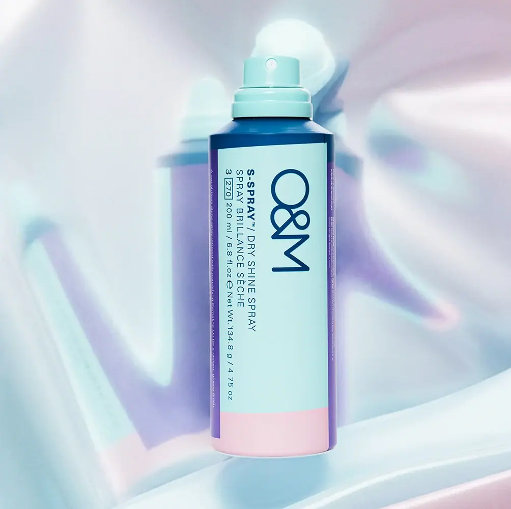
Aqua spray can with navy type and pink-violet framing
O&M's S-Spray Dry Shine Spray turns a tall aerosol-style cylinder into a sideways information panel. A large dark O&M mark sits above English and French product lines when the pack is rotated for reading. Aqua dominates the front and exposed actuator, with a pale pink lower band, violet side columns and a dark blue shoulder. The approved official image places this geometry against a shimmering reflected scene. The official listing confirms 200 mL and a finishing-spray role; the product's promised hair shine is distinct from the package's own surface treatment.
- Hair
- Light pack
- Bold typographic
- Playful colour
About this study
Selected 200 mL S-Spray can with exposed actuator; only this photographed front and official product identity are analysed.
Sources & evidence · Reviewed 2026-10-19Color Palette
Approximate colours interpreted from photography. These are screen references, not official brand colours or print specifications.
Label
Pale aqua front
#BCE4E3
Approximate broad reading field, repeated by the actuator in a slightly more saturated appearance under the selected light.
Ink
Deep navy lettering
#063E5C
Large maker and smaller product information; a closely related dark blue also appears across the shoulder and top band.
Accent
Pale pink lower band
#EDD0DD
Quiet colour block below the aqua panel; it is a broad band, not a printed ingredient image.
Violet side columns
#8D72B1
Narrow vertical framing at the front's sides, carrying very small contrasting side copy.
Typography
Suggested visual alternatives, not confirmed brand typefaces. Any scale below is an illustrative estimate.
The maker is much larger than all other information, with a rounded O, a conspicuous ampersand and a simple M. The complete mark is rotated along the can's height; its letters are not separately stacked. In the same orientation, S-SPRAY is bold before a lighter dry-shine descriptor, followed by a French role line and a quantity line. This creates a conventional horizontal reading composition after the object is turned, rather than several competing reading directions. A boxed number and other small symbols appear near the quantity information but are not interpreted as performance scores or certifications. The fine side-column writing is a separate low-priority layer.
Fonts
Original large maker alternative
Manrope
- Looks like
- Open geometric sans serif
- Type
- Geometric sans serif
- Weight
- Regular, Medium
- Case
- Uppercase
- Tracking
- Normal
- Fallback
- Arial, sans-serif
Develop a different short maker with strong character counters, keeping its silhouette clear when rotated. Do not substitute this font into a copied O&M mark; create independent lettering and spacing.
Product and quantity alternative
Inter
- Looks like
- Compact plain sans serif
- Type
- Sans serif
- Weight
- Regular, Bold
- Case
- Uppercase with conventional unit abbreviations
- Tracking
- Normal to slightly open
- Fallback
- Arial, sans-serif
Use weight to distinguish the product name from its functional descriptor within one line. Give multilingual roles and quantities enough leading to remain distinct on a curved surface.
Structure & Proportions
Visual proportions and finish previews are illustrative. Confirmed construction details and uncertainties are distinguished in the study notes.
Proportions
| Purpose | Value | Preview |
|---|---|---|
| Long-axis reading | The large maker and adjacent information use the height of the cylinder as their line width; rotating the object restores a familiar reading orientation. | — |
| Broad central field | Aqua dominates the front, while the violet side columns remain narrow enough to frame rather than compete with the text. | — |
| Low pink band | A compact pink block anchors the base, leaving most of the vertical front available for information. | — |
| Stepped spray top | The collar is broader than the actuator, providing a clear transition to the sloped shoulder below. | — |
Shapes
| Element | Value | Preview |
|---|---|---|
| Can body | Straight tall cylinder with a sloping dark shoulder and rounded lower edge. | |
| Actuator | Short aqua push-down component with a circular front spray opening. | |
| Main colour panel | Broad aqua rectangle wrapped around the cylinder. | |
| Colour framing | Violet side strips meet a pale pink lower block. |
Finishes
Smooth colour fields
Can exterior; exact decoration process unverified · matte
Highlighted spray components
Aqua actuator and collar; material unverified · gloss
Formats and materials
| Formats | Tall cylindrical spray can with a sloping shoulder, Exposed aqua actuator with a small circular front nozzle, Stepped aqua collar above the dark shoulder, Selected front reads 200 mL / 6.8 fl oz and 134.8 g / 4.75 oz net weight |
| Materials | The rigid can-like body is visually evident, but the reviewed product page does not establish its exact metal or coating specification., The opaque aqua actuator and collar have a moulded-looking form; their resin and material composition are unverified., The colour fields may be printed or applied by another decoration system; the image does not establish a label film, shrink sleeve or direct-print process. |
| Closures | The actuator is uncovered and its pale circular spray opening faces the camera. A stepped collar links it to the sloping dark-blue shoulder. No separate overcap is shown, so its colour, shape or existence should not be invented. The selected image is a ready-to-use presentation rather than a cutaway of the valve. The official directions describe shaking the can and misting after styling, but the internal valve, propellant arrangement and dismantling procedure remain outside the study. The visible nozzle is enough to identify a spray interface without inferring engineering details. |
| Decoration | Aqua panel bounded by violet side columns, Broad pale pink block across the bottom, Large rotated navy maker, English and French role information in the same rotated reading direction |
Front Panel
Schematic reading order. The diagram’s zone heights do not represent measured artwork proportions.
The front combines maker, role and quantity inside one large aqua field. Dark text remains visually continuous across these levels, while the colour changes sit mainly around the perimeter. The upper dark band and shoulder create a strong termination above the panel; the pink block supplies the corresponding lower stop. The violet strips are not random floating rectangles: they frame the side boundaries and carry fine writing. Rotating the can makes the hierarchy easier to parse, but a catalogue should still supply an upright product title for readers viewing a small thumbnail.
| Zone | Content |
|---|---|
| Maker | Large rotated O&M signature in navy. |
| Product role | Bold S-SPRAY name followed by a lighter English description, with French description on a separate line. |
| Quantity | Volume and net-weight declarations in a smaller line, with additional tiny symbols not assigned meanings here. |
| Peripheral bands | Pink base block and violet side columns, the latter containing fine contrasting text. |
Range System
The official page positions S-Spray as a finishing product and identifies its 200 mL format. Its hold and finish scales belong to the brand's product guidance, not an observed colour code on this can. One selected package does not establish which colours identify other treatments or whether every O&M format shares this exact structure. The useful system principle is a stable reading field with restrained perimeter blocks, allowing a short maker and a longer multilingual role to coexist without covering the entire cylinder with large text.
- The current official 200 mL listing agrees with the volume visible on the photographed can.
- The pale pink band and violet strips are observed graphic components, not verified ingredient or treatment codes.
- An original range could vary a peripheral block while keeping the central text field stable, but explicit role names should remain primary variant identifiers.
Back of Pack & Shelf
Only the front and narrow side strips are visible. The reverse, underside and any removable cover are not shown.
- The presence of tiny side copy does not reveal a complete ingredients or instructions panel.
- No barcode location, recycling instruction or component-separation method is established.
- The boxed numeric marking is recorded as visible structure without an invented functional meaning.
On shelf
The large maker should remain recognisable before the smaller bilingual role lines, while the aqua body and matching actuator maintain a continuous colour impression. This is visual interpretation rather than a measured recognition result. The navy information has useful tonal separation from the pastel field, but the side-strip copy will need close inspection. A front-facing photo without reflective props would help assess whether the pastel framing still distinguishes the product among other aerosol cans. The exposed actuator also changes the silhouette compared with any covered retail presentation.
Imagery
The can appears against a pale reflective scene that repeats blurred aqua and violet shapes. Strong light produces several soft-edged echoes of the object and bright bands across the background. These reflections extend the pack's colour family without adding new printed elements to the can. The central object stays sharply defined, with the nozzle and quantity line still visible. The image does not establish a holographic sleeve or pearlescent can finish: the strongest iridescent effects belong to the setting. No hair, mist or application demonstration appears in the selected frame.
Guidelines
Editorial principles for an original design brief, not official brand guidelines.
Do
- Rotate the whole information hierarchy consistently.
- Keep the longest role line within a clear reading field.
- Separate reflective scenery from package finish.
- Distinguish source product use from visual construction.
- Test a covered and uncovered silhouette separately.
Don't
- Do not interpret every small numeric mark as a performance scale.
- Do not call the background a holographic sleeve.
- Do not assume the can's exact metal from shape alone.
- Do not turn the side strips into random floating blocks.
- Do not equate a hair-shine promise with a glossy can coating.
Sources & evidence
How this study was built
edition · Sourced fact
Official page confirms a 200 mL dry-shine finishing spray and describes use after styling.S-Spray Dry Shine Spray 200 mL — O&Mstructure · Visual observation
Exposed aqua actuator, circular nozzle and stepped collar sit above a dark sloping shoulder.typography · Visual observation
Maker, bilingual role and quantity lines share a rotated reading direction.palette · Visual observation
Aqua front is framed by violet side columns and a pale pink lower band, with navy information.imagery · Visual observation
Shimmering multicolour reflections belong to the background and do not establish a holographic can finish.range · Editorial interpretation
One package supports a perimeter-framing principle but not a verified colour-to-function map across the brand.
What remains unverified
- Exact can substrate, decoration process and actuator resin unverified.
- No reverse, underside, internal valve or separate overcap view.
- Fonts and colours are visual alternatives or approximations.
- No full-range colour-coding system established.
Give your AI
packaging taste
Give your design or image tool a packaging study: palette, type, structure, front panel and principles for an original brief.
Export this styleFree with an email. PACK.md works in Claude, ChatGPT, Cursor and image tools.
More like this

ACURE
Iridescent spectacle with practical, tightly ordered type

Bask
sunny yellow with a playful turquoise signature

Beame
Orange bubble lettering, pink mascot, clear product badge

Bread Beauty Supply
bubblegum pumps and a fat black wordmark

Cut By Fred
Orange gel, cropped geometry and bold bilingual utility

Dune Suncare
Coral bottle with striped vertical identity and small left-aligned copy

e.l.f. Cosmetics
Pink tube, black cap, oversized thin lowercase signature
Ethique
Orange carton, oversized white script and a lathered square bar