Photography: Ceremonia official photography. Images belong to their respective owners.
Ceremonia

Warm colour labels bounded by upright and inverted wordmarks
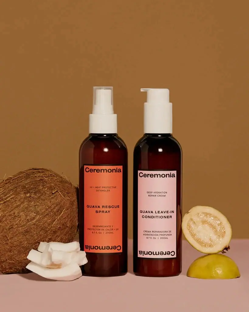
The selected Guava kit pairs two similar amber bottles with different white dispensers and contrasting labels: saturated coral-orange for the rescue spray and pale blush for the leave-in conditioner. Each label begins with an upright Ceremonia wordmark and ends with an inverted one, creating a distinctive frame around the product information. English and Spanish wording occupy the space between. Garrett Elizabeth Office, the identity designer, connects this paired logo orientation to Spanish exclamation punctuation. The study follows how that documented idea appears on these two specific bottles, without assuming every Ceremonia format uses identical proportions or materials.
- Hair
- Light pack
- Colour-coded range
- Bold typographic
About this study
The approved Guava Rescue Spray and Guava Leave-in Conditioner pair, shown as the Protect & Repair Kit. No wider range, outer kit box or later packaging revision is visually surveyed.
Sources & evidence · Reviewed 2026-10-19Color Palette
Approximate colours interpreted from photography. These are screen references, not official brand colours or print specifications.
Pack body
Dark amber appearance
#451C10
Approximate body colour, strongest at the edges and below the labels. Transparency and contents affect this appearance; the image does not identify glass, resin or light-protection performance.
Warm white closures
#EAE5D9
Approximate spray and pump colour, repeated across different mechanisms to keep the top assemblies visually related.
Label
Rescue coral
#E86945
Approximate saturated label field on the spray. It gives that function a distinct presence while retaining the same dark typography and label structure as its partner.
Conditioner blush
#E8BEB5
Approximate pale label field on the conditioner. Its lower saturation separates the product without changing the underlying identity arrangement.
Ink
Near-black lettering
#241B16
Approximate wordmarks, function copy and quantity text on both labels, supplying a consistent graphic voice across the two colour fields.
Typography
Suggested visual alternatives, not confirmed brand typefaces. Any scale below is an illustrative estimate.
A broad, relatively heavy Ceremonia wordmark fills much of each label's top width. A second copy turns upside down along the lower boundary. Between them, small uppercase functional wording sits above a bolder product-name block, with Spanish description and quantity lower down. The two wordmarks create strong endpoints, while weight and spacing distinguish the internal text. The product names remain upright; the inverted name is a deliberate identity device rather than a reversal of the entire information panel.
Fonts
Original identity alternative
DM Sans
- Looks like
- Broad confident sans serif
- Type
- Sans serif
- Weight
- Bold
- Case
- Title case for an independent name
- Tracking
- Close but optically balanced
- Fallback
- Arial, sans-serif
A possible broad signature for a new haircare identity. Preserve clarity and a strong silhouette without tracing Ceremonia's exact wordmark or repeating its distinctive inverted arrangement.
Product-information alternative
Inter
- Looks like
- Compact neutral sans serif
- Type
- Sans serif
- Weight
- Regular, Semibold
- Case
- Uppercase for short product and function groups
- Tracking
- Gently open for small capitals
- Fallback
- Arial, sans-serif
Create a practical bilingual hierarchy with stronger product names and smaller explanatory lines. Edit each language for its actual width rather than shrinking one translation until it disappears.
Structure & Proportions
Visual proportions and finish previews are illustrative. Confirmed construction details and uncertainties are distinguished in the study notes.
Proportions
| Purpose | Value | Preview |
|---|---|---|
| Shared vessel family | The two bodies have similar tall cylindrical proportions, rounded shoulders and flat-looking lower edges. Their matching appearance does not prove identical technical bottle specifications. | — |
| Label coverage | Each narrow rectangular label occupies most of the middle wall height but leaves amber visible around it. The pink panel sits slightly lower in the photograph; exact identical placement is not assumed. | — |
| Internal rhythm | Large wordmarks bound the top and bottom, while the central product-name block has open space above and below. Small explanatory copy remains grouped rather than filling every interval. | — |
| Visible quantity | Both pictured front labels show 200 mL with fluid-ounce information. These markings describe contents, not the actual physical height of the bottles. | — |
Shapes
| Element | Value | Preview |
|---|---|---|
| Bottle bodies | Tall cylinders with rounded shoulders, repeated across the two functions. | |
| Colour panels | Narrow upright rectangles with strong top and bottom typographic boundaries. | |
| Spray assembly | Narrow white actuator covered by a clear cylindrical overcap. | |
| Conditioner pump | White pump with a short horizontal spout and broader housing. |
Finishes
Amber optical surface
Visible body areas around the labels; appearance does not establish glass composition or a protective coating · transparent
Flat colour label appearance
Coral-orange and pale blush rectangular fronts; no special tactile finish is confirmed · matte
Clear protective cover
Over the spray actuator only; the conditioner pump is uncovered in the selected image · transparent
Formats and materials
| Formats | Amber cylindrical spray bottle with clear protective overcap, Amber cylindrical leave-in conditioner bottle with exposed white pump |
| Materials | Both bodies have an amber transparent appearance, but no exact material specification for these photographed components was established., The left spray carries a clear overcap above white dispensing parts; its resin and the internal spray construction remain unverified., Opaque rectangular colour fields appear label-like. Substrate, adhesive and printing method are not documented by the consulted sources. |
| Closures | The left product uses a narrow spray actuator under a clear protective cap, whereas the right uses a broader pump with a projecting side nozzle. Both assemblies are white and reach broadly comparable heights in the composition. This makes them related without disguising their different dispensing tasks. The photograph does not establish lock positions, dose volumes, dip-tube materials or refill compatibility. |
| Decoration | Upright and inverted identity repeated at opposite label ends, Bilingual text groups separated by generous colour space, No fruit illustration or all-over pattern printed on the two selected front labels |
Front Panel
Schematic reading order. The diagram’s zone heights do not represent measured artwork proportions.
Each label is a long text-led panel framed by the repeated brand name. The upper wordmark reads normally and the lower one rotates through half a turn. The internal content remains upright, moving from a small functional descriptor to a stronger product name, then to Spanish wording and fill amount. This gives both bottles the same reading sequence while allowing their colour and copy to identify different uses. The effect is more specific than simply placing a large logo above a generic description.
| Zone | Content |
|---|---|
| Top boundary | Large upright Ceremonia wordmark, close to the label's upper edge. |
| Upper function | Small English functional description, different for the spray and the conditioner. |
| Central product name | GUAVA RESCUE SPRAY or GUAVA LEAVE-IN CONDITIONER in a stronger uppercase weight, split over short lines. |
| Lower information | Spanish descriptive wording and quantity, kept separate from the bold product-name block. |
| Bottom boundary | Repeated Ceremonia wordmark inverted relative to the main reading direction, completing the typographic frame. |
Range System
The official kit page pairs these two named products, so the shared bottle family and different label colours can be analysed together rather than inferred from one isolated object. G.E.O. separately documents the identity's orientation and bilingual principles. Those sources support a coherent family structure, but this study does not turn coral and blush into universal category codes for every Ceremonia product or edition.
- Observed pair: a coral-labelled capped spray and a blush-labelled exposed pump share amber bodies and the same top/bottom identity principle.
- Documented rationale: the designer associates paired logo orientation with Spanish punctuation and treats English/Spanish communication as an intentional identity element.
- Original-design interpretation: coordinate vessel and closure colour while using a clearly written product name alongside each differentiating label colour.
Back of Pack & Shelf
Only the front labels and small side areas are visible. The reverse, base markings and any kit carton are absent. A retail kit listing does not prove that the two bottles arrive in a particular box or sleeve. The visible bilingual front also does not establish the complete language arrangement of technical information elsewhere.
- Inspect both reverses separately before describing ingredient, barcode or usage-copy placement.
- Verify any outer kit packaging through a direct image or specification.
- Do not infer recycling instructions from amber appearance or a general brand sustainability statement.
On shelf
Interpretation: matching body shapes create a family, while label colour, product name and dispensing mechanism provide three complementary ways to tell the products apart. The inverted lower wordmark gives a memorable graphic ending even when the central copy is small. On a crowded shelf, the colour distinction could help scanning, but it should not replace the written names. The pair is strongest when the original text hierarchy remains readable under ordinary lighting and the amber body does not disappear into a dark background.
Imagery
A whole coconut and cut coconut pieces sit to the left, while cut guava sits to the right. The bottles remain front-facing between these props, with their label colours distinct against a warm brown backdrop and pale pink surface. The fruit supports the Guava product-family story, but its presence alone does not establish identical ingredient lists across both formulas. The composition also leaves the two dispensing systems unobstructed, making the difference between spray and cream pump clear before the small text is read.
Guidelines
Editorial principles for an original design brief, not official brand guidelines.
Do
- Give related products both a shared structure and explicit functional differences.
- Make bilingual wording intentional within the hierarchy.
- Use dispenser geometry as an additional product cue.
- Attribute a documented identity rationale to its designer.
- Compare actual label placement instead of assuming identical grids from family resemblance.
Don't
- Do not call the amber bottles glass without a product-specific source.
- Do not omit the inverted lower wordmark when describing this front system.
- Do not treat colour alone as a complete function label.
- Do not assume the photographed fruit establishes each formula's full ingredients.
Sources & evidence
- Guava Protect & Repair Kit — official product listingproduct
- Ceremonia identity and packaging — Garrett Elizabeth Officedesigner
How this study was built
edition · Sourced fact
The official kit listing identifies the paired spray and leave-in conditioner.Guava Protect & Repair Kit — official product listingtypography · Sourced fact
G.E.O. explains the upright/inverted logo relationship through Spanish exclamation punctuation.Ceremonia identity and packaging — Garrett Elizabeth Officelabel · Sourced fact
The designer identifies bilingual communication as an intentional identity principle; the photograph shows English and Spanish groups.Ceremonia identity and packaging — Garrett Elizabeth Officestructure · Visual observation
A capped white spray and exposed white pump distinguish similar amber cylindrical bodies.Guava Protect & Repair Kit — official product listingpalette · Visual observation
Coral and blush labels distinguish the selected products while dark text and white closures remain shared.Guava Protect & Repair Kit — official product listinglabel · Visual observation
Both front panels repeat the wordmark at opposite orientations; their product information stays upright.Guava Protect & Repair Kit — official product listingrange · Editorial interpretation
A photographed pair supports comparison, but its colours and material appearance do not establish universal brand specifications.Guava Protect & Repair Kit — official product listing · Ceremonia identity and packaging — Garrett Elizabeth Office
What remains unverified
- No component-specific glass, resin, recycled-content or label-stock specification was verified for the photographed pair.
- Exact fonts, dimensions, dispensing dose and refill compatibility remain unknown.
- The designer's broader bilingual principle is not evidence that every line has equal size on this label.
- Reverse labels, base markings and any outer kit presentation are unseen.
Give your AI
packaging taste
Give your design or image tool a packaging study: palette, type, structure, front panel and principles for an original brief.
Export this styleFree with an email. PACK.md works in Claude, ChatGPT, Cursor and image tools.
More like this

AKT
Lilac stage directions with a quiet metallic detail
Bouclème
warm colour blocks crossed by flowing white ribbons

Dr. Bronner’s
A bright soap wrapper with a densely ordered voice
Essie
Visible red colour, clear relief and a white cap
KraveBeauty
cropped wordmarks on minty skincare bottles
L'Oréal Paris
translucent amber shampoo under a gilded serif masthead

Malin+Goetz
pharmacy label set in bracketed helvetica

Native
white drugstore bottles, scent-tinted vertical caps