
Photography: EADEM official photography. Images belong to their respective owners.
EADEM

Mirror-bright tube, oversized black identity, juicy campaign color
Le Chouchou in Guava Fresca turns a narrow lip-balm tube into a bold lengthwise brand surface. Reflective silver-looking body and cap form an almost continuous object, interrupted by a fine closure seam and a ribbed sealed tail. Large black lettering supplies the only dominant printed statement in the selected image. Pink balm, cut guava and translucent blocks supply variant cues outside that restrained package. This study examines the closed 14 g tube shown in the approved campaign view, not every side or variant of the range.
- Make-up
- Light pack
- Bold typographic
- Luxe monochrome
About this study
Closed 14 g Le Chouchou Guava Fresca tube in the selected official still life. Analysis covers visible front, cap and crimp; it does not establish unseen applicator construction, reverse copy or a full shade-coding system.
Sources & evidence · Reviewed 2026-10-19Color Palette
Approximate colours interpreted from photography. These are screen references, not official brand colours or print specifications.
Pack body
Reflective silver
#D9DDD5
Approximate neutral screen impression of the body and cap. Actual highlights reflect the green surroundings; silver is an appearance, not a substrate specification.
Ink
Wordmark black
#171B18
Dark lettering contrasts with the bright reflection. The pink balm draped over the tail and green backdrop are not permanent package colors.
Typography
Suggested visual alternatives, not confirmed brand typefaces. Any scale below is an illustrative estimate.
The brand spans most of the available tube-body length, aligned with its long axis rather than stacked into a narrow upright label. Heavy simple capitals create a strong read, with custom-looking curved details inside some letters adding personality. No secondary name or benefit block is clearly readable on the visible face. That absence is specific to this photograph and should not be interpreted as proof that the complete pack omits product information.
Fonts
Primary identity
Manrope
- Looks like
- Bold geometric capitals with custom internal details
- Type
- Geometric sans-serif
- Weight
- Bold, ExtraBold
- Case
- Uppercase
- Tracking
- Moderate; optically space the fictional name across a long surface
- Fallback
- Arial, sans-serif
Proposed alternative for a new wordmark. Work with broad clear letterforms and deliberate spacing, but do not reproduce the curved cuts or proportions of the existing lettering.
Supporting information
Inter
- Looks like
- Neutral small-format sans-serif
- Type
- Neo-grotesque sans-serif
- Weight
- Regular, Medium
- Case
- Mixed case or uppercase according to role
- Tracking
- Normal; test physical readability before tightening
- Fallback
- Arial, sans-serif
Proposed for the shade name, product type and volume on an original design's secondary face. This role is a design recommendation, not a reconstruction of unseen EADEM typography.
Structure & Proportions
Visual proportions and finish previews are illustrative. Confirmed construction details and uncertainties are distinguished in the study notes.
Proportions
| Purpose | Value | Preview |
|---|---|---|
| Long-axis recognition | The name uses most of the body's long printable span while leaving clear margins near the cap seam and sealed tail; no measured coverage is claimed. | — |
| Cap-to-body relationship | The cap is a distinct short cylinder adjoining a much longer tapered body. Matching finish makes their separation subtle. | — |
| Tube taper | The body moves from a rounded cross-section near the cap to a visibly flattened crimp, giving the object two different end conditions. | — |
| Type-to-surface contrast | The dark name is large enough to remain visible through changing reflections; small decorative details would be much more vulnerable to glare. | — |
Shapes
| Element | Value | Preview |
|---|---|---|
| Closed cap | Smooth short cylinder with a simple round perimeter and fine seam against the body. | |
| Tube body | Elongated taper between a rounded dispensing end and a flat sealed tail; exact cross-section unmeasured. | |
| Tail crimp | A straight transverse band of fine closely spaced ridges, visibly contrasting with the smooth reflective body. |
Finishes
Mirror-like silver appearance
Tube and cap; the photo does not distinguish metal, metallized polymer, laminate or another construction. · metallic
Smooth specular response
Broad surfaces catch long bright highlights; this is visual observation, not proof of a particular clearcoat. · gloss
Formats and materials
| Formats | Closed squeeze-tube format; official net weight 0.49 oz / 14 g |
| Materials | Tube wall composition, reflective layer and cap material are not specified in the inspected primary product information., The brand's linked recycling page discusses a glass bottle and dropper; it does not resolve the lip tube's component construction. |
| Closures | A smooth cylindrical cap sits at the rounded dispensing end and matches the tube's reflective appearance. A fine circular seam makes the removable component legible without a large color change. The cap is closed, so the applicator, opening and closure threads cannot be described from this image. |
| Decoration | Large dark lengthwise brand lettering, No fruit illustration or colored flavor panel visible on the selected face, Exact printing, coating and sealing processes unverified |
Front Panel
Schematic reading order. The diagram’s zone heights do not represent measured artwork proportions.
The visible face behaves as a single wordmark field. Its linear arrangement follows the tube instead of attempting a miniature upright front panel. There is no visible applied-label edge, but the decoration method remains unknown. The printed identity and the ridged seal occupy distinct functional areas.
| Zone | Content |
|---|---|
| Cap | Unlettered-looking reflective cylinder in the selected view. The quiet surface gives the hand a visually clear handling end. |
| Main body | One dominant black name stretches along the long axis. A large uncomplicated typographic mass competes effectively with bright reflected light. |
| Seal margin | The final letter ends before the ribbed tail. Pink product draped across this area belongs to the styled photograph and should not be documented as a color-coded stripe. |
| Secondary information | Not readable in this hero view. Shade, product descriptor, net weight and required details need separate photographs before their placement can be recorded. |
Range System
The official product page offers multiple shades and identifies Guava Fresca as a pink option. That verifies the selected variant, but this study does not infer a complete physical shade-coding system from a front dominated by the brand. The photographed swatch and fruit perform variant communication in the campaign; those aids are absent when the closed tube is seen alone.
- For an original multi-shade tube family, add a clearly legible shade identifier on a documented secondary surface instead of relying solely on styled ingredient imagery.
- Keep the main typographic span consistent across an original range, but test longer and shorter fictional names before fixing the decoration area.
- A colored applicator or base marker could aid distinction in a proposed design, but neither is asserted as a feature of the closed reference tube.
Back of Pack & Shelf
No reverse copy or full circumference is visible. Exact shade-label placement, barcode, usage instructions and net-weight position are unknown from the approved image.
- Acquire a matching open and reverse view before documenting the applicator or secondary information.
- Do not transfer instructions for EADEM's glass-dropper products to this tube.
- Reserve legible secondary information on an original concept rather than assuming brand recognition can replace product identification.
On shelf
As an interpretation, a compact reflective object with a large black name can remain recognizable among small cosmetics without needing a sculptural bottle. The reflection also makes its appearance highly dependent on surroundings: green in this scene is environmental, not necessarily tint. Evaluate an original design in diffuse daylight, dark storage and crowded retail conditions to see whether the typography remains strong when its favorable highlight disappears.
Imagery
The tube balances diagonally over a guava half and two translucent pink blocks against a pale green ground. A glossy pink ribbon of balm crosses the sealed end, with a small dab on the surface below. These soft and edible-looking cues contrast with the cool mirror-bright package. The black wordmark stays unobstructed, so the scene explains flavor and texture while the object delivers brand recognition.
Guidelines
Editorial principles for an original design brief, not official brand guidelines.
Do
- Use the long axis of a narrow tube as a deliberate identity surface.
- Leave space between the brand lettering and mechanical seams.
- Distinguish styled product swatches from permanent packaging graphics.
- Test wordmark contrast across several reflective environments.
- Plan a readable shade identifier separately from campaign art direction.
Don't
- Do not infer aluminum or a metal applicator from a silver-looking closed tube.
- Do not list pink balm or green background as verified printed package colors.
- Do not copy the custom letter details in EADEM's wordmark.
- Do not invent reverse-panel typography from the sparse hero face.
- Do not treat a general recycling banner as a component-specific disposal specification.
Sources & evidence
How this study was built
edition · Sourced fact
The variant page explicitly identifies Guava Fresca and 14 g, despite the shared document containing other shade content.EADEM — Le Chouchou, Guava Frescastructure · Visual observation
Closed cylindrical cap, long tapering body and flat ribbed tail are visible; composition and applicator are not.EADEM — Le Chouchou, Guava Frescatypography · Visual observation
A large dark wordmark follows the long axis; exact custom lettering is not reproduced by the suggested alternatives.EADEM — Le Chouchou, Guava Frescapalette · Visual observation
Reflective silver appearance and dark lettering define the pack; pink balm and pale green surroundings belong to the scene.EADEM — Le Chouchou, Guava Frescaimagery · Visual observation
Guava, pink translucent blocks and a draped product swatch support the selected variant without printed fruit art on the visible face.EADEM — Le Chouchou, Guava Frescastructure · Sourced fact
Linked recycling instructions refer to glass and dropper parts and cannot resolve this lip tube's material or disposal specification.EADEM — Recycling guidancerange · Editorial interpretation
An original multi-shade system needs a physical variant identifier beyond props; its location on the reference remains undocumented.
What remains unverified
- Tube substrate, reflective coating and cap material unverified.
- Closed cap conceals applicator and dispensing aperture.
- General recycling page concerns a glass bottle and dropper, not the selected tube.
- Exact fonts, physical dimensions, secondary shade label and reverse are unknown.
- Approximate colors exclude temporary balm styling and campaign props.
Give your AI
packaging taste
Give your design or image tool a packaging study: palette, type, structure, front panel and principles for an original brief.
Export this styleFree with an email. PACK.md works in Claude, ChatGPT, Cursor and image tools.
More like this

Color Wow
Tall condensed naming on a broad reflective silver jar
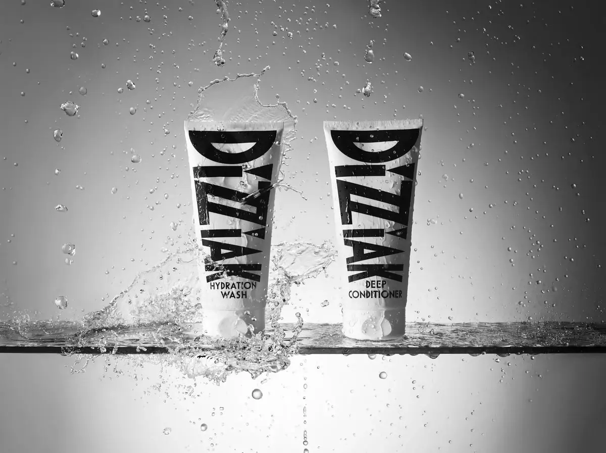
DIZZIAK
Oversized black lettering unites two pale haircare tubes
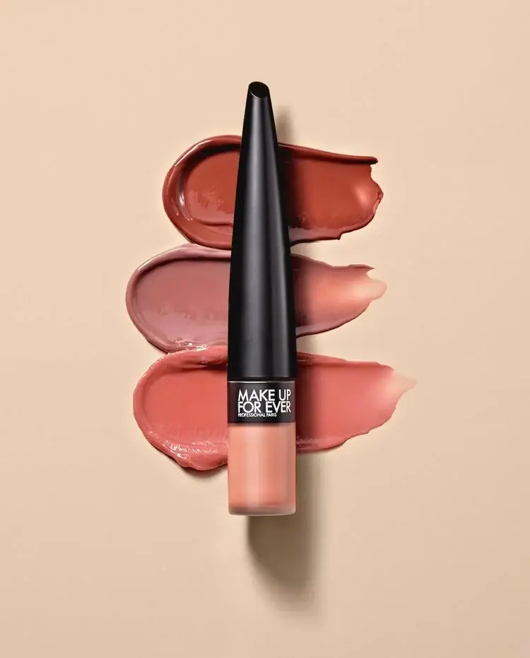
MAKE UP FOR EVER
Long tapered black cap above a compact colour chamber
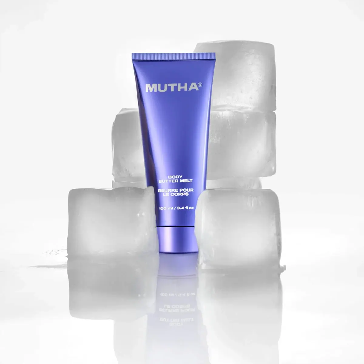
MUTHA
Reflective violet tube with bold maker and spacious middle
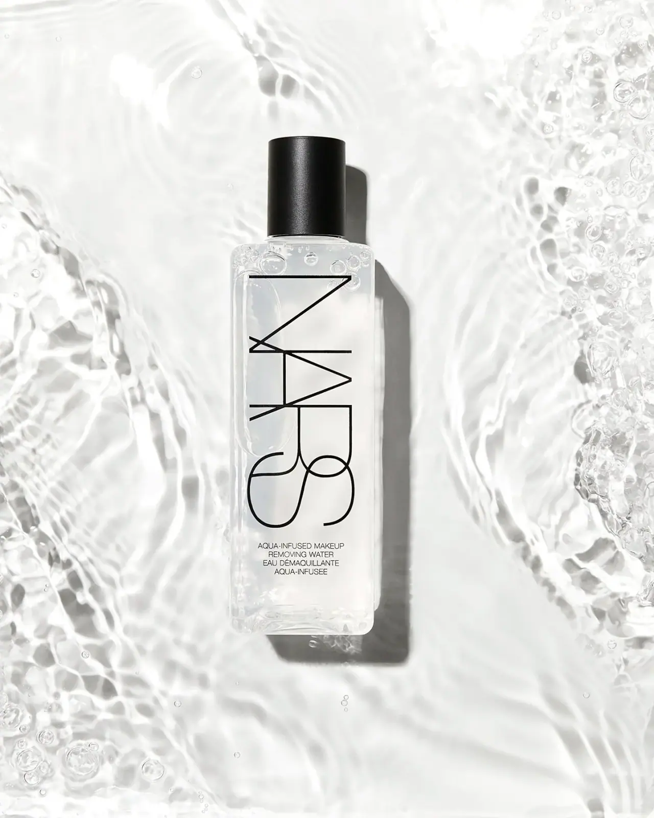
NARS
Clear elongated bottle with oversized interlocking mark and black cap
Pat McGrath Labs
Gold pigment kit with sparse labelling and sequin-filled pouch
Rodial
Reflective silver with parallel vertical foundation lettering

Saie
giant lowercase wordmark over frosted shade