
Photography: Jake Stewart photography for Plants By There / AKT. Images belong to their respective owners.
AKT

Lilac stage directions with a quiet metallic detail
The selected SC.05 Columbia Road deodorant balm pairs a pale lilac tube with a matching tall carton. Its character comes from compact black capitals, separated information blocks and unusually deliberate line breaks. The carton gives the scent name a staggered composition; the tube centres its product name and moves AKT to the base. They share a vocabulary without repeating one rigid layout. In the campaign photograph, flowers emerging behind the carton turn the restrained objects into a small floral scene. The printed packaging itself remains typographic: botanical atmosphere comes from the photography, not a floral label.
- Body & bath
- Light pack
- Bold typographic
- Colour-coded range
About this study
SC.05 Columbia Road tube and carton in the approved Plants By There campaign photograph. Current product and sustainability pages supply context, not proof that every production detail matches this undated photographed edition. Other scent artwork and reverse panels are outside scope.
Sources & evidence · Reviewed 2026-10-19Color Palette
Approximate colours interpreted from photography. These are screen references, not official brand colours or print specifications.
Pack body
Columbia lilac
#CFC4EB
Approximate screen appearance of the tube and carton. Their shared light violet field is the principal packaging colour; lighting changes it across each surface.
Ink
Soft black
#292533
Approximate dark lettering, retaining strong contrast without introducing another decorative colour. Not a verified ink formula.
Accent
Silver detail
#A8B4BC
Approximate midtone of the exposed metallic-looking neck or closure area. Highlights and shadows cannot be represented by one flat swatch.
Typography
Suggested visual alternatives, not confirmed brand typefaces. Any scale below is an illustrative estimate.
The tube begins with a compact scene code, then a smaller location line. A larger three-line product descriptor follows, with scent notes isolated farther down and the small brand signature near the bottom. The carton puts AKT first, gives the scene/location block considerable width, then separates the product descriptor with a generous gap. Uppercase sans-serif lettering connects these different arrangements. The visual tension comes from alternating centred and staggered blocks, rather than contrasting multiple decorative fonts.
Fonts
Display
Barlow Semi Condensed
- Looks like
- Compact industrial grotesque capitals; visual alternative only
- Type
- Semi-condensed sans serif
- Weight
- Medium to semibold
- Case
- Uppercase
- Tracking
- Compact to neutral; adjust optically
- Fallback
- Arial Narrow, Arial, sans-serif
An original product descriptor and location block. Keep short lines substantial enough to read while leaving distinct gaps between blocks; do not recreate the AKT wordmark.
Detail
Roboto Condensed
- Looks like
- Narrow utilitarian sans serif; visual alternative only
- Type
- Condensed sans serif
- Weight
- Regular to medium
- Case
- Uppercase
- Tracking
- Neutral, with slightly more air for very small text
- Fallback
- Arial Narrow, Arial, sans-serif
Scent notes, size and short secondary labels. Test printed samples: the subdued photograph is not evidence that tiny type is sufficiently legible in production.
Alternative system
IBM Plex Sans Condensed
- Looks like
- Plain editorial grotesque; alternative direction
- Type
- Condensed grotesque
- Weight
- Regular and semibold
- Case
- Uppercase for front-panel hierarchy
- Tracking
- Neutral
- Fallback
- Arial, sans-serif
A possible single-family replacement for both large and small levels in a fictional design. These three proposals are choices, not a recommendation to combine three families.
Structure & Proportions
Visual proportions and finish previews are illustrative. Confirmed construction details and uncertainties are distinguished in the study notes.
Proportions
| Purpose | Value | Preview |
|---|---|---|
| Paired silhouettes | The carton and tube have similar apparent heights in this composition. The carton remains straight-sided while the tube narrows toward its neck; this is a photographic relationship, not a dimension specification. | — |
| Information spacing | Large blank intervals separate scent, product and brand blocks. The pauses are as important as the letter size; filling them would flatten the hierarchy. | — |
| Front-panel balance | The carton uses a broad text area and visibly stepped line endings. The tube concentrates information toward its central axis, responding to a curved and narrowing surface. | — |
Shapes
| Element | Value | Preview |
|---|---|---|
| Outer carton | Slim rectangular prism with square front corners and long vertical edges. | |
| Tube | Flattened crimp at the wide end, gently tapering sides and a short projecting neck at the narrow end. |
Finishes
Low-glare lilac appearance, not verified soft-touch
Tube body and carton face; broad gentle tonal transitions rather than sharp reflections · matte
Silver-looking reflective detail
Exposed tube neck or closure region, with small bands of highlight and shadow; alloy is not identified from appearance alone · metallic
Formats and materials
| Formats | Tapered squeeze tube with a flattened upper seam, Tall rectangular outer carton |
| Materials | Current AKT sustainability copy describes aluminium tube packaging and explicitly identifies its aluminium cap; exact construction of this photographed edition was not independently verified., Paperboard-like carton visible in the photograph; board grade, recycled content and coating are undocumented. |
| Closures | A short silver-coloured feature projects below the tube. The image does not resolve its construction clearly. Current product instructions confirm a screw cap and a seal that is pierced before dispensing; this does not establish every hidden component of the photographed pack. |
| Decoration | Dark typographic information on uninterrupted lilac fields, No separate front-label edge is clearly visible; printing method unverified, No front-facing botanical illustration in the selected image |
Front Panel
Schematic reading order. The diagram’s zone heights do not represent measured artwork proportions.
Two related compositions rather than identical layouts. The box is the more expressive information surface, with staggered location and product lines. The tube uses a tighter central stack, allowing the same content to survive on a curved body. Neither visible front uses a border, badge or enclosing label panel.
| Zone | Content |
|---|---|
| Carton top | Small centred brand signature above a widely distributed short tagline; this establishes identity before the scent block. |
| Carton upper middle | Scene code and exterior notation lead into the location, with the final word shifted right. A small horizontal note row sits directly below. |
| Carton lower middle and foot | The product descriptor breaks across three staggered lines. Small claims and volume information form a separate footer rather than a promotional badge. |
| Tube upper and middle | Scene code and location sit near the crimp; the product descriptor forms a larger centred stack below. |
| Tube lower | Scent notes sit toward the right side of the photographed face, followed by a low brand signature. The metallic-looking neck gives the lilac body a distinct endpoint. |
Range System
The official shop lists numbered scent variants, supporting a code-plus-name navigation system. This study documents only SC.05 visually; it does not establish fixed artwork positions, colours or component specifications for other scents. For an original range, the transferable idea is to keep product recognition stable while assigning each scent a clear identifier and a restrained colour field.
- Observed selected pack: SC.05 Columbia Road, lilac carton and tube, with a short scent-note list.
- Official navigation also names SC.01 Orange Grove and SC.02 After Thunder; their colourways and layouts are outside this image review.
Back of Pack & Shelf
The reverse faces are not visible. A narrow side edge does not provide enough legible information to reconstruct a back panel. No ingredient layout, barcode position or recycling symbol is asserted here.
- Obtain a clear reverse photograph before documenting actual information order.
- For new production artwork, reserve space for independently checked ingredients, directions and required markings; this is workflow guidance, not a transcription of AKT's reverse.
On shelf
Interpretation: the shared lilac bodies should create a recognisable pair at a glance, while the large product descriptor clarifies function at closer range. The small brand signature and subtle colour may be less forceful at thumbnail scale than a large logo. Evaluate the tube alone as well as beside its carton; recognition after unboxing depends on retained colour and type character, not identical front-panel positions.
Imagery
The packaging fronts contain lettering rather than pictures. The selected campaign scene supplies the natural imagery: pink and violet flowers rise behind the carton, green leaves interrupt the pale ground, and the two packs sit together on a cool blue surface. Plants By There describes a Columbia Road flower-market brief and credits Jake Stewart for photography. This separates product design from campaign art direction: the floral abundance is a staging decision, not evidence of flowers printed on the box.
Guidelines
Editorial principles for an original design brief, not official brand guidelines.
Do
- Study the carton and tube separately before defining their shared rules.
- Use intentional line breaks and visible gaps to organise a sparse front.
- Keep scent identity and product function distinguishable at a glance.
- Check colour and legibility using physical samples, not campaign lighting.
- Let photography introduce botanical atmosphere without assuming it belongs on the printed artwork.
Don't
- Do not describe the two faces as an identical grid.
- Do not sample the blue photographic background and call it the tube colour.
- Do not turn a low-glare photograph into a verified soft-touch coating claim.
- Do not extrapolate this one scent into universal AKT packaging rules.
- Do not reproduce environmental or performance claims on fictional artwork without substantiation.
Sources & evidence
- The Deodorant Balm SC.05 — AKT Londonproduct
- SC.05 Columbia Road — Plants By There, photography credited to Jake Stewartphotographer
- Sustainability — AKT Londonbrand
How this study was built
structure · Sourced fact
The current product page identifies a 50 mL balm and screw-cap/seal use; the sustainability page identifies aluminium packaging and a bespoke aluminium cap. Historical component equivalence is not proven.The Deodorant Balm SC.05 — AKT London · Sustainability — AKT Londonlabel · Visual observation
The inspected approved photograph places AKT at the carton top and tube bottom, with staggered carton lines and more centred tube blocks.SC.05 Columbia Road — Plants By There, photography credited to Jake Stewarttypography · Visual observation
Compact uppercase sans-serif lettering is visible. Proposed Google families are visual alternatives, not identified original fonts.SC.05 Columbia Road — Plants By There, photography credited to Jake Stewartpalette · Visual observation
Lilac belongs to the packaging; the larger cool blue area belongs to the photographic setting. Listed colours deliberately exclude that background.SC.05 Columbia Road — Plants By There, photography credited to Jake Stewartimagery · Sourced fact
Plants By There describes flower-market art direction and credits Jake Stewart; the selected photograph supports the distinction between floral props and typographic fronts.SC.05 Columbia Road — Plants By There, photography credited to Jake Stewartrange · Editorial interpretation
Official numbered scent names support a variant system, but recommended range behaviour is design interpretation; other variant artwork was not reviewed.The Deodorant Balm SC.05 — AKT Londonedition · Editorial interpretation
The source identifies the campaign and scent without dating the exact pack revision, so contemporary specifications are not treated as a complete historical bill of materials.The Deodorant Balm SC.05 — AKT London · SC.05 Columbia Road — Plants By There, photography credited to Jake Stewart · Sustainability — AKT London
What remains unverified
- No manufacturer artwork, dieline or typeface attribution was available.
- Exact tube construction, carton stock, coating and printing process of this photographed edition remain unverified.
- HEX values are visual approximations affected by lighting, not production colour references.
- The photograph does not show readable reverse panels or establish a dated packaging revision.
Give your AI
packaging taste
Give your design or image tool a packaging study: palette, type, structure, front panel and principles for an original brief.
Export this styleFree with an email. PACK.md works in Claude, ChatGPT, Cursor and image tools.
More like this
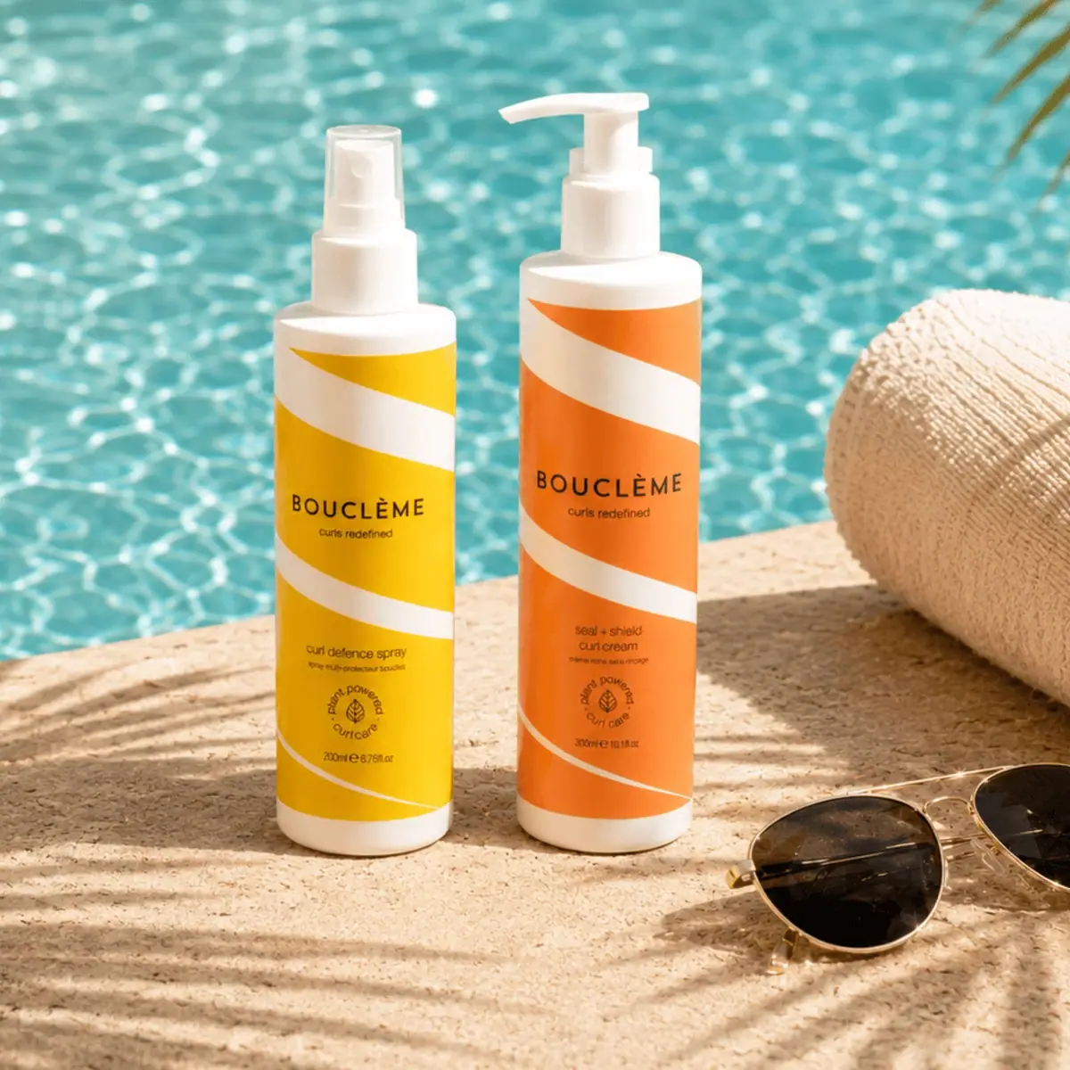
Bouclème
warm colour blocks crossed by flowing white ribbons
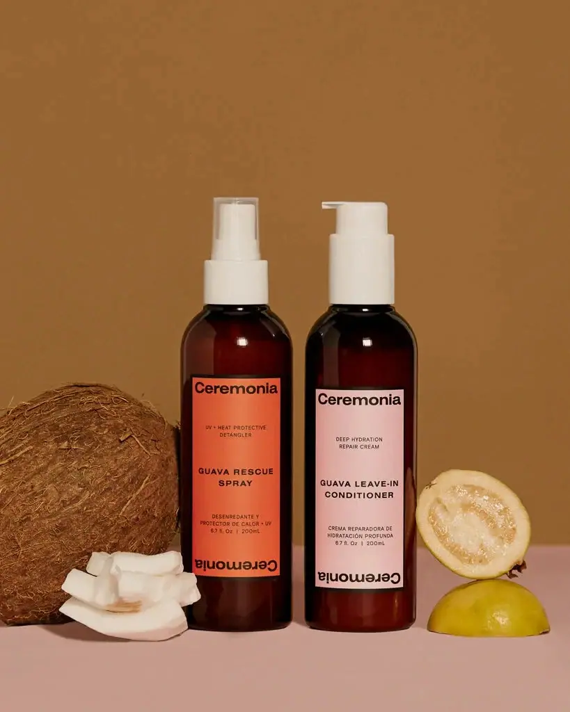
Ceremonia
Warm colour labels bounded by upright and inverted wordmarks

Dr. Bronner’s
A bright soap wrapper with a densely ordered voice
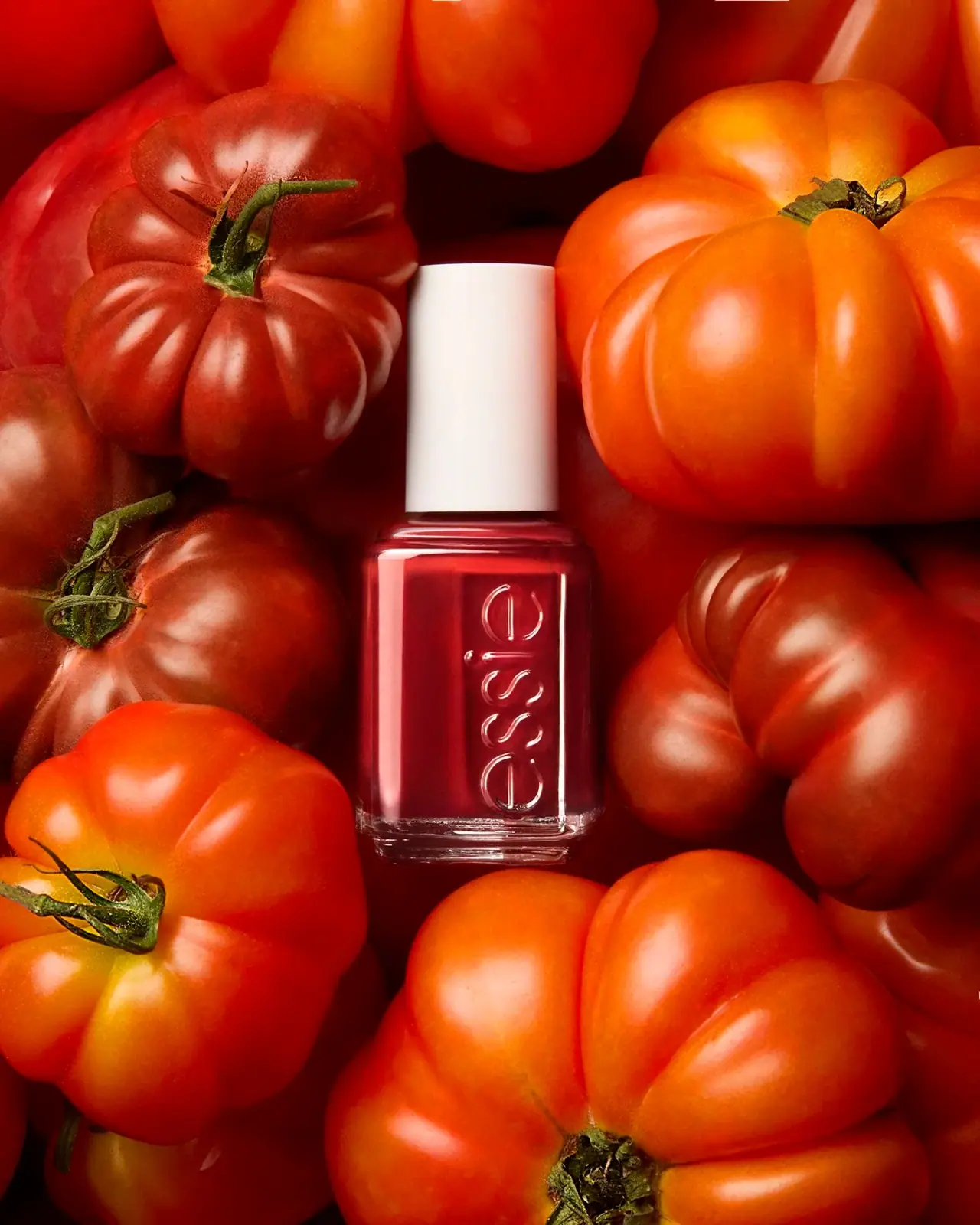
Essie
Visible red colour, clear relief and a white cap
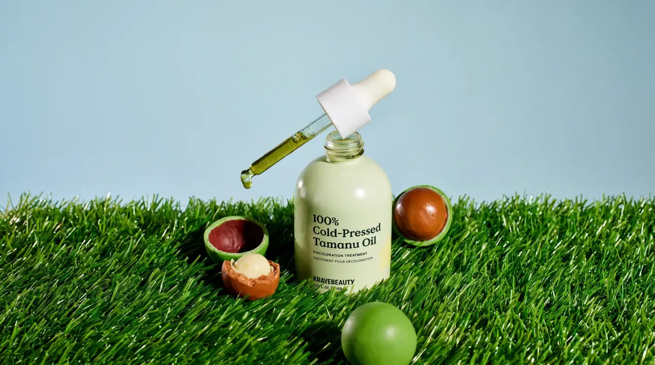
KraveBeauty
cropped wordmarks on minty skincare bottles

L'Oréal Paris
translucent amber shampoo under a gilded serif masthead

Malin+Goetz
pharmacy label set in bracketed helvetica

Native
white drugstore bottles, scent-tinted vertical caps