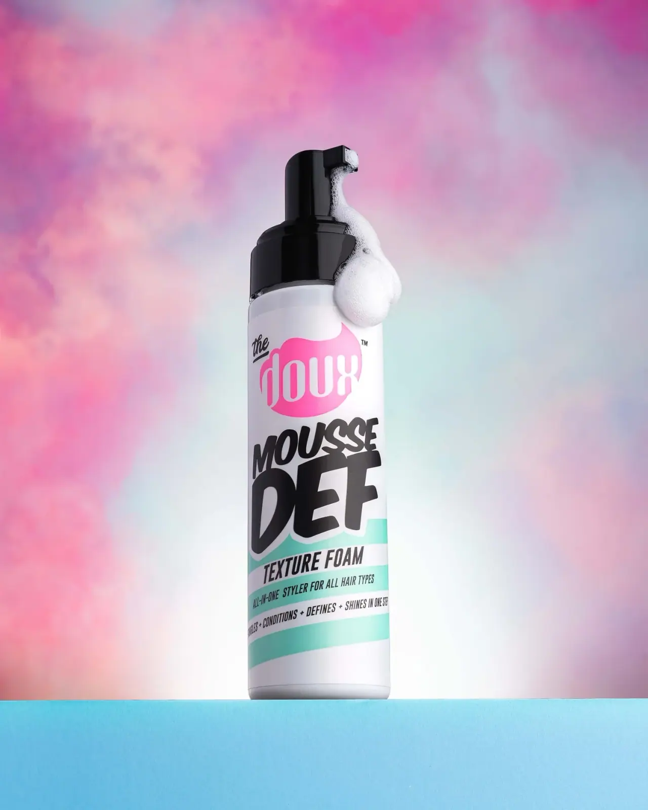
Photography: Derek Drapeau portfolio photography. Images belong to their respective owners.
The Doux

oversized slanted lettering above turquoise bands and black pump
Mousse Def Texture Foam places a high-energy graphic stack on a relatively simple white cylinder. A pink maker field introduces the pack, then large black slanted product lettering takes over the middle. Turquoise and white bands carry smaller functional information below. The unusually substantial black pump repeats the visual weight of the title. Derek Drapeau's selected photograph adds a stream of foam and a pastel cloud-like setting; those photographic effects are distinct from the permanent package design.
- Hair
- Light pack
- Bold typographic
- Playful colour
About this study
Mousse Def Texture Foam in Derek Drapeau's selected front photograph. Current product context is separate from unverified material and edition specifications.
Sources & evidence · Reviewed 2026-10-19Color Palette
Approximate colours interpreted from photography. These are screen references, not official brand colours or print specifications.
Pack body
White body field
#F3F2F3
Approximate pale body and unprinted-looking front field. Grey and violet shadows in the photograph are lighting effects, not additional specified package colours.
Ink
Dense black lettering
#171619
Approximate heavy product title and smaller information, echoed by the black-looking pump. Ink and closure need not share a material or manufacturing colour specification.
Turquoise bands
#75D8CD
Approximate lower graphic stripes. Their photographed brightness changes across the curved front, so this is a screen reference rather than a print formula.
Accent
Hot pink maker field
#ED4FA5
Approximate irregular field behind the white maker lettering. It is more saturated than much of the surrounding pink photographic cloud.
Typography
Suggested visual alternatives, not confirmed brand typefaces. Any scale below is an illustrative estimate.
The maker combines tall narrow white lowercase forms inside a pink field with a much smaller black script word above-left. Beneath it, MOUSSE and DEF are deliberately unequal: the short second word becomes substantially larger and heavier. Both lean and rise across the front, with tight spacing and nearly touching forms. The category line below is narrower and more regular, followed by still smaller benefit text. This creates several voices without giving every line equal emphasis.
Fonts
Heavy product-title alternative
Archivo Black
- Looks like
- Archivo Black for a dense display foundation
- Type
- Heavy sans serif
- Weight
- Regular 400
- Case
- Uppercase
- Tracking
- Tight, with optical spacing
- Fallback
- Arial Black, sans-serif
Use a short original product name and vary the two line sizes to create a clear second-line emphasis. Archivo Black does not reproduce the photographed sloping letterforms; any transformed type needs separate optical spacing and legibility checks. Do not trace the original title contours.
Narrow information alternative
Barlow Condensed
- Looks like
- Barlow Condensed for compact category and supporting lines
- Type
- Condensed sans serif
- Weight
- Bold 700 / Medium 500
- Case
- Uppercase
- Tracking
- Compact but readable
- Fallback
- Arial Narrow, sans-serif
Keep the functional category larger than the benefit line and leave more space around small text than around the display title. A narrower family can accommodate a curved bottle's limited frontal reading area, but the final label needs an actual-size wrap test rather than a flat mockup alone.
Structure & Proportions
Visual proportions and finish previews are illustrative. Confirmed construction details and uncertainties are distinguished in the study notes.
Proportions
| Purpose | Value | Preview |
|---|---|---|
| Unequal product-name lines | The short DEF line occupies more vertical space than MOUSSE above it, making the second word the principal black mass on the body. | — |
| Closure as visual anchor | The exposed black pump forms a substantial dark upper section, balancing the heavy title farther down the pale body. | — |
| Narrow functional register | The lower category and benefit bands are much shallower than the title zone, creating a deliberate transition from expressive naming to compact information. | — |
| Continuous curved field | Bands and text extend around the sides beyond the frontal reading area. The photograph cannot establish their complete circumference or seam location. | — |
Shapes
| Element | Value | Preview |
|---|---|---|
| Bottle silhouette | Long near-parallel sides, shallow shoulder and subtly rounded base edge. | |
| Foaming actuator | Tall rounded upper volume with a short projecting outlet above a broader collar. | |
| Maker field | Irregular rounded pink silhouette with pointed changes in its upper contour. | |
| Lower stripes | Broad oblique turquoise bands alternating with white information channels. |
Finishes
Glossy closure appearance
Black collar and actuator, where reflections make their curved geometry visible. No gloss-unit or polymer specification is claimed. · gloss
Smooth pale front
The white bottle field and coloured graphics; lighting does not establish a special tactile coating. · matte
Formats and materials
| Formats | Selected upright, tall cylindrical-looking white bottle with a broad black foaming pump and short projecting spout. |
| Materials | Bottle and pump component materials are not established by the accessed sources or photograph., The white front may involve a label, direct decoration or another construction; no complete application boundary or production specification is verified. |
| Closures | The black closure has a broad lower collar and a tall upper actuator with a short rectangular-looking outlet. Its overall silhouette is prominent relative to the narrow bottle. The photograph shows foam gathered at the nozzle and down one side. That visible styling supports discussion of dispensing context, but does not reveal the internal mesh, spring, locking system or supplied transport protection. No overcap is visible in this selected view. |
| Decoration | Irregular pink maker field with white narrow lettering., Oversized black slanted two-line product name with pale separation at its lower edge., Alternating turquoise and white diagonal bands carrying condensed functional information. |
Front Panel
Schematic reading order. The diagram’s zone heights do not represent measured artwork proportions.
The front moves through three main zones: pink maker identity, black product-name mass, then turquoise-striped functional information. The title is not enclosed in a tidy rectangular panel; its enlarged lower letters overlap visually with the striped area, separated by a pale outline. The stripes impose a directional rhythm beneath that irregular title. Small copy follows the same general sloping movement, while the cylindrical surface bends its visible baseline and clips the side words. No reverse-panel reconstruction is possible from this single angle.
| Zone | Content |
|---|---|
| Maker identity | Pink irregular field, white narrow lowercase name, and smaller black script element above-left. |
| Main product name | MOUSSE above a larger DEF, in heavy black slanted forms. |
| Functional category | TEXTURE FOAM in condensed black uppercase inside a pale oblique band. |
| Supporting claims | Smaller all-in-one and benefit wording on alternating bands, partially turning away around the bottle. |
| Base interval | A pale lower margin between the final coloured stripe and rounded base edge. |
Range System
The official product page confirms the named foam and currently presents a 7 oz version. This study analyses the photographed Mousse Def front, not the entire The Doux range. Pink and turquoise are therefore recorded as this package's accents rather than a proven category-coding system. A future related design could retain the separation between maker, expressive title and narrow functional bands, but that is a design interpretation requiring comparison with other products.
- Selected Mousse Def: white cylinder, pink maker field, black display title and turquoise lower bands.
- Current official listing supplies product context and a 7 oz designation; quantity is not legible on the selected photographic front.
Back of Pack & Shelf
The bottle's sides continue beyond the view and the back is hidden. Ingredients, complete directions, barcode, quantity placement and recycling marks cannot be mapped from the front. The official online instructions identify product use, but do not establish the printed reverse hierarchy or how that text is arranged around the cylinder.
- Inspect the reverse before describing its information blocks or barcode location.
- Confirm closure transport protection and locking behaviour with a physical sample.
- For a new wrap, test a narrow frontal reading window so key category text does not disappear around the sides.
On shelf
Interpretation: the high-contrast black title should remain a strong visual mass when the finer benefit lines become unreadable. The pink maker block offers a second recognition cue above it. However, dense sloping lettering and wraparound lower copy can lose clarity at an angle; a new design should be tested frontally and from either side. The black pump makes the object distinctive even when the lower body is partly obscured, but its prominence is a visual observation rather than evidence of superior dispensing performance.
Imagery
Derek Drapeau's photograph places the bottle on a cyan pedestal against diffuse pink, blue and pale cloud-like colour. White foam hangs from the nozzle along the right side, making texture tangible and linking the dispensing point to the product category. The bottle remains sharply outlined against the softer background. Neither the plinth's saturated cyan nor every pink cloud tone belongs in the package palette. The foam is a styled external product demonstration, not a decorative component shipped attached to the bottle.
Guidelines
Editorial principles for an original design brief, not official brand guidelines.
Do
- Give a short product name a deliberate internal hierarchy rather than equalising every line.
- Reserve a clearer, narrower register for the functional category below expressive lettering.
- Consider closure colour as part of the complete front composition.
- Separate permanent graphics from foam, lighting and photographic props.
Don't
- Do not attribute original fonts from visual resemblance alone.
- Do not turn one product's accents into an assumed whole-range colour code.
- Do not infer polymer or print process from the white front and black pump.
- Do not copy The Doux maker silhouette, title lettering or exact stripe arrangement.
Sources & evidence
- The Doux — Mousse Def Texture Foam, current productproduct
- Derek Drapeau — product photography portfolio, selected Mousse Def imagephotographer
How this study was built
context · Sourced fact
The official page identifies Mousse Def Texture Foam and currently lists 7 oz.The Doux — Mousse Def Texture Foam, current productimagery · Sourced fact
The photographer's portfolio captions the selected Mousse Def image and attributes the photography to Derek Drapeau.Derek Drapeau — product photography portfolio, selected Mousse Def imagetypography · Visual observation
DEF is substantially larger than MOUSSE above it; lower category and benefit text use narrower forms.Derek Drapeau — product photography portfolio, selected Mousse Def imagepalette · Visual observation
White, black, pink and turquoise describe the main package fields; background clouds and plinth are separate.Derek Drapeau — product photography portfolio, selected Mousse Def imagestructure · Visual observation
A tall glossy-looking black pump projects above the cylindrical body; foam hangs along its right side.Derek Drapeau — product photography portfolio, selected Mousse Def imageshelf · Editorial interpretation
Heavy title and pump create durable dark masses, while small wraparound copy needs angle-specific readability testing.
What remains unverified
- Exact fonts, graphic application, component materials and physical dimensions are unverified.
- Reverse, quantity marking, transport overcap and internal pump mechanism are not visible.
- One selected package does not establish universal range coding.
- Foam and pastel scene are photographic styling rather than permanent package surfaces.
Give your AI
packaging taste
Give your design or image tool a packaging study: palette, type, structure, front panel and principles for an original brief.
Export this styleFree with an email. PACK.md works in Claude, ChatGPT, Cursor and image tools.
More like this

ACURE
Iridescent spectacle with practical, tightly ordered type

Bask
sunny yellow with a playful turquoise signature

Beame
Orange bubble lettering, pink mascot, clear product badge

Bread Beauty Supply
bubblegum pumps and a fat black wordmark

Cut By Fred
Orange gel, cropped geometry and bold bilingual utility

Dune Suncare
Coral bottle with striped vertical identity and small left-aligned copy

e.l.f. Cosmetics
Pink tube, black cap, oversized thin lowercase signature
Ethique
Orange carton, oversized white script and a lathered square bar