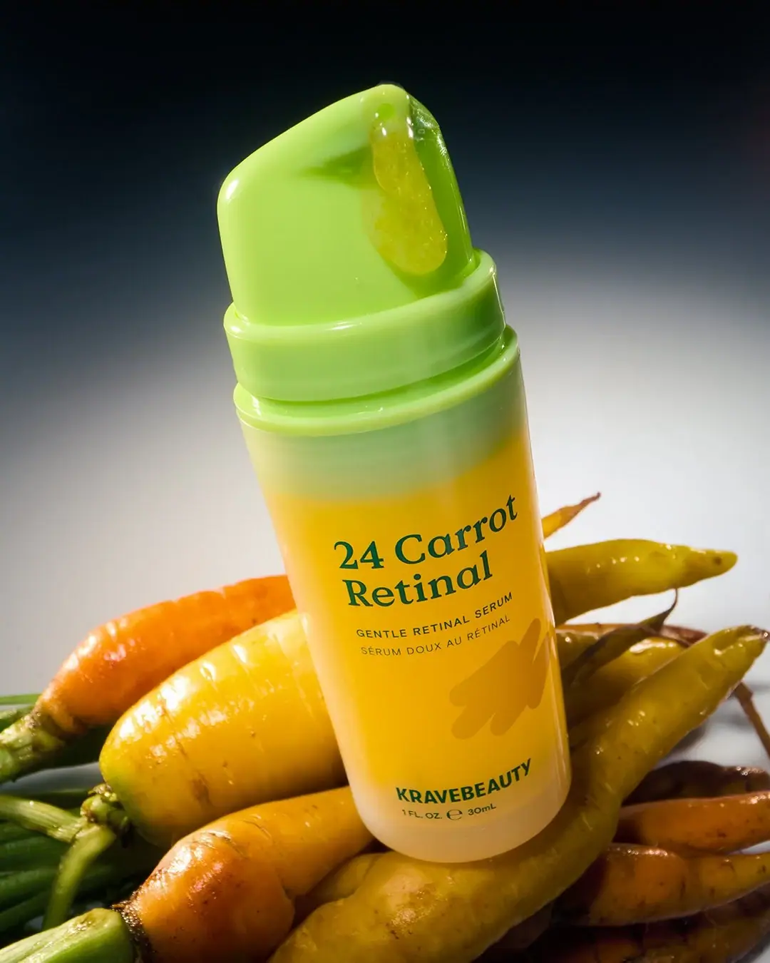
Great Barrier Relief

Photography: kravebeauty.com. All imagery belongs to its respective owner.
What makes the design work
KraveBeauty brand studyVisual observations across the brand’s packaging. Individual formats and editions may vary.
Cropped wordmark
Heavy condensed capitals about 20% of front height, running across the label base with the last letters cut off by the label edge.
Vertical tube wordmark
The same wordmark rotated 90 degrees along about 85% of a white tube, printed in the tube's cap colour.
Wrap label
Solid colour rectangle around the lower 55% of a clear bottle, carrying all text.
Reading the label
A rectangular wrap label covering the lower half of bottles, or direct print on tubes; the name sits top left, the cropped wordmark across the bottom.
- Top left
- Punny product name in the soft serif, two or three lines
- Middle
- Small leaf icon, bilingual descriptor, volume
- Bottom or side
- Wordmark at full width, cropped by the label edge or rotated up the tube
Typography & hierarchy
Two loud elements and one quiet one: the cropped condensed wordmark at maximum size across the label base or up the tube side, the punny product name at the top left of the label in a soft serif, and a small block of leaf icon, bilingual descriptor and volume between them.
Display
Druk Bold, Bebas Neue Pro Bold
Heavy condensed grotesque
Uppercase · Bold
Headline
Recoleta Light, GT Alpina Light
Soft low-contrast serif
Title case · Light, Regular
Label
Graphik Medium, Inter Medium
Neutral grotesque
Uppercase · Medium
Typeface suggestions based on visual similarity. These are not verified font identifications.
How the range holds together
Each product owns one colour (sometimes a pair), used on the cap, the label or the wordmark, and repeated as the gradient photo background; layout and type stay fixed.
Shelf presence
On shelf and online the range reads as a row of single-colour personalities, each bottle or tube shouting one cropped word in its colour, so products are found by colour and the cropped wordmark becomes a repeating stripe.
Related packaging
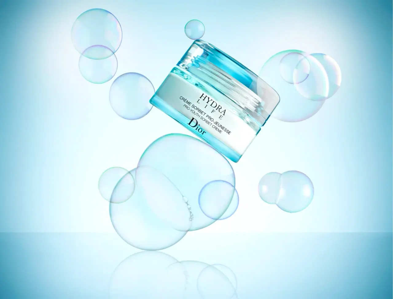
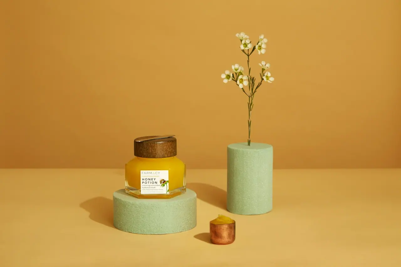
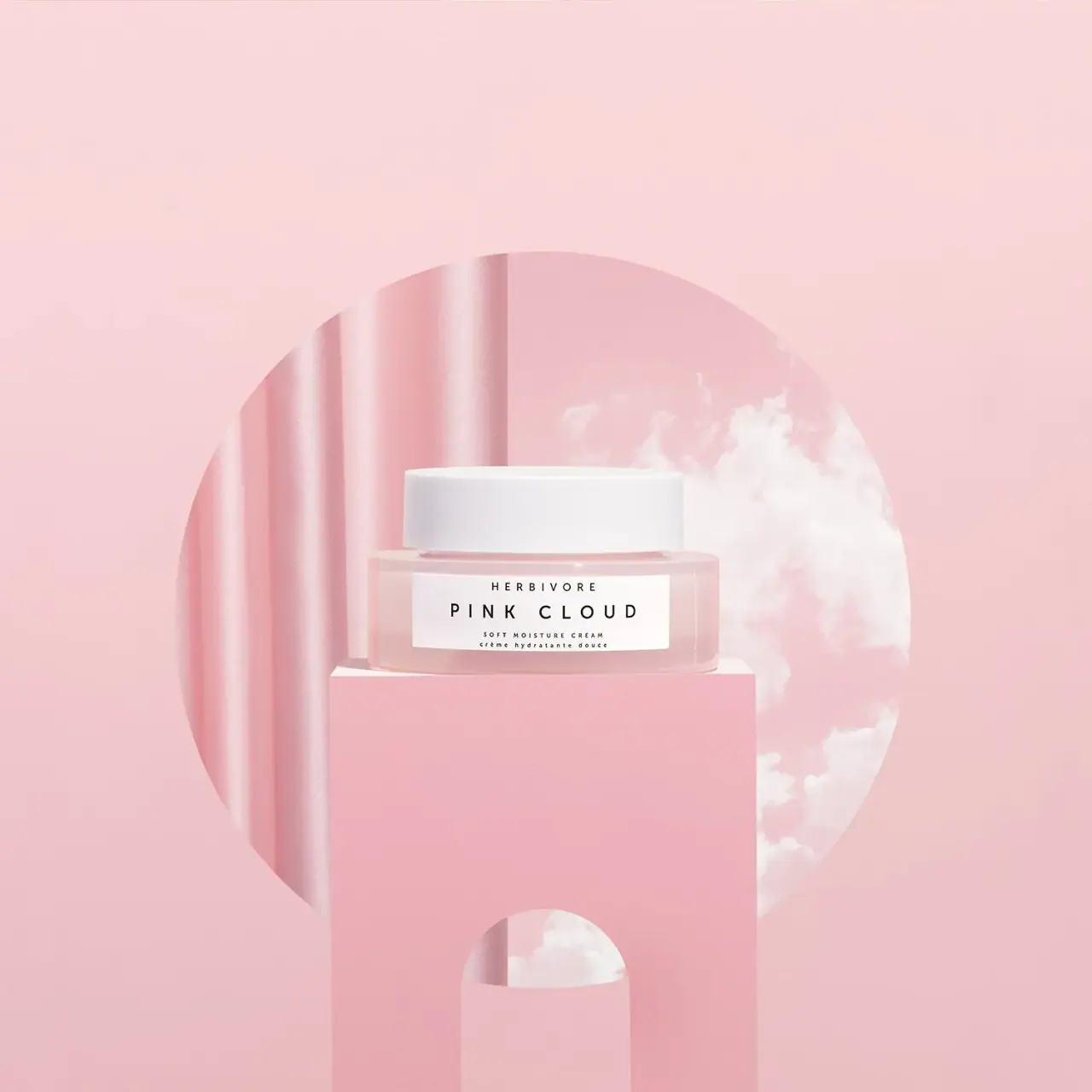
More curated references in skincare, matched by format and visual style.

Featured from KraveBeauty
The selected packaging reference for this brand.