Campaign images © KraveBeauty, from kravebeauty.com
KraveBeauty

cropped wordmarks on minty skincare bottles
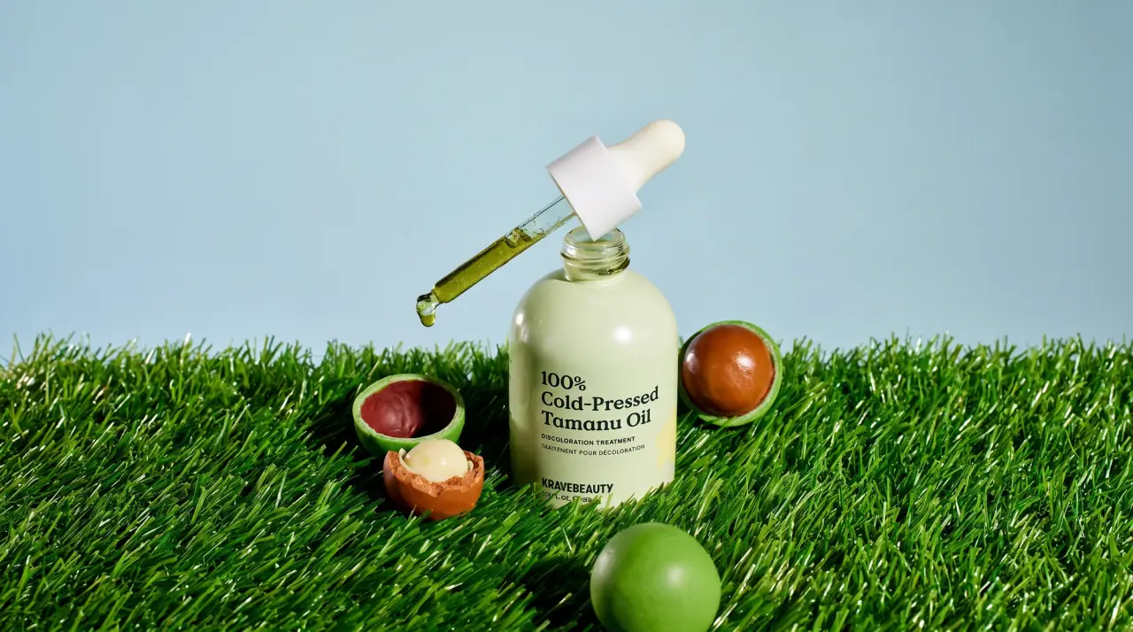
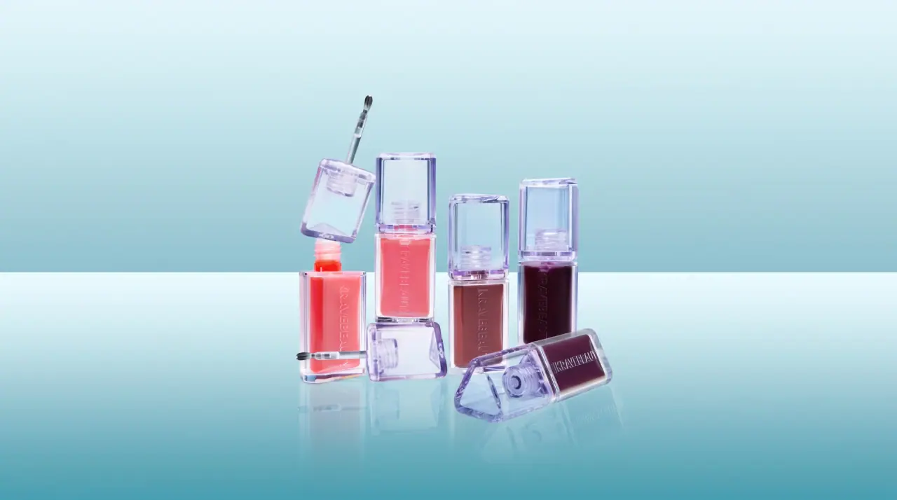
KraveBeauty runs a colour-coded skincare range in which every product owns a colour pair, worn as a cap and a wrap label on bottles or as a cap and a wordmark on white tubes. The wordmark is set very large in heavy condensed capitals and deliberately cropped: it runs off the right edge of the wrap label on round serum bottles and climbs vertically up the side of tubes. Product names are punny and set in a soft, low-contrast serif at the top left, broken over two or three lines, with a tiny leaf swoosh and small bilingual English and French descriptors underneath. Each pack is shot on a smooth gradient backdrop in its own colour, so the product colour carries from cap to label to background.
- Skincare
- Light pack
- Colour-coded range
- Bold typographic
- Playful colour
Color Palette
Approximate colours interpreted from photography. These are screen references, not official brand colours or print specifications.
Pack body
Clear Bottle
#edf1f0
Rounded clear bottle showing the milky serum or oil inside
Tube White
#f6f6f1
Soft white tubes for cleanser, sunscreen and lip balm
Label
Barrier Teal
#0e6b75
Wrap label of the barrier serum and text colour on the lip tube
Ink
Name Ink
#1d3a3c
Product names and descriptors on white tubes and pale labels
Accent
Mint Cap
#b5eedf
Tall serum overcap and the cropped wordmark printed on the teal label
Pump Butter
#f4e58c
Pump head of the cleansing oil and its cropped wordmark
Range coding
Matcha Lime
#c3df57
Cleanser tube cap, its vertical wordmark and the cap of the retinal serum
Beet Pink
#ee2c7b
Sunscreen tube cap and its vertical wordmark
Kale Green
#1f7a45
Label on the exfoliating toner bottle
Carrot Amber
#f2c64a
Tinted serum seen through the frosted retinal bottle
Oil Sky
#a9c9ea
Pale blue wrap label of the cleansing oil, with a butter-yellow wordmark
Typography
Suggested visual alternatives, not confirmed brand typefaces. Any scale below is an illustrative estimate.
Two loud elements and one quiet one: the cropped condensed wordmark at maximum size across the label base or up the tube side, the punny product name at the top left of the label in a soft serif, and a small block of leaf icon, bilingual descriptor and volume between them.
Type scale
Estimated cap size as a share of the panel · Front of the 45 ml serum bottle, cap excluded, about 70 mm tall
wordmark
20% · Bold · Display
KALEBALM
tube-wordmark
14% · Bold · Display
KALEBALM
product-name
7% · Light · Headline
Great Oat Relief
descriptor
2.4% · Medium · Label
REPARATIVE SOOTHING SERUM
translation
2.4% · Medium · Label
SÉRUM RÉPARATEUR APAISANT
volume
1.8% · Medium · Label
1.52 fl. oz. e 45 mL
Fonts
Display
Anton
- Looks like
- Druk Bold, Bebas Neue Pro Bold
- Type
- Heavy condensed grotesque
- Weight
- Bold
- Case
- Uppercase
- Tracking
- Tight, about -1%
- Fallback
- Impact, Bebas Neue, Arial Narrow Bold
The wordmark only, set larger than the label and cropped by its edge, or rotated 90 degrees up the side of a tube.
Headline
Fraunces
- Looks like
- Recoleta Light, GT Alpina Light
- Type
- Soft low-contrast serif
- Weight
- Light, Regular
- Case
- Title case
- Tracking
- Normal
- Fallback
- Cooper Light, Georgia
Punny product names broken over two or three lines, top left of the label.
Label
Inter
- Looks like
- Graphik Medium, Inter Medium
- Type
- Neutral grotesque
- Weight
- Medium
- Case
- Uppercase
- Tracking
- Wide, about +6%
- Fallback
- Helvetica, Arial
English descriptor followed by the French translation, and the volume line.
Structure & Proportions
Proportions
| Purpose | Value | Preview |
|---|---|---|
| Wrap label height | About 55% of bottle height, lower half | |
| Wordmark overflow | About 25% of the wordmark runs off the label edge | |
| Wordmark height | About 20% of front height on bottles | |
| Tube wordmark | Vertical along about 85% of the tube length | |
| Name block | Top left, about 40% of label width | |
| Colours per pack | Two: one label or body colour plus one cap/wordmark colour | — |
| Density | Bold and simple: one huge word, one name, one small text block | — |
Shapes
| Element | Value | Preview |
|---|---|---|
| Serum bottle | Rounded flask with sloping shoulders | |
| Overcap | Tall flat-top cylinder cap | |
| Wrap label | Rectangle wrapping the lower half | |
| Tube cap | Flat colour-matched screw cap | |
| Leaf icon | Tiny hand-drawn leaf swoosh |
Finishes
Clear gloss plastic
Serum and oil bottles · transparent
Frosted plastic
Retinal serum bottle · frosted
Matte soft-touch tube
Cleanser, sunscreen and lip tubes · soft-touch
Gloss coloured caps
Overcaps and tube caps · gloss
Formats and materials
| Formats | Rounded serum bottle, Squeeze tube, Slim lip tube, Toner bottle, Jar |
| Materials | Clear plastic, Frosted plastic, Soft-touch tube |
| Closures | Tall flat-top overcaps in the range colour on serums, colour-matched flip and screw caps on tubes, a coloured pump on the oil |
| Decoration | Wrap label in solid colour, Cropped wordmark, Small leaf-swoosh icon |
Front Panel
Schematic reading order. The diagram’s zone heights do not represent measured artwork proportions.
A rectangular wrap label covering the lower half of bottles, or direct print on tubes; the name sits top left, the cropped wordmark across the bottom.
| Zone | Content |
|---|---|
| Top left | Punny product name in the soft serif, two or three lines |
| Middle | Small leaf icon, bilingual descriptor, volume |
| Bottom or side | Wordmark at full width, cropped by the label edge or rotated up the tube |
Range System
Each product owns one colour (sometimes a pair), used on the cap, the label or the wordmark, and repeated as the gradient photo background; layout and type stay fixed.
- Barrier serum = mint cap + teal label + mint wordmark
- Cleanser = white tube + lime cap + lime wordmark
- Sunscreen = white tube + hot pink cap + pink wordmark
- Cleansing oil = yellow pump + sky label + yellow wordmark
- Retinal serum = lime cap + frosted amber bottle
Back of Pack & Shelf
The wrap continues round the back in the same colour with a short friendly paragraph, directions, the full ingredient list and bilingual legal text in small uppercase grotesque, ending with volume, batch and recycling marks.
- Short conversational paragraph about the formula
- Directions in a few numbered steps
- Full INCI ingredient list
- English and French product type and cautions
- Volume in fl oz and mL with the estimated sign
- Barcode, recycling and cruelty-free marks
On shelf
On shelf and online the range reads as a row of single-colour personalities, each bottle or tube shouting one cropped word in its colour, so products are found by colour and the cropped wordmark becomes a repeating stripe.
Imagery
No illustration beyond a tiny hand-drawn leaf swoosh and, on some packs, a soft painted brush mark; photography uses smooth colour-gradient backdrops that match the product colour.
Guidelines
Do
- Give every product a colour pair and use it on cap plus label, or cap plus wordmark.
- Set the wordmark in heavy condensed capitals at about 20% of front height and crop it at the label edge.
- On tubes, run the wordmark vertically along about 85% of the length in the cap colour.
- Put a punny product name in a soft serif at the top left, on two or three lines.
- Keep descriptors small and bilingual, English then French, in uppercase grotesque.
- Photograph each pack on a gradient of its own colour.
Don't
- Don't show the full wordmark uncut on bottles.
- Don't use more than two colours on one pack.
- Don't set product names in the condensed display face or in all caps.
- Don't add botanical illustration or ingredient photos to the pack.
- Don't use metallic or luxury finishes.
Give your AI
packaging taste
Give your design or image tool a packaging study: palette, type, structure, front panel and principles for an original brief.
Export this styleFree with an email. PACK.md works in Claude, ChatGPT, Cursor and image tools.
More like this
Starface
star-eyed smiley in neon bubblegum

Behave
struck-through wordmark on sour neon pouches

Boy Smells
candy-shell flacons over blush pink glass
Magic Spoon
saturday cartoon cereal for grown-ups

Partake
one saturated carton per cookie flavour

ACURE
Iridescent spectacle with practical, tightly ordered type

AKT
Lilac stage directions with a quiet metallic detail

Bask
sunny yellow with a playful turquoise signature