
Photography: Anna Keville Joyce / Lucas Zarebinski — Aesop commissioned photography. Images belong to their respective owners.
Aesop

a botanical still life around a disciplined apothecary label
The selected Resurrection Aromatique Hand Wash makes a dense information label feel composed rather than decorative. A broad amber-toned bottle supports a black pump and an off-white wraparound field. The distinctive serif wordmark has breathing room above compact bilingual text, while dark horizontal bands separate identity, description and the footer. This study reads the photographed front, not a complete Aesop identity manual. Its strongest transferable principle is the contrast between a functional, ordered object and a richly textured botanical environment: the packaging communicates through language and geometry, while the photograph supplies atmosphere.
- Body & bath
- Light pack
- Apothecary
- Heritage label
About this study
Resurrection Aromatique Hand Wash as shown in the selected Anna Keville Joyce / Lucas Zarebinski campaign photograph. The inspected image does not establish its production year or material specification. Current official product information is explicitly separated from this photographed edition; this is not a comprehensive Aesop brand manual.
Sources & evidence · Reviewed 2026-10-19Color Palette
Approximate colours interpreted from photography. These are screen references, not official brand colours or print specifications.
Pack body
Amber brown
#52271D
Approximate midtone of the photographed bottle, excluding bright reflections. Its depth changes with lighting and contents; this is neither a resin specification nor a claim of amber glass.
Label
Warm ivory
#E9E7D1
Approximate label field. The photograph casts green light across it, so use this as a visual starting point rather than a verified print colour.
Ink
Near black
#191D18
Approximate dark label text and horizontal information bands; the pump belongs to the same perceived dark family. No ink formulation is established.
Typography
Suggested visual alternatives, not confirmed brand typefaces. Any scale below is an illustrative estimate.
The wordmark occupies a spacious opening field, with its uneven letter widths and serif detail distinguishing it from the practical text below. The product name follows in a narrow reversed band. A French translation, a compact aromatic-note line and paired descriptive blocks build a second reading speed. The result is not empty minimalism: it is controlled density, with a clear entry point and several tightly organised subordinate levels.
Fonts
Identity alternative
Newsreader
- Looks like
- Newsreader, used as an editorial serif starting point
- Type
- Contrast-bearing editorial serif
- Weight
- Regular
- Case
- Title case
- Tracking
- Start at normal spacing and adjust for the fictional name
- Fallback
- Georgia, serif
For a new identity, explore a modest serif name above the information block. Retain generous separation from the product title, but develop original letterforms and proportions instead of reconstructing the Aesop wordmark.
Information alternative
Roboto Condensed
- Looks like
- Roboto Condensed, as a practical narrow sans-serif option
- Type
- Condensed sans serif
- Weight
- Regular and Medium
- Case
- Sentence and title case
- Tracking
- Normal; avoid compression that compromises small text
- Fallback
- Arial Narrow, Arial, sans-serif
Use for product identity, translations and short explanatory passages. Test reverse text at actual print size and allow more room than the photograph appears to show; photographic density is not a production legibility specification.
Structure & Proportions
Visual proportions and finish previews are illustrative. Confirmed construction details and uncertainties are distinguished in the study notes.
Proportions
| Purpose | Value | Preview |
|---|---|---|
| Body and closure | The body is broad and stable-looking; the narrower pump assembly creates a distinct upper tier. These are qualitative observations, not dimensions. | — |
| Label placement | The label sits below the shoulder and leaves an amber margin above the base. Its edges turn away around the cylinder, reducing the readable frontal width. | — |
| Information density | A comparatively open wordmark zone precedes much denser text blocks. Preserve that contrast rather than distributing all lines at equal size or spacing. | — |
Shapes
| Element | Value | Preview |
|---|---|---|
| Bottle | Round cylindrical body with sloping shoulders and a narrower neck. | |
| Label field | Rectangular wraparound panel; curved appearance follows the bottle surface. | |
| Information separators | Horizontal dark bars that follow the label around the body. | |
| Dispenser | Projecting pump head over a vertically ribbed collar. |
Finishes
Reflective bottle appearance; material unverified
Shoulder and exposed lower body; highlights are affected by coloured set lighting. · gloss
Subdued label appearance; coating unverified
Ivory information panel; lower reflection relative to the adjacent shoulder. · matte
Formats and materials
| Formats | Selected object: rounded upright pump bottle with a broad cylindrical body and sloping shoulders., Current product comparison: Aesop also lists a screw-cap refill; that variant is not the photographed object. |
| Materials | The selected photograph does not establish the bottle resin, recycled content or label substrate. Amber appearance alone cannot distinguish plastic from glass., Current Aesop product guidance says bottles contain at least 97% recycled plastic. This does not establish the specification of the earlier photographed specimen. |
| Closures | A black pump rises from a wide ribbed collar, with its horizontal spout extending left in the photograph. The vertical grip texture contrasts with the smooth shoulder. Internal components, locking mechanism, neck finish and output are not established from this view. |
| Decoration | Rectangular pale label wraps around the cylindrical body., Serif wordmark, compact bilingual text and dark horizontal bands provide the visible decoration., No illustration is visible on the inspected front; the foliage belongs to the photographic set. |
Front Panel
Schematic reading order. The diagram’s zone heights do not represent measured artwork proportions.
Read the front as a descending sequence of text fields rather than a centred badge. The name starts near the left edge, and the body copy follows a shared left alignment. Full-width dark bands establish horizontal pauses. The bilingual arrangement is part of the photographed edition; it should not be assumed identical in every market or year.
| Zone | Content |
|---|---|
| Upper identity field | Large Aesop wordmark on pale ground, with open space to its right. The name has greater character size but does not consume the entire panel. |
| Product identification | English product name reversed out of a dark band, followed by the French product name on the light field. Contrast separates the two without requiring a decorative border. |
| Aromatic-note block | Compact English and French note lines sit between product identification and descriptive copy. Their typographic role is secondary to the product title. |
| Description | Short English copy reverses from a dark block, with French copy beneath on pale ground. Only the exposed front is analysed; text disappearing around the sides is not reconstructed. |
| Footer | A narrow dark strip includes the website. The bottom pale margin gives the printed field a visible endpoint before the exposed bottle base. |
Range System
Only one selected pack is studied, so no universal colour-coding or range grid is asserted. For an original system, the useful hypothesis is to retain a consistent hierarchy and differentiate products through clear names and descriptors. That is a design interpretation requiring testing with multiple SKUs, not documented Aesop guidance.
- The photographed hand wash uses bilingual identity and aromatic descriptors as its visible product cues.
- The current official page lists a 500 mL pump presentation and 500 mL refill, showing a functional format distinction rather than proving a different colour family.
Back of Pack & Shelf
The reverse is not visible. The curved front photograph cannot confirm an ingredient panel, barcode location, seam, recycling mark or manufacturing code. A new design must reserve those areas using its own market requirements and supplier dieline.
- Verify mandatory ingredient, responsible-party and quantity information against the intended market.
- Plan a readable reverse panel and batch-code area without copying unseen details from this reference.
- Confirm the label seam and pump orientation on a physical sample before approving artwork.
On shelf
Interpretation: the dark closure and pale rectangular label should remain recognisable before the small copy is legible. At closer distance, the information density encourages inspection. In a crowded bathroom, the contrast between label and bottle may be more useful than the individual aromatic words. These are visual hypotheses; no shelf test or customer-recognition data was consulted.
Imagery
The inspected image places the pack low in a dense arrangement of bark, foliage, citrus, feathers and dried botanical textures. Saturated green and warm orange surround the subdued bottle. Directional highlights preserve the shoulder and pump silhouette, while the pale label remains the strongest reading surface. The creators identify the work as set design and photography for the hand wash. This is one campaign treatment, not evidence that all Aesop imagery uses forest scenery. The large amount of surrounding green should not be mistaken for a green packaging palette.
Guidelines
Editorial principles for an original design brief, not official brand guidelines.
Do
- Give a dense label one clear entry point before secondary information.
- Use aligned text blocks and deliberate spacing to organise languages.
- Separate a material claim from a visual description and identify the edition it applies to.
- Test the full-wrap artwork on a cylindrical mock-up; edge copy becomes harder to read as it turns away.
Don't
- Do not call this photographed bottle glass or assign PET solely from its amber appearance.
- Do not import green foliage or orange fruit into the pack palette as if they were printed colours.
- Do not reproduce the Aesop wordmark, distinctive label wording or exact band arrangement.
- Do not extend current recycled-content guidance backwards to the photographed edition without documentation.
Sources & evidence
- Aesop — Resurrection Aromatique Hand Wash: current product, refill and packaging guidanceproduct
- Anna Keville Joyce / Lucas Zarebinski — Resurrection Aromatique Hand Wash image, AESOP Set Design: Foraging & Photographyphotographer
How this study was built
structure · Sourced fact
The current official page describes recycled-plastic bottles and a pump-free refill. The historical photographed bottle is not assigned that specification.Aesop — Resurrection Aromatique Hand Wash: current product, refill and packaging guidanceedition · Sourced fact
The creator image page identifies the selected hand wash and its authors; it does not establish the specimen production year.Anna Keville Joyce / Lucas Zarebinski — Resurrection Aromatique Hand Wash image, AESOP Set Design: Foraging & Photographytypography · Visual observation
The inspected local photograph shows a serif wordmark above compact sans-serif information. Proposed Google fonts are alternatives, not identifications.Anna Keville Joyce / Lucas Zarebinski — Resurrection Aromatique Hand Wash image, AESOP Set Design: Foraging & Photographylabel · Visual observation
Bilingual blocks alternate pale and dark fields beneath the open identity zone. Reverse and hidden side content are excluded.Anna Keville Joyce / Lucas Zarebinski — Resurrection Aromatique Hand Wash image, AESOP Set Design: Foraging & Photographypalette · Visual observation
Amber, ivory and near black describe the pack. The dominant green comes from scenery and coloured light; swatches are approximate.Anna Keville Joyce / Lucas Zarebinski — Resurrection Aromatique Hand Wash image, AESOP Set Design: Foraging & Photographyimagery · Visual observation
Citrus, foliage and textured natural props surround the lower-centred bottle in the selected campaign image.Anna Keville Joyce / Lucas Zarebinski — Resurrection Aromatique Hand Wash image, AESOP Set Design: Foraging & Photographyrange · Editorial interpretation
Fixed hierarchy with descriptive product differentiation is a proposed learning from one pack, not a verified rule across Aesop products.
What remains unverified
- The photographed bottle material and recycled content are unverified; current recycled-plastic guidance is not evidence for this specimen.
- Exact fonts, HEX specifications, label substrate, printing method and coating have not been identified.
- No dimensions, dieline or reverse-panel photograph were available; proportions are qualitative.
- The full Behance project returned HTTP 403 during this review; the individual image page was accessible.
- The image source reserves rights and requires explicit permission; this study does not establish an image-reuse licence.
Give your AI
packaging taste
Give your design or image tool a packaging study: palette, type, structure, front panel and principles for an original brief.
Export this styleFree with an email. PACK.md works in Claude, ChatGPT, Cursor and image tools.
More like this
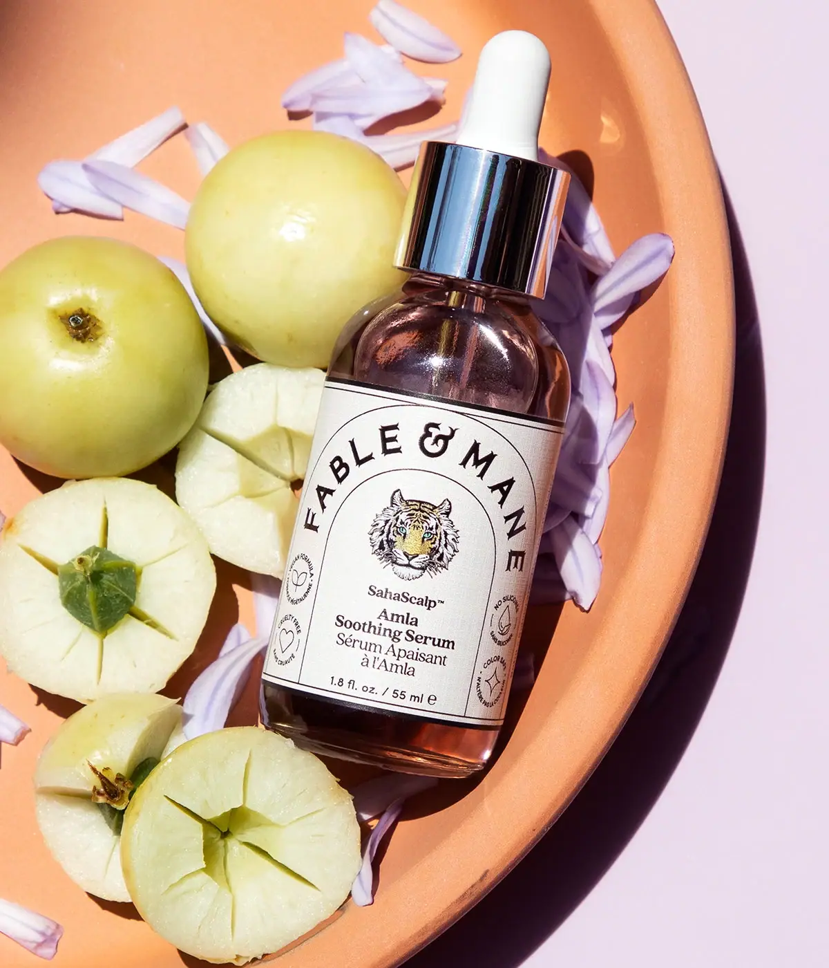
Fable & Mane
Arched serif maker, tiger portrait and amber dropper bottle
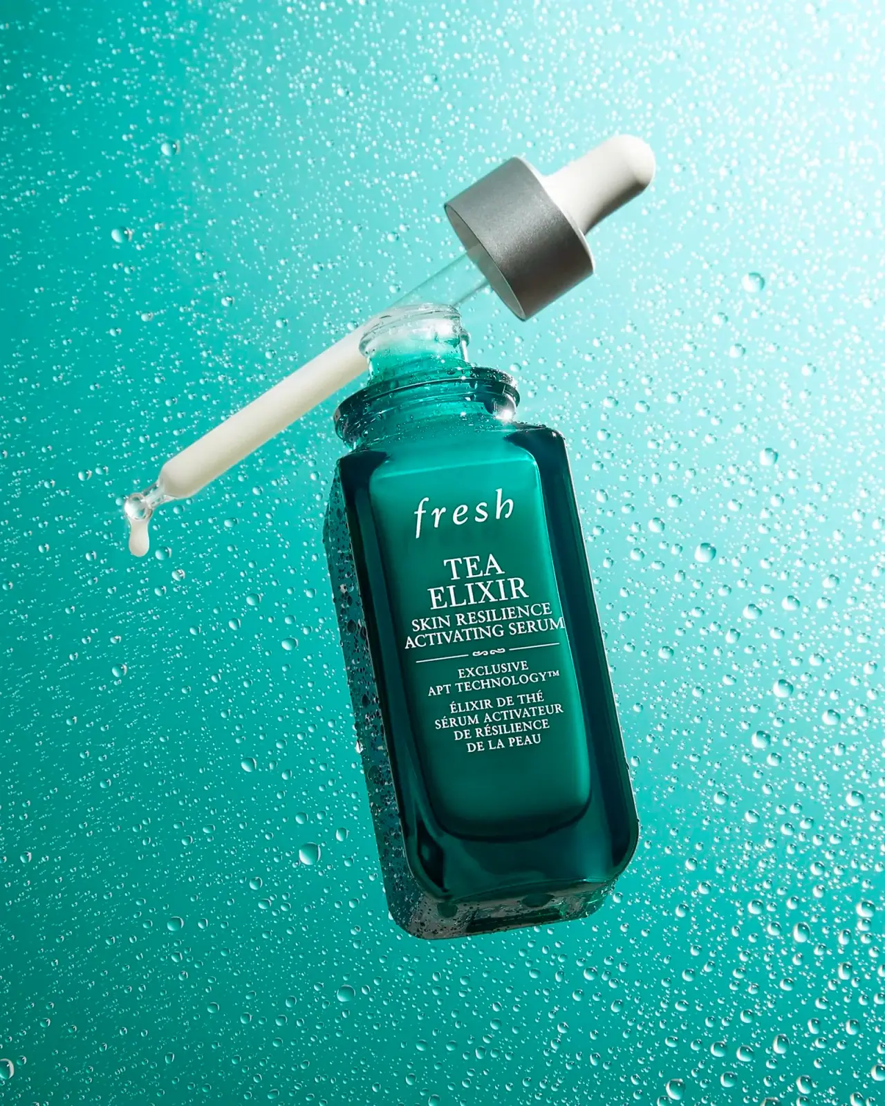
Fresh
Teal dropper bottle with white serif naming and silver collar
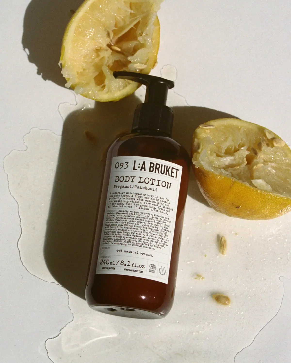
L:A Bruket
Amber pump bottle with a ruled typographic information label
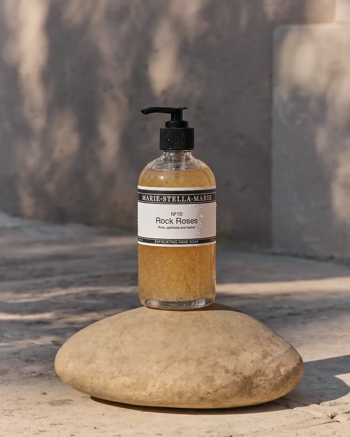
Marie-Stella-Maris
Black label bands frame numbered scent and amber texture
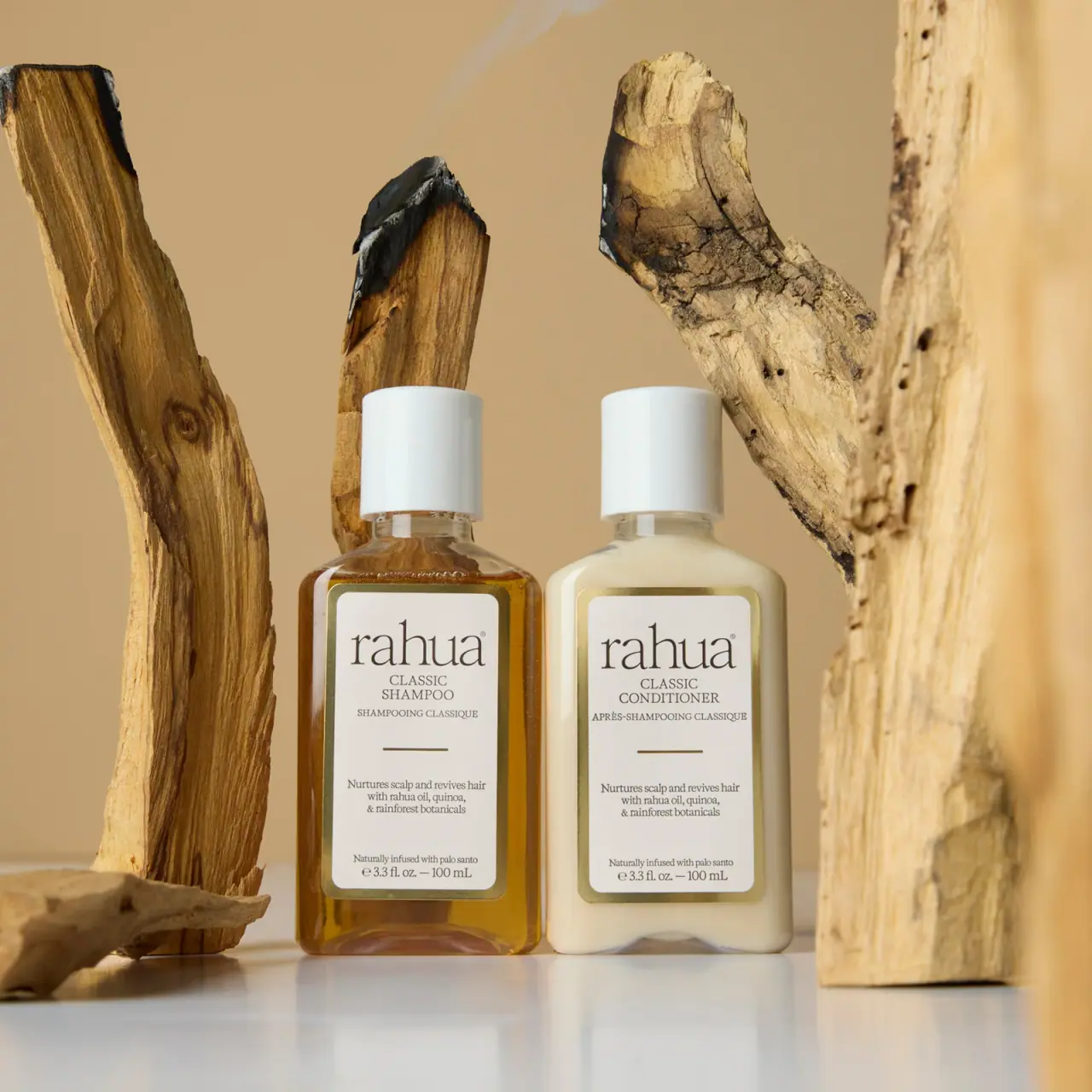
Rahua
paired cream serif labels with gold borders and white caps
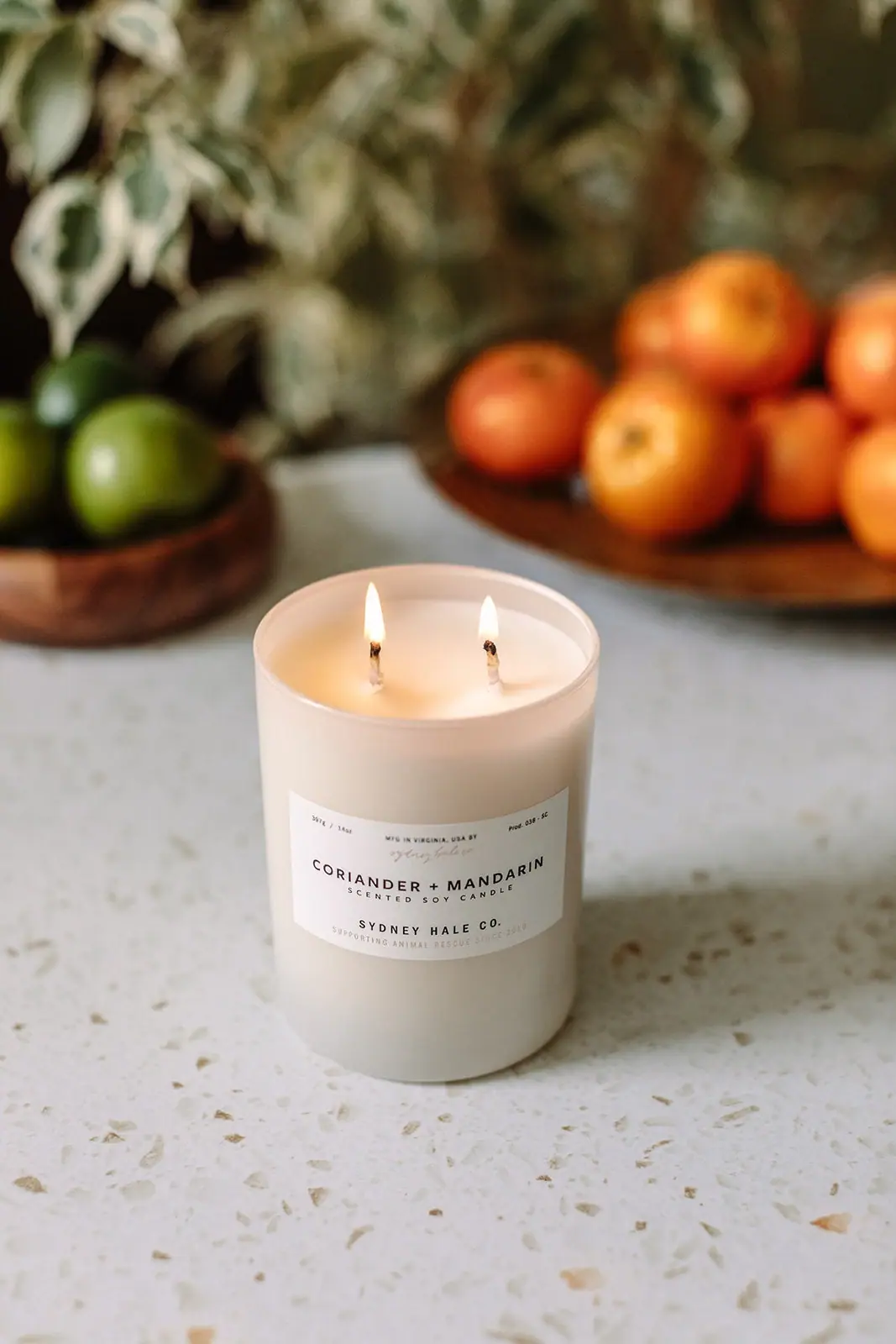
Sydney Hale Co.
Pale double-wick tumbler with a scent-first maker label

ARRAN
Festive golden linework on garnet with a grain-textured collar

Benamôr
Ornamental lilac medallion suspended above golden botanical oil