Photography: Rahua official photography. Images belong to their respective owners.
Rahua

paired cream serif labels with gold borders and white caps
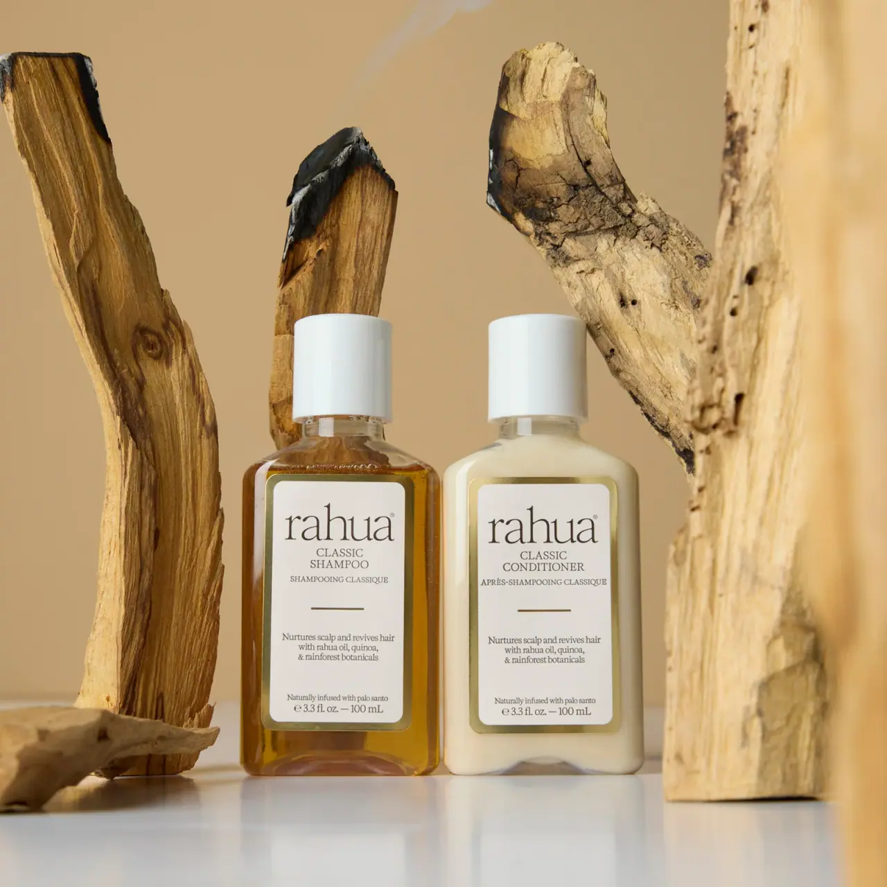
The selected Classic Discovery duo places two 100 mL bottles side by side with matching rounded rectangular bodies, tall white caps and cream labels framed in gold-looking borders. The shampoo appears amber and transparent, while the conditioner appears pale and opaque, creating a visible difference within a closely shared layout. Large fine serif rahua lettering leads each label, followed by category, French wording, a short rule, supporting copy and quantity. The official Classic Discovery Set page confirms the shampoo-and-conditioner pairing; its materials remain unverified.
- Hair
- Light pack
- Heritage label
- Apothecary
About this study
Selected Classic Shampoo and Classic Conditioner discovery bottles, both visibly 100 mL / 3.3 fl oz. Exact official duo page confirmed separately from the larger Classic Set trio.
Sources & evidence · Reviewed 2026-10-19Color Palette
Approximate colours interpreted from photography. These are screen references, not official brand colours or print specifications.
Pack body
Amber shampoo appearance
#9D671B
Approximate visible shampoo-side colour through the bottle. It is an optical contents/body appearance, not a separate verified resin tint.
Pale conditioner appearance
#E5E0C5
Approximate opaque-looking contents/body field on the companion bottle, distinct from the shared label and white caps.
Label
Cream reading panel
#E5DFD3
Approximate shared label field on both bottles. Its warm appearance is affected by the tan photographic setting; stock and coating are unverified.
Ink
Dark brown-grey serif
#514B3F
Approximate maker and informational text, held within the cream field rather than printed over variable contents.
Accent
Gold-looking frame
#A89963
Approximate border and short divider rule. Highlights vary across the frame; no hot-foil or metallic substrate specification is established.
Typography
Suggested visual alternatives, not confirmed brand typefaces. Any scale below is an illustrative estimate.
Both fronts begin with a large lowercase serif maker name with fine strokes and tall ascenders. CLASSIC and the product category follow in smaller uppercase serif lines, with a French counterpart below. A short horizontal rule separates this identity group from a centred benefit paragraph. Near the base, a small ingredient-story line precedes the quantity. The design remains within a related serif vocabulary, relying on scale, case and spacing rather than a dramatic font-family switch to distinguish roles.
Fonts
Large maker alternative
Cormorant Garamond
- Looks like
- Cormorant Garamond for fine expressive lowercase serif forms
- Type
- Display serif
- Weight
- Regular 400
- Case
- Lowercase
- Tracking
- Natural optical spacing
- Fallback
- Georgia, serif
Explore a new short maker name at a generous size with fine but reproducible strokes. The proposed family does not identify the Rahua wordmark; assess its own ascenders, counters and spacing without imitating the source lettering.
Product and supporting copy alternative
Libre Baskerville
- Looks like
- Libre Baskerville for compact readable serif information
- Type
- Text serif
- Weight
- Regular 400
- Case
- Uppercase category, sentence-case support
- Tracking
- Normal with deliberate line breaks
- Fallback
- Georgia, serif
Use a sturdier text serif for category, translation, supporting copy and quantity. Preserve clear intervals between groups rather than reducing everything to one dense paragraph. Check the longer conditioner name before fixing the label width.
Structure & Proportions
Visual proportions and finish previews are illustrative. Confirmed construction details and uncertainties are distinguished in the study notes.
Proportions
| Purpose | Value | Preview |
|---|---|---|
| Matched pair | Bottle height, shoulders, caps and label boundaries closely align in the selected view. This is a direct comparison of the photographed pair, not a dimensional specification. | — |
| Broad frame around a narrow copy column | The border encloses a generous cream area; centred copy sits within it with visible side margins. The longer conditioner word remains in the same general upper zone as shampoo. | — |
| Two main label sections | A short rule divides the upper maker/category area from a quieter benefit paragraph below. Further space separates the bottom ingredient-story line and quantity. | — |
Shapes
| Element | Value | Preview |
|---|---|---|
| Bottle body | Rounded rectangular front with curved shoulders and softly rounded base corners. | |
| Label frame | Gold-looking rounded rectangular border enclosing a cream panel. | |
| Cap | Tall smooth white cylinder narrower than the body. | |
| Divider | Short centred horizontal rule rather than a full-width line. |
Finishes
Reflective frame appearance
Gold-looking label border and short rule; application process unknown. · metallic
Transparent-looking body edge
Particularly visible around the amber shampoo and near both bases; material unverified. · transparent
Formats and materials
| Formats | Selected pair of 100 mL rounded rectangular bottles with broad front faces, curved shoulders, narrow necks and matching tall cylindrical white caps. |
| Materials | Bottle and cap materials are not confirmed for the selected discovery edition by the inspected current source., Label substrate, adhesive, gold-looking decoration and any liners are unverified. Visible transparent edges and white closures do not identify specific polymers or glass. |
| Closures | The white caps have a substantial smooth cylindrical sidewall and appear equal in size across the pair. A narrow clear-looking neck is visible beneath each. The selected image is closed, so the orifice, hinge or attachment details are not available. Their matching appearance supports visual coordination but does not prove identical internals, opening force or dispensing performance for the different formulas. |
| Decoration | Large fine serif maker name shared by both bottles., Centred category and French text in aligned upper groups., Gold-looking rounded rectangular frame and short central divider., Small benefit, ingredient-story and quantity lines in the lower label area. |
Front Panel
Schematic reading order. The diagram’s zone heights do not represent measured artwork proportions.
The two labels repeat a stable centred sequence. The maker anchors the upper portion, the Classic category name and French wording sit close beneath, and a short rule creates a pause. Supporting benefit text then occupies a separate middle-lower paragraph. The palo santo wording and quantity sit near the bottom border. This repeatable architecture makes the category words easy to compare at the same vertical position while allowing the contents' different appearance to remain visible outside the label.
| Zone | Content |
|---|---|
| Maker | Large lowercase rahua serif signature. |
| Category pair | Classic Shampoo or Classic Conditioner, followed by French wording. |
| Divider | Short gold-looking horizontal rule centred in open space. |
| Supporting paragraph | Small centred benefit and botanical wording. |
| Lower detail | Palo santo phrase above the visible 3.3 fl oz / 100 mL quantity. |
Range System
The selected photograph permits a direct comparison of the two 100 mL fronts: shared structure and label arrangement, different category names and contents appearance. The exact official Classic Discovery Set page confirms a shampoo-and-conditioner duo. A separate Classic Set page describes a larger trio and is retained only as distinct assortment context; its contents and specifications do not describe this selected pair.
- Photographed pair: Classic Shampoo and Classic Conditioner, each visibly marked 100 mL.
- Current linked assortment: larger Classic shampoo and conditioner plus Legendary Amazon Oil; a different set.
- Original-design exercise: align category names across a two-step routine while retaining a secondary distinction beyond contents colour.
Back of Pack & Shelf
The reverse, underside, open closures and any discovery-set outer packaging are unseen. The front provides descriptive wording and quantity but not a complete information map. Online ingredient lists for current larger products are not assigned a printed position on these bottles.
- Inspect both backs before describing instructions and ingredient placement.
- Check the closure openings separately for shampoo and conditioner.
- For a new pair, test category recognition when contents colour is hidden by lighting or an opaque vessel.
On shelf
Interpretation: matching labels and caps make the pair feel coordinated, while amber versus pale contents provide a quick visual distinction. Because that distinction depends on visibility and lighting, the category wording remains essential. Fine serif maker strokes and small supporting copy may require closer inspection than the overall framed silhouette. For a new routine, test both pair recognition and selection of the correct individual step, especially when bottles are separated on a shelf.
Imagery
Warm wood pieces rise around the two bottles, including a darkened cut surface and pale rough grain. The vertical props echo the products' upright orientation while their irregular outlines contrast with the matching labels. A light base and tan background preserve the cream, amber and gold-looking relationships. The wood supports an ingredient-oriented story, but it is external scenery: it does not identify bottle material, label fibre or the provenance of the pictured formulas.
Guidelines
Editorial principles for an original design brief, not official brand guidelines.
Do
- Align comparable category information across products used as a pair.
- Use contents appearance as a secondary cue alongside readable names.
- Separate identity and supporting copy with deliberate spacing and a restrained divider.
- Match source pages to the exact named set before transferring assortment or component information.
Don't
- Do not transfer current trio contents or larger-bottle details to this discovery pair.
- Do not identify gold foil or label stock from reflective appearance alone.
- Do not assume matching caps have identical dispensing internals.
- Do not copy the Rahua wordmark or complete framed label arrangement.
Sources & evidence
- Rahua — Classic Set, separate larger-assortment contextproduct
- Rahua — Classic Discovery Set, exact selected duoproduct
How this study was built
context · Sourced fact
Exact Classic Discovery Set page confirms Classic Shampoo and Classic Conditioner as a duo. Accessed through page HTML after web-reader failure.Rahua — Classic Discovery Set, exact selected duoedition · Sourced fact
Current Classic Set page describes a larger shampoo/conditioner/oil trio, so it is distinguished from the selected discovery pair.Rahua — Classic Set, separate larger-assortment contextedition · Visual observation
Both selected fronts visibly carry 100 mL / 3.3 fl oz.Rahua — Classic Discovery Set, exact selected duotypography · Visual observation
Fine serif maker, smaller categories, French wording and supporting paragraphs repeat across both labels.Rahua — Classic Discovery Set, exact selected duolabel · Visual observation
Gold-looking border and short divider organise two main information areas.Rahua — Classic Discovery Set, exact selected duopalette · Visual observation
Amber shampoo and pale conditioner appearances differ while cream panels and white caps remain coordinated.Rahua — Classic Discovery Set, exact selected duoshelf · Editorial interpretation
Category names remain necessary when contents colour is difficult to distinguish under different lighting.
What remains unverified
- The separate larger Classic Set is not the selected Discovery Set; no trio specifications transferred.
- Bottle, cap, label and gold-looking decoration materials and processes are unverified.
- Original fonts, physical dimensions and closure internals are unknown.
- Reverse, underside and discovery outer packaging are unseen; colours are approximate.
Give your AI
packaging taste
Give your design or image tool a packaging study: palette, type, structure, front panel and principles for an original brief.
Export this styleFree with an email. PACK.md works in Claude, ChatGPT, Cursor and image tools.
More like this

Aesop
a botanical still life around a disciplined apothecary label
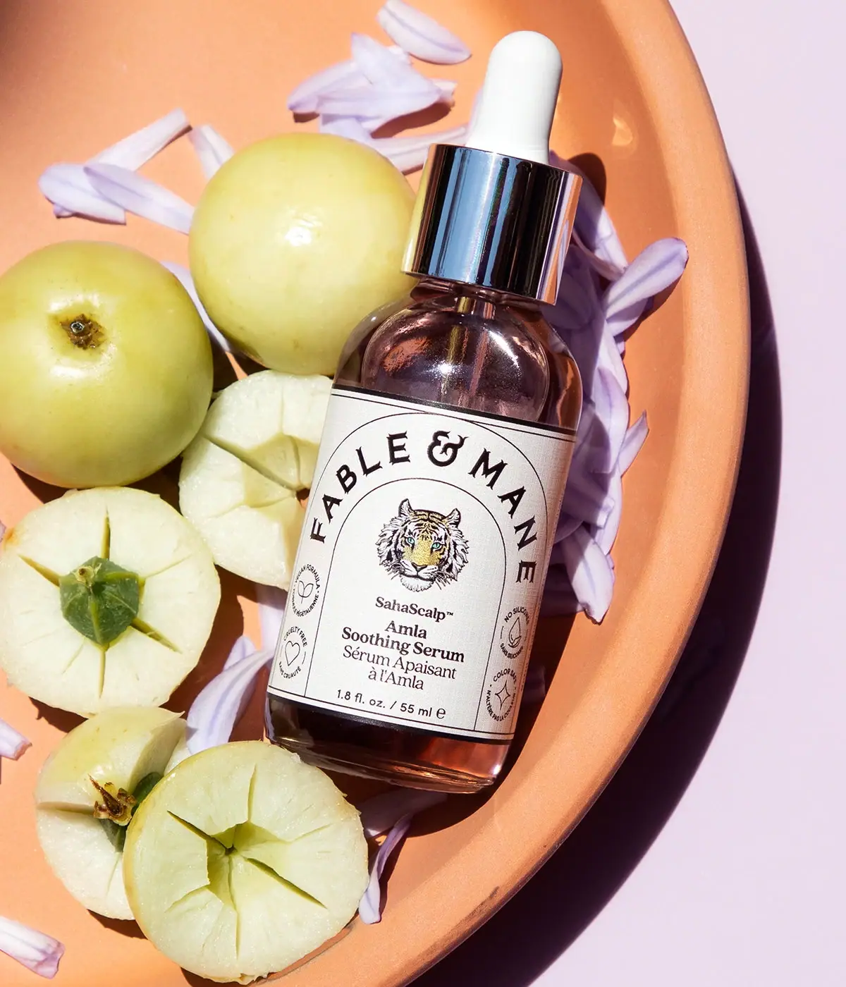
Fable & Mane
Arched serif maker, tiger portrait and amber dropper bottle
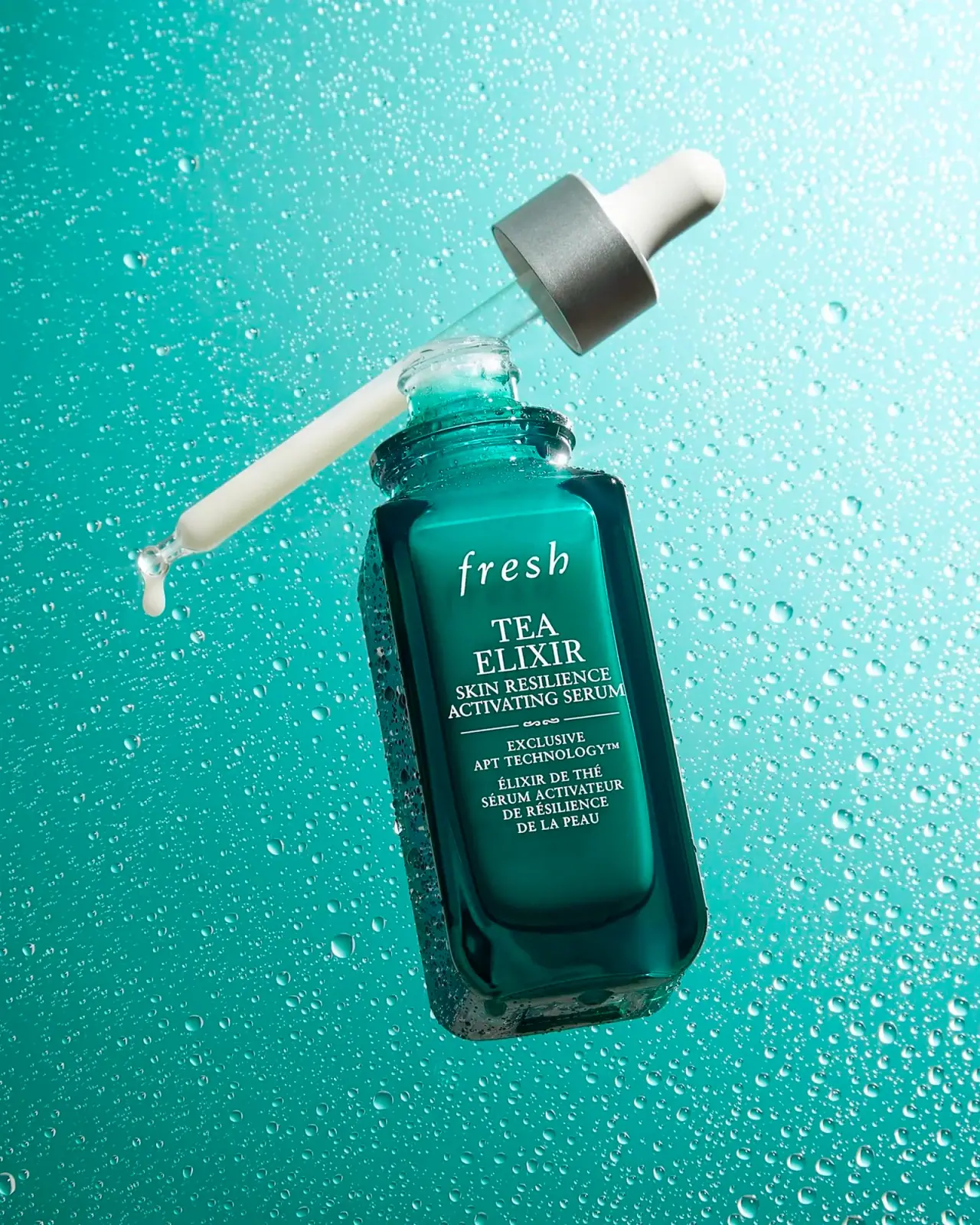
Fresh
Teal dropper bottle with white serif naming and silver collar
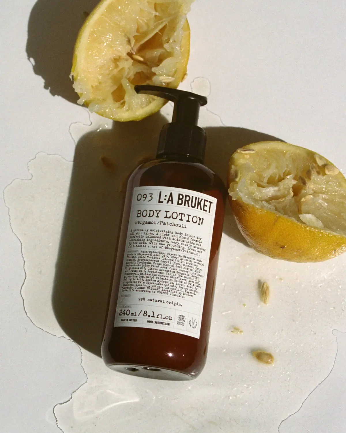
L:A Bruket
Amber pump bottle with a ruled typographic information label
Marie-Stella-Maris
Black label bands frame numbered scent and amber texture
Sydney Hale Co.
Pale double-wick tumbler with a scent-first maker label
ARRAN
Festive golden linework on garnet with a grain-textured collar

Benamôr
Ornamental lilac medallion suspended above golden botanical oil