Photography: Marie-Stella-Maris official photography. Images belong to their respective owners.
Marie-Stella-Maris

Black label bands frame numbered scent and amber texture
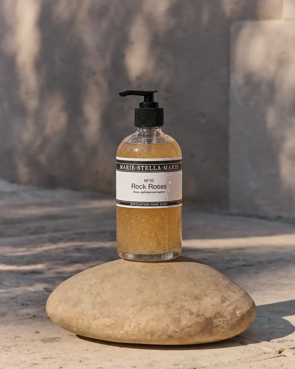
The No.10 Rock Roses Exfoliating Hand Soap uses a transparent pump bottle to reveal its amber, particle-filled contents, while a white mid-body label supplies a controlled reading area. A broad black upper band carries the maker in white serif capitals. The central field presents a small number, a larger scent name and a short italic note line; a thinner lower band carries the product function. This layered hierarchy separates maker, fragrance and use without requiring a coloured variant panel. The selected 250 mL presentation is studied individually, including the exact product's refill limitations.
- Body & bath
- Light pack
- Apothecary
- Heritage label
About this study
Selected No.10 Rock Roses Exfoliating Hand Soap 250 mL bottle in official styled photography. Range numbering and format-specific refill limits are sourced; other package designs are not audited.
Sources & evidence · Reviewed 2026-10-19Color Palette
Approximate colours interpreted from photography. These are screen references, not official brand colours or print specifications.
Label
Warm white panel
#EDE9E1
Approximate central label field under warm light. It provides a calm opaque area above the visually active contents.
Ink
Deep charcoal bands
#252321
Approximate top and bottom bands and central lettering, echoed by the black pump hardware.
Accent
Amber contents appearance
#B68645
Approximate visible gel and suspended-particle colour. This is contents seen through the bottle, not evidence of amber bottle resin or a coloured coating.
Typography
Suggested visual alternatives, not confirmed brand typefaces. Any scale below is an illustrative estimate.
The upper maker name uses compact white serif capitals across a long dark band, creating an apothecary-like header. The centre switches to an uncomplicated sans serif: N°10 sits above the larger Rock Roses name, with a small italic fragrance-description line beneath. At the bottom, EXFOLIATING HAND SOAP returns to reversed uppercase text in a narrow black strip. Three distinct jobs are therefore separated by both position and voice. The scent is prominent, but the lower function is still necessary because the number/name pair alone does not explain what the bottle does.
Fonts
Original maker-header alternative
Libre Baskerville
- Looks like
- Compact traditional serif capitals
- Type
- Transitional serif
- Weight
- Bold
- Case
- Uppercase
- Tracking
- Compact, with clear word separation
- Fallback
- Georgia, serif
Use for a new short maker name with sufficient breathing room inside a dark header. Do not recreate the long hyphenated Marie-Stella-Maris wordmark or its exact band proportions.
Scent and functional-copy alternative
Source Sans 3
- Looks like
- Neutral practical sans
- Type
- Humanist sans serif
- Weight
- Regular, SemiBold, Italic
- Case
- Title case for scent; uppercase for function
- Tracking
- Normal in title, slightly open in small reversed text
- Fallback
- Arial, sans-serif
Maintain a clear distinction between scent and product role. Use italic only for a brief secondary descriptor and check its smallest strokes against the chosen substrate and printing method.
Structure & Proportions
Visual proportions and finish previews are illustrative. Confirmed construction details and uncertainties are distinguished in the study notes.
Proportions
| Purpose | Value | Preview |
|---|---|---|
| Label as a middle belt | The label sits around the bottle's middle, leaving both the shoulders and a substantial lower contents window visible. | — |
| Asymmetric band emphasis | The upper maker band is more substantial than the narrow lower function strip, giving the header greater visual weight without filling the whole label in black. | — |
| Raised working closure | The pump projects above the rounded shoulders and its spout reaches sideways. Its recognisable working form remains distinct from the cylindrical body; dimensions are not measured. | — |
Shapes
| Element | Value | Preview |
|---|---|---|
| Bottle silhouette | Straight lower cylinder with rounded shoulders tapering toward a narrow neck. | |
| Pump assembly | Flat actuator and lateral spout above a visibly ribbed collar. | |
| Label system | Broad horizontal light field enclosed by dark top and bottom bands. | |
| Central scent block | Stacked small number, larger title and brief italic line on a shared centre axis. |
Finishes
Clear contents window
Exposed shoulders and lower bottle · transparent
Low-glare label appearance
White panel and dark printed bands · matte
Small reflected highlights
Black pump and photographed droplets · gloss
Formats and materials
| Formats | Transparent cylindrical 250 mL pump-bottle presentation, Rounded shoulders beneath a black ribbed collar, White wraparound-looking mid-body label with dark horizontal bands |
| Materials | The official page confirms the product size and describes scrub particles from pomegranate and upcycled rosehip, supplying context for the visibly textured contents., The transparent body is not enough to identify glass, a particular polymer or recycled-content percentage., Pump component materials, label stock, adhesive and wet-use coating are not established by the inspected source. Visible water drops do not verify waterproof construction. |
| Closures | The black pump has a broad flat pressing surface, a short stem and a spout pointing left in the photograph. A ribbed cylindrical collar gives the neck a distinct textured band. The bottle is not shown open, and no locking action or dismantling sequence is demonstrated. Internal pump construction, delivered dose and long-term reuse performance remain outside the evidence. The dark hardware visually repeats the label bands without requiring the same physical material or finish. |
| Decoration | Broad upper black maker band with white serif lettering, Number and scent name on a white central field, Small italic fragrance-note line, Thin lower black function band edged by pale rules |
Front Panel
Schematic reading order. The diagram’s zone heights do not represent measured artwork proportions.
The label uses horizontal compartments instead of a single undifferentiated text stack. The long maker line runs through the upper dark band; the fragrance information is centred in the larger pale area; and the functional product description sits in the narrow lower strip. Fine pale edges keep the dark bands crisp. Small capacity text appears toward the wrap edges, but the exact 250 mL identification is securely supplied by the official listing. The broad white area interrupts the speckled contents so the scent does not have to compete with their texture.
| Zone | Content |
|---|---|
| Upper maker band | MARIE-STELLA-MARIS reversed in serif capitals, with thin pale rules around the dark strip. |
| Central scent identity | N°10 above the larger Rock Roses name, establishing number and verbal name as a pair. |
| Fragrance descriptor | Small italic line referring to rose, cashmere and leather as scent notes, not an ingredient declaration. |
| Lower function strip | EXFOLIATING HAND SOAP in small reversed capitals, distinguishing use from the scent family. |
Range System
The official site explicitly pairs numbers with scent names, including No.10 Rock Roses, No.05 Bergamot Leaf and No.12 Objets d'Amsterdam. That supports interpreting the number as fragrance classification rather than product size or a universal step sequence. It does not prove that each scent uses the same bottle, formula or label proportions. The selected front also needs the lower function line because a scent family can extend beyond a single product role. Refill messaging must be equally specific: the product FAQ says there is currently no at-home refill pack for this exfoliating hand soap, despite broader refill messaging elsewhere on the page.
- No.10 and Rock Roses work together as the selected scent identifier.
- The lower strip separately names the exfoliating hand-soap format.
- The source discusses boutique hand-soap refilling, but eligibility and availability for an individual visit should not be promised from the generic banner.
Back of Pack & Shelf
The reverse, base markings and any carton are absent. The label appears to wrap around the cylinder, but its unseen information arrangement is not reconstructed.
- No printed ingredient-list, barcode or batch-code location is verified.
- The online ingredient list and refill FAQ are not evidence of their physical placement on the label.
- An original wrap label should retain a readable front role identifier when the bottle turns, while secondary information is laid out and checked separately.
On shelf
As an interpretation, the black header and lower strip can form a recognisable horizontal rhythm even when the smaller central descriptor is unreadable. Up close, the larger Rock Roses line gives the scent a clear name, while visible particles distinguish the formula's appearance from a clear untextured liquid. That difference cannot replace the written exfoliating function, since lighting and bottle fill can change. A practical design check would test recognition when the pump faces away, the label is wet, and only the front's main text is visible at ordinary sink distance.
Imagery
The bottle stands on a large smooth tan stone in a softly textured, sunlit setting. Dappled shadows fall across the background, and small drops remain on the label and dark closure. The transparent lower area makes amber gel and suspended flecks visually prominent. This scene gives the object a tactile bathing context without placing literal roses or a fragrance ingredient beside it. The stone is a photographic support, not a verified supplied accessory. Warm light affects both the apparent gel colour and the pale label, so screen samples should not become production standards.
Guidelines
Editorial principles for an original design brief, not official brand guidelines.
Do
- Separate maker, scent and product function into distinct areas.
- Pair a numeric code with a readable verbal name.
- Use opaque label space where visible contents could compete with copy.
- Check exact-format refill information instead of relying on a general brand banner.
- Keep fragrance-note descriptions distinct from ingredient lists.
Don't
- Do not promise an at-home refill pack for this product.
- Do not infer bottle resin or glass from transparency.
- Do not describe the stone as a supplied accessory.
- Do not treat water drops as proof of waterproof labelling.
- Do not rely on particles alone to communicate exfoliating function.
Sources & evidence
How this study was built
edition · Sourced fact
The official page identifies No.10 Rock Roses Exfoliating Hand Soap in a 250 mL format.Exfoliating Hand Soap No.10 Rock Roses 250 mL — Marie-Stella-Marisstructure · Visual observation
The approved image shows a transparent rounded-shoulder bottle, black pump and opaque white label between dark bands.Exfoliating Hand Soap No.10 Rock Roses 250 mL — Marie-Stella-Marisstructure · Sourced fact
The current product description names pomegranate and upcycled rosehip scrub particles, contextualising the visible textured contents.Exfoliating Hand Soap No.10 Rock Roses 250 mL — Marie-Stella-Maristypography · Visual observation
A reversed serif maker header contrasts with the central sans-serif number/name pair and smaller lower function strip.Exfoliating Hand Soap No.10 Rock Roses 250 mL — Marie-Stella-Marisrange · Sourced fact
Official navigation pairs numbered scent families with names, while the specific FAQ says no at-home refill package is currently available for exfoliating hand soap.Exfoliating Hand Soap No.10 Rock Roses 250 mL — Marie-Stella-Marisimagery · Visual observation
Stone support, dappled light and water droplets belong to the photograph and do not establish accessories or waterproof stock.Exfoliating Hand Soap No.10 Rock Roses 250 mL — Marie-Stella-Maris
What remains unverified
- Exact bottle, closure and label materials and manufacturing processes are unknown.
- Current formula description does not identify each photographed particle or exact batch composition.
- Reverse, underside and outer packaging are not visible.
- Generic refill wording is qualified by the product FAQ's explicit absence of an at-home exfoliating-soap refill pack.
Give your AI
packaging taste
Give your design or image tool a packaging study: palette, type, structure, front panel and principles for an original brief.
Export this styleFree with an email. PACK.md works in Claude, ChatGPT, Cursor and image tools.
More like this

Aesop
a botanical still life around a disciplined apothecary label
Fable & Mane
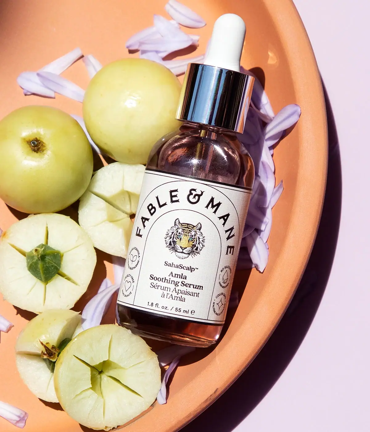
Arched serif maker, tiger portrait and amber dropper bottle
Fresh
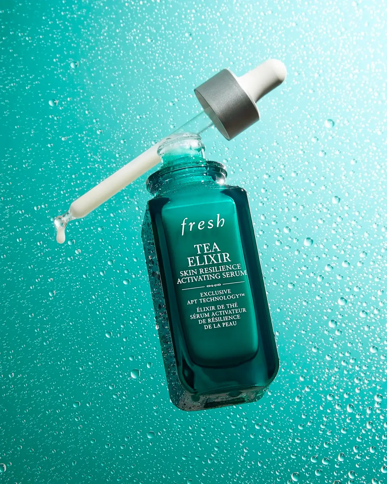
Teal dropper bottle with white serif naming and silver collar
L:A Bruket
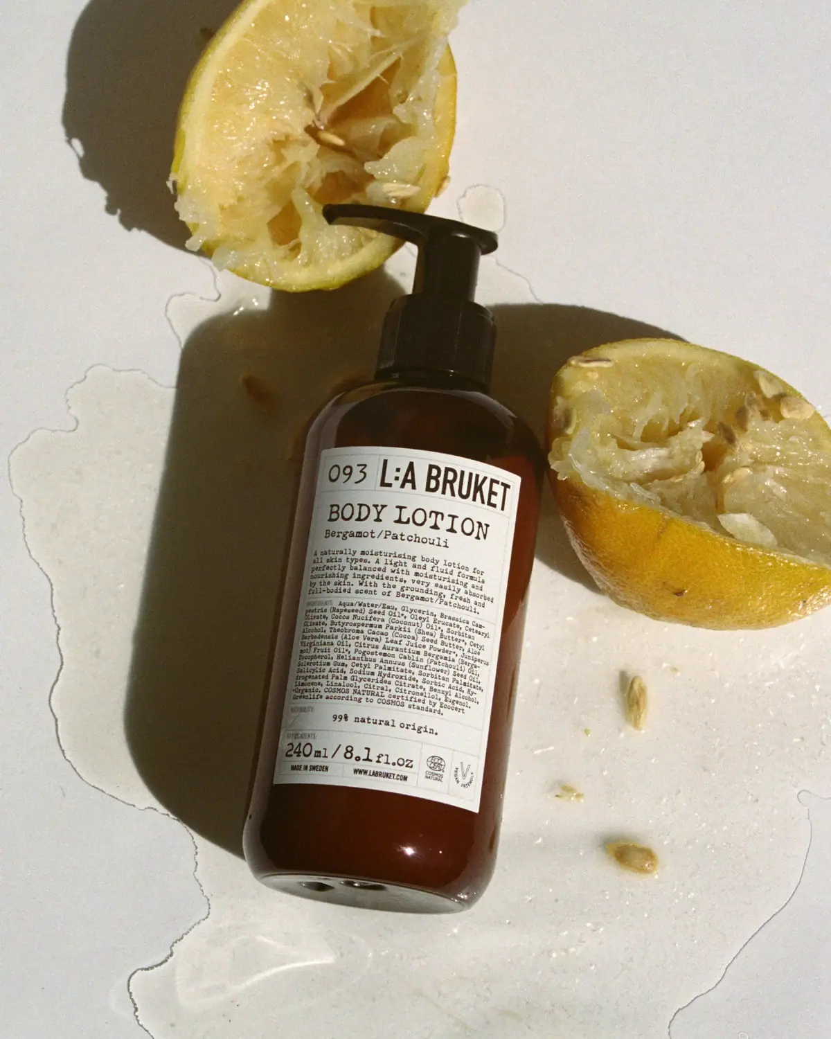
Amber pump bottle with a ruled typographic information label
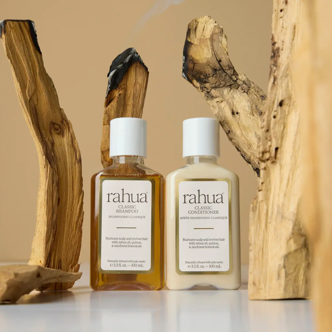
Rahua
paired cream serif labels with gold borders and white caps
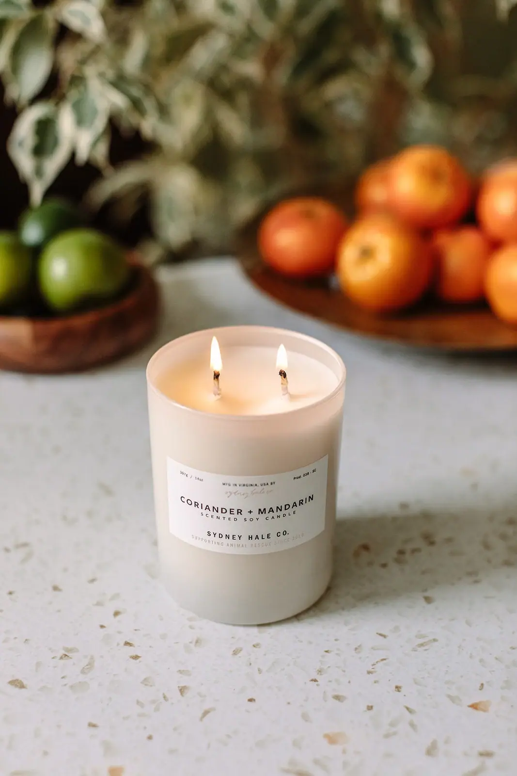
Sydney Hale Co.
Pale double-wick tumbler with a scent-first maker label
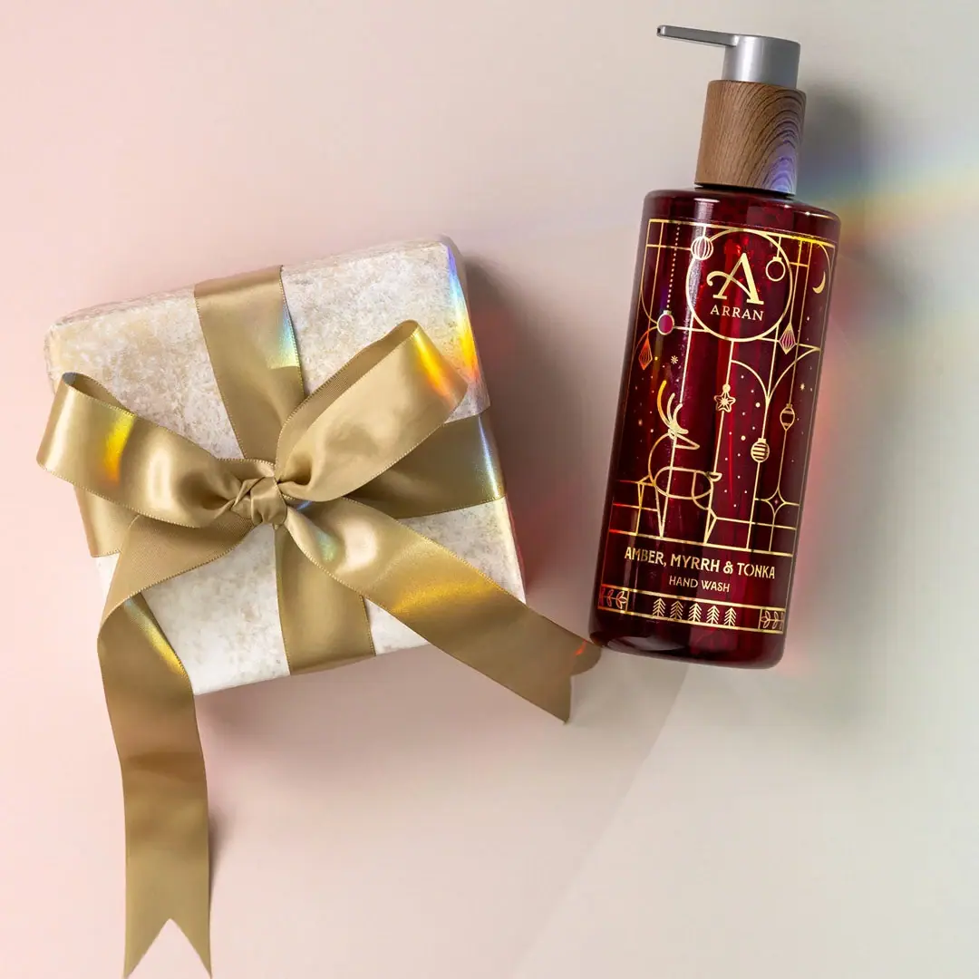
ARRAN
Festive golden linework on garnet with a grain-textured collar

Benamôr
Ornamental lilac medallion suspended above golden botanical oil