Photography: L:A Bruket official photography. Images belong to their respective owners.
L:A Bruket

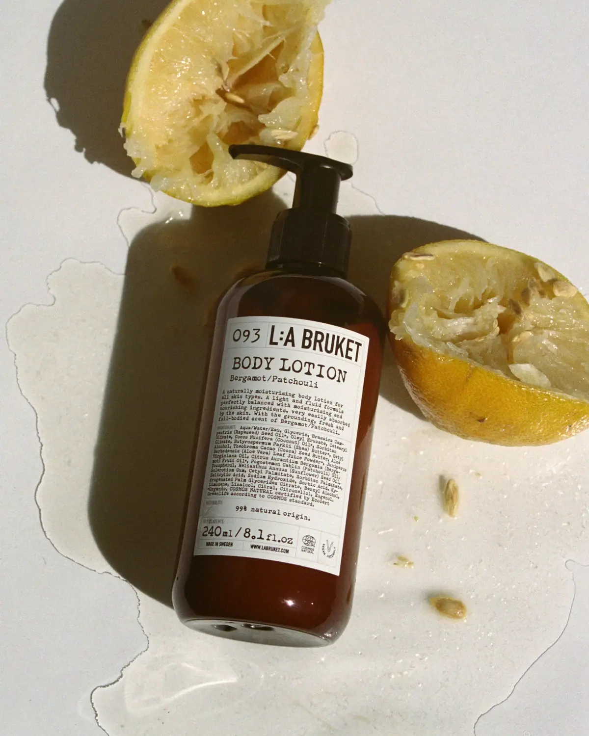
Amber pump bottle with a ruled typographic information label
093 Body Lotion uses a pale ruled label to organise a substantial amount of front-facing information. The number occupies a small header cell beside the large condensed L:A BRUKET name, followed by a prominent typewriter-like BODY LOTION line and smaller Bergamot/Patchouli wording. Descriptive and ingredient text fills the middle, while amount and practical marks occupy the bottom. The amber-looking bottle and black pump give this document-like panel a dark frame. In the selected photograph, cut citrus and direct sunlight reinforce the scent context without replacing the label's precise product identification.
- Body & bath
- Light pack
- Apothecary
- Heritage label
- Bold typographic
About this study
The selected 240 mL 093 body-lotion bottle with its dense front label. Current product and scent pages support identity and numbering context, not an exact material or historic formula specification.
Sources & evidence · Reviewed 2026-10-19Color Palette
Approximate colours interpreted from photography. These are screen references, not official brand colours or print specifications.
Pack body
Dark amber appearance
#422318
Approximate brown bottle appearance, much darker around the shoulder and edges. This does not prove a particular glass or plastic substrate.
Black pump assembly
#181A12
Approximate dispensing hardware colour. It continues the dark silhouette above the amber-looking body.
Label
Pale paper-like ground
#E0DFCF
Approximate light label field under warm sunlight. The surface appears paper-like, but exact stock, coating and adhesive are not verified.
Ink
Dark printed information
#202019
Approximate wordmark, product text, rules and practical information. A largely shared dark treatment lets type shape and size do the hierarchy work.
Typography
Suggested visual alternatives, not confirmed brand typefaces. Any scale below is an illustrative estimate.
The header is divided into two cells: 093 at left and a larger condensed uppercase L:A BRUKET wordmark at right. BODY LOTION follows in broad typewriter-like serif capitals, with the scent on a smaller line. Dense monospaced-looking description and ingredients occupy the middle. Lower text gives the natural-origin statement, amount and practical footer. The number is an identifying code within the header, not an oversized headline above the brand. The distinctive relationship is between condensed maker lettering, typewriter-like product language and fine administrative rules.
Fonts
Original maker-header alternative
Barlow Condensed
- Looks like
- Narrow bold uppercase sans
- Type
- Condensed sans serif
- Weight
- SemiBold, Bold
- Case
- Uppercase
- Tracking
- Normal
- Fallback
- Arial Narrow, Arial, sans-serif
Create a strong maker cell without overwhelming adjacent product identification. Use an original name and header proportion rather than recreating the L:A BRUKET lock-up.
Product and descriptive copy alternative
Courier Prime
- Looks like
- Typewriter-like monospaced serif
- Type
- Monospaced serif
- Weight
- Regular, Bold
- Case
- Uppercase title and sentence-case supporting text
- Tracking
- Normal
- Fallback
- Courier New, monospace
Pair a substantial product heading with smaller readable paragraphs. Check line length and print clarity carefully: a dense label can convey detail while still becoming difficult to read if copied at an arbitrary reduced scale.
Structure & Proportions
Visual proportions and finish previews are illustrative. Confirmed construction details and uncertainties are distinguished in the study notes.
Proportions
| Purpose | Value | Preview |
|---|---|---|
| Large information area | The pale label occupies most of the visible straight body, leaving dark shoulder and base margins that frame it. | — |
| Unequal header cells | The numeric identifier uses a smaller left portion while the condensed maker name occupies the broader right portion. | — |
| Dense centre, clear endpoints | The large header and lower amount help bracket the dense paragraphs, providing easier entry points into a long front label. | — |
Shapes
| Element | Value | Preview |
|---|---|---|
| Bottle body | Rounded cylindrical-looking body with smoothly curved shoulders and a substantial-looking lower edge. | |
| Label grid | Pale rectangular panel with thin rules and divided header/footer areas. | |
| Pump | Ribbed cylindrical collar below a broad laterally projecting actuator. |
Finishes
Glossy amber-looking wall
Exposed shoulder, sides and base · gloss
Quiet pale label appearance
Large front information panel · matte
Formats and materials
| Formats | Amber-looking cylindrical body with rounded shoulders and base, Black pump with ribbed collar and lateral spout, Broad pale front label carrying the visible 240 ml / 8.1 fl oz amount |
| Materials | The official product page confirms the 240 mL product but does not specify the bottle substrate in the accessible text., Amber colour and glossy reflections alone cannot distinguish glass from a suitable polymer or confirm recycled content., The label's paper-like appearance and the pump's black exterior do not establish stock, coating, adhesive or component resin specifications. |
| Closures | The black pump has a wide ribbed collar and a projecting actuator pointing toward the left in the image. Its shape is clearly distinct from a dropper or spray overcap. The selected view does not reveal the internal mechanism, exact output per stroke, locking action or transport protection, so those functions are not inferred. |
| Decoration | Divided maker-and-number header, Large typewriter-like product title, Fine rectangular rules separating dense information zones |
Front Panel
Schematic reading order. The diagram’s zone heights do not represent measured artwork proportions.
The front resembles a compact product record: ruled cells organise identifiers at the top and practical information below, while descriptive and ingredient paragraphs share the centre. Small category labels and changes in type size add structure inside that density. Unlike a minimal label with hidden detail, this selected front visibly includes ingredient information. The body curvature compresses the label edges, so the grid must be evaluated on the bottle rather than as a flat page alone.
| Zone | Content |
|---|---|
| Header row | 093 in a left cell beside the prominent condensed maker wordmark. |
| Product identity | Large BODY LOTION followed by Bergamot/Patchouli in smaller typewriter-like lettering. |
| Descriptive and ingredient text | A short descriptive paragraph and dense ingredient information printed directly on the visible front. |
| Lower statement area | A natural-origin percentage statement, treated here as observed label content rather than a newly verified certification finding. |
| Practical footer | 240 ml / 8.1 fl oz, Swedish origin wording, website and small certification-style marks in divided areas. |
Range System
The brand's own scent overview lists 093 Body Lotion, 104 Hand & Body Wash, 102 Hand Cream and 296 Sea Salt Scrub under Bergamot/Patchouli. These distinct numbers show that 093 is not merely a universal code for that scent. The selected label combines numerical product identification with a readable product type and scent name. That redundancy helps users navigate without memorising numbers. The sources support this naming relationship but not identical label dimensions or material specifications across those formats.
- 093 identifies the selected body lotion while the words state both function and scent.
- Other products sharing Bergamot/Patchouli have different numbers on the official scent page.
- A fictional system could pair a code with plain-language naming, provided the code does not become the only way to distinguish products.
Back of Pack & Shelf
The reverse and underside are not shown. However, descriptive and ingredient copy is already visible on the front, so it would be inaccurate to assume that all detailed information is hidden on the back.
- Record the dense visible front without inventing unseen rear fields.
- The current official ingredient listing may differ from the photographed label; do not silently overwrite edition-specific text.
- For original artwork, develop information from the actual formula and market rather than copying the reference's ingredient paragraph or certification marks.
On shelf
As an interpretation, the pale panel against the amber-looking body is the strongest large-scale contrast. At closer range, the maker and BODY LOTION title should be easier to read than the small code, scent and ingredients. The design combines a familiar apothecary silhouette with unusually visible information density. Actual label legibility depends on printing, curvature and lighting, so the enlarged photograph should not be treated as a proof of small-text usability. A useful test would ask users to identify function and scent without first explaining the numbering system.
Imagery
The approved source record identifies official L:A Bruket imagery, with a source set page that was inaccessible during this review. The local photograph shows the bottle diagonally beside squeezed citrus halves and scattered seeds on a light surface. Wet trails and hard shadows make the composition tactile and informal. The official scent description provides a reason for citrus association, but the botanical identity of each photographed fruit is not independently established. The yellow props are not part of the label palette, and the wet surface is not evidence of a tested water-resistant adhesive or package.
Guidelines
Editorial principles for an original design brief, not official brand guidelines.
Do
- Pair a numerical identifier with clear function and scent names.
- Use fine rules to organise dense information.
- Give small copy enough space on the actual curved container.
- Distinguish a product code from a scent-family code.
- Check current text against the photographed edition before transcribing it.
Don't
- Do not describe 093 as a giant number above the maker.
- Do not infer glass or recycled plastic from amber colour.
- Do not claim letterpress from typewriter-like lettering.
- Do not copy ingredient lists, certification marks or the exact ruled header.
Sources & evidence
How this study was built
edition · Sourced fact
The canonical official page identifies 093 Body Lotion, Bergamot/Patchouli, 240 mL and Swedish production.093 Body Lotion Bergamot / Patchouli — L:A Brukettypography · Visual observation
093 occupies a left header cell beside the larger condensed maker name, above a typewriter-like product title.label · Visual observation
Description and ingredients are directly visible on the front, followed by a divided practical footer.range · Sourced fact
The scent overview lists several differently numbered products sharing Bergamot/Patchouli, so 093 is not simply a scent code.Our Scents — L:A Bruketpalette · Visual observation
A pale ruled panel contrasts with an amber-looking body and black pump; yellow citrus belongs to the scene.imagery · Editorial interpretation
Cut citrus relates to the named scent without independently identifying the fruit specimen or package water resistance.093 Body Lotion Bergamot / Patchouli — L:A Bruket
What remains unverified
- The original variant URL and source trio-set page were inaccessible; the canonical product page was accessible.
- Bottle, pump and label materials and print process remain unspecified.
- The reverse, underside and transport packaging are not inspected.
- Current online ingredients are not assumed identical to the photographed label's edition.
Give your AI
packaging taste
Give your design or image tool a packaging study: palette, type, structure, front panel and principles for an original brief.
Export this styleFree with an email. PACK.md works in Claude, ChatGPT, Cursor and image tools.
More like this

Aesop
a botanical still life around a disciplined apothecary label
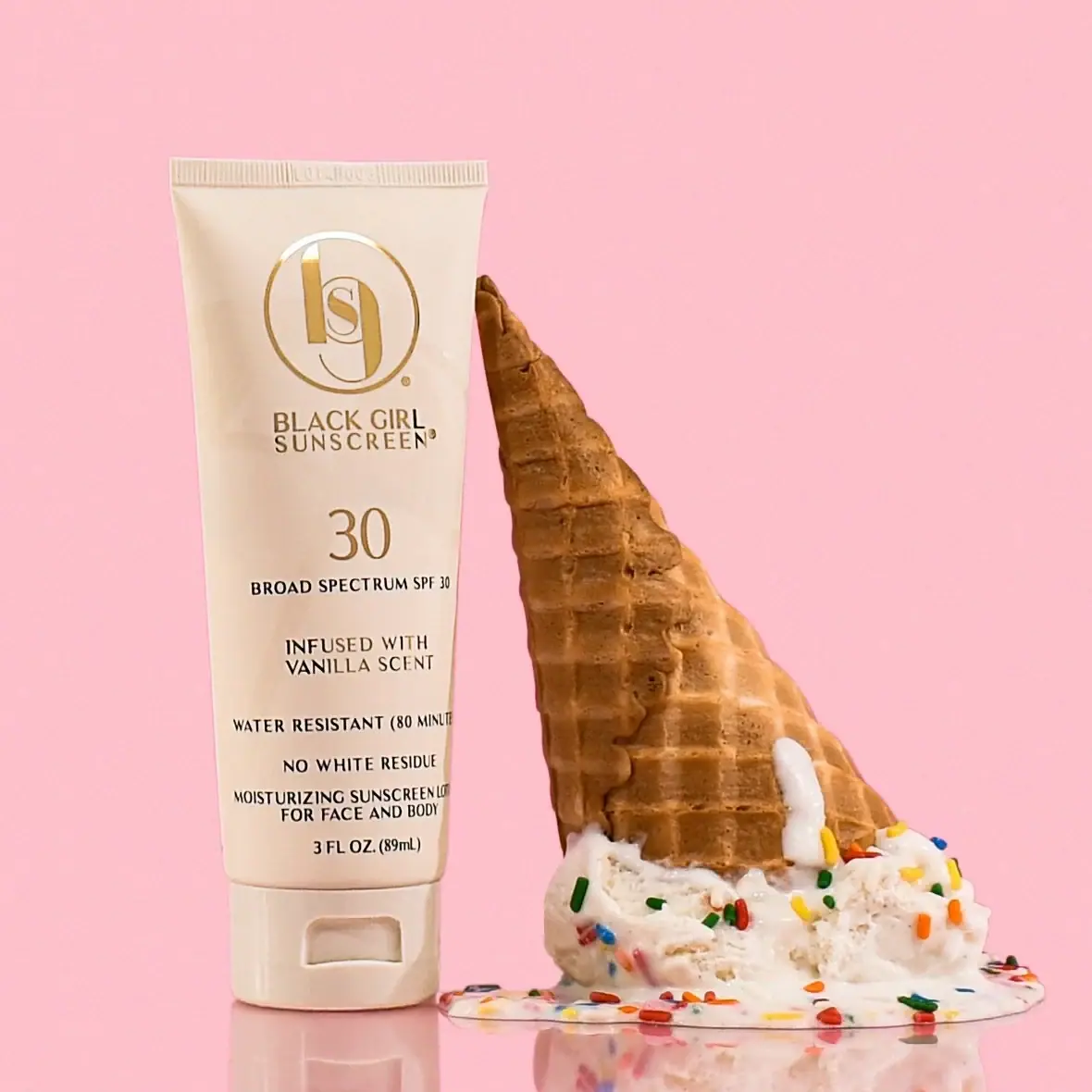
Black Girl Sunscreen
Cream tube with gold crest and an isolated SPF numeral
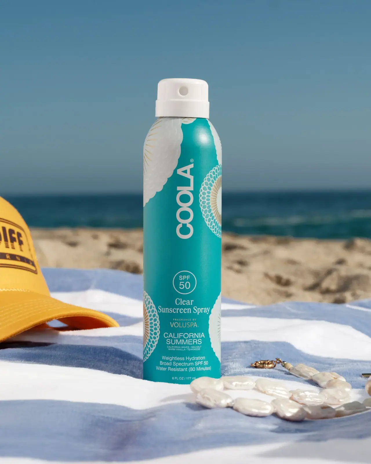
COOLA
Turquoise cylinder, cropped rosettes, vertical brand and fragrance attribution
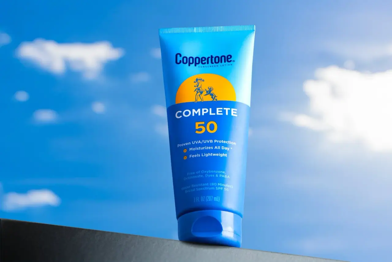
Coppertone
Blue fields, a yellow sun and a clear number

Dr. Bronner’s
A bright soap wrapper with a densely ordered voice
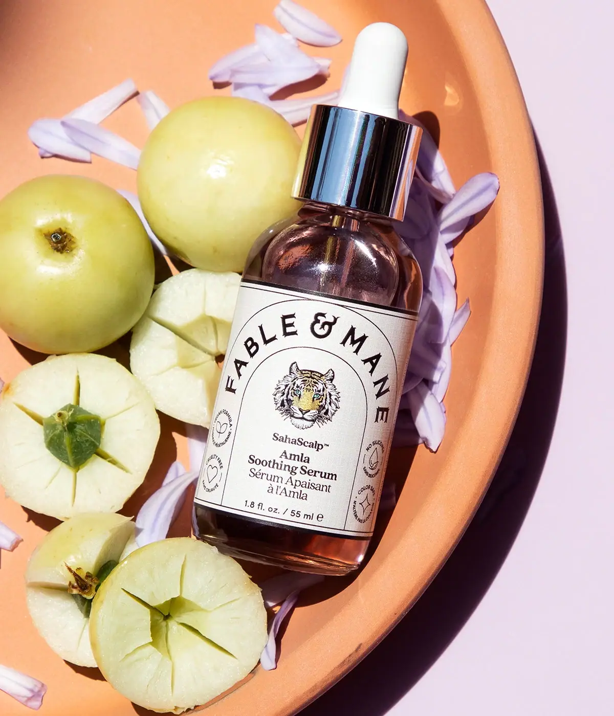
Fable & Mane
Arched serif maker, tiger portrait and amber dropper bottle
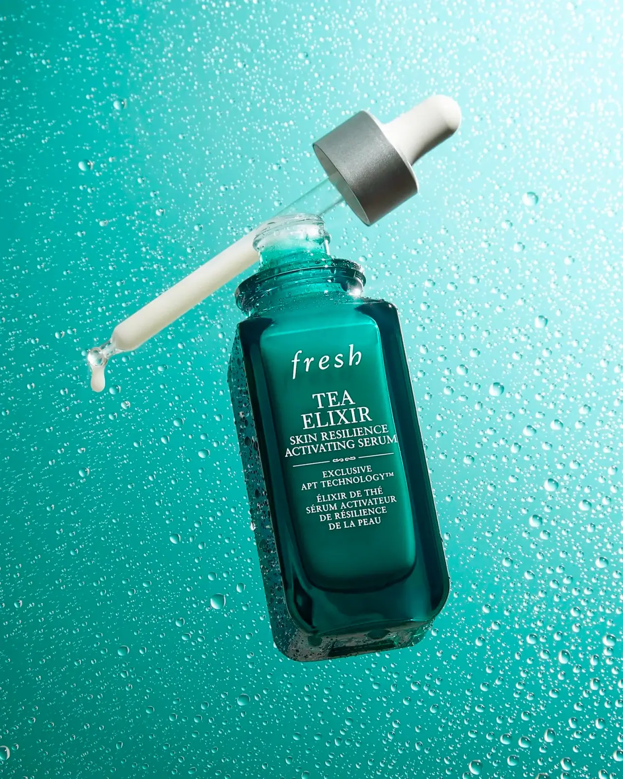
Fresh
Teal dropper bottle with white serif naming and silver collar
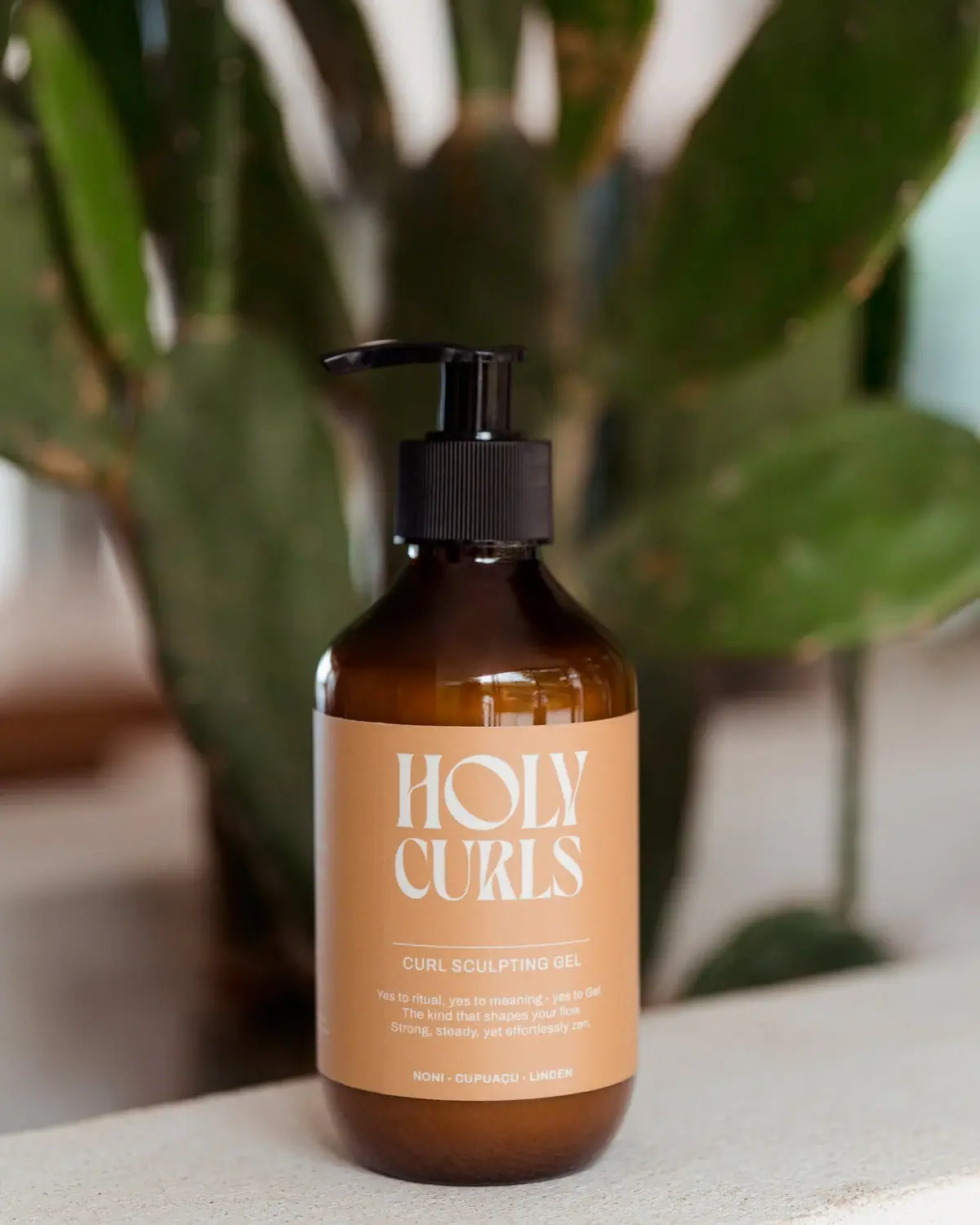
Holy Curls
Expressive white serifs on warm ochre with amber shoulders