
Photography: Plainsight Studio / Xavier Ames project photography. Images belong to their respective owners.
Crown Affair

Pale frosted-looking bottle, black pump and small looping emblem
The Leave-In Conditioner presents a spare pale bottle with a black pump and three small front elements: a looping emblem, a two-line product name and a separate capacity line. The absence of a large front-facing maker name makes the symbol carry more of the recognition work. Its fine curves contrast with the pump's dark solid shape. In the selected photograph, the bottle sits on a pearlescent shell form before a larger gold-toned shell against brown. Those rich surroundings amplify the package's restraint without becoming part of its material or colour specification.
- Hair
- Light pack
- Luxe monochrome
- Clinical minimal
About this study
The selected 150 mL Leave-In Conditioner bottle in the shell still life. Original identity-system credits provide context, not exact attribution of every component in this later product photograph.
Sources & evidence · Reviewed 2026-10-19Color Palette
Approximate colours interpreted from photography. These are screen references, not official brand colours or print specifications.
Pack body
Pale warm grey body
#D8D9CA
Approximate frosted-looking bottle appearance in the warm photograph. The brighter centre and grey lower edge reflect light and contents, not a documented multi-colour coating.
Black dispensing assembly
#121614
Approximate pump and collar colour. The concentrated dark crown gives the otherwise pale object its strongest silhouette contrast.
Ink
Fine dark front graphics
#23251E
Approximate emblem, product name and capacity lettering. Their small total area preserves a quiet face without eliminating useful identification.
Typography
Suggested visual alternatives, not confirmed brand typefaces. Any scale below is an illustrative estimate.
The front reads in three widely spaced steps: emblem, The Leave-In Conditioner on two lines, then 150 ml and 5.1 fl oz near the base. The product name is a straightforward mixed-case sans serif, neither an oversized headline nor a dense technical block. The name therefore becomes the main readable statement while the emblem supplies brand recognition. The capacity is substantially smaller and placed well below. There is no visible large Crown Affair wordmark on this front, so a type-only description would miss the symbol's central role.
Fonts
Original product-name alternative
Inter
- Looks like
- Plain contemporary mixed-case sans
- Type
- Sans serif
- Weight
- Regular, Medium
- Case
- Title case across two short lines
- Tracking
- Normal
- Fallback
- Arial, sans-serif
Use a compact readable name with generous surrounding space. Keep line breaks intentional so the product remains clear without increasing the type to fill the entire face.
Practical information alternative
Source Sans 3
- Looks like
- Quiet humanist text sans
- Type
- Sans serif
- Weight
- Regular
- Case
- Mixed case with standard units
- Tracking
- Normal
- Fallback
- Arial, sans-serif
A suitable starting point for a small capacity line and original secondary information. Test its apparent weight against the emblem so the practical text remains useful without competing visually.
Structure & Proportions
Visual proportions and finish previews are illustrative. Confirmed construction details and uncertainties are distinguished in the study notes.
Proportions
| Purpose | Value | Preview |
|---|---|---|
| Dark crown over pale body | The dispensing assembly is narrower than the bottle and dark enough to read as a distinct upper section, without a broad decorative cap. | — |
| Three separated front anchors | Emblem, product name and capacity occupy small areas separated by substantial pale space. Their relationship is visual, not a measured layout grid. | — |
| Soft outer contour | The front appears tall with rounded corners and softened shoulders. A near-front photograph cannot establish the exact cross-section or depth. | — |
Shapes
| Element | Value | Preview |
|---|---|---|
| Bottle front | Tall rounded rectangular-looking face with a flat resting base and softly curved upper corners. | |
| Dispensing assembly | Dark cylinder supporting a short actuator with a projecting lip. | |
| Looping emblem | Fine nested curves forming a compact vertical ornamental mark; the wave preview is schematic rather than a reproduction. |
Finishes
Frosted-looking body
Pale bottle wall · frosted
Low-glare black appearance
Pump collar · matte
Formats and materials
| Formats | Pale pump bottle with a softly rounded rectangular front silhouette, Black cylindrical collar and short projecting actuator, Selected standard size marked 150 ml / 5.1 fl oz |
| Materials | The body looks frosted or softly translucent in the image. Exact glass or polymer construction is not established by the accessible product text., Neither the visible appearance nor the brand's general material preferences identifies a specific coating, etching process or recycled content for this bottle., The black pump's external and internal materials are unverified; a pump silhouette alone does not establish an airless system. |
| Closures | The pump sits above a short rounded shoulder and is shown with its actuator visible in profile. A narrow lip projects to the right, while the broad collar forms a simple dark cylinder beneath it. The product page's dispensing directions confirm pump use. Output volume, locking action, internal spring construction and transport cover are not visible or specified here. |
| Decoration | Small vertically oriented looping emblem, Two-line product name placed below the symbol, Capacity isolated near the lower front |
Front Panel
Schematic reading order. The diagram’s zone heights do not represent measured artwork proportions.
The front graphics sit directly on a pale-looking field without a visible large framed label panel. The symbol is centred above the two-line title, and the small capacity line sits on the same axis below. There are no visible front ingredient illustrations, benefit badges or broad colour bands. The decoration method is unknown; the unobtrusive appearance does not by itself prove screen printing or a label-free construction.
| Zone | Content |
|---|---|
| Upper front symbol | A small looping fine-line emblem, visually separated from the shoulder and from the title. |
| Middle product name | The Leave-In Conditioner in two centred mixed-case lines. |
| Lower capacity | 150 ml and 5.1 fl oz presented together in a compact dark line. |
| Pale surrounding field | Unoccupied space preserves the distinction between the three information anchors rather than introducing additional graphic panels. |
Range System
The official page lists a 150 mL standard version and a 50 mL travel version. Only the standard bottle shown here is studied, so the smaller size does not automatically inherit identical proportions or a verified material. The original designer case study establishes a considered wider identity system, but this analysis does not turn one conditioner into a universal packaging template. A transferable principle is to preserve clear symbol, product and quantity roles as formats change.
- The selected standard bottle carries its quantity separately from the name.
- A travel adaptation would need its own legibility and spacing check rather than a uniform reduction of this face.
- A hypothetical companion product could retain the small emblem while changing the product name, provided the words remain distinguishable at use distance.
Back of Pack & Shelf
The selected image does not show the reverse, underside or carton. The product page gives usage and ingredient information, but their printed arrangement is not inspected.
- Do not infer a blank reverse from the minimal front.
- Do not assign the original launch project's paper supplier to an unseen conditioner carton.
- A new packaging system should reserve a clearly readable location for practical information without assuming it can fit at the front's smallest scale.
On shelf
As an interpretation, the pump and pale body offer an immediate two-part silhouette, while the small emblem rewards closer attention. The product title is readable in the enlarged image but is relatively restrained on the bottle face, so real-size recognition should be tested. The dark photographic setting exaggerates separation around the pale body; an all-white bathroom shelf may produce a quieter result. A useful comparison would assess both environments and check how similar product names remain distinct without relying on surrounding props.
Imagery
Xavier Ames' project page explicitly credits prop styling and names Plainsight Studio as photographer. In this selected still life, a large gold-toned shell form rises behind the bottle and a lower pearlescent shell supports it. Their radiating ridges and irregular edges contrast with the smooth vertical package. A deep brown setting makes the pale body stand forward, while the black pump links to the darkest shadows. The shells are not evidence of marine ingredients, pearl pigment, a metallic bottle finish or included accessories. The composition works through contrasts of scale, surface and contour rather than a literal formula illustration.
Guidelines
Editorial principles for an original design brief, not official brand guidelines.
Do
- Assign the symbol and product name distinct recognition roles.
- Keep capacity readable without making it the main graphic.
- Show the dispensing silhouette clearly in a reference photograph.
- Separate verified original brand-system credits from exact edition claims.
- Test a pale package against both light and dark surroundings.
Don't
- Do not call the bottle glass solely because it looks frosted.
- Do not infer an airless mechanism from the pump.
- Do not attribute the shell props' gold or pearlescence to the package.
- Do not reproduce the looping mark or proprietary Crown Affair Sans lettering.
Sources & evidence
- The Leave-In Conditioner — Crown Affairproduct
- Crown Affair prop styling — Xavier Amesphotographer
- Crown Affair identity — Placeholderdesigner
How this study was built
edition · Sourced fact
The official product page lists 150 mL standard and 50 mL travel sizes; the selected bottle visibly carries 150 ml.The Leave-In Conditioner — Crown Affairstructure · Sourced fact
The brand's directions specify pump dispensing, consistent with the visible black assembly.The Leave-In Conditioner — Crown Affairtypography · Sourced fact
Placeholder credits the original custom Crown Affair Sans to Grilli Type; proposed Google fonts remain alternatives.Crown Affair identity — Placeholderlabel · Visual observation
A small emblem, two-line product title and separate capacity line occupy the pale front; no large maker name is visible.Crown Affair prop styling — Xavier Amespalette · Visual observation
The body and pump are pale and black; metallic and pearlescent surfaces belong to the surrounding shell forms.Crown Affair prop styling — Xavier Amesimagery · Sourced fact
Xavier Ames' page credits his prop styling and names Plainsight Studio as photographer.Crown Affair prop styling — Xavier Ames
What remains unverified
- Exact body and pump materials, finish processes and dispensing mechanism remain unknown.
- The reverse, underside and carton are not inspected.
- Crown Affair Sans is credited at original-system level; exact font cut on this bottle is not independently established.
- The front view does not establish exact bottle depth or cross-section.
Give your AI
packaging taste
Give your design or image tool a packaging study: palette, type, structure, front panel and principles for an original brief.
Export this styleFree with an email. PACK.md works in Claude, ChatGPT, Cursor and image tools.
More like this

African Botanics
Technical black label with a low serif signature

bareMinerals
a restrained black compact framing the powder itself

BeautyPWR
Clear square shell, white cream cup, black serif identity

Corpus
sage gloss with whispered gold lettering

Costa Brazil
Pale matching vessels with small, deliberate bilingual labels

HAKU
Pearly narrow tube with stacked serif identity and clear base

Haus Labs
mirror chrome hardware over frosted shade
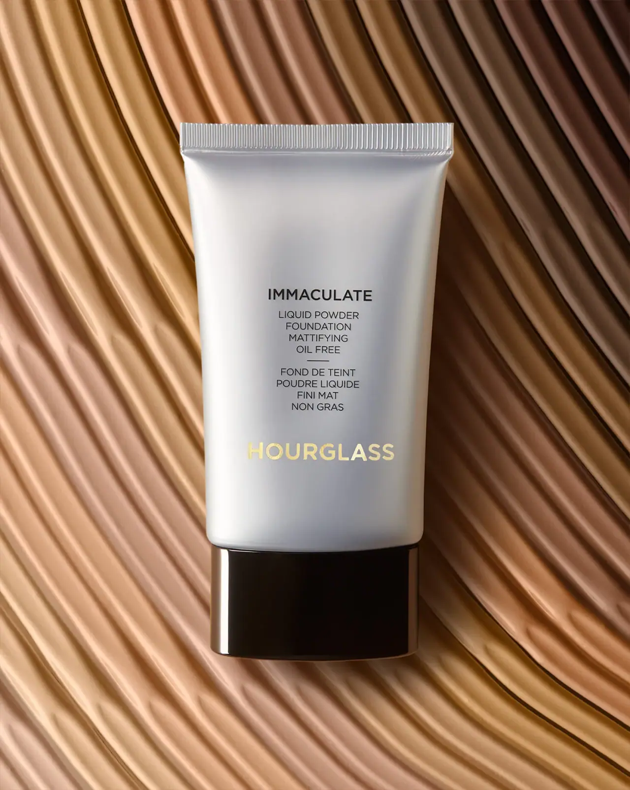
Hourglass
Silver-grey foundation tube with bilingual precision and golden signature