


Haus Labs

mirror chrome hardware over frosted shade
Haus Labs treats makeup packaging like hardware: polished chrome (#c9cbcd) caps, sleeves and pencil ends paired with frosted glass, matte-white or shade-matched bodies. Colour comes almost entirely from the product, seen through glass or repeated on the compact lid, the lacquer tube and the pencil barrel, while print is reduced to one condensed bold HAUS LABS wordmark, usually set vertically along a stick or tube in one ink. Pressed powders are debossed with a large geometric H-and-L block monogram that fills the pan, and highlighters sit in an iridescent pearly compact, so the range reads as a set of tech objects with almost no type.
- Make-up
- Light pack
- Luxe monochrome
- Clinical minimal
Color Palette
Approximate colours interpreted from photography. These are screen references, not official brand colours or print specifications.
Pack body
Mirror Chrome
#c9cbcd
Polished caps, mascara and liner sleeves, compact rims, stick bases and pencil end caps
Frosted Glass
#e8eaea
Acid-etched foundation bottle and balm jars that show the shade inside
Matte White
#f4f4f2
Blush and highlighter balm stick bodies and the gel-powder compact base
Ink
Haus Black
#141414
Wordmark on chrome sleeves, white sticks and the mascara tube
Haus White
#f8f8f8
Wordmark and product name reversed out on frosted glass and shade-coloured bodies
Chrome Grey Print
#8d8f92
Tone-on-tone wordmark printed on polished chrome stick sleeves
Accent
Opal Iridescence
#dfe7f0
Pearly rainbow-sheen lid and rim of the gel-powder highlighter compact
Range coding
Berry Lacquer
#86153d
Shade-matched opaque tube of the berry lip lacquer
Terracotta Blush
#b66b5a
Lid of the blush compact and the debossed powder pan, matched to the shade
Cocoa Liner
#5a3a36
Pencil, crayon and liner barrels coloured to their shade, capped in chrome
Coral Glow
#e98366
Highlighter pan shade seen under the clear compact window
Typography
Suggested visual alternatives, not confirmed brand typefaces. Any scale below is an illustrative estimate.
The wordmark is often the only type visible: set vertically up the side of sticks, pencils, lacquer tubes and mascara, or horizontally on bottles and compact lids. Product name and a French format line appear only in tiny tracked capitals below it, and the block monogram replaces type entirely on powders.
Type scale
Estimated cap size as a share of the panel · Front of the 30 ml lip lacquer tube body below the cap, about 85 mm tall
wordmark-vertical
5% · Bold · Display
MAKE LAB
wordmark-lid
3% · Bold · Display
MAKE LAB
product-name
1.6% · Medium · Label
GLASS SHINE LIP LACQUER
format-line
1.3% · Medium · Label
LAQUE À LÈVRES
shade-name
1.2% · Medium · Label
MULBERRY
volume
1% · Medium · Label
6 ML / 0.2 FL OZ
Fonts
Display
Roboto Condensed
- Looks like
- Helvetica Neue Condensed Bold, Univers 67 Bold Condensed
- Type
- Condensed neutral grotesque, bold
- Weight
- Bold
- Case
- Uppercase
- Tracking
- Slightly wide, about +4%
- Fallback
- Arial Narrow Bold, Helvetica Condensed, sans-serif
The two-word wordmark, running vertically on slim components and horizontally on bottles; black on chrome or white, white on glass and colour.
Label
Inter
- Looks like
- Helvetica Neue Medium, Akzidenz-Grotesk
- Type
- Neutral grotesque, tracked small caps
- Weight
- Medium
- Case
- Uppercase
- Tracking
- Wide, about +12%
- Fallback
- Helvetica, Arial, sans-serif
Product name, the French format line ('FOND DE TEINT', 'LAQUE À LÈVRES'), shade name and volume, all tiny and centred under the wordmark.
Body
Inter
- Looks like
- Helvetica Neue Regular
- Type
- Neutral grotesque
- Weight
- Regular
- Case
- Sentence case
- Tracking
- Normal
- Fallback
- Helvetica, Arial, sans-serif
Carton side panels: ingredient list, claims and directions in small regular text.
Structure & Proportions
Proportions
| Purpose | Value | Preview |
|---|---|---|
| Printed area | Under 5% of the component surface carries print | |
| Vertical wordmark length | About 35% of the tube or stick body height, centred | |
| Chrome share | About 30% of a component is chrome cap, sleeve or base | |
| Monogram in pan | About 80% of the powder pan face | |
| Inks per component | One: black, white or chrome grey | — |
| Density | Almost empty; one vertical line of type on a coloured or metallic object | — |
Shapes
| Element | Value | Preview |
|---|---|---|
| Lacquer tube | Square-shouldered rectangular tube with a tall chrome cap | |
| Compact | Square compact with softly rounded corners and a window lid | |
| Balm stick | Slim cylinder with a domed bullet top | |
| Monogram | Geometric block H and L built from rectangles and a diagonal | |
| Cap | Tall polished chrome screw cap |
Finishes
Mirror chrome
Caps, sleeves, rims and pencil ends · metallic
Acid-etched frost
Foundation bottle and jars · frosted
Soft matte colour
Shade-matched tubes, lids and barrels · matte
Iridescent pearl
Highlighter compact lid · holographic
Deboss
Monogram pressed into powder pans · emboss
Formats and materials
| Formats | Glass foundation bottle, Lip lacquer tube, Mascara, Square compact, Twist-up balm stick, Pencil, Glass jar |
| Materials | Frosted glass, Chrome-finish plastic or metal, Opaque plastic, Glass jar |
| Closures | Tall chrome screw caps, chrome pencil caps and sharpener ends, clear-windowed hinged compact lids, chrome twist bases on sticks |
| Decoration | Direct print in one ink, Debossed monogram in powder pans, Embossed lid monogram, Shade-matched component colour |
Front Panel
Schematic reading order. The diagram’s zone heights do not represent measured artwork proportions.
No labels; a single line of type printed directly on the component, either vertical on slim pieces or a small centred block on bottles and lids.
| Zone | Content |
|---|---|
| Body centre or side | Two-word wordmark |
| Below wordmark | Product name and French format line in tiny tracked capitals |
| Lid or pan | Block monogram, embossed or debossed |
Range System
Hardware (chrome, frost, white) is fixed; the shade itself colours the body, lid or barrel so each SKU is identified by its product colour rather than by graphics.
- Foundation = frosted glass showing the shade + chrome cap
- Lip lacquer = berry opaque tube + chrome cap
- Blush powder = terracotta lid + debossed monogram pan
- Gel-powder highlighter = iridescent compact + coral monogram pan
- Liner and lip pencil = cocoa barrel + chrome ends
- Balm stick = matte white body + shade-coloured bullet
Back of Pack & Shelf
Components carry almost nothing on the back; the white folding carton holds the information: wordmark on the front face, then ingredient list, key-ingredient claims, directions, net content and recycling marks on the side panels in small black type.
- INCI ingredient list in small uppercase on the carton side
- Bilingual English and French product name and net content
- Short directions in sentence case
- Shade name and number on a carton end flap
- Barcode, batch code, PAO icon and recycling marks
On shelf
On the counter the range reads as a row of chrome caps over blocks of shade colour, so it billboards by metal and product colour rather than by type.
Imagery
No imagery. Packs are shot as clean frontal silhouettes on pure white, sometimes open to show the debossed pan or the wand.
Guidelines
Do
- Pair polished chrome (#c9cbcd) caps and sleeves with frosted, matte-white or shade-coloured bodies.
- Let the product shade colour the body, lid or barrel instead of printing colour graphics.
- Run the wordmark vertically in a condensed bold grotesque along about a third of slim components.
- Keep all other type to tiny tracked capitals under 2% of component height, with a French format line.
- Deboss a large geometric block monogram into pressed powders, filling most of the pan.
- Use one iridescent pearly finish only for the highlighter family.
- Print one ink per component: black, white or chrome grey.
Don't
- Don't add illustrations, patterns or photography.
- Don't use gold or warm metallics; the metal is cool chrome.
- Don't print more than one ink colour on a component.
- Don't use serif or script type.
- Don't wrap products in printed labels or stickers.
- Don't set the wordmark large across a lid; it stays a narrow line.
Give your AI
packaging taste
Give your design or image tool a packaging study: palette, type, structure, front panel and principles for an original brief.
Export this styleFree with an email. PACK.md works in Claude, ChatGPT, Cursor and image tools.
More like this

African Botanics
Technical black label with a low serif signature

bareMinerals
a restrained black compact framing the powder itself

BeautyPWR
Clear square shell, white cream cup, black serif identity

Corpus
sage gloss with whispered gold lettering

Costa Brazil
Pale matching vessels with small, deliberate bilingual labels

Crown Affair
Pale frosted-looking bottle, black pump and small looping emblem

HAKU
Pearly narrow tube with stacked serif identity and clear base
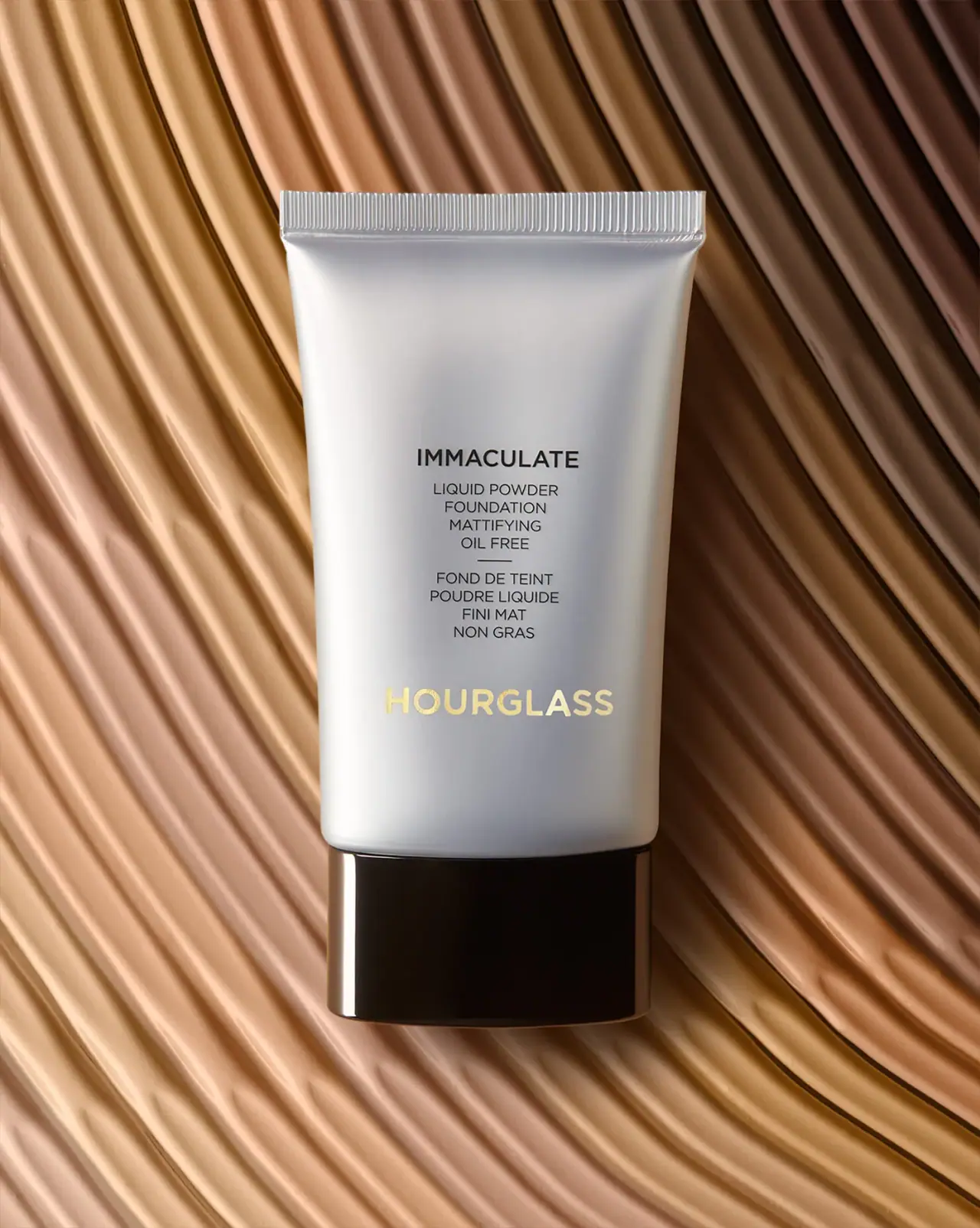
Hourglass
Silver-grey foundation tube with bilingual precision and golden signature