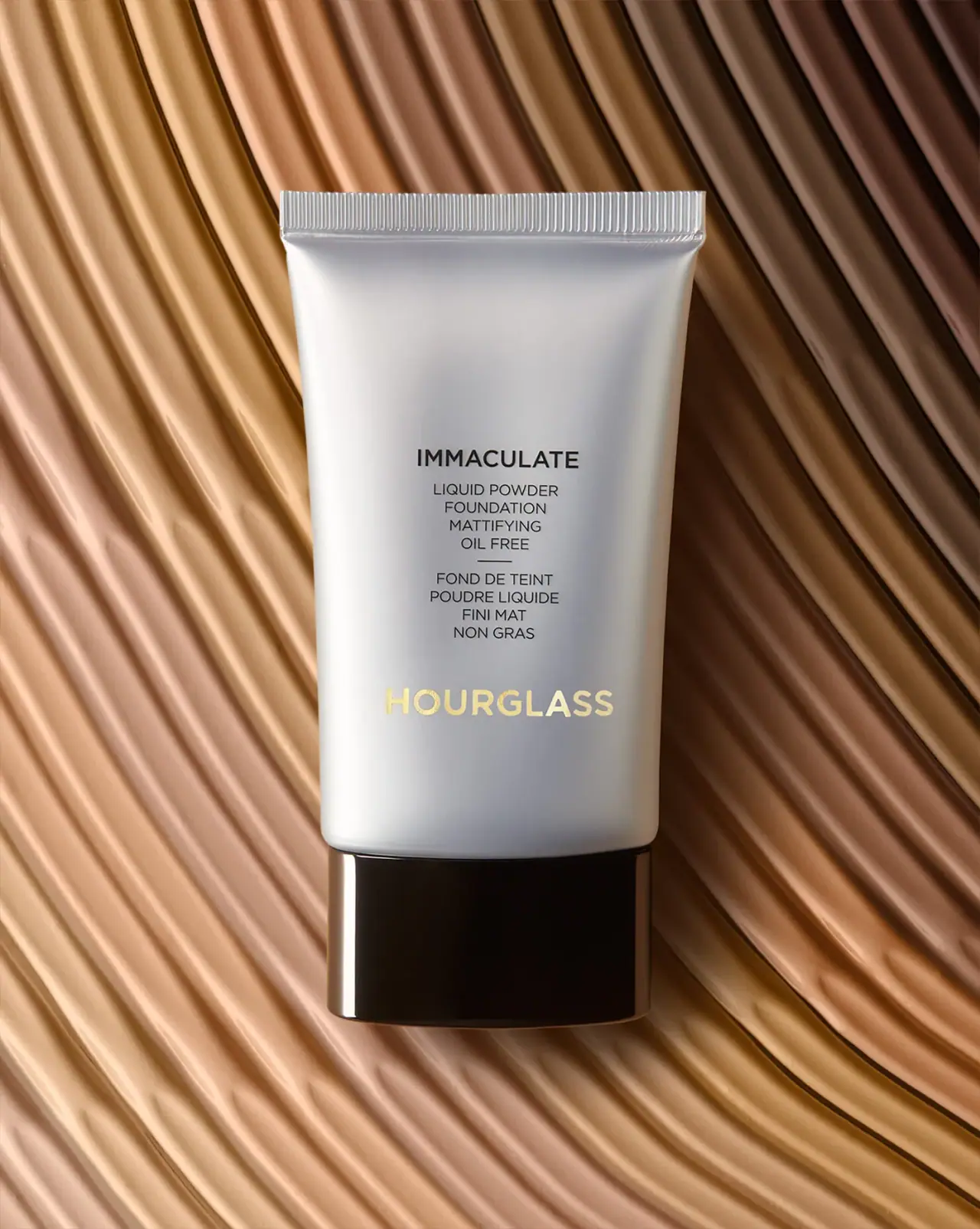
Photography: Teri Lyn Fisher — Hourglass product photography. Images belong to their respective owners.
Hourglass

Silver-grey foundation tube with bilingual precision and golden signature
This archived Immaculate foundation tube uses a silver-grey body, glossy near-black cap and a single warm gold-coloured producer signature. The product name and English/French descriptions form a compact centred column above that signature. A narrow horizontal rule separates the language blocks, while broad empty areas above and below prevent the detailed wording from filling the whole tube. The selected photograph comes from Teri Lyn Fisher’s portfolio and records this particular tube edition. It should not be treated as a description of current Hourglass packaging or an identifiable foundation shade.
- Make-up
- Light pack
- Clinical minimal
- Luxe monochrome
About this study
Archived Immaculate tube photographed by Teri Lyn Fisher. No particular shade or current Hourglass packaging system is inferred.
Sources & evidence · Reviewed 2026-10-19Color Palette
Approximate colours interpreted from photography. These are screen references, not official brand colours or print specifications.
Pack body
Silver-grey tube
#C5C6CB
Approximate smooth body appearance. Pale highlights and darker grey curves come from lighting; aluminium content or a metallic laminate is not established.
Near-black cap
#211A16
Approximate glossy closure colour. Warm brown reflections from the scene do not prove a separate brown material specification.
Ink
Dark functional copy
#242323
Approximate product title, bilingual descriptors and divider colour, providing stronger contrast than the lower gold-coloured signature.
Accent
Pale golden signature
#E2CB7F
Approximate large producer lettering. Its reflective-looking character is observed; foil, metallic ink or transfer process remains unverified.
Typography
Suggested visual alternatives, not confirmed brand typefaces. Any scale below is an illustrative estimate.
Immaculate is the strongest dark line at the top of the central information block. Four short English lines follow, then a small divider, then four French lines of comparable scale. The larger gold-coloured Hourglass signature sits substantially lower and spans more width. The product title is therefore the first dark-text anchor, while the producer becomes a separate colour and scale anchor. A large unprinted-looking area below the crimp helps the central column feel deliberate rather than crowded. The two languages are organised as parallel blocks, not mixed line by line.
Fonts
Product title and producer alternative
Montserrat
- Looks like
- Montserrat
- Type
- Geometric sans serif
- Weight
- Medium 500 / SemiBold 600
- Case
- Uppercase
- Tracking
- Neutral to modestly open
- Fallback
- sans-serif
Use for an original product title and separate producer signature. Their colour and placement should perform different roles; do not reproduce the Hourglass wordmark or its letter spacing exactly.
Bilingual descriptor alternative
Lato
- Looks like
- Lato
- Type
- Humanist sans serif
- Weight
- Regular 400
- Case
- Uppercase
- Tracking
- Neutral
- Fallback
- sans-serif
A proposed clear voice for compact English and French blocks. Keep comparable apparent size and line spacing, and have both languages reviewed rather than mechanically copying line lengths.
Structure & Proportions
Visual proportions and finish previews are illustrative. Confirmed construction details and uncertainties are distinguished in the study notes.
Proportions
| Purpose | Value | Preview |
|---|---|---|
| Tapered body | The crimped top is wider than the lower body near the cap, creating a broad upper blank area above the text. | — |
| Cap base | The dark closure forms a substantial low band and a visual base for the lighter tube. Its exact depth and internal construction are not measured. | — |
| Text column | The central descriptor is narrow relative to the available face, while the lower producer line extends farther horizontally. | — |
Shapes
| Element | Value | Preview |
|---|---|---|
| Tube | Tapered body with gently curved sides and a straight crimped top. | |
| Cap | Broad dark cover with rounded vertical edges. | |
| Bilingual column | Two compact blocks separated by a short horizontal line. | |
| Crimp | Narrow ridged band across the top edge. |
Finishes
Diffuse silver-grey appearance
Tube body; material and coating unverified. · matte
Polished dark reflection
Cap exterior. · gloss
Gold-coloured signature
Lower producer lettering; metallic look only, process unverified. · metallic
Formats and materials
| Formats | A tapered squeeze tube with a broad ridged crimp and a large dark cap at the bottom. The retained retailer listing describes dispensing by squeezing and lists 1 oz.; the selected front does not show a readable quantity. |
| Materials | Tube laminate, barrier layers, cap resin and recycled content are not specified in the inspected sources. Silver-grey colour does not establish aluminium construction., The front decoration may be direct printing or another applied process; the photograph does not reveal the manufacturing specification. |
| Closures | The broad glossy cap is fitted and the dispensing outlet is hidden. A threaded, flip-top or other mechanism cannot be verified from the frontal closed view. The crimped upper seam is visible, but no batch code is readable there. |
| Decoration | The surface relies on centred dark lettering, one short rule and a lower gold-coloured identity. There are no visible ingredient illustrations, shade swatches or patterned panels. |
Front Panel
Schematic reading order. The diagram’s zone heights do not represent measured artwork proportions.
The frontal information sits directly against a continuous silver-grey field with no visible paper-label boundary. The central block is positioned below a generous upper blank area. Product name, English description, divider and French description align to one axis. The lower producer mark shares that axis but changes colour and scale, creating a second focal level.
| Zone | Content |
|---|---|
| Upper breathing space | A broad pale area separates the ridged crimp from the product title. It makes the relatively dense bilingual copy feel less crowded. |
| Product title | Immaculate appears in heavier dark capitals above the functional description. It is visually distinct from both the producer and the supporting wording. |
| English and French blocks | The descriptions use short centred lines and similar scale. A small rule marks the transition between languages without enclosing either in a box. |
| Lower producer signature | Gold-coloured Hourglass lettering is wider and larger than the descriptor lines. It anchors the bottom half without displacing the product-title position. |
| Hidden shade information | No specific shade name or code is readable on the selected face. The photograph’s multiple foundation-coloured surroundings cannot identify the contents of this tube. |
Range System
The retained Nordstrom listing identifies the discontinued retail reference and displays a selected shade in its own page context. That shade is not assigned to the photographer’s specimen, whose front shows no shade identifier. Only the archived tube is audited, with no transfer of its finish or layout to other Hourglass lines.
- For an original complexion range, keep shade identification accessible even when the front prioritises product and producer. An underside or cap code would require an actual verified view before it could be documented.
- Parallel bilingual blocks can preserve a common hierarchy across products, but translated wording should determine line breaks. Equal visual dignity does not require identical character counts.
Back of Pack & Shelf
The reverse, cap base, outlet and inner seal are unseen. Full ingredients, shade code, batch marking and directions cannot be assigned to exact surfaces.
- Inspect the back and base before reconstructing shade-selection information.
- Treat the retailer’s 1 oz. statement as listing evidence rather than visible front transcription.
- Do not infer a pump, seal or cap mechanism from the closed tube silhouette.
On shelf
At reduced size, the pale body/dark cap contrast and gold-coloured producer should remain stronger than the small bilingual descriptors. Immaculate remains the main dark textual cue. This is visual interpretation, not a consumer test. An archive page should keep the edition label visible and avoid implying current availability or mapping the photographed tube to a shade selected on a separate retailer page.
Imagery
Teri Lyn Fisher’s portfolio describes this image as an Hourglass product photograph over a field of foundation. Broad flowing bands of complexion colours create a warm textured background, while the cool silver-grey tube remains sharply legible in front. The dark cap and golden signature connect visually to the surrounding warm tones without making those tones part of the printed palette. The image is a campaign treatment of formula texture, not a measured shade chart. Its frontal orientation reveals the bilingual hierarchy particularly clearly.
Guidelines
Editorial principles for an original design brief, not official brand guidelines.
Do
- Keep the archive edition explicit in the study and catalogue context.
- Separate product title, bilingual descriptors and producer signature.
- Treat the warm foundation scene as imagery rather than a shade identifier.
- Retain unknown material and decoration specifications as unknown.
Don't
- Do not infer aluminium from the silver-grey tube appearance.
- Do not describe the golden signature as confirmed foil.
- Do not assign the retailer’s selected shade to the photographer’s unlabelled specimen.
- Do not apply this archived hierarchy to every current Hourglass product.
Sources & evidence
- Immaculate Liquid Powder Foundation — Nordstrom archive listingproduct
- Product photography — Teri Lyn Fisherphotographer
How this study was built
edition · Sourced fact
Retailer marks listing no longer available and gives 1 oz.Immaculate Liquid Powder Foundation — Nordstrom archive listingimagery · Sourced fact
Primary photographer portfolio identifies the matching Hourglass image over foundation.Product photography — Teri Lyn Fisherstructure · Visual observation
Crimped silver-grey tube ends in broad glossy dark cap.typography · Visual observation
Dark product title and two language blocks sit above larger golden producer.label · Visual observation
Short rule separates English and French; no shade identifier visible.palette · Visual observation
Silver-grey, dark copy/cap and gold-coloured identity belong to package.range · Editorial interpretation
Archive-specific hierarchy cannot be transferred to current products or an identified shade.
What remains unverified
- Materials, decoration process and hidden closure mechanism unknown.
- Retailer lists 1 oz.; quantity not readable on selected front.
- Selected photograph does not identify shade.
- Current packaging is outside scope; fonts and colours are alternatives or approximations.
Give your AI
packaging taste
Give your design or image tool a packaging study: palette, type, structure, front panel and principles for an original brief.
Export this styleFree with an email. PACK.md works in Claude, ChatGPT, Cursor and image tools.
More like this

African Botanics
Technical black label with a low serif signature

bareMinerals
a restrained black compact framing the powder itself

BeautyPWR
Clear square shell, white cream cup, black serif identity

Corpus
sage gloss with whispered gold lettering

Costa Brazil
Pale matching vessels with small, deliberate bilingual labels

Crown Affair
Pale frosted-looking bottle, black pump and small looping emblem

HAKU
Pearly narrow tube with stacked serif identity and clear base

Haus Labs
mirror chrome hardware over frosted shade