
Photography: Akro official photography. Images belong to their respective owners.
Akro
soft pink interrupted by an assertive black signature
Crush Extrait de Parfum contrasts a calm pink bottle with a large restless black signature. Rounded corners and a simple cylindrical cap keep the structure controlled, while the brush-like wordmark supplies movement. The fragrance name sits beneath it in a compact uppercase line, and the concentration is isolated much lower on the face. The result is graphic without being information-heavy: one expressive gesture, one quiet product name and a small technical descriptor. This study follows the selected opaque-looking pink presentation, not an assumed transparent Akro bottle or a universal brand template.
- Perfume
- Light pack
- Bold typographic
- Luxe monochrome
About this study
Crush Extrait de Parfum in the selected official pink closed-bottle image. Physical construction, production year and exact size of this specimen are not independently established.
Sources & evidence · Reviewed 2026-10-19Color Palette
Approximate colours interpreted from photography. These are screen references, not official brand colours or print specifications.
Pack body
Soft rose pink
#E5ADB5
Approximate body colour from the selected front. The image does not reveal whether this comes from coating, coloured material or another construction; it is not a production swatch.
Ink
Near-black signature
#171314
Approximate wordmark and darker cap family. Small product text reads in the same dark family; no ink or cap-material specification is established.
Typography
Suggested visual alternatives, not confirmed brand typefaces. Any scale below is an illustrative estimate.
The Akro signature is the overwhelmingly dominant front graphic. Its steep, irregular strokes and open loops cut across the stable rectangular field, with visual energy concentrated in the upper-middle area. CRUSH follows in small evenly spaced capitals, returning the composition to a calm horizontal axis. EXTRAIT DE PARFUM sits separately near the bottom. The contrast between gesture and utility matters more than simply making one font large and another small.
Fonts
Expressive identity alternative
Caveat Brush
- Looks like
- Caveat Brush as a rough handwritten starting point
- Type
- Informal brush-like display lettering
- Weight
- Regular
- Case
- An original name in mixed case
- Tracking
- Natural handwritten rhythm
- Fallback
- cursive
Explore a new expressive identity with its own rhythm, not a tracing of Akro strokes. This alternative is looser and less angular; custom original lettering may be preferable to a literal font substitution.
Product information alternative
DM Sans
- Looks like
- DM Sans for restrained capitals
- Type
- Low-contrast sans serif
- Weight
- Regular and Medium
- Case
- Uppercase
- Tracking
- Moderately open on short lines
- Fallback
- Arial, sans-serif
Set fragrance name and concentration as controlled information beneath an original signature. Preserve clear contrast and enough spacing around each line; avoid expanding tracking until the name becomes difficult to read.
Structure & Proportions
Visual proportions and finish previews are illustrative. Confirmed construction details and uncertainties are distinguished in the study notes.
Proportions
| Purpose | Value | Preview |
|---|---|---|
| Signature versus body | The signature uses much of the available width but leaves clear margins. Its diagonal strokes create movement inside an otherwise vertical, stable face. | — |
| Information spacing | CRUSH is close enough to relate to the signature but remains visually separate. The concentration line sits much lower, leaving a substantial quiet interval. | — |
| Cap relationship | The cylindrical cap is narrower than the body, producing a strong dark top accent without extending beyond the shoulder width. | — |
| Rounded rectangle | Broad shoulders and lower corner radii soften the silhouette. No measured radius, height, width or label coverage is available. | — |
Shapes
| Element | Value | Preview |
|---|---|---|
| Bottle front | Broad rounded rectangle with softly curved shoulders. | |
| Cap | Simple cylindrical dark top with a visible lower collar. | |
| Signature gesture | Angular brush-like strokes and irregular loops, not a geometric badge. |
Finishes
Subdued pink appearance
Main bottle face; matte-looking lighting does not establish a soft-touch coating. · matte
Soft cap reflection
Dark cylindrical cap; material and surface treatment remain unverified. · gloss
Formats and materials
| Formats | Selected presentation: broad rectangular fragrance bottle with rounded shoulders and corners, closed by a cylindrical cap., Official listing includes 100 mL, 30 mL and 10 mL; this does not establish identical proportions across those sizes. |
| Materials | Bottle, cap and decoration substrates are not verified by the consulted official listing. The pink face appears opaque in the image; that appearance does not identify the underlying material. |
| Closures | A dark cylindrical cap sits centrally above the rounded shoulders, with a shallow lower collar visible. The sprayer is hidden. Magnetism, snap fit, internal liner, pump specification and neck construction cannot be determined from this closed view. |
| Decoration | Large brush-style signature, smaller fragrance name and separate concentration line., No printed ingredient illustration or ornamental border on the visible front., The rounded bottle outline remains legible around the graphic gesture. |
Front Panel
Schematic reading order. The diagram’s zone heights do not represent measured artwork proportions.
The selected face reads as one continuous pink field carrying dark graphics. No small rectangular label boundary is visible. The signature, scent name and concentration occupy three distinct levels on a shared central axis, although the signature itself is deliberately asymmetrical. Most of the lower-middle face is left clear.
| Zone | Content |
|---|---|
| Central identity | Large Akro brush-style lettering dominates the face and extends diagonally within its allotted area. |
| Fragrance name | CRUSH is a short uppercase line beneath the signature. Its evenly spaced geometry contrasts with the irregular mark above. |
| Concentration | EXTRAIT DE PARFUM sits near the lower edge as a small separate line, indicating product type without competing for attention. |
| Unprinted field | Pink space surrounds the signature and separates the two smaller text levels, preventing an expressive logo from making the whole face feel crowded. |
Range System
The official product page lists three sizes of Crush and identifies it as an extrait. The same site navigation names other fragrances, but this study does not compare their physical packs. Range guidance therefore remains an interpretation: an expressive master identity can stay stable while a compact scent-name zone changes.
- Crush: the selected pink presentation and short five-letter product name.
- Official size options: 100 mL, 30 mL and 10 mL are listed, without a claim that all use this identical geometry.
- Interpretation: longer future names would need their own spacing and line-break tests; the spacious fit of CRUSH is not proof that every name works in one line.
Back of Pack & Shelf
The reverse, base and opened cap are not visible. Ingredients, volume marking, batch code and regulatory statements cannot be located from the selected front. Their absence from this view should not be mistaken for their absence from the physical product.
- Inspect reverse and base images before assigning a regulatory information zone.
- For an original fragrance, reserve legible mandatory text independently of the expressive front.
- Verify dispenser construction before describing refillability or cap attachment.
On shelf
Interpretation: a dark expressive signature on a large pale field offers a clear recognition cue at thumbnail scale, while the short fragrance name becomes useful at closer distance. The pink body could also distinguish this presentation among darker or transparent-looking fragrance packs, but no comparative shelf study was consulted. A new design should test the signature under small image scaling so its finer strokes do not collapse.
Imagery
Lychees, rose petals, nuts and vanilla pods form a dense frame behind the bottle on a white background. Their saturated pinks and reds extend the bottle colour into the surrounding composition, while natural textures contrast with its smooth face. The official description connects Crush with rose macarons and lists related scent notes, supporting this sensory styling. Those props are not a literal ingredient declaration or a quantitative formulation statement. The clean background keeps the dark cap and signature sharply separated from the colourful frame.
Guidelines
Editorial principles for an original design brief, not official brand guidelines.
Do
- Let one expressive mark supply movement while practical typography stays calm.
- Separate concentration from scent name with deliberate space.
- Use pack-specific colour rather than the dominant background colour when making a palette.
- Describe opacity and reflection as appearance until construction is verified.
Don't
- Do not call the selected bottle clear or invent a separate small front label.
- Do not infer soft-touch coating, glass or cap magnetism from this photograph.
- Do not reproduce the Akro signature or its exact stroke arrangement.
- Do not turn scent props into verified ingredient quantities.
Sources & evidence
How this study was built
edition · Sourced fact
Official listing identifies Crush as Extrait de Parfum and lists three sizes; one photographed presentation is analysed.Akro — Crush Extrait de Parfum, official product and photographystructure · Visual observation
Rounded rectangular pink body and dark cylindrical closed cap are visible; materials and attachment remain unknown.Akro — Crush Extrait de Parfum, official product and photographytypography · Visual observation
Large brush-like signature contrasts with restrained uppercase scent and concentration lines.Akro — Crush Extrait de Parfum, official product and photographylabel · Visual observation
Graphics sit on a continuous pink field without a visible small label boundary.Akro — Crush Extrait de Parfum, official product and photographypalette · Visual observation
Approximate pink and near-black describe the pack; scene white and ingredient colours are excluded.Akro — Crush Extrait de Parfum, official product and photographyimagery · Sourced fact
Official rose-macaron story and scent notes support the ingredient-themed styling, not formulation quantities.Akro — Crush Extrait de Parfum, official product and photographyrange · Editorial interpretation
A stable signature and variable scent-name zone are transferable design principles, not a verified universal Akro rule.
What remains unverified
- Underlying bottle material, decoration process, cap composition and attachment are unverified.
- Exact fonts, physical dimensions and print colours are not established.
- Reverse, base and dispensing head are unseen.
- The selected front appears opaque pink; current research wording describing a clear bottle is not used.
Give your AI
packaging taste
Give your design or image tool a packaging study: palette, type, structure, front panel and principles for an original brief.
Export this styleFree with an email. PACK.md works in Claude, ChatGPT, Cursor and image tools.
More like this
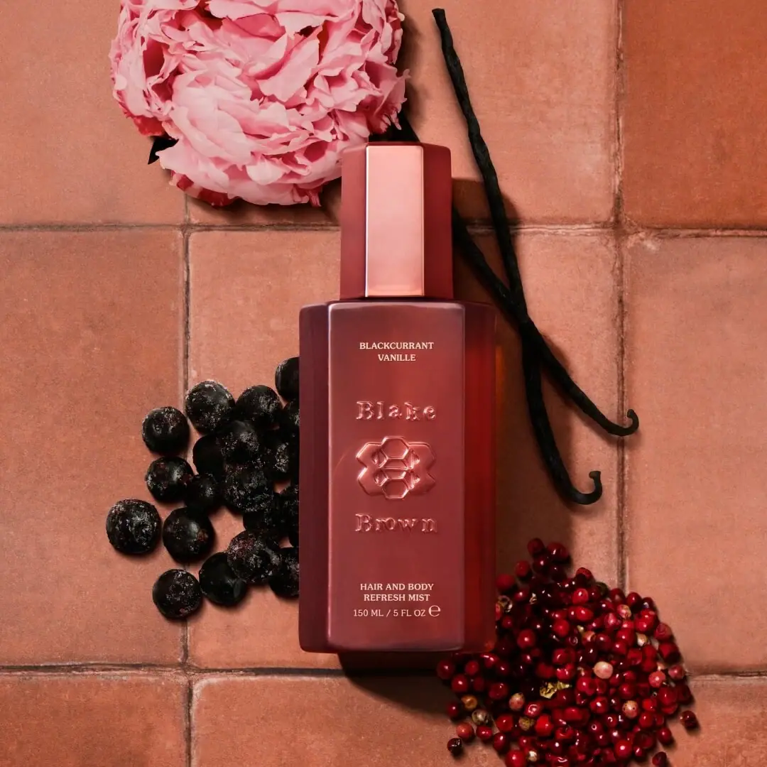
Blake Brown
sculptural rose-brown fragrance with a jewel-like centre
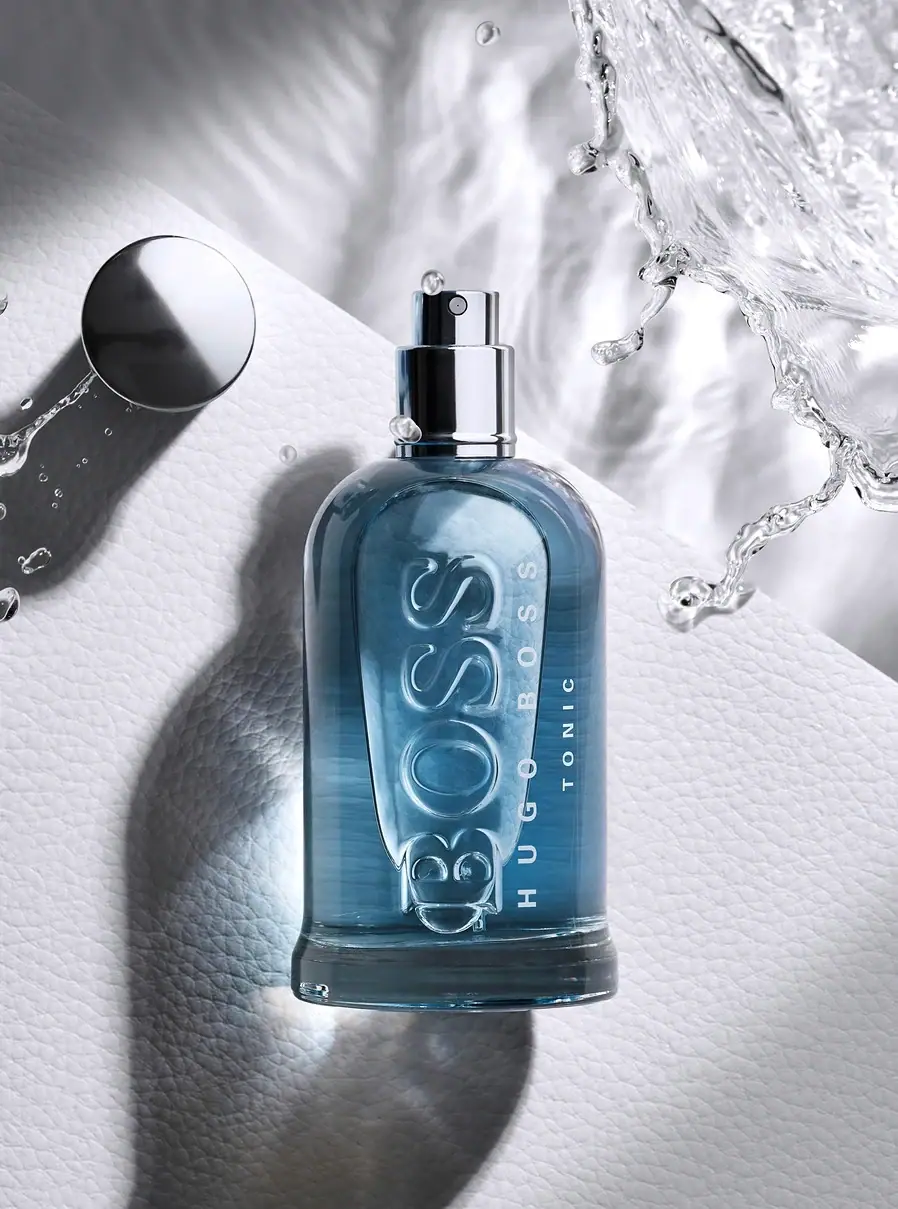
Hugo Boss
Blue transparent bottle with dimensional lettering and silver spray hardware
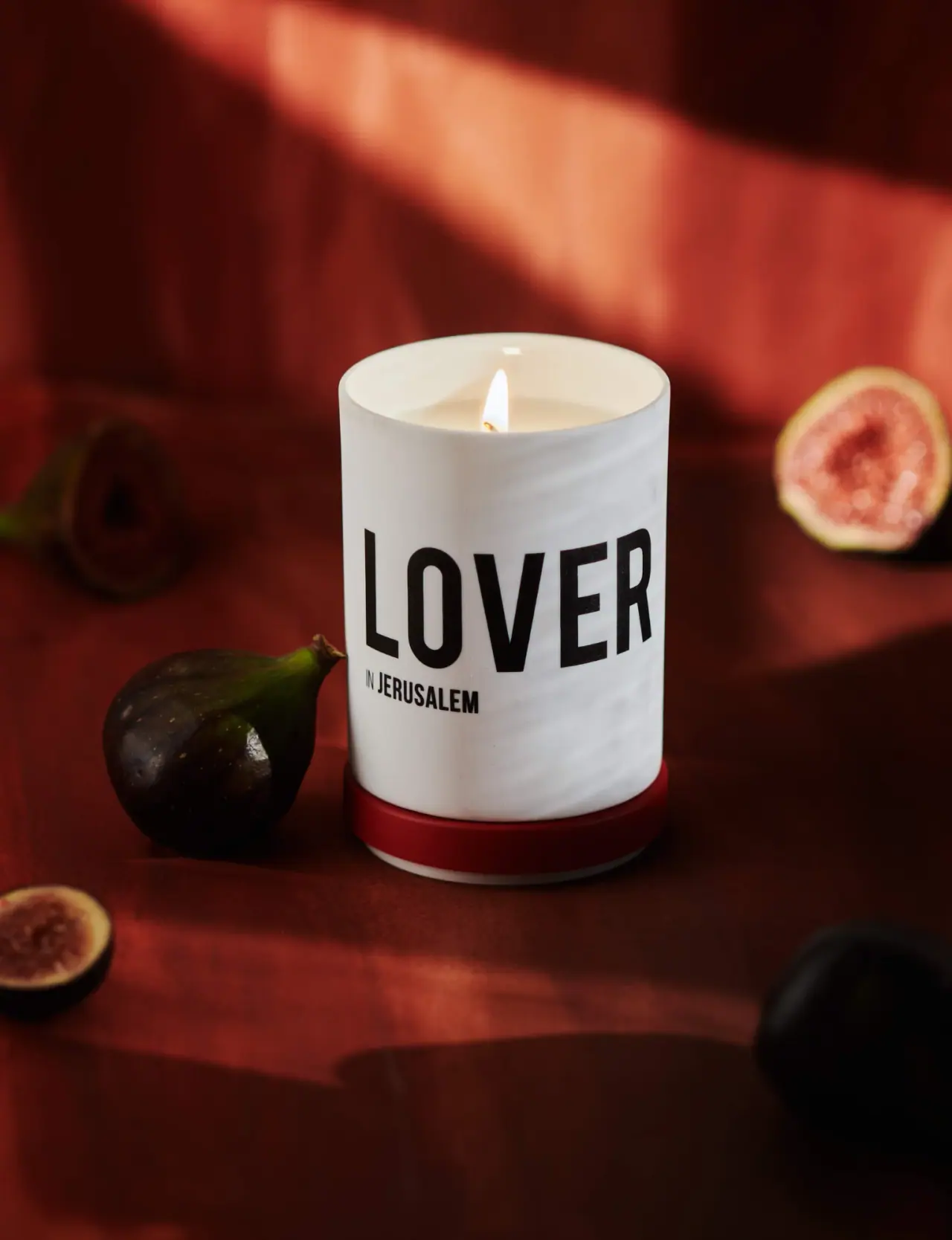
Nomad Noé
Giant black character name on white porcelain and red
Vyrao
mirror cylinder with cropped lettering and a bowl-shaped cap

Color Wow
Tall condensed naming on a broad reflective silver jar
DIZZIAK
Oversized black lettering unites two pale haircare tubes

EADEM
Mirror-bright tube, oversized black identity, juicy campaign color
MAKE UP FOR EVER
Long tapered black cap above a compact colour chamber