Photography: Lucas Zarebinski — product photography. Images belong to their respective owners.
MAKE UP FOR EVER
Long tapered black cap above a compact colour chamber
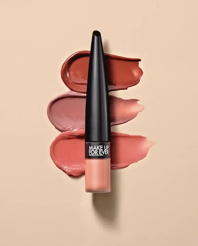
The selected Rouge Artist For Ever Matte package is dominated by a long black cap that narrows towards an angled top. A much shorter translucent lower chamber reveals a peach-toned liquid, while a compact white producer mark sits in the black band at their junction. Three broad cosmetic swatches behind the upright package provide colour variation without changing its restrained front. The exact photographed shade is unverified even though the current official page defaults to a named peachy-nude option.
- Make-up
- Light pack
- Bold typographic
- Luxe monochrome
About this study
Selected closed Rouge Artist For Ever Matte in three-swatch composition; exact photographed shade and applicator shape unverified.
Sources & evidence · Reviewed 2026-10-19Color Palette
Approximate colours interpreted from photography. These are screen references, not official brand colours or print specifications.
Pack body
Deep cap black
#1A191A
Dominant sculptural cap and short identity band. A narrow vertical highlight describes the curved surface without introducing another printed colour.
Visible peach-toned contents
#D89078
Approximate product colour seen through the lower chamber, not a verified shade code or separately printed peach ink. Background swatches are excluded from this package palette.
Ink
White identity
#F3F2ED
Stacked producer lettering and tiny professional/location line on the short black band.
Typography
Suggested visual alternatives, not confirmed brand typefaces. Any scale below is an illustrative estimate.
MAKE UP and FOR EVER form two tightly stacked white lines on the short black band above the colour chamber. A very small PROFESSIONAL PARIS line sits below. The producer is concentrated into a small region rather than spread along the unusually long cap. The silhouette therefore leads from a distance, while the white word block supplies close-range attribution. Product name, shade number and quantity are not legible on this selected front and should not be invented from the product page.
Fonts
Compact producer alternative
Barlow Condensed
- Looks like
- Barlow Condensed
- Type
- Condensed sans serif
- Weight
- SemiBold 600 / Bold 700
- Case
- Uppercase
- Tracking
- Close to neutral
- Fallback
- sans-serif
A proposed compact uppercase voice for a distinct two-line producer name. Keep sufficient margin around the letters on the narrow band rather than attempting to fill every millimetre.
Supporting information proposal
Inter
- Looks like
- Inter
- Type
- Sans serif
- Weight
- Regular 400 / Medium 500
- Case
- Short uppercase identifiers
- Tracking
- Neutral to slightly open
- Fallback
- sans-serif
Use for an original small descriptor or verified base label. Hidden packaging typography is not established here, so this is an implementation proposal rather than an attribution.
Structure & Proportions
Visual proportions and finish previews are illustrative. Confirmed construction details and uncertainties are distinguished in the study notes.
Proportions
| Purpose | Value | Preview |
|---|---|---|
| Cap dominance | The tapered cap occupies most of the visible package height, making its silhouette more prominent than the small product chamber. | — |
| Short colour chamber | The lower translucent section is a compact cylinder with a flat-looking base and small rounded lower edges. | — |
| Identity band | A short black register between cap and contents holds all readable producer text. | — |
Shapes
| Element | Value | Preview |
|---|---|---|
| Tapered cap | Long narrowing black shape with an angled top; not an exposed nozzle. | |
| Lower chamber | Short cylindrical colour reservoir with softened bottom corners. | |
| Producer band | Compact rectangular text field on a curved black surface. |
Finishes
Smooth black highlight
Long closed cap; coating and substrate unverified. · gloss
Translucent colour view
Lower chamber reveals contents; exact material unknown. · transparent
Formats and materials
| Formats | A closed liquid-lipstick package with a long tapered cap, short black identity band and much shorter translucent cylindrical product chamber. The official page confirms liquid lipstick as the product format. |
| Materials | The accessed official listing does not specify the lower chamber resin or glass, cap substrate, decorative coating or internal applicator materials. Transparency does not identify the substrate., The peach appearance comes from contents visible through the chamber. The photograph does not establish fill quantity, wall thickness or residual product level. |
| Closures | The long cap meets the lower assembly at a thin horizontal seam. Its top is angled and rounded in projection, not a visible dispensing opening. The official page describes a seamless-swipe applicator, but the closed photograph does not show the wand, tip geometry, wiper or thread arrangement. |
| Decoration | White producer lettering is confined to the short black band at the junction. The remainder of the long cap is visually unprinted in this view., No printed shade swatches appear on the container: the three broad strokes sit behind the product as photographic styling. |
Front Panel
Schematic reading order. The diagram’s zone heights do not represent measured artwork proportions.
The visible identity is compressed into the short band between the sculptural cap and the colour chamber. This leaves the long tapered upper part free to act as a single black form. The compact stacked word block is high contrast, while the lower section communicates colour through the contents themselves. No larger product-title label interrupts that division.
| Zone | Content |
|---|---|
| Long cap field | A smooth black tapered surface dominates the package and carries no readable front copy above the junction. |
| White producer block | Two close uppercase lines occupy the black junction band, followed by the tiny professional/location text. |
| Colour chamber | The short lower body reveals peach-toned liquid. It provides a visual shade cue without establishing the exact commercial shade name. |
| Base edge | A flat-looking end and softly rounded corners finish the chamber. The underside is not visible, so any shade sticker remains undocumented. |
Range System
The official UAE listing describes sixteen shades and an applicator developed for this liquid-lipstick line. Its selected page state is shade 190, Always Au Naturel, but there is no readable shade code in the approved photograph. The three swatches therefore illustrate a colour story rather than a verified mapping between named shades and the photographed tube.
- An original colour range can retain one sculptural cap while exposing contents in a short lower chamber. A verified shade name or code should still be available on a documented secondary surface.
- Campaign swatches can demonstrate variation without changing package artwork. Label each photographed swatch when exact shade comparison matters; otherwise present it as an atmospheric palette rather than a calibrated colour chart.
Back of Pack & Shelf
The rear, underside and open applicator are unseen. Product name, shade identifier, quantity, ingredients and applicator geometry cannot be reconstructed from this front view alone.
- Inspect an open product image before describing the application tip shape.
- Verify a base or rear label before identifying the photographed shade.
- Do not infer fill quantity from the apparent height of the coloured chamber.
On shelf
The unusually long black taper should provide recognition before the small producer lettering becomes readable. The short visible colour section makes shade part of the object without competing with the silhouette. This is visual interpretation rather than tested recognition or ergonomic performance. A practical catalogue should add an open-applicator view and a legible base label so that the striking hero also connects to product function and a specific shade.
Imagery
The upright closed product overlaps three broad horizontal cosmetic strokes on a warm peach ground. The upper swatch is a deeper red-brown, the middle a muted mauve and the lower a warmer coral-peach. Their glossy ridges and feathered ends create a soft irregular backdrop to the sharply controlled black taper. These wet-looking swatches do not prove the final dried lipstick finish. A clear cast shadow to the right reinforces the container’s height and keeps it distinct from the flat background.
Guidelines
Editorial principles for an original design brief, not official brand guidelines.
Do
- Separate product matte finish from cap appearance.
- Keep the exposed colour cue distinct from the photographic swatches.
- Use an open view to document the applicator accurately.
- Verify the shade through readable packaging rather than page defaults.
Don't
- Do not call the angled closed cap an exposed nozzle.
- Do not assign shade 190 solely because the official page selects it.
- Do not infer chamber material or fill amount from appearance.
- Do not treat glossy wet swatches as the final dried formula finish.
Sources & evidence
- Rouge Artist For Ever Matte — MAKE UP FOR EVER UAEproduct
- Cosmetics photography — Lucas Zarebinskiphotographer
How this study was built
edition · Sourced fact
Official page confirms liquid lipstick, sixteen shades and a named applicator feature; selected page state is 190.Rouge Artist For Ever Matte — MAKE UP FOR EVER UAEimagery · Sourced fact
Primary photographer portfolio supports selected image provenance.Cosmetics photography — Lucas Zarebinskistructure · Visual observation
Long tapered closed cap dominates short translucent colour chamber.typography · Visual observation
White stacked producer and tiny supporting line occupy the black junction band.label · Visual observation
No readable shade code, quantity or product-title line on selected front.palette · Visual observation
Black cap, white identity and peach visible contents are distinct from three background swatches.range · Editorial interpretation
Page default and styling colours cannot establish exact photographed shade mapping.
What remains unverified
- Closed product does not show applicator tip or wiper.
- Shade 190 is page state, not verified photographed shade.
- Component materials, coating and fill quantity unverified.
- Fonts proposed; content colour and swatches affected by photography.
Give your AI
packaging taste
Give your design or image tool a packaging study: palette, type, structure, front panel and principles for an original brief.
Export this styleFree with an email. PACK.md works in Claude, ChatGPT, Cursor and image tools.
More like this

Color Wow
Tall condensed naming on a broad reflective silver jar
DIZZIAK
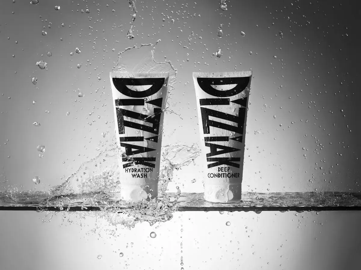
Oversized black lettering unites two pale haircare tubes

EADEM
Mirror-bright tube, oversized black identity, juicy campaign color
MUTHA
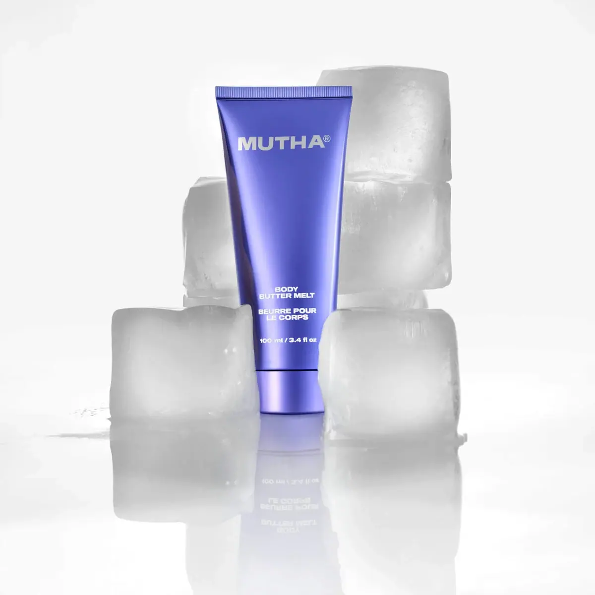
Reflective violet tube with bold maker and spacious middle
NARS
Clear elongated bottle with oversized interlocking mark and black cap
Pat McGrath Labs
Gold pigment kit with sparse labelling and sequin-filled pouch
Rodial
Reflective silver with parallel vertical foundation lettering

Saie
giant lowercase wordmark over frosted shade