Photography: Vyrao official photography. Images belong to their respective owners.
Vyrao

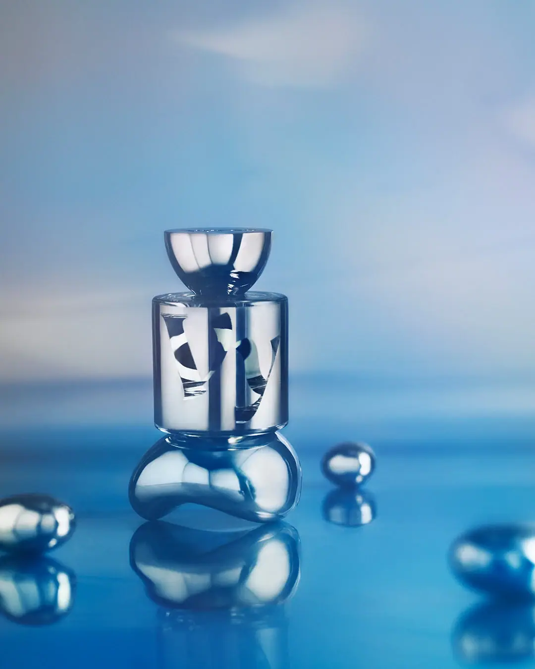
mirror cylinder with cropped lettering and a bowl-shaped cap
The Sixth turns a compact cylindrical perfume bottle into a reflective graphic object. A bowl-like cap narrows into the neck, while enormous curved letterforms spread around the body and disappear beyond its visible sides. The silver-looking surfaces absorb the blue photographic environment, creating bright and dark bands that change the apparent contrast of the lettering. This study follows the selected official image, separating the actual vessel from the sculptural pedestal and silver spheres used to stage it.
- Perfume
- Light pack
- Bold typographic
- Luxe monochrome
About this study
The Sixth in the approved blue-set official photograph, associated with the 50 ml Eau de Parfum listing. This is not a full Vyrao identity manual or a component specification.
Sources & evidence · Reviewed 2026-10-19Color Palette
Approximate colours interpreted from photography. These are screen references, not official brand colours or print specifications.
Pack body
Silver midtone appearance
#B6C4CE
Approximate reflected midtone on the body and closure. This is a photographic appearance, not a verified metallic ink, coating specification or intrinsic blue-grey material colour.
Ink
Pale graphic appearance
#E7EBED
Approximate light-facing portions of the oversized graphic. Reflection and the underlying decoration influence contrast; the image does not establish a separate opaque white ink.
Accent
Deep reflected contrast
#17364A
Approximate darkest reflected areas across cap and body. Useful for demonstrating tonal range, but not a prescribed navy brand colour or proof of a second printing ink.
Typography
Suggested visual alternatives, not confirmed brand typefaces. Any scale below is an illustrative estimate.
The oversized house graphic takes priority over conventional product information. Its sweeping thick and thin shapes occupy much of the body height, with only fragments readable from this angle. Curvature and cropping make the word behave like an image before it behaves like a complete line of text. No confidently readable scent title or concentration line is available on the selected front, so a full textual hierarchy cannot be reconstructed from this photograph.
Fonts
Expressive display alternative
Cormorant Garamond
- Looks like
- Cormorant Garamond for contrasting curved display forms
- Type
- Display serif
- Weight
- SemiBold 600
- Case
- Mixed case for an original word
- Tracking
- Optically adjusted to the curved container
- Fallback
- Georgia, serif
Explore broad curves and varied stroke thickness using a new short name. Judge the visible fragment on a cylindrical mock-up, not just the flat artwork. This alternative cannot reproduce the proprietary lettering and should not be distorted to imitate it.
Supporting information alternative
Inter
- Looks like
- Inter for a calm functional counterpart
- Type
- Sans serif
- Weight
- Regular 400 / Medium 500
- Case
- Sentence case and numerals
- Tracking
- Normal, with additional space only where reading tests support it
- Fallback
- Arial, sans-serif
Reserve a separate readable location for scent, concentration and capacity in an original design. This is a proposed complement because those roles cannot be identified on the photographed face; it is not an observed secondary Vyrao font.
Structure & Proportions
Visual proportions and finish previews are illustrative. Confirmed construction details and uncertainties are distinguished in the study notes.
Proportions
| Purpose | Value | Preview |
|---|---|---|
| Compact vessel mass | The body reads as a short drum rather than a tall column. Its broad front supports unusually large letter fragments without requiring a long vertical label. | — |
| Narrow connection, broad closure | A reduced neck joins two substantially wider volumes. This creates a clear pause between body and cap without a contrasting colour band. | — |
| Graphic exceeds the viewing window | Letterforms extend beyond the portion of the cylinder visible from one viewpoint. The study does not infer a measured wrap angle or a complete flat artwork. | — |
| Scene is separate | The rounded silver support below the bottle is a prop. Including it in a packaging silhouette would produce an incorrect height and base geometry. | — |
Shapes
| Element | Value | Preview |
|---|---|---|
| Body | Short upright cylinder with a broad curved front and near-horizontal upper edge. | |
| Closure | Bowl-like cap: wider across its top, narrowing towards the neck beneath. | |
| Letter fragments | Large curving strokes and open counters interrupted by the cylinder's turning sides. |
Finishes
Mirror-like silver appearance
Body and cap; this visual description does not establish polished metal or a metallisation process. · metallic
High environmental reflection
Bright vertical bands and dark blue areas over the vessel; these change with the scene and viewing angle. · gloss
Formats and materials
| Formats | Selected compact cylindrical perfume flacon with a bowl-like cap and a narrow neck connection; official product listing identifies 50 ml Eau de Parfum. |
| Materials | The brand describes its fragrance bottles generally as glass; the selected vessel has a mirror-like exterior. Exact wall construction, reflective layer and any separate decorative sleeve are not verified., Cap, pump, lining, adhesive and coating composition are unverified. Platinum is the brand's descriptive appearance language here, not a confirmed precious-metal bill of materials. |
| Closures | The cap has a broad, nearly flat-looking top and a rounded underside that tapers towards the neck, creating an inverted bowl profile. The body begins below a narrow connection rather than continuing directly into the cap. The image is closed, so the dispenser, attachment method and internal fit are hidden. A domed cap is not evidence of a magnetic closure or a particular opening gesture. |
| Decoration | Overscaled curved house lettering wraps beyond the visible front., The reflective field supplies most of the visual activity between letterforms., No separate front paper label boundary is evident, but this does not identify how the graphic is applied. |
Front Panel
Schematic reading order. The diagram’s zone heights do not represent measured artwork proportions.
The front is organised as a continuous curved graphic field rather than a conventional rectangular information panel. Large letter fragments occupy almost the full body height and move out of view on both sides. Reflections run vertically through that field, so the boundary between letter and background is not equally clear everywhere. No complete reverse or base label can be derived from the open-looking areas of this face. A schematic should illustrate wrapping and cropping without inventing missing words.
| Zone | Content |
|---|---|
| Reflective cap | Broad bright upper volume with a narrowed lower connection. |
| Neck interval | A short constriction separates cap from the cylindrical graphic field. |
| Oversized house graphic | Partial curved lettering fills the visible body and continues around its sides. |
| Lower rim | Narrow base transition above the independent sculptural photo support. |
Range System
The 2022 campaign interview describes The Sixth's silvery white direction in relation to the colours of the first five fragrances. This supports a particular campaign distinction, not a complete permanent colour chart for every Vyrao scent. The selected image demonstrates how a shared broad shape could accommodate a reflective treatment, but this study does not compare dimensions, closure construction or full artwork across the range.
- Selected reference: The Sixth, with silver-looking cylindrical body and large wraparound lettering.
- Documented context: the campaign filmmaker discusses a silvery white visual direction for this fragrance.
- Original-design exercise: test a stable readable scent identifier when a reflective finish replaces an opaque coloured field.
Back of Pack & Shelf
The back, underside, carton, open dispenser and complete circumference are unseen. The front does not provide enough legible small copy to locate every technical requirement. Oversized branding therefore needs to be understood alongside a separate information system that this photograph does not document.
- Obtain a full rotation before mapping where the large graphic begins and ends.
- Inspect the underside and reverse before positioning capacity or batch information in a reconstruction.
- For an independent concept, test small text on the actual reflective surface rather than assuming dark-on-silver is consistently readable.
On shelf
Interpretation: the compact silhouette and exceptionally large graphic may aid recognition of the house while leaving the particular scent less explicit from a single front view. A mirror-like finish also changes dramatically under shelf lighting, beside neighbouring colours and in a shopper's hand. For a new project, test three separate tasks: identifying the maker, finding the scent and reading practical information. A strong campaign photograph does not establish performance under all three conditions.
Imagery
The bottle stands on an irregular silver support above a reflective blue floor, surrounded by smaller silver spheres. These objects repeat the pack's rounded and reflective qualities but are not attached components. The broad blue background enters the vessel as reflections, making an apparently monochrome object feel saturated. The official source credits Ruth Hogben for a 2022 campaign; the selected still's existing provenance names Vyrao official photography, so that individual photographer credit is not transferred without a match.
Guidelines
Editorial principles for an original design brief, not official brand guidelines.
Do
- Evaluate oversized graphics on a curved mock-up from several viewpoints.
- Separate fixed decoration from changing reflections when describing colour.
- Reserve a readable place for product identity beyond a large house mark.
- Keep photographic supports outside the packaging construction diagram.
Don't
- Do not treat platinum wording as proof of precious-metal construction.
- Do not infer two printing inks from changing white and dark letter appearances.
- Do not identify cap attachment or refillability from the closed silhouette.
- Do not copy the Vyrao lettering or the complete cap-and-cylinder combination.
Sources & evidence
- Vyrao — The Sixth, official productproduct
- Vyrao — The Story Behind The Sixth, September 2022brand
- Vyrao — The Sixth: Meet The Filmmaker, October 2022brand
- Vyrao — Our Story, bottle contextbrand
How this study was built
context · Sourced fact
Official listing identifies The Sixth as a 50 ml Eau de Parfum.Vyrao — The Sixth, official productfinishes · Sourced fact
Brand launch story uses platinum appearance language; it does not supply a coating or alloy specification.Vyrao — The Story Behind The Sixth, September 2022structure · Sourced fact
General brand story describes glass fragrance bottles, without a detailed component declaration for this photographed edition.Vyrao — Our Story, bottle contextrange · Sourced fact
Campaign interview explains the silvery white direction in relation to the first five fragrances' colours.Vyrao — The Sixth: Meet The Filmmaker, October 2022typography · Visual observation
Oversized curved letter fragments wrap beyond the front viewing window; exact font and application process remain unidentified.Vyrao — The Sixth, official productimagery · Visual observation
Organic pedestal and small spheres are external props, with blue surroundings strongly reflected on the vessel.Vyrao — The Sixth, official productshelf · Editorial interpretation
Changing reflections and partial lettering call for separate tests of house recognition, scent selection and small-text reading.
What remains unverified
- Reflective layer, decoration process, cap composition and component assembly are unverified.
- Original lettering, physical dimensions and full wrap artwork are unidentified.
- Reverse, base, carton and exposed dispenser are unseen; no refill mechanism inferred.
- Selected still is credited to the official source, not automatically to the separately documented 2022 campaign photographer.
- HEX values are photographic approximations affected by blue scenery and reflections.
Give your AI
packaging taste
Give your design or image tool a packaging study: palette, type, structure, front panel and principles for an original brief.
Export this styleFree with an email. PACK.md works in Claude, ChatGPT, Cursor and image tools.
More like this

Akro
soft pink interrupted by an assertive black signature
Blake Brown
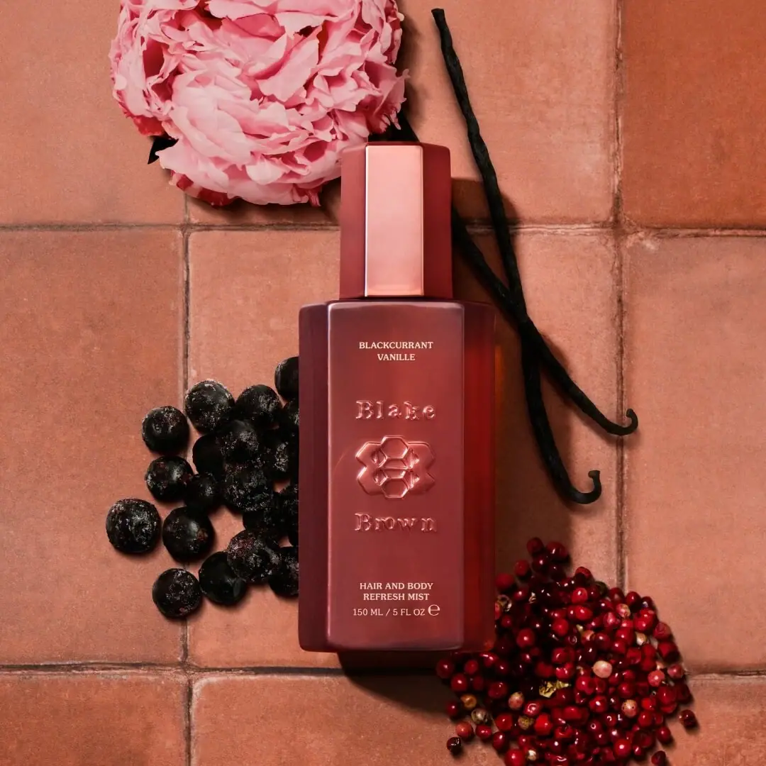
sculptural rose-brown fragrance with a jewel-like centre
Hugo Boss
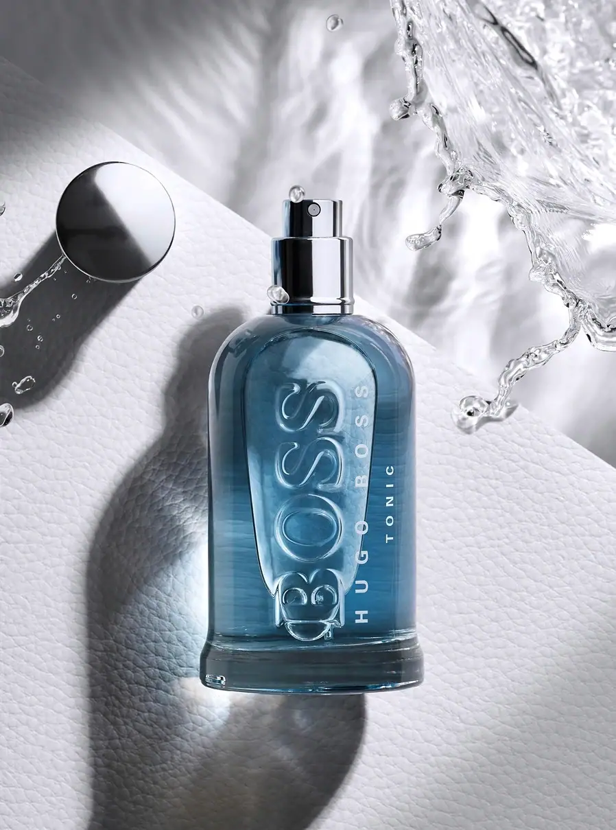
Blue transparent bottle with dimensional lettering and silver spray hardware
Nomad Noé
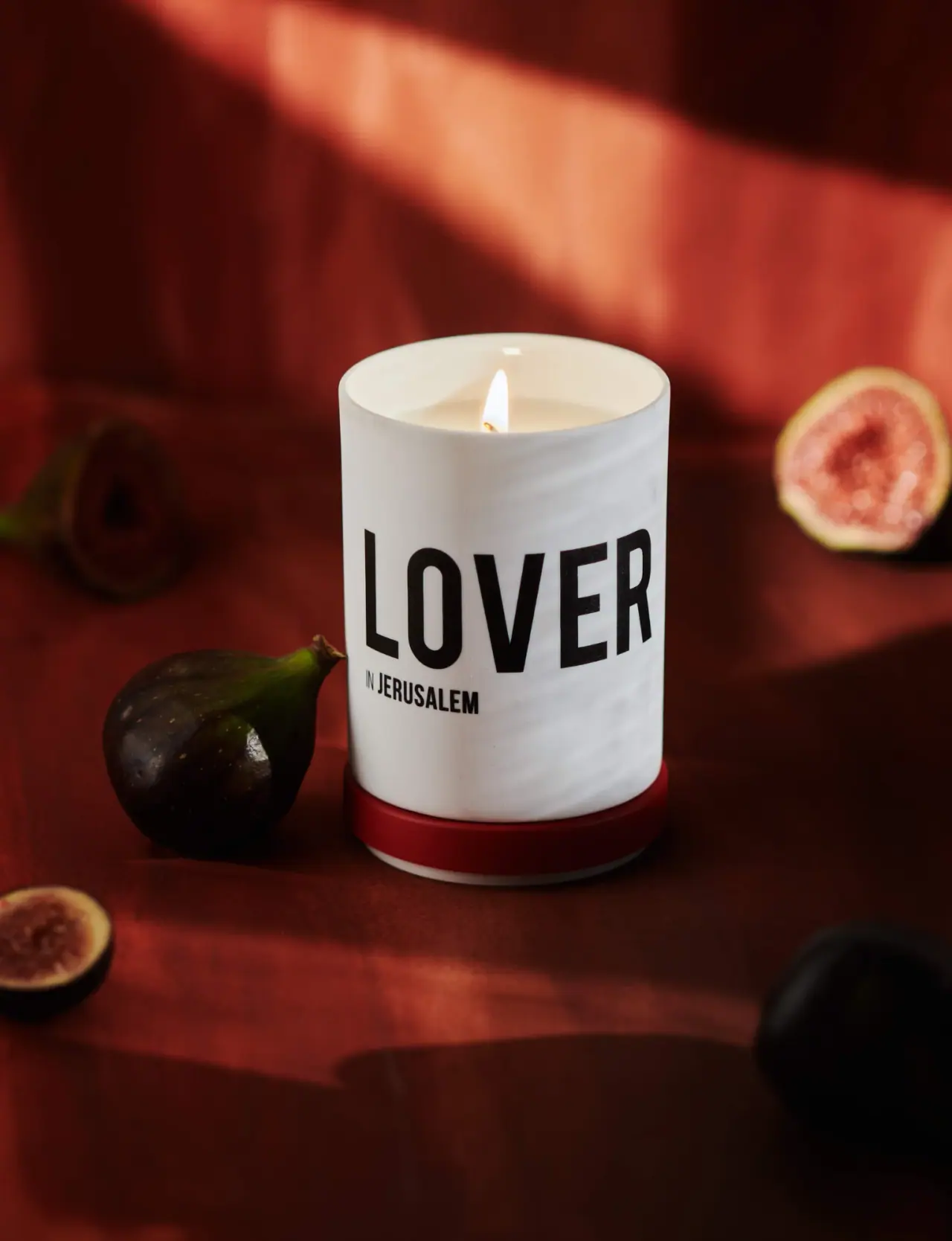
Giant black character name on white porcelain and red

Color Wow
Tall condensed naming on a broad reflective silver jar
DIZZIAK
Oversized black lettering unites two pale haircare tubes

EADEM
Mirror-bright tube, oversized black identity, juicy campaign color
MAKE UP FOR EVER
Long tapered black cap above a compact colour chamber