Photography: Nomad Noé official photography. Images belong to their respective owners.
Nomad Noé

Giant black character name on white porcelain and red
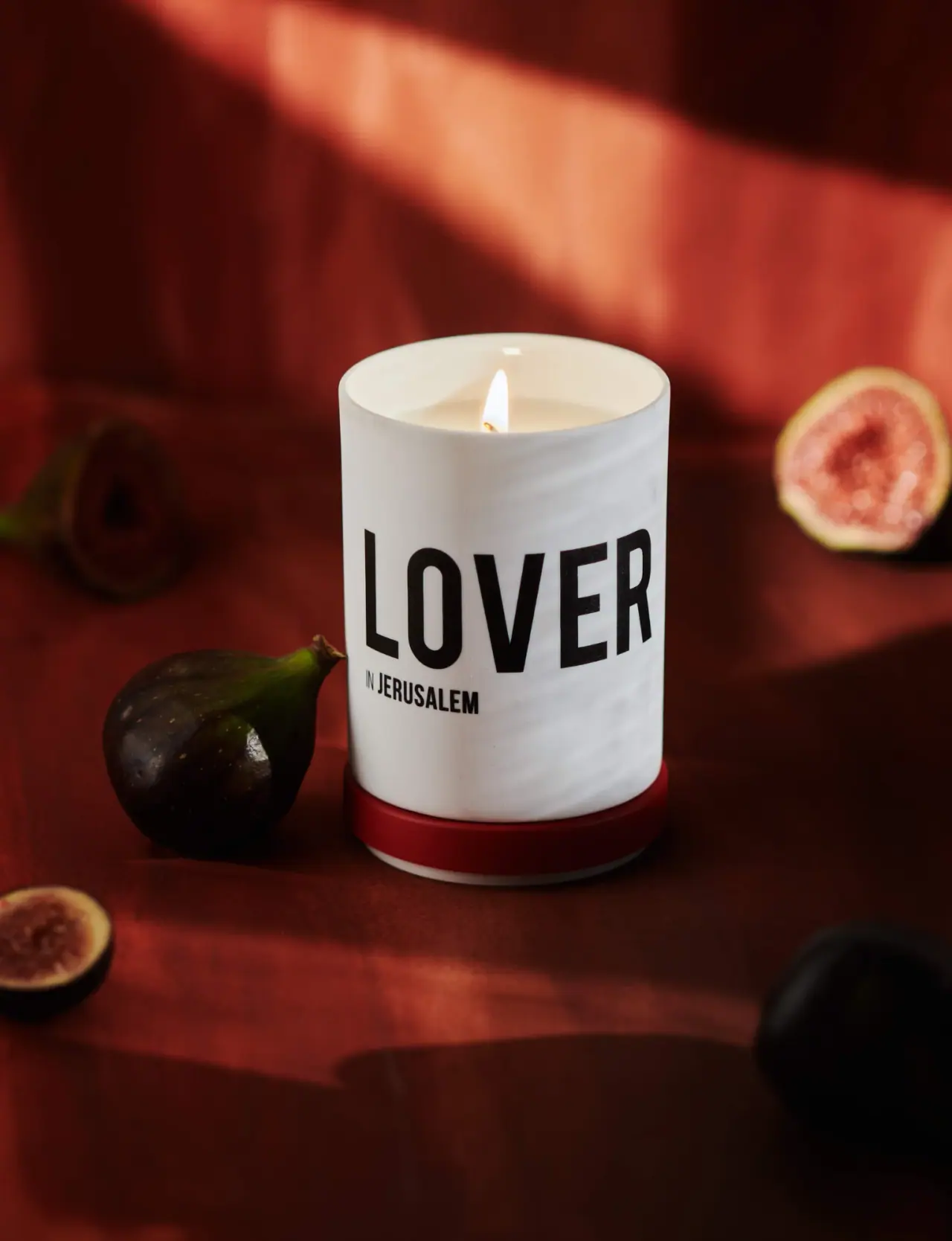
Lover in Jerusalem makes the candle's evocative name the dominant visual asset. Tall black LOVER capitals span a white cylindrical porcelain vessel, with a much smaller location line below. A red porcelain lid is shown beneath the lit candle, adding a narrow coloured base to an otherwise monochrome object. The official source confirms the vessel and lid material, a soy-and-coconut wax blend and cotton wick. Whole and cut figs connect the scene to the named fig-and-petitgrain fragrance, while the package front itself stays typographic and free of fruit illustrations.
- Candles & home scent
- Light pack
- Bold typographic
- Luxe monochrome
About this study
Selected lit Lover in Jerusalem candle with red lid beneath it. Porcelain and candle-composition facts are sourced; other range packaging, lid fit and hidden information are not inspected.
Sources & evidence · Reviewed 2026-10-19Color Palette
Approximate colours interpreted from photography. These are screen references, not official brand colours or print specifications.
Pack body
Warm white porcelain
#E9E6DA
Approximate vessel appearance under warm directional light. Pale grey shadows are lighting variations, not additional specified glaze colours.
Ink
Dense black title
#181512
Large character name and smaller location line. Decoration method and firing process are not identified.
Accent
Deep red lid
#8F211A
Approximate coloured removable lid shown beneath the vessel. The matching red fabric remains a separate photographic surface.
Typography
Suggested visual alternatives, not confirmed brand typefaces. Any scale below is an illustrative estimate.
LOVER is set in very tall, heavy condensed sans-serif capitals and occupies most of the available front width. Its narrow proportions let a short word achieve considerable height without stacking. The location begins below the left edge: the small IN is visually lighter and narrower than JERUSALEM. This creates a primary character and secondary place rather than a conventional maker-first product label. No comparably large Nomad Noé wordmark appears on the selected face. The generous white area above the title gives the open vessel and flame room to remain part of the composition.
Fonts
Original character-title alternative
Barlow Condensed
- Looks like
- Tall heavy condensed grotesque
- Type
- Condensed sans serif
- Weight
- Bold, ExtraBold
- Case
- Uppercase
- Tracking
- Compact with clear letter separation
- Fallback
- Arial Narrow, sans-serif
Give a new short title significant height on a curved face. Test the actual word length rather than applying one scale to every name, and avoid duplicating LOVER or the same place pairing.
Secondary location alternative
Roboto Condensed
- Looks like
- Narrow practical sans
- Type
- Condensed sans serif
- Weight
- Regular, Bold
- Case
- Uppercase
- Tracking
- Normal
- Fallback
- Arial, sans-serif
Keep a smaller secondary phrase aligned to the title's starting edge. Different weight can distinguish a connector from the main place name without introducing another colour or decorative frame.
Structure & Proportions
Visual proportions and finish previews are illustrative. Confirmed construction details and uncertainties are distinguished in the study notes.
Proportions
| Purpose | Value | Preview |
|---|---|---|
| Title height | The condensed capitals occupy a substantial vertical band while leaving clear space above and below. Their tall shape makes the short word feel larger without using multiple lines. | — |
| Secondary phrase | The location line is much smaller and sits under the title's left edge rather than centred across the entire front width. | — |
| Removable colour accent | The red lid becomes a shallow base band when placed under the white vessel, giving a narrow component disproportionate visual importance. | — |
Shapes
| Element | Value | Preview |
|---|---|---|
| Porcelain vessel | Straight white cylinder with an open circular rim and lightly softened lower edge. | |
| Removable lid | Shallow circular red component shown underneath the candle. | |
| Title field | Broad band of tall condensed black capitals following the curved front. | |
| Location line | Short horizontal text block anchored under the left of the main word. |
Finishes
Smooth porcelain appearance
White vessel and interior rim; exact glaze unverified · gloss
Red porcelain lid appearance
Removed component beneath the candle; coating specification unknown · gloss
Formats and materials
| Formats | Straight-sided white cylindrical candle vessel, Separate circular red lid positioned beneath the vessel, Open top with visible pale wax and one lit wick |
| Materials | The exact product page specifies porcelain for both vessel and lid., The brand describes a soy-and-coconut wax blend and a cotton wick for its candles., The photograph does not identify glaze chemistry, pigment, decoration transfer method or the construction of the lid's pale underside. |
| Closures | The red lid is removed from the top and used as a visual base in this photograph. Its circular profile is close to the vessel's diameter, with a thin pale lower edge visible beneath the red band. The image does not show how it seats on the rim when closed, whether it contains a gasket, or how tightly it fits. Porcelain material is sourced, but airtightness, heat resistance as a stand and any manufacturer-approved use beneath a burning candle are not established from this styling alone. |
| Decoration | One oversized character word wrapping the cylinder, Small left-aligned location line directly beneath, Large unprinted white margins, No fruit illustration or ornate label border on the selected face |
Front Panel
Schematic reading order. The diagram’s zone heights do not represent measured artwork proportions.
There is no visibly separate paper label or enclosed text panel. Black lettering appears directly against the broad white vessel surface, though its application process remains unverified. The large character name does nearly all the distant communication, while the smaller location adds a narrative cue at closer range. The title begins and ends toward the turning sides of the cylinder, so the curved surface changes the apparent width of its outer letters. Empty space remains an active part of the design: it prevents the oversized word from making the vessel feel completely covered in print.
| Zone | Content |
|---|---|
| Upper white margin | Open unprinted-looking area beneath the rim, leaving a calm visual transition from flame and wax to title. |
| Main character name | LOVER in very large black condensed uppercase letters. |
| Location qualifier | IN JERUSALEM in a smaller left-aligned line, with a lighter connector and stronger place name. |
| Lower white margin | Plain body region above the detached red lid; no readable mass or maker mark in this view. |
Range System
The official product page lists several character-and-place names, including Dreamer in London and Poet in Hangzhou. That supports a narrative naming system in which a strong character word is completed by a location. Only Lover's physical packaging is inspected here; the other names do not prove identical lid colours, title sizes or vessel decoration. The selected front also does not list fig and petitgrain, so the emotional name and explicit fragrance description operate in different communication contexts. The place is part of the product story, not proof of where its vessel or wax was manufactured.
- Lover in Jerusalem pairs a prominent character with a subordinate location on the inspected vessel.
- Dreamer in London and Poet in Hangzhou are verified neighbouring names, not independently inspected packaging examples.
- An original range using this principle must accommodate longer titles deliberately instead of compressing them until they lose the desired weight.
Back of Pack & Shelf
The reverse, underside, lid interior and carton are not shown. A sparse front does not establish that the product lacks practical or safety information elsewhere.
- No warning placement, batch code, net weight or barcode is visible.
- The maker's complete identity and fragrance-note list are not readable on the selected front.
- No refill insert, lid gasket or approved repurposing method is established by the image.
On shelf
The contrast of black capitals on white porcelain should retain a clear title shape at a distance, while the red lid supplies a memorable secondary cue. This is visual interpretation rather than measured sales or recognition evidence. The place name requires closer viewing, and the maker is not prominent on this selected face. A range evaluation should therefore distinguish recognition of the individual candle from recognition of Nomad Noé itself. Testing should also compare the closed presentation with the photographed open arrangement, since moving the red lid changes where its accent appears.
Imagery
The lit candle stands against dark red draped fabric, surrounded by whole and cut figs at different depths. Warm directional light makes the white vessel the brightest substantial object, while the flame adds a small luminous point above it. The red lid echoes the fabric without merging completely into the shadows. Foreground fruit gives scale and softness beside the rigid cylinder; the cut fig connects directly to the officially named fragrance. This is a styled product photograph, not evidence of burn performance or a recommended arrangement around a lit candle. No specific textile composition or photographic date is established.
Guidelines
Editorial principles for an original design brief, not official brand guidelines.
Do
- Use a short title's height to create a strong distant read.
- Give secondary place wording a clear alignment and scale.
- Keep sourced porcelain separate from unverified glaze processes.
- Evaluate the pack with its lid both fitted and removed.
- Plan long and short range names independently.
Don't
- Do not infer manufacturing origin from a place in the product name.
- Do not treat styled lid placement as a heat-safety instruction.
- Do not mistake fruit props for printed artwork.
- Do not invent a refill system or concealed warning layout.
- Do not copy the character-and-place names or exact title treatment.
Sources & evidence
How this study was built
structure · Sourced fact
Exact product listing specifies porcelain vessel and lid.Lover in Jerusalem — Fig & Petitgrain Candle — Nomad Noéstructure · Sourced fact
Brand statement identifies soy-and-coconut wax blend and cotton wick.Lover in Jerusalem — Fig & Petitgrain Candle — Nomad Noérange · Sourced fact
Collection lists character-and-place names such as Dreamer in London and Poet in Hangzhou.Lover in Jerusalem — Fig & Petitgrain Candle — Nomad Noétypography · Visual observation
Oversized condensed black LOVER is paired with a smaller left-aligned location line on white.Lover in Jerusalem — Fig & Petitgrain Candle — Nomad Noéstructure · Visual observation
Red lid is placed beneath the open lit vessel, creating a narrow coloured base band.Lover in Jerusalem — Fig & Petitgrain Candle — Nomad Noéimagery · Editorial interpretation
Fig props connect to the named scent while the actual vessel remains typographic.Lover in Jerusalem — Fig & Petitgrain Candle — Nomad Noé
What remains unverified
- Exact typeface, decoration method and glaze formulation unknown.
- Reverse, underside, carton and lid seating are not visible.
- Other collection names are verified without inspecting their packaging.
- Styled burning scene does not establish heat-safety or performance specifications.
Give your AI
packaging taste
Give your design or image tool a packaging study: palette, type, structure, front panel and principles for an original brief.
Export this styleFree with an email. PACK.md works in Claude, ChatGPT, Cursor and image tools.
More like this

Akro
soft pink interrupted by an assertive black signature
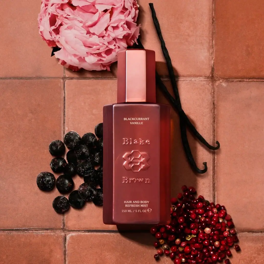
Blake Brown
sculptural rose-brown fragrance with a jewel-like centre
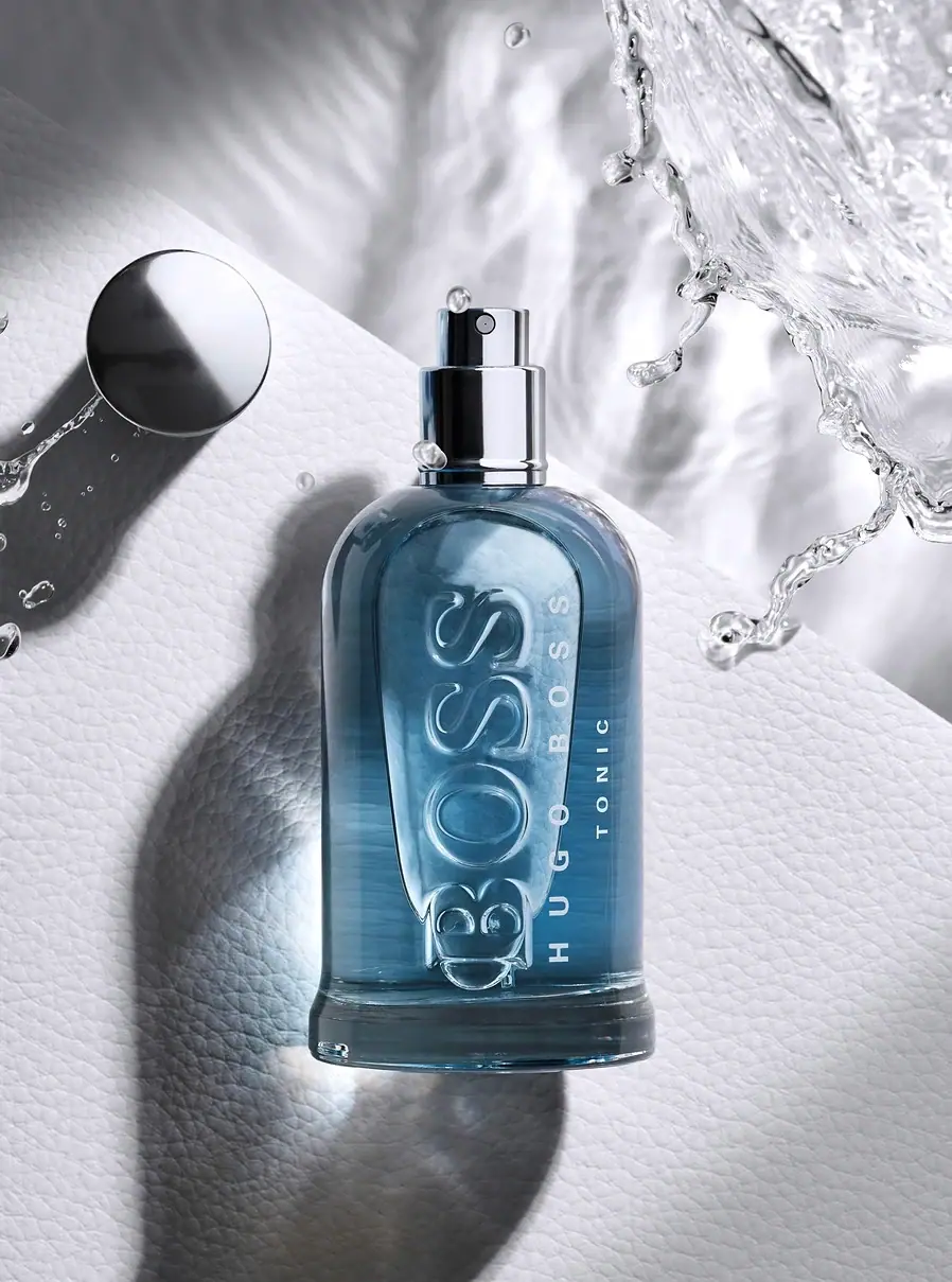
Hugo Boss
Blue transparent bottle with dimensional lettering and silver spray hardware
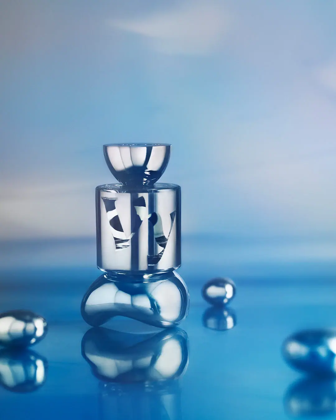
Vyrao
mirror cylinder with cropped lettering and a bowl-shaped cap

Color Wow
Tall condensed naming on a broad reflective silver jar
DIZZIAK
Oversized black lettering unites two pale haircare tubes

EADEM
Mirror-bright tube, oversized black identity, juicy campaign color
MAKE UP FOR EVER
Long tapered black cap above a compact colour chamber