Photography: Binaurale official photography. Images belong to their respective owners.
Binaurale

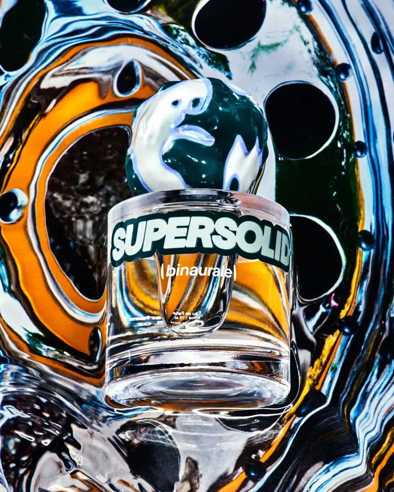
Globular teal cap above slanted pale fragrance lettering
Supersolid gives a compact clear bottle two forceful identifiers: an irregular globe-like cap and a large slanted fragrance name. The cap's dark teal surface carries pale organic islands, while the heavy pale letters have a dark contour that separates them from the shifting background. A smaller white Binaurale signature sits underneath. The bottle becomes part of the photograph's optical play, transmitting orange, silver and dark shapes without acquiring those colours as a verified packaging specification. The useful principle is a controlled collision between sculptural closure, assertive typography and transparent space.
- Perfume
- Dark pack
- Bold typographic
- Playful colour
About this study
The approved Supersolid bottle photograph and accessible official product page. This is not a technical construction study or a survey of every Binaurale fragrance.
Sources & evidence · Reviewed 2026-10-19Color Palette
Approximate colours interpreted from photography. These are screen references, not official brand colours or print specifications.
Pack body
Dark teal cap
#123B42
Approximate deep cap ground and visual anchor. It reads nearly black in shadow, but the brighter curved areas retain a blue-green character.
Ink
Pale title fill
#E2E7DC
Approximate opaque-looking interior of the large title. The lettering is visibly filled, rather than an empty outline through which the dark background simply shows.
Deep title contour
#173D40
Approximate heavy border around the title. This helps hold the pale letters apart from bright reflections and connects the typography to the closure.
Accent
Pale mint islands
#DCE5D8
Approximate light organic patches on the cap. Their irregular boundaries provide movement without becoming a repeated flat print pattern.
Typography
Suggested visual alternatives, not confirmed brand typefaces. Any scale below is an illustrative estimate.
The large SUPERSOLID title runs across the upper front in heavy slanted capitals. Its broad footprint continues toward the curved sides, where perspective compresses the terminal letters. A much smaller italic Binaurale signature forms a second centred line, with tiny capacity information below. The hierarchy therefore gives the fragrance name more visual territory than the maker name. The slant adds directional energy to an otherwise vertical bottle, while the title's dark contour creates a separate edge against the photograph's complex transmitted light.
Fonts
Original fragrance-name alternative
Archivo Black
- Looks like
- Heavy slanted display sans
- Type
- Display sans serif
- Weight
- Regular
- Case
- Uppercase
- Tracking
- Compact but preserve open counters
- Fallback
- Arial Black, sans-serif
Use as a starting point for a forceful short name, with an independently drawn slant and border if needed. Test the actual artwork on a curved mock-up; a readable flat word may lose its last letters around the bottle.
Supporting identity alternative
Barlow
- Looks like
- Clean contemporary italic sans
- Type
- Sans serif
- Weight
- Regular, Medium
- Case
- Lowercase for an original maker signature
- Tracking
- Normal
- Fallback
- Arial, sans-serif
Set a quieter maker line beneath the large title. Keep its weight and width clearly subordinate, and use a separate upright treatment for practical information where that improves reading.
Structure & Proportions
Visual proportions and finish previews are illustrative. Confirmed construction details and uncertainties are distinguished in the study notes.
Proportions
| Purpose | Value | Preview |
|---|---|---|
| Closure dominance | The cap is large relative to the neck, creating a strong rounded crown above the straight-sided body. This is a visual relationship, not a measured cap-to-bottle ratio. | — |
| Title coverage | The main word extends across most of the apparent front width. Its edges move into curvature, trading some straight-on readability for an enveloping graphic effect. | — |
| Lower breathing room | The smaller signature occupies only a modest portion below the title, leaving clear-looking wall area to reveal light and reflections. | — |
Shapes
| Element | Value | Preview |
|---|---|---|
| Bottle wall | Straight-sided cylindrical vessel with a broad round shoulder and substantial clear-looking base. | |
| Cap silhouette | Uneven globe-like crown; the circle preview is only a schematic reference and does not imply a perfect sphere. | |
| Slanted title field | A broad diagonal typographic band laid across the curved front. |
Finishes
Glossy cap appearance
Rounded closure · gloss
Clear vessel appearance
Bottle walls and base · transparent
Formats and materials
| Formats | Compact cylindrical fragrance bottle with clear-looking walls and substantial visible base, Large irregular globular cap above a short narrow neck |
| Materials | The official product page identifies a 50 mL eau de parfum. It does not supply the exact bottle material specification in the accessible text., The clear rigid bottle visually suggests glass, but composition, supplier, wall thickness and recycled content remain unverified., The cap's glossy patterned appearance does not identify natural stone, resin, metal or a specific decorative process. |
| Closures | The cap is fitted in the selected photograph. Its broad, uneven globe-like form overhangs the narrow neck and draws attention to the transition between bottle and closure. The attachment, inner fitment and dispensing mechanism are concealed; they should not be described from silhouette alone. |
| Decoration | Organic pale islands distributed over the dark cap, Large slanted fragrance-name lettering following the cylinder, Small maker signature and restrained lower information |
Front Panel
Schematic reading order. The diagram’s zone heights do not represent measured artwork proportions.
The visible front is organised as lettering on a clear-looking field rather than a large opaque rectangular label panel. The title forms the first horizontal band; the maker signature sits below it; the smallest details remain near the bottom. This keeps the vessel optically active while giving the typography enough contrast to avoid disappearing into the scene. The photograph does not resolve the exact decoration method or whether a transparent carrier is present.
| Zone | Content |
|---|---|
| Upper front | Large pale slanted SUPERSOLID capitals with a dark border. Curvature affects the reading of the outer letters. |
| Middle-lower front | Small white italic maker signature, separated vertically from the main title. |
| Lower detail area | Very small light capacity information is present. Its full printed wording is not confidently transcribed from the photograph. |
| Closure | Organic colour shapes supply a second identity signal without an additional visible front-facing name. |
Range System
Only Supersolid's approved package is examined here. A possible design lesson is to retain a clear cylindrical vessel while varying closure colour and the fragrance title, but this is an interpretation rather than a verified rule for every Binaurale release. The selected bottle alone does not establish a fixed number of colours, a universal cap material or a standard hierarchy across the full collection.
- Within this package, the dark title contour echoes the dominant cap colour.
- A fictional range could vary the closure's colour relationship while holding bottle geometry steady.
- Any proposed range should test each name on the cylinder, since longer words will reach the obscured sides earlier.
Back of Pack & Shelf
The selected image is a front presentation. The reverse, underside, carton and opened closure are not available for direct analysis.
- Do not reconstruct ingredients, warnings, batch placement or barcode position from the front.
- Keep current online product capacity distinct from any unreadable small print in this photograph.
- A production design would need separate flat artwork and compliance review for the market where it is sold.
On shelf
As an interpretation, the large globe-like closure would help separate the silhouette from conventional narrow perfume caps. The title adds another recognition cue at closer range. However, the photographed letters become compressed near the sides, and their visibility depends on the background transmitted through the bottle. A retail evaluation should therefore include plain light and dark backgrounds as well as the dramatic campaign image; recognisability in one scene is not evidence of consistent shelf performance.
Imagery
The official product presentation credits Bobby Doherty. In the selected image, the bottle stands against a highly distorted reflective setting with bright silver, black, orange and blue passages. Reflections and transmitted scenery make the clear vessel appear more complex than its basic geometry. The cap remains a comparatively solid coloured anchor above that optical movement. This scene should not be sampled wholesale as the package palette: the orange is not proof of amber liquid, and the dark bands are not proof of a dark bottle coating. For an original study, preserve the distinction between a stable product silhouette and a changing light field without reproducing this exact mirrored arrangement.
Guidelines
Editorial principles for an original design brief, not official brand guidelines.
Do
- Give a small bottle one distinctive silhouette feature.
- Test wrapped names on the actual curved form.
- Describe filled and outlined typography accurately.
- Separate reflected scene colours from intrinsic package colours.
- Keep maker attribution subordinate when the fragrance title leads.
Don't
- Do not identify the cap as marble from its pattern.
- Do not call the organic globe a perfect sphere.
- Do not infer dark or amber liquid from the photographic background.
- Do not reproduce the cap's exact islands or proprietary lettering.
Sources & evidence
How this study was built
edition · Sourced fact
The official page identifies Supersolid as a 50 mL eau de parfum.Supersolid Eau de Parfum — Binauralestructure · Visual observation
The approved image shows a compact clear cylinder with a large irregular globe-like fitted cap.Supersolid Eau de Parfum — Binauraletypography · Visual observation
The large slanted title has pale filled interiors and a dark contour; it is not empty outline lettering.Supersolid Eau de Parfum — Binauralepalette · Visual observation
Dark teal and pale organic patches belong to the cap, while orange and black distortions largely belong to the surrounding image.Supersolid Eau de Parfum — Binauraleimagery · Sourced fact
The official page's photograph alt text credits Bobby Doherty.Supersolid Eau de Parfum — Binauralerange · Editorial interpretation
Closure colour and title could support differentiation, but one inspected package does not establish a universal range system.
What remains unverified
- Exact bottle and cap materials, attachment system and decoration process remain unverified.
- The photograph does not reveal the nozzle, reverse, underside or carton.
- Fonts are proposed alternatives; colours and proportions are approximate visual readings.
- The backdrop affects the clear vessel's apparent colour and cannot identify the liquid tint.
Give your AI
packaging taste
Give your design or image tool a packaging study: palette, type, structure, front panel and principles for an original brief.
Export this styleFree with an email. PACK.md works in Claude, ChatGPT, Cursor and image tools.
More like this

Boy Smells
candy-shell flacons over blush pink glass
Le Monde Gourmand
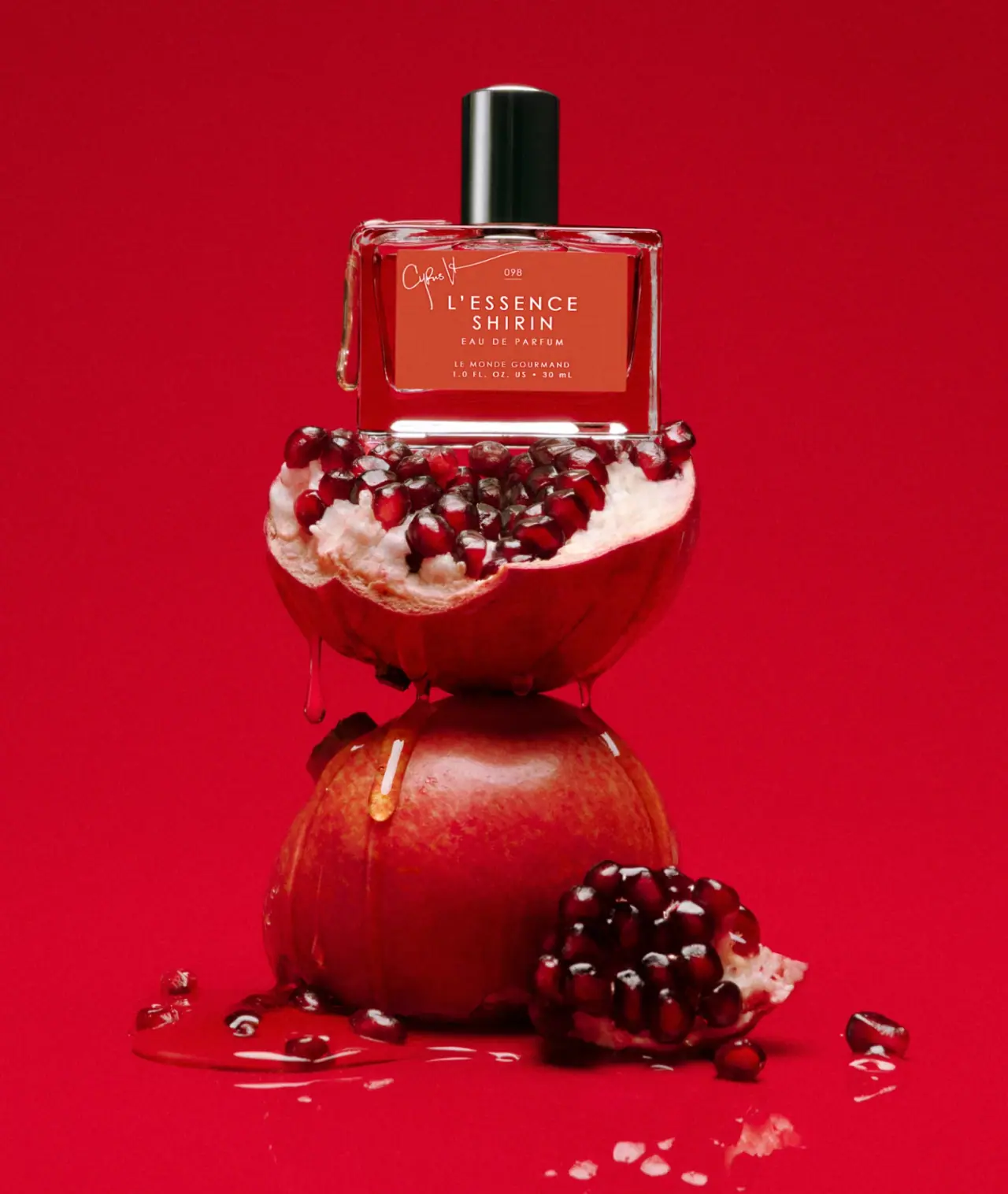
white spaced scent naming on red beneath a black cap
Moodcast
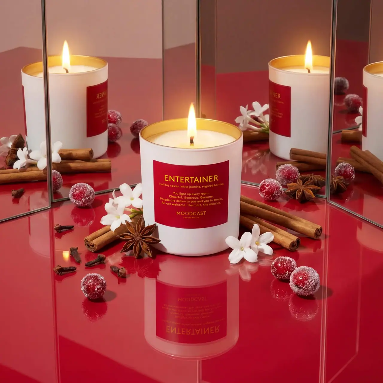
White candle with red personality label and golden inner rim

ACURE
Iridescent spectacle with practical, tightly ordered type

Bask
sunny yellow with a playful turquoise signature

Beame
Orange bubble lettering, pink mascot, clear product badge

Behave
struck-through wordmark on sour neon pouches

Bread Beauty Supply
bubblegum pumps and a fat black wordmark