Photography: Halves Studio portfolio photography. Images belong to their respective owners.
Bumble and bumble

Amber transparency, handwritten range signature, black precision tip
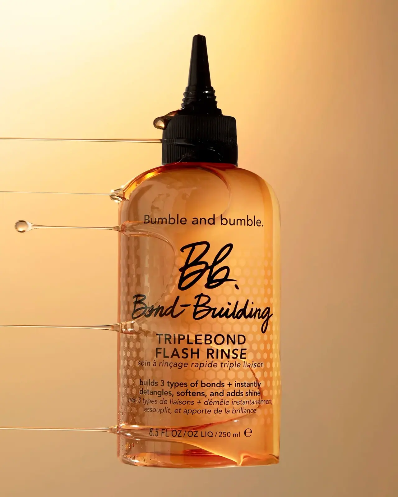
The selected 250 mL TripleBond Flash Rinse uses an amber transparent-looking body and a tall black dispensing tip. Its front combines a small plain brand name, oversized handwritten-looking Bb. signature, script Bond-Building line and bold uppercase product name. A pale honeycomb field sits behind the central and lower information. Halves Studio's stretched glossy strands emphasize a fluid texture around the object, but those strands are photographic styling rather than printed decoration or structural features.
- Hair
- Light pack
- Bold typographic
About this study
Selected 8.5 fl oz / 250 mL TripleBond Flash Rinse in Halves Studio's drip image. No complete range specification, material identity or mechanism claim inferred.
Sources & evidence · Reviewed 2026-10-19Color Palette
Approximate colours interpreted from photography. These are screen references, not official brand colours or print specifications.
Pack body
Amber body appearance
#D88A2B
Approximate warm transparent-looking body color. Vessel tint, contents and directional lighting cannot be separated from this photograph.
Nozzle black
#100D0A
Dark ribbed collar and elongated tip create a strong upper silhouette against the luminous body.
Ink
Typography black
#211309
Shared dark tone for script, product name and small supporting text; warm illumination affects the screen appearance.
Pale honeycomb
#F4C375
Approximate light hexagonal field behind the text, intentionally quieter than the dark lettering.
Typography
Suggested visual alternatives, not confirmed brand typefaces. Any scale below is an illustrative estimate.
A small Bumble and bumble. line sits near the shoulders. Beneath it, the large Bb. script acts as the primary signature, followed by an equally expressive but horizontally extended Bond-Building line. TRIPLEBOND FLASH RINSE then switches to a two-line uppercase sans-serif block. Smaller bilingual descriptors and benefits follow before the contents line. The contrast is between handwriting and clear informational type, not an uninterrupted stack of bold capitals. Each change in voice marks a different information role.
Fonts
Expressive range line
Caveat
- Looks like
- Energetic connected brush script
- Type
- Handwritten script
- Weight
- Bold
- Case
- Mixed case
- Tracking
- Natural connected rhythm
- Fallback
- cursive
Alternative for a newly named range, using its own letter shapes and a more restrained scale than the source signature. Proof long words carefully so flourishes do not collide with the product block.
Product and information
Inter
- Looks like
- Direct neutral sans-serif
- Type
- Neo-grotesque sans-serif
- Weight
- Regular, Medium, Bold
- Case
- Uppercase product name; mixed case supporting information
- Tracking
- Natural to moderately open
- Fallback
- Arial, sans-serif
Proposed for the two-line product name and bilingual detail. The source's larger script can be balanced by a firm, unembellished information layer rather than another decorative face.
Structure & Proportions
Visual proportions and finish previews are illustrative. Confirmed construction details and uncertainties are distinguished in the study notes.
Proportions
| Purpose | Value | Preview |
|---|---|---|
| Dispensing silhouette | The tall narrow tip creates a prominent vertical extension above the broader collar, making the assembly visually distinct from a flat cap. | — |
| Shoulder transition | Rounded shoulders soften the move from the broad body to the narrow dispensing assembly; no exact shoulder radius is measured. | — |
| Identity balance | The short large initials and long script range line occupy different widths, while the product block returns to a compact centered rectangle. | — |
| Information depth | Multiple bilingual lines fill the lower front, with the small contents line separated near the base. This needs real-size review in any adaptation. | — |
Shapes
| Element | Value | Preview |
|---|---|---|
| Body outline | Tall rounded rectangular front silhouette with curved shoulders. | |
| Dispensing tip | Long tapered black projection narrowing toward a small flat-looking end. | |
| Grip collar | Broad black cylindrical collar with repeated vertical ribs. | |
| Pattern field | Small pale hexagonal cells spread behind the middle and lower information; preview stands for the overall rectangular field. |
Finishes
Transparent-looking body
Amber container with visible internal depth; color source and substrate remain unresolved. · transparent
Glossy surface highlights
Shoulders and front edges, intensified by the studio's strong warm lighting. · gloss
Dark textured collar
Ribbed dispensing base; texture is visible but no tactile coating is claimed. · matte
Formats and materials
| Formats | Upright treatment bottle marked 8.5 FL OZ / 250 ml, with rounded shoulders and a tall tapered dispensing tip |
| Materials | The amber body appears transparent enough to show depth and light through it; the consulted sources do not establish glass, a specific polymer, or the contribution of liquid color., The black collar has fine vertical grip ribs. Their visibility does not identify the component material or confirm how the assembly detaches. |
| Closures | A broad ribbed black collar supports a narrower neck and elongated tapered tip. Small ridges appear at the tip base. The image does not demonstrate an opening action, removable end cap, dispensing dose or refill interface, so it is documented as a visible dispensing assembly rather than a fully specified mechanism. |
| Decoration | Small full brand name and large script initials, Script range name over a quiet geometric field, Bold uppercase product name with smaller English and French lines, Contents line close to the lower edge |
Front Panel
Schematic reading order. The diagram’s zone heights do not represent measured artwork proportions.
A centered vertical hierarchy sits directly against an amber-looking field without an obvious opaque rectangular label boundary. The pale honeycomb pattern passes behind the script and information, while dark copy remains in the foreground. Whether the graphics are direct decoration or carried on a transparent label is not resolved by the photograph. External glossy strands cross parts of the face and should not be mistaken for label edges.
| Zone | Content |
|---|---|
| Full brand line | The small plain name near the shoulders establishes the maker before the more prominent abbreviated signature. |
| Script identity pair | Large initials and the flowing range name create the strongest expressive area, with a clear distinction between the two lines. |
| Product block | Two uppercase lines name the rinse. Their simpler forms provide a stable reading block beneath the handwritten-looking range line. |
| Bilingual support | Smaller English and French copy adds detail in compact lines. This study observes its placement without independently endorsing performance claims. |
| Quantity | The lower line visibly identifies 8.5 FL OZ and 250 ml, matching the full-size option on the official product page. |
Range System
The official page places this treatment in the Bond-Building collection and offers full and smaller sizes. That establishes product-family context, but the selected image alone cannot prove that every related treatment shares this amber body, nozzle or pattern. The following extensions are interpretive suggestions for an original system, not specifications for the entire Bumble and bumble range.
- Keep a distinct script range layer and plain product-name layer when adapting an original system to a different treatment format.
- On a smaller size, reduce decorative pattern complexity before making bilingual supporting text excessively small.
- Use explicit product names to distinguish functions instead of assuming that one warm color communicates every treatment's role.
Back of Pack & Shelf
No reverse, underside or carton is shown. The visible bilingual front does not establish where the complete directions, ingredients, warnings or batch marks sit.
- Inspect the reverse before describing full application instructions or information density.
- Confirm the tip's operation with a separate functional reference.
- Do not derive a recycling code or material specification from transparency and amber color.
On shelf
Interpretively, the black pointed top provides a strong shape cue above the warm body. The script pair gives personality while the uppercase product block offers a clearer functional anchor. Transparency and pale patterning can make the copy's contrast sensitive to what sits behind the bottle. An original design should therefore be reviewed with changing fill levels and backgrounds, not just in a luminous studio scene.
Imagery
Warm side and back lighting makes the body glow against a cream-to-amber backdrop. Several stretched glossy strands pull horizontally away from the pack and a rounded drop sits near the collar. They communicate viscosity and movement as photographic devices; the exact styling substance is not identified. The bottle appears isolated without a normal shelf support, so the image emphasizes form and texture rather than everyday storage.
Guidelines
Editorial principles for an original design brief, not official brand guidelines.
Do
- Separate range personality from product naming.
- Keep a background pattern quieter than functional copy.
- Document the dispensing silhouette without inventing its mechanism.
- Distinguish external liquid styling from package construction.
- Check transparent-pack text against varied backgrounds.
Don't
- Do not describe Bond-Building as an uppercase sans-serif line.
- Do not limit the observed honeycomb to tiny bottom marks.
- Do not infer glass or a particular polymer.
- Do not treat the pattern as proof of bond-building performance.
- Do not trace the Bb. signature or reproduce the source arrangement.
Sources & evidence
- Bumble and bumble — Bond-Building TripleBond Flash Rinseproduct
- Halves Studio — Product photography portfoliophotographer
How this study was built
edition · Sourced fact
Official page identifies the treatment and lists the 8.5 fl oz size, matching the selected front marking.Bumble and bumble — Bond-Building TripleBond Flash Rinsestructure · Visual observation
Rounded shoulders lead to a ribbed black collar and elongated tapered tip.Halves Studio — Product photography portfoliotypography · Visual observation
The Bb. and Bond-Building lines are script; the following product name is bold uppercase sans-serif.Halves Studio — Product photography portfoliolabel · Visual observation
A pale honeycomb field extends behind middle and lower copy, including compact bilingual information.Halves Studio — Product photography portfoliopalette · Visual observation
Warm transparent-looking body, dark assembly and pale pattern are observed; composition and tint source remain uncertain.Halves Studio — Product photography portfolioimagery · Visual observation
Glossy horizontal strands are staged around the container rather than printed decoration.Halves Studio — Product photography portfoliorange · Editorial interpretation
Script range naming paired with plain product naming could guide an independent range, without generalizing this nozzle or body to all brand products.
What remains unverified
- Exact substrate and source of amber appearance unknown.
- No reverse, underside, carton or functional opening sequence shown.
- Fonts, pattern application process and decoration plane unidentified.
- External glossy styling substance unspecified.
- Visible benefit wording is documented as label content, not independently assessed.
Give your AI
packaging taste
Give your design or image tool a packaging study: palette, type, structure, front panel and principles for an original brief.
Export this styleFree with an email. PACK.md works in Claude, ChatGPT, Cursor and image tools.
More like this

ACURE
Iridescent spectacle with practical, tightly ordered type

AKT
Lilac stage directions with a quiet metallic detail

AussieZinc
Sun-yellow numerals on a tall, information-rich white cylinder

Bask
sunny yellow with a playful turquoise signature

Beame
Orange bubble lettering, pink mascot, clear product badge

BioSeivas
Vertical serif identity on a mauve treatment band
Black Girl Sunscreen
Cream tube with gold crest and an isolated SPF numeral

Bomba Curls
tropical foliage gathered around a bold yellow nameplate