
Photography: AussieZinc official photography. Images belong to their respective owners.
AussieZinc

Sun-yellow numerals on a tall, information-rich white cylinder
Everyday SPF50 uses a tall white cylinder as a vertical information stack. A yellow spiral and narrow brand name introduce the product, but the oversized yellow 50 becomes the strongest practical read. Smaller black lines, a yellow variant name and a compact lower cluster follow beneath. The full-width white cap maintains the bottle's silhouette and keeps the print concentrated on the body. This study documents the photographed 110 g presentation, including its visible SPF50 wording, without assessing or endorsing the protective and environmental claims printed on it.
- Suncare
- Light pack
- Bold typographic
- Clinical minimal
About this study
Photographed capped Everyday bottle marked SPF50 and 110 g / 3.9 oz. Current official copy also uses SPF50+; this study preserves the image's wording and assesses design organization only, not efficacy or claim compliance.
Sources & evidence · Reviewed 2026-10-19Color Palette
Approximate colours interpreted from photography. These are screen references, not official brand colours or print specifications.
Pack body
Clean cylinder white
#EDF2EF
Approximate body and cap tone under warm scene lighting. The matching cap avoids introducing another visual tier above the dense front.
Ink
Sunflower yellow
#E8B82D
Shared accent for emblem, brand, large number, variant and bottom ribbon. Its perceived brightness changes across the curved face.
Fine-copy black
#252822
Functional text and small graphic accents. The darker ink protects readability where yellow would be weak at small sizes.
Typography
Suggested visual alternatives, not confirmed brand typefaces. Any scale below is an illustrative estimate.
The large 50 dominates the middle, with SPF turned vertically beside it. Above, a narrow lightweight wordmark and a spaced category line follow the spiral emblem. Beneath, small qualifications lead to a bold Everyday title, then more compact descriptive lines and a bottom origin ribbon. Several tiers must coexist, so size, weight, orientation and color all participate in the reading order. The design is restrained in color but not sparse in information.
Fonts
Numeral and variant
Archivo
- Looks like
- Heavy straightforward sans-serif
- Type
- Grotesque sans-serif
- Weight
- Bold, Black
- Case
- Numerals and uppercase
- Tracking
- Compact but not compressed
- Fallback
- Arial Black, sans-serif
Alternative for a large approved product metric and a strong variant name in an original brief. Keep the primary figure visibly stronger than surrounding qualifiers without shrinking those qualifiers excessively.
Brand name
Barlow Condensed
- Looks like
- Narrow light geometric lettering
- Type
- Condensed sans-serif
- Weight
- Light, Regular
- Case
- Mixed case or uppercase for a new identity
- Tracking
- Moderately open
- Fallback
- Arial Narrow, sans-serif
Proposed for an original slim wordmark beneath a distinct emblem. It should contrast with the heavy number rather than compete through another heavy headline.
Supporting information
Roboto Condensed
- Looks like
- Small utilitarian sans-serif
- Type
- Condensed neo-grotesque
- Weight
- Regular, Medium
- Case
- Mixed case and selected uppercase lines
- Tracking
- Normal for dense text, slightly open for category
- Fallback
- Arial, sans-serif
Alternative for compact explanatory copy. Resolve the wording and line lengths first; do not use extreme condensation to make an overloaded panel fit.
Structure & Proportions
Visual proportions and finish previews are illustrative. Confirmed construction details and uncertainties are distinguished in the study notes.
Proportions
| Purpose | Value | Preview |
|---|---|---|
| Overall silhouette | A markedly tall narrow cylinder with nearly continuous width through body and cap; no measured height-to-diameter ratio is asserted. | — |
| Primary numeral | The number occupies much of the visible body width and is substantially taller than neighboring text, establishing the clearest scan point. | — |
| Cap height | The cap forms a large unprinted upper segment, visually calming the dense information below. | — |
| Lower density | Several short text lines share the lower portion. Differences in weight and yellow emphasis prevent them from becoming a completely uniform block, although actual-size readability still needs testing. | — |
Shapes
| Element | Value | Preview |
|---|---|---|
| Cylinder | Straight-sided white body and matching full-width cap, ending in softly rounded top and base edges. | |
| Spiral emblem | Circular yellow movement with white internal space; an existing brand symbol, not a generic mark to reproduce. | |
| Origin ribbon | A narrow yellow band follows the curved lower front, carrying pale uppercase text. |
Finishes
Smooth white appearance
Bottle and overcap; matte-looking in portions of the lighting but no tactile treatment is verified. · matte
Formats and materials
| Formats | Tall capped cylindrical bottle; photographed net weight 110 g / 3.9 oz |
| Materials | Opaque white body and cap; resin, coating and recycled content not identified in the inspected primary source., Decoration method and any applied-label substrate are unverified. |
| Closures | A substantial full-width white overcap sits above a fine horizontal seam. It conceals the dispensing head in the selected image. Official instructions refer to pumps, supporting a pump format, but the mechanism, aperture and presence of an airless system cannot be inferred from the closed silhouette. |
| Decoration | High spiral emblem and narrow brand name, Oversized central number with vertically oriented SPF letters, Dense lower text groups and an origin-style yellow ribbon near the base |
Front Panel
Schematic reading order. The diagram’s zone heights do not represent measured artwork proportions.
A single centered vertical composition moves through emblem, name, category, dominant metric, qualifications, variant and supporting detail. Yellow recurs at important anchor points; black carries smaller wording. The curved body means some side markings turn away from view, so the photographed front does not represent the whole label.
| Zone | Content |
|---|---|
| Identity and category | Yellow spiral over a narrow brand line, followed by a small black category descriptor. These establish origin and product type before the oversized figure. |
| Primary metric | Large yellow 50 with smaller rotated SPF lettering. The image records this notation; current web copy also uses SPF50+, which should not be silently substituted into the photograph's edition. |
| Qualifications and variant | Small black protection-oriented text, a compact claim grouping and the larger yellow Everyday name. This study observes their organization rather than validating their content. |
| Supporting details and base | Ingredient- and performance-oriented wording is packed into short lines above a yellow origin band and black net weight. Their relative roles matter more here than copying the claims. |
Range System
The official site lists several sunscreen variants, but no full visual range comparison is included in this study. The selected pack suggests a potential architecture in which identity and a major metric stay prominent while the variant receives a secondary accent. Any extension is a design interpretation; it is not a verified color-to-product map or a claim that all variants use this capacity.
- For an original family, give each variant an explicit readable name rather than relying on a slight change of yellow alone.
- If a smaller pack is introduced, reduce nonessential front wording before compressing instructions into illegible lines.
- Keep the approved metric and its necessary qualifiers together when adapting the hierarchy to a different format; do not isolate a large number from its meaning.
Back of Pack & Shelf
The back and most side markings are unseen. Application directions, full ingredient details, warnings and any registration information cannot be positioned or transcribed from this front photograph.
- Request a complete edition-matched pack rotation before documenting the full information system.
- Keep label content verification separate from aesthetic observations.
- Do not assume that the current webpage's text is identical to this photographed edition's entire labeling.
On shelf
Interpretively, the large yellow number can make the product category easy to recognize at a distance, while the lightweight wordmark and smaller variant need closer reading. Yellow on white is less robust than black on white for small copy, which explains why the darker information layer matters. An original adaptation should test real printed contrast and full label comprehension, not only whether the oversized numeral looks striking in a hero photograph.
Imagery
The white cylinder stands among pale wood-like round blocks under warm directional light and leaf shadows. The setting creates a sunlit mood without adding bright competing props. Beige and brown occupy much of the image but are not package colors. The straight upright view makes the long information stack accessible, while the large white cap remains visibly separate from the printed body.
Guidelines
Editorial principles for an original design brief, not official brand guidelines.
Do
- Give the principal product metric a clear relationship to its qualifying text.
- Use dark ink for small information when the accent is pale against white.
- Separate identity, variant and supporting details through deliberate spacing.
- Record the exact photographed notation rather than silently updating it from a webpage.
- Test dense lower copy at physical scale and on the curved body.
Don't
- Do not infer airless dispensing from a capped cylinder.
- Do not copy the spiral emblem or claim cluster into a fictional design.
- Do not present observed environmental or protection wording as independently verified.
- Do not include wood-block colors in the package palette.
- Do not add more front claims just because the cylinder has unused vertical space.
Sources & evidence
How this study was built
edition · Visual observation
The selected front shows SPF50 and 110 g / 3.9 oz; this exact photographed presentation defines the study.AussieZinc — Everyday SPF50 Organic Mineral Zinc Sunscreenstructure · Sourced fact
Official use instructions refer to pumps, supporting a pump format despite the closed cap; no airless mechanism is established.AussieZinc — Everyday SPF50 Organic Mineral Zinc Sunscreentypography · Visual observation
Large yellow numerals with rotated SPF dominate a stack of narrower identity and smaller informational text.AussieZinc — Everyday SPF50 Organic Mineral Zinc Sunscreenpalette · Visual observation
White, yellow and black explain the pack. Warm beige scene blocks and leaf shadows are excluded.AussieZinc — Everyday SPF50 Organic Mineral Zinc Sunscreenlabel · Visual observation
The dense lower front alternates black and yellow emphasis and ends with a ribbon-style origin band above net weight.AussieZinc — Everyday SPF50 Organic Mineral Zinc Sunscreenimagery · Visual observation
Upright staging among pale round blocks reveals the entire visible front while maintaining a sunlit warm-neutral context.AussieZinc — Everyday SPF50 Organic Mineral Zinc Sunscreenrange · Editorial interpretation
Keeping identity, metric and variant distinct is proposed guidance for an original family, not a documented brand-wide template.
What remains unverified
- Pump is concealed; internal mechanism and materials unverified.
- Exact label substrate, finishing process, typefaces and dimensions unknown.
- Photographed SPF50 and some current webpage SPF50+ wording differ.
- Reverse and full side information unseen; printed claims are documented visually rather than independently validated.
Give your AI
packaging taste
Give your design or image tool a packaging study: palette, type, structure, front panel and principles for an original brief.
Export this styleFree with an email. PACK.md works in Claude, ChatGPT, Cursor and image tools.
More like this

BioSeivas
Vertical serif identity on a mauve treatment band
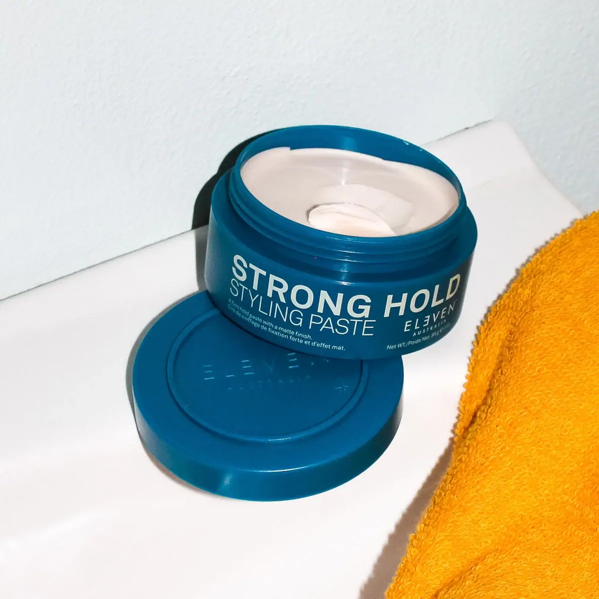
ELEVEN Australia
Deep blue open jar with emphatic hold-first typography
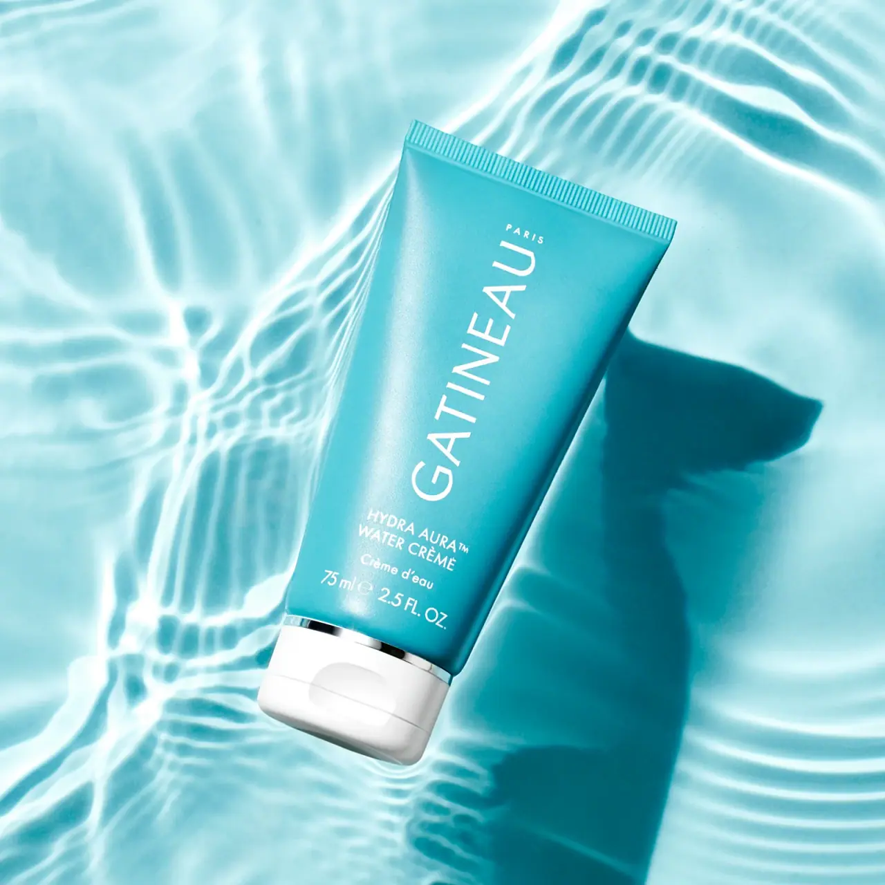
Gatineau
Turquoise tube with lengthwise white name and silver accent

Malin+Goetz
pharmacy label set in bracketed helvetica
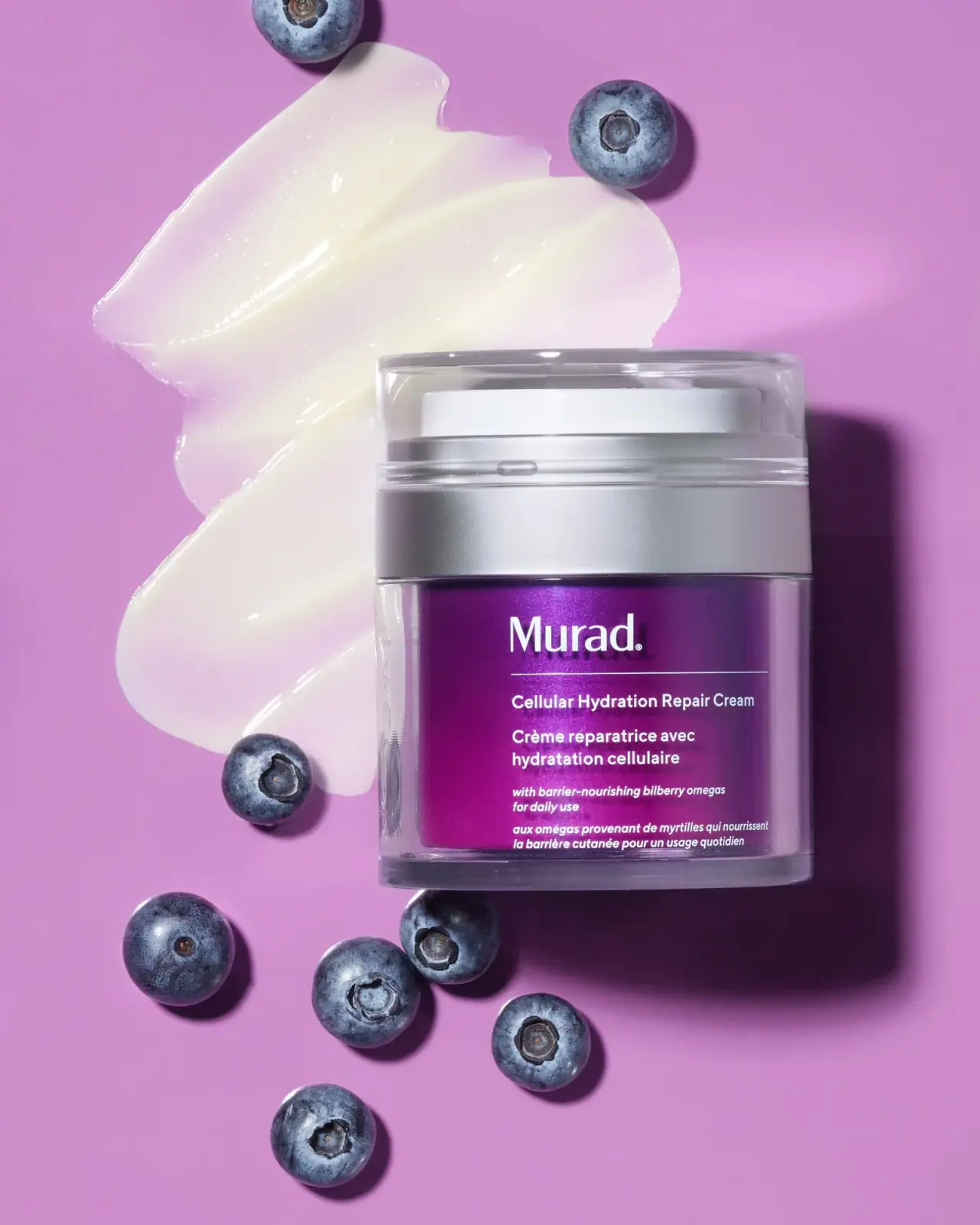
Murad
Purple inner field framed by clear walls and silver

Native
white drugstore bottles, scent-tinted vertical caps
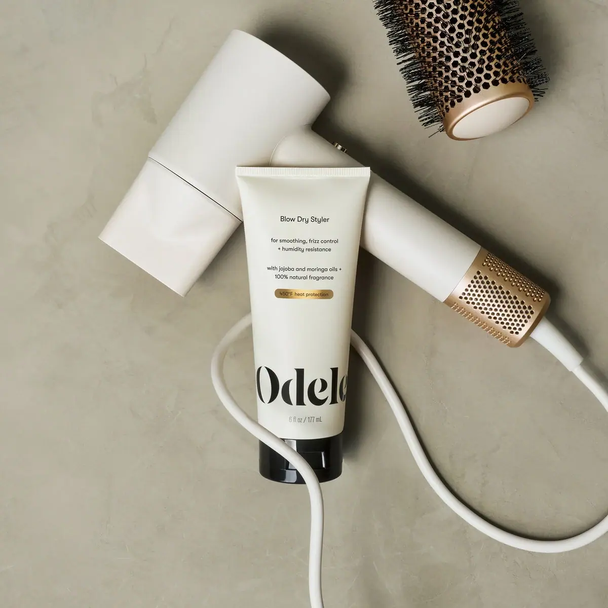
Odele
Cream tube with tiny utility copy and oversized lower serif
Olaplex
Clear compact bottle with golden oil and precise black type