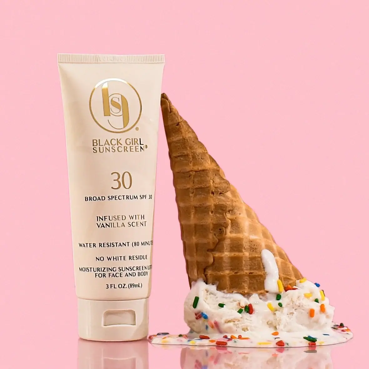
Photography: Hello Falcon Studio — Black Girl Sunscreen photography. Images belong to their respective owners.
Black Girl Sunscreen

Cream tube with gold crest and an isolated SPF numeral
Vanilla Crème SPF30 pairs a cream squeeze tube with a large gold-coloured circular monogram, a stacked brand name and an isolated 30. The front then becomes a denser column of smaller product, scent and claim wording. Its hierarchy is deliberately uneven: a decorative identity at the top, a functional number in the middle and practical information below. In the selected Hello Falcon image, a fallen ice-cream cone and pink setting make the vanilla edition playful, while the packaging itself remains a restrained cream, gold and dark-text composition. The photograph's scene colours should not replace that actual package palette.
- Suncare
- Light pack
- Bold typographic
- Heritage label
About this study
The approved Hello Falcon Vanilla Crème cream-tube photograph and matching official 3 fl oz / 89 mL edition. Other BGS formulas, sizes and packaging are outside this visual study.
Sources & evidence · Reviewed 2026-10-19Color Palette
Approximate colours interpreted from photography. These are screen references, not official brand colours or print specifications.
Pack body
Vanilla cream
#E8D8C0
Approximate body and cap colour. The official product page explicitly identifies the edition's cream-coloured tube; warm photographic light affects the exact appearance.
Ink
Gold-coloured identity
#A87C35
Approximate circular monogram, brand lettering and large numeral appearance. Bright reflections are visible on parts of the emblem, but no foil or metallisation process is confirmed.
Dark functional copy
#29211A
Approximate lower product information and claim lettering. The darker tone gives dense small text greater separation from the cream field than the decorative gold-coloured mark.
Typography
Suggested visual alternatives, not confirmed brand typefaces. Any scale below is an illustrative estimate.
A large circular monogram starts the front, followed closely by BLACK GIRL / SUNSCREEN on two lines. A separate oversized 30 sits below, leaving enough space around it to function as its own reading event. Smaller broad-spectrum wording anchors the numeral to the category. Farther down, scent, water-resistance, residue and face/body wording form several centred groups, ending with net contents. The lower text is more closely packed than the upper identity, so spacing changes are as important as size changes.
Fonts
Original display and numeral alternative
Cormorant Garamond
- Looks like
- Elegant narrow high-contrast serif
- Type
- Display serif
- Weight
- Medium, Semibold
- Case
- Uppercase identity and large numerals where appropriate
- Tracking
- Optically balanced within the available width
- Fallback
- Georgia, serif
Explore an independent identity and a clearly separated numerical information level. Do not imitate the reference's circular monogram or its particular interwoven letters.
Practical-copy alternative
Source Serif 4
- Looks like
- Compact readable text serif
- Type
- Text serif
- Weight
- Regular, Semibold
- Case
- Short uppercase phrases with restrained emphasis
- Tracking
- Normal to gently open
- Fallback
- Georgia, serif
Keep small descriptive groups legible without turning each line into a headline. Test the copy on the curved tube rather than evaluating a flat label alone.
Structure & Proportions
Visual proportions and finish previews are illustrative. Confirmed construction details and uncertainties are distinguished in the study notes.
Proportions
| Purpose | Value | Preview |
|---|---|---|
| Standing silhouette | The tube body is wider at the crimped end and narrows gently toward the cap, creating a familiar cap-down lotion profile. The cap supplies a broad stable-looking base. | — |
| Identity allocation | The circular monogram takes up much of the upper face width, with the stacked brand name directly below. Its size makes the crest a strong recognition cue. | — |
| Numerical emphasis | The 30 is much larger than the surrounding functional copy but smaller in overall footprint than the monogram. Empty space distinguishes it from the dense lower text. | — |
| Published fill amount | The official page identifies 3 fl oz / 89 mL, matching the visible net-content line. This is a fill amount, not a measurement of the tube's height or wall thickness. | — |
Shapes
| Element | Value | Preview |
|---|---|---|
| Tube body | Softly tapered rectangular front ending in a straight flattened crimp. | |
| Monogram enclosure | Large fine circular outline containing distinctive intertwined brand artwork. | |
| Cap opening recess | Small rounded rectangular finger-access area in the broad lower closure. | |
| Front information column | A sequence of centred text groups, with no separate coloured boxes or rules. |
Finishes
Soft neutral body appearance
Cream tube and cap; the actual coating or soft-touch treatment is unverified · matte
Reflective gold-coloured crest
Circular emblem and associated upper graphics; metallic appearance does not identify foil or metal content · metallic
Formats and materials
| Formats | Cream squeeze tube standing on a broad flip-top base, Straight crimped upper seam with a slightly tapering body |
| Materials | The flexible-looking cream tube is visible, but its laminate, resin and barrier structure are not specified in the consulted product text., The matching rigid-looking cap has an opening recess on the front; its material and component count remain unverified., Gold-coloured and dark graphics are visible on the body, without evidence of a separate paper label or a confirmed direct-print process. |
| Closures | The tube stands cap-down, with a recessed finger-access area visible on the lower closure. A seam separates that closure from the body. The top is flattened and crimped, while the dispensing opening remains hidden because the cap is closed. The image does not reveal the hinge, orifice size, sealing system or whether the cap can be removed from the neck. |
| Decoration | Large circular intertwined monogram above a two-line brand name, Separate large numeral and smaller category wording, Text-only front without a printed ice-cream illustration or all-over pattern |
Front Panel
Schematic reading order. The diagram’s zone heights do not represent measured artwork proportions.
The front follows one centred axis from the monogram to the net-content line. A generous upper area handles identity, the isolated numeral establishes a second focal point, and the lower area accommodates several short information groups. There is no large variant banner. The vanilla edition is expressed through the cream body and written scent wording, while the permanent brand signature remains visually dominant. Some lower lines extend toward the curved side, which affects their legibility in the photograph.
| Zone | Content |
|---|---|
| Upper crest | Gold-coloured circular monogram, followed by a stacked brand name on two lines. |
| Central numeral | Large 30 with smaller broad-spectrum SPF wording immediately below. These are observed product markings, not a value proposed for another product. |
| Scent identification | A separate short vanilla-scent statement, visually lower in priority than the emblem and numeral. |
| Lower functional groups | Smaller printed claim and face/body product wording, grouped through line spacing rather than coloured panels. |
| Base information | Net contents above the cap seam, leaving the closure itself free of visible front copy. |
Range System
The official page expressly presents Vanilla Crème as a scented edition in cream packaging. That supports a product-specific colour distinction. It does not establish a full colour-to-SPF system or mean that all lighter tubes in the brand represent the same formula. Only this selected edition is visually analysed; other product names and imagery appearing in the site's navigation should not be treated as packaging evidence for it.
- Observed: cream body, gold-coloured identity and darker functional text create three clear visual roles.
- Sourced edition cue: the brand associates the cream tube with this vanilla-scented product.
- Original-design interpretation: preserve a recognisable identity while giving each variant an explicit written identifier, rather than relying on body colour alone.
Back of Pack & Shelf
The reverse and dispensing opening are not visible. The official page contains directions and ingredient information, but it does not establish their printed layout on the unseen tube back. No carton, barcode, lot code or disposal mark can be documented from this front photograph.
- Inspect the reverse separately before describing its information hierarchy.
- Keep front-facing category information distinct from a full technical or directions panel.
- Do not infer a tube recycling stream or laminate from the cream surface.
- For original design, use only independently established product claims rather than copying the reference's SPF and performance wording.
On shelf
Interpretation: the crest builds brand recognition and the large numeral provides a separate functional cue. The cream field gives the edition a softer presence than a highly saturated tube, while the dark lower copy carries practical information. Because several lines cluster near the base, a new design should check readability on a real filled tube, including curvature and ordinary handling. The photographic scene makes the scent association immediate, but the written variant wording still matters when the tube stands alone.
Imagery
The tube stands beside an overturned cone melting into a scoop of pale ice cream with colourful sprinkles. A pink background and reflective tabletop create a confectionery setting. The melting shape echoes creaminess, while the cone gives the scene a second tall form beside the package. These objects are photographic cues for the named scent, not contents or illustrations on the tube. The background occupies most of the image, which explains why automated colour extraction can misleadingly classify this essentially cream-coloured package as pink.
Guidelines
Editorial principles for an original design brief, not official brand guidelines.
Do
- Separate brand recognition from functional product information.
- Use both colour and written wording to identify a variant.
- Test dense copy on the curved filled tube.
- Keep the package palette distinct from the campaign backdrop.
- Treat reflective appearance and verified printing process as different kinds of evidence.
Don't
- Do not describe the tube as pink because the scene is pink.
- Do not assign foil or a tube laminate without a source.
- Do not copy an existing monogram into a new product.
- Do not transfer SPF, water-resistance or other performance wording into an unverified fictional design.
Sources & evidence
- BGS Vanilla Crème SPF 30 — official product listingproduct
- Hello Falcon — beauty product photography studiophotographer
How this study was built
edition · Sourced fact
The brand explicitly identifies the cream-coloured vanilla-scented edition and its fill amount.BGS Vanilla Crème SPF 30 — official product listingstructure · Visual observation
A matching cap-down tube has a straight crimp and visible front opening recess on the closed cap.Hello Falcon — beauty product photography studiotypography · Visual observation
The large crest, stacked name and isolated numeral precede denser small information groups.Hello Falcon — beauty product photography studiopalette · Visual observation
Cream, gold-coloured graphics and dark text belong to the package; the pink background is excluded.Hello Falcon — beauty product photography studiolabel · Editorial interpretation
Observed SPF and performance wording are analysed as hierarchy, not transferred as claims for an original design.BGS Vanilla Crème SPF 30 — official product listing · Hello Falcon — beauty product photography studioimagery · Editorial interpretation
The cone and ice cream reinforce the scent theme while remaining separate props rather than tube decoration.Hello Falcon — beauty product photography studio
What remains unverified
- Studio homepage is accessible but supplies no detailed caption or date for the approved hosted image.
- Some official image alt text refers to another product; identity here follows the page title/body and the selected photograph.
- Tube material, printing process, actual typefaces and physical dimensions remain unverified.
- The reverse, dispensing opening and retail carton are unseen; some lower copy curves beyond the frontal view.
Give your AI
packaging taste
Give your design or image tool a packaging study: palette, type, structure, front panel and principles for an original brief.
Export this styleFree with an email. PACK.md works in Claude, ChatGPT, Cursor and image tools.
More like this
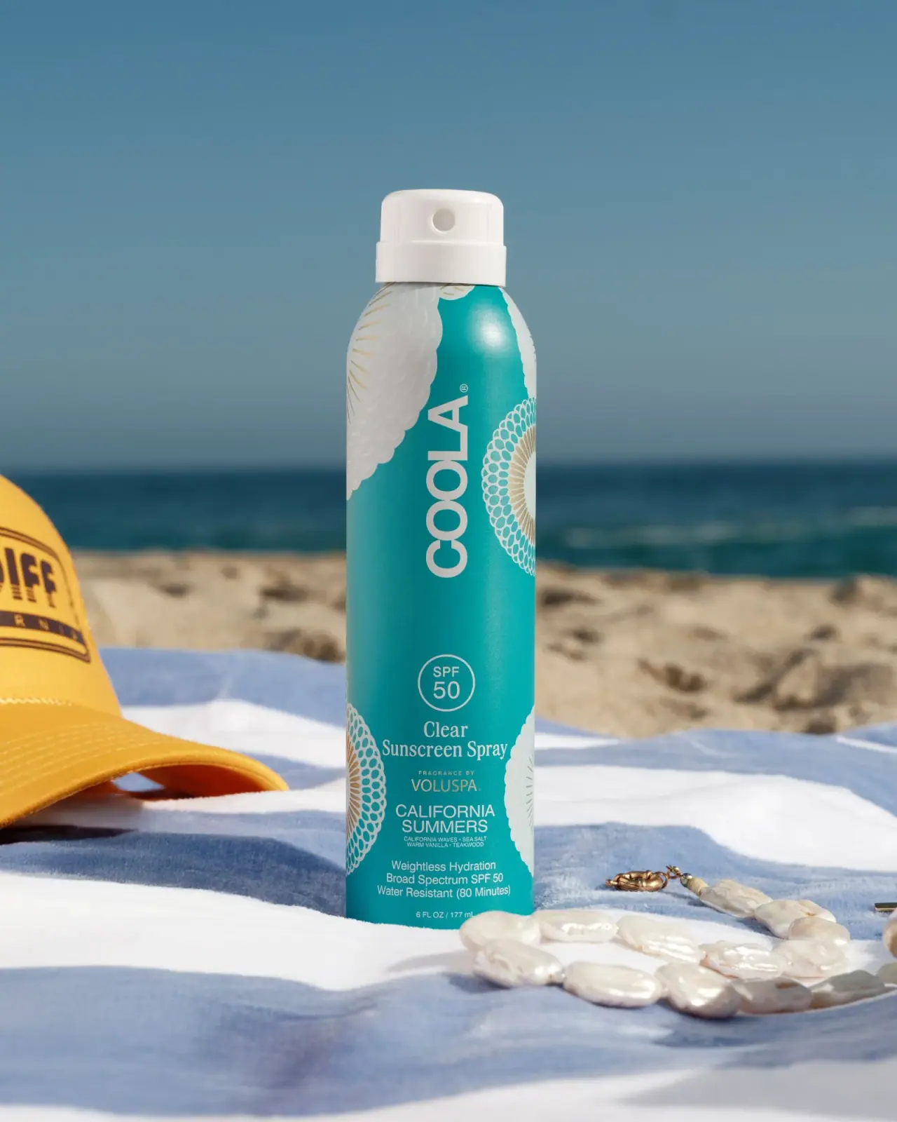
COOLA
Turquoise cylinder, cropped rosettes, vertical brand and fragrance attribution
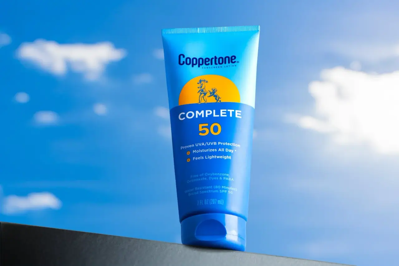
Coppertone
Blue fields, a yellow sun and a clear number

Dr. Bronner’s
A bright soap wrapper with a densely ordered voice
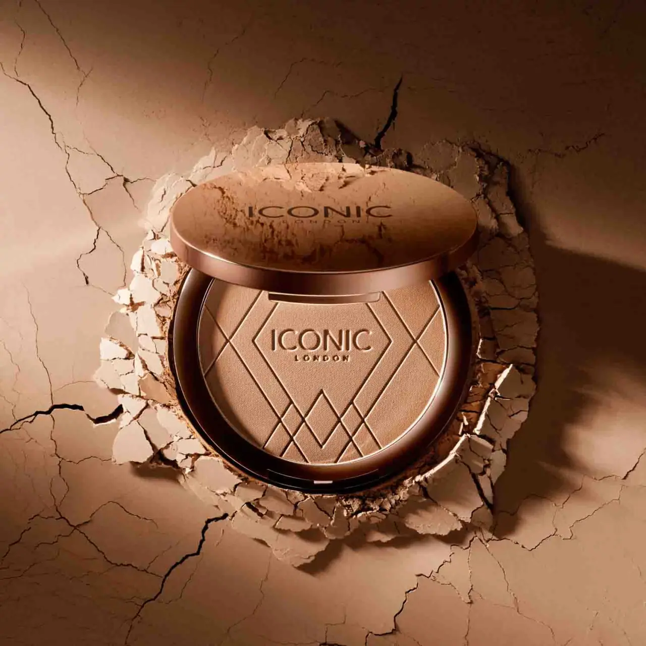
ICONIC London
Geometric powder relief inside a warm reflective round compact
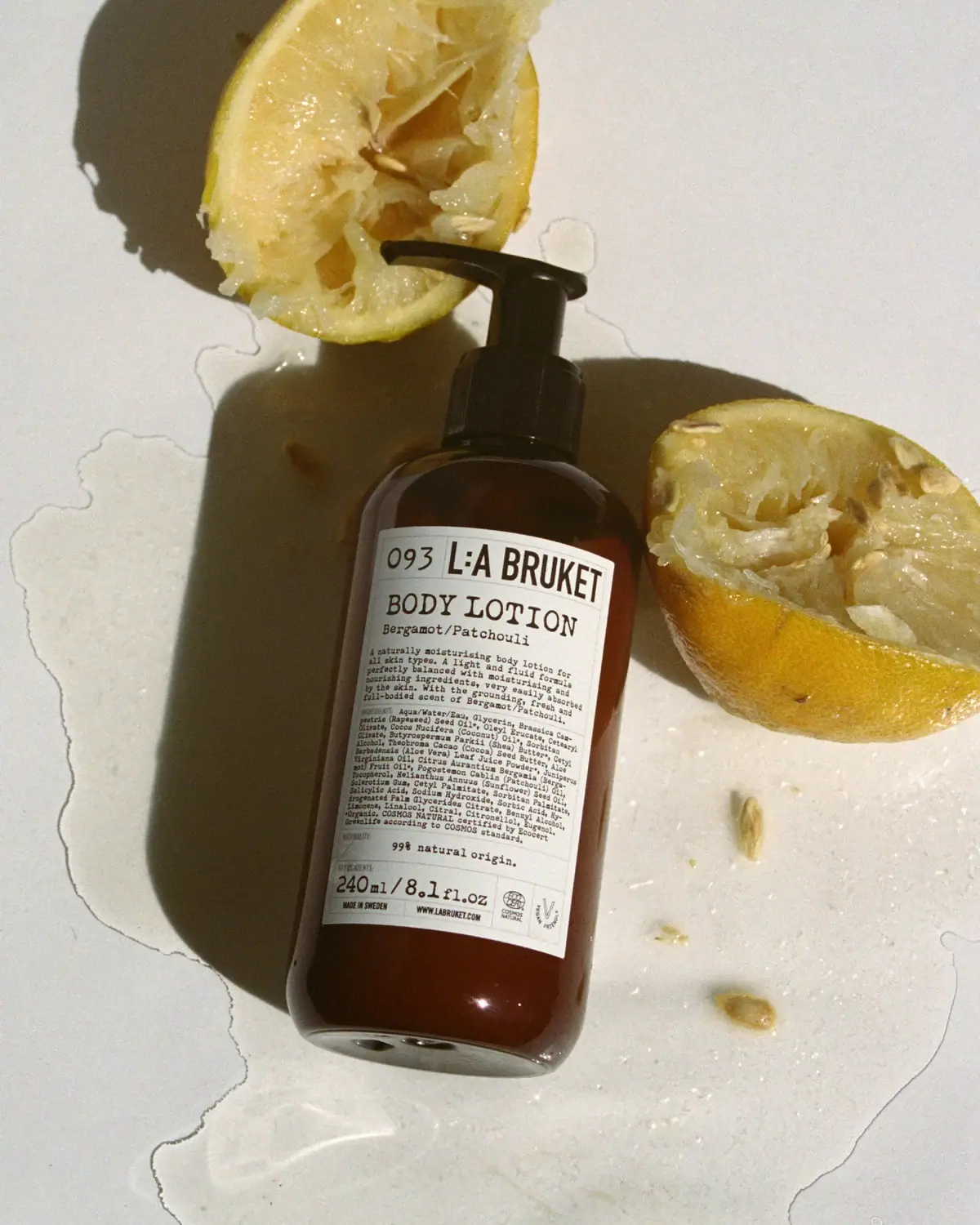
L:A Bruket
Amber pump bottle with a ruled typographic information label
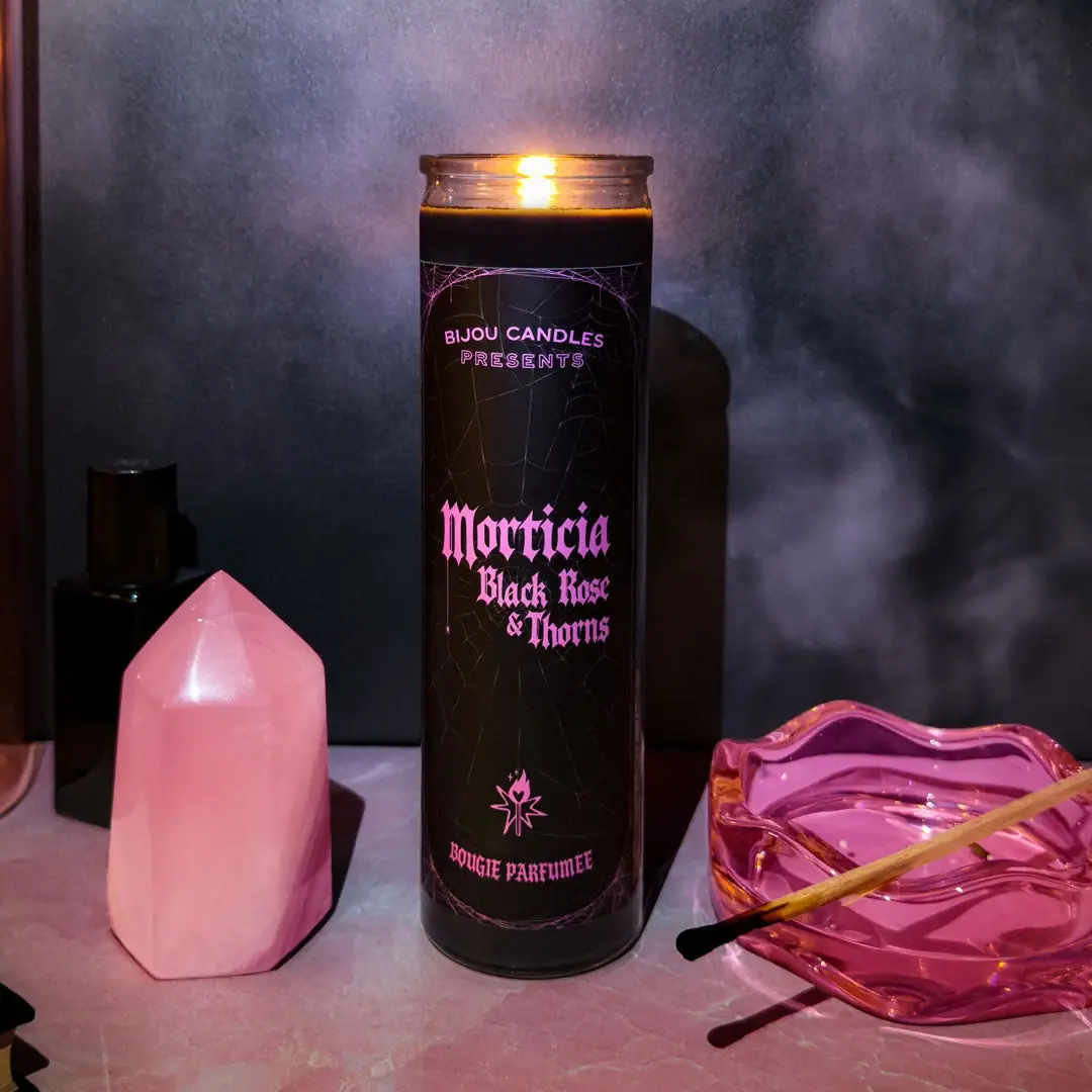
Bijou Candles
Pink blackletter and fine webs on a tall dark candle

Kettle & Fire
farmhouse animal badges on black cartons
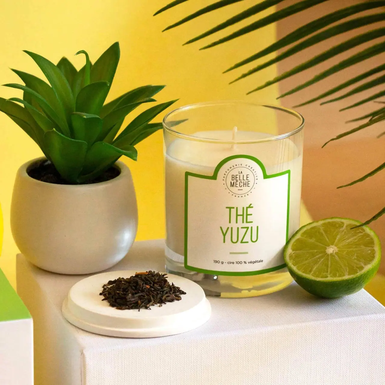
La Belle Mèche
Green scent lettering inside an arched white candle label