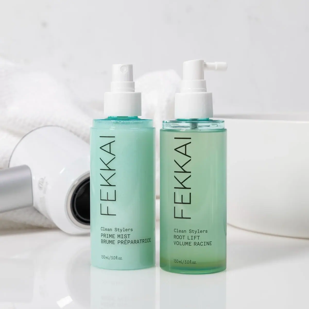
cocokind gives each product family one flat, opaque body colour (Electrolyte Aqua #7fcdd8, Ceramide Peach #f4c2a1, AHA Navy, Advanced Black, Beginner Stone, SPF Butter) and prints everything in a single ink on top. A bold lowercase slab-serif wordmark runs vertically up the right edge, while the product name sits low on the left in a bold grotesque, followed by an English benefit line and its French translation and bilingual net contents at the base. A small thin-line icon (water drops, waves, a molecule, a percentage roundel) above the name is the only drawing on the pack. Caps are white or tone-matched and there are no paper labels.
Approximate colours interpreted from photography. These are screen references, not official brand colours or print specifications.
Pack body
Cap White
#f6f2ee
Tall white caps on tubes, dropper collars and the mist pump
Ink
Contrast Ink
#1d1d1d
Wordmark, name, copy and icon on all light bodies
Reverse White
#ffffff
Same type and icon reversed out on the navy and black packs
Range coding
Electrolyte Aqua
#7fcdd8
Body colour of the electrolyte serum, water cream tube, magnesium mist and water-cream can
Ceramide Peach
#f4c2a1
Body colour of the ceramide body oil stick, lip balm jar and soft-glow illuminator
AHA Navy
#1f4e70
Body colour of the KP smoothing stick, printed in white
Advanced Black
#2b2a29
Tube colour for the stronger retinol gel, printed in white
Beginner Stone
#d3cfc8
Tube colour for the gentler retinol gel, the light pair to the black tube
SPF Butter
#f7c64c
Body colour of the daily SPF tube
Typography
Suggested visual alternatives, not confirmed brand typefaces. Any scale below is an illustrative estimate.
The vertical wordmark on the right is the largest element. The product name is the second read, set bold and flush left at about two-thirds down, then a short English benefit line, its French equivalent, and the bilingual net contents centred at the base. Strength tags sit in a tiny outlined pill above the name.
Type scale
Estimated cap size as a share of the panel · Front of the 30 ml retinol gel squeeze tube, about 110 mm tall excluding cap
vertical-wordmark
8% · Bold · Display
tidekind
product-name
4.5% · Bold · Headline
retinol gel
percentage
2.6% · Bold · Label
0.5%
strength-tag
1.8% · Bold · Label
ADVANCED
benefit-en
1.8% · Regular · Body
with aloe and cica
benefit-fr
1.8% · Regular · Body
avec aloès et cica
Fonts
Display
Zilla Slab
Looks like
Clarendon Bold, Courier Prime Bold
Type
Bold slab serif with typewriter character
Weight
Bold
Case
Lowercase
Tracking
Normal
Fallback
Rockwell Bold, Courier New Bold
The wordmark only, rotated 90 degrees to read bottom to top along the right edge.
Headline
Inter
Looks like
Helvetica Neue Bold, Söhne Halbfett
Type
Neo-grotesk sans
Weight
SemiBold, Bold
Case
Lowercase or title case
Tracking
Normal, tight leading
Fallback
Helvetica Neue, Arial
Two-line product name flush left in the lower half.
Body
Inter
Looks like
Helvetica Neue Regular
Type
Neo-grotesk sans, small sizes
Weight
Regular
Case
Sentence case
Tracking
Normal
Fallback
Helvetica, Arial
English benefit line, French translation and the bilingual net contents.
Label
Inter Tight
Looks like
Helvetica Neue Condensed Bold
Type
Compact grotesk for tags
Weight
Bold
Case
Uppercase
Tracking
Open, about +6%
Fallback
Arial Narrow Bold
Strength pills ('ADVANCED', 'BEGINNER'), percentages and format lines such as 'FACIAL MIST'.
Structure & Proportions
Proportions
Purpose
Value
Preview
Wordmark length
About 40% of pack height, running up the right edge
Wordmark position
Starts about 20% from the base, hugging the right margin
—
Text column width
About 60% of pack width, flush left
Text column start
Product name begins about 60% down the front
Side margin
About 8% of pack width on the left
Colours per pack
Two: body colour plus one ink, cap white or matched
—
Density
Empty upper half, compact text block in the lower left
—
Shapes
Element
Value
Preview
Tube
Straight squeeze tube with a tall cylindrical white cap
Stick
Oval-section twist-up stick with a flush lid
Strength tag
Tiny outlined pill
Percentage badge
Small overlapping circles around the strength figure
Tall white caps on tubes and serums, white mist pump with clear overcap, colour-matched lids on sticks and the illuminator
Decoration
Single-colour direct print, Thin-line icon, Bilingual text block
Front Panel
Schematic reading order. The diagram’s zone heights do not represent measured artwork proportions.
Right edge
Left, mid
Left, lower
Base
Direct print in one ink on a flat-coloured body: vertical wordmark up the right edge, a left-aligned text column in the lower half.
Zone
Content
Right edge
Vertical lowercase wordmark
Left, mid
Thin-line icon and optional strength tag
Left, lower
Product name, English benefit line, French benefit line
Base
Bilingual net contents
Range System
Each product or family owns one body colour, while the layout, single ink and type stay identical; strength levels are paired as dark vs light versions of the same tube.
Electrolyte line = aqua bodies with water-drop icons
Ceramide line = peach bodies with a molecule icon
Retinol gels = black tube (advanced) vs stone tube (beginner)
KP stick = navy with a wave icon
Daily SPF = butter yellow
Back of Pack & Shelf
The reverse keeps the same body colour and single ink: a short how-to in English and French, the full INCI list, and a small block of legal marks along the base, all flush left like the front.
Directions in English with French translation
Full INCI ingredient list
Caution line for actives such as retinol or AHA
Barcode printed on the body colour
Period-after-opening symbol, recycling marks and distributor address
On shelf
On shelf the packs read as blocks of flat aqua, peach and navy with the same sideways wordmark repeating down the right edge of every unit, which billboards the brand even when only the edge is visible.
Imagery
No photography or illustration beyond tiny single-weight line icons (drops, waves, molecule hexagons, strength roundels) placed just above the product name.
Guidelines
Do
Give each product family one flat opaque body colour such as Electrolyte Aqua (#7fcdd8) and print in one ink only.
Rotate the bold lowercase slab-serif Display wordmark up the right-hand edge at about 40% of pack height.
Set the product name in the bold Headline grotesk, flush left, starting about 60% down the front.
Print the benefit line in English and French at the same Body size.
Use a single thin-line icon above the name to hint at the active ingredient.
Pair strength variants as dark and light versions of the same pack, e.g. #2b2a29 vs #d3cfc8.
Don't
Don't use gradients, patterns or photographic imagery on the body.
Don't set the product name in the wordmark's slab serif.
Don't centre the text column; it is always flush left.
Don't add paper labels or foil.
Don't use more than one colour of ink on a pack.
Don't run the wordmark horizontally on the front face.
Give your AI packaging taste
Give your design or image tool a packaging study: palette, type, structure, front panel and principles for an original brief.