Photography: Davines official photography. Images belong to their respective owners.
Davines

A playful musical box around restrained monochrome haircare minis
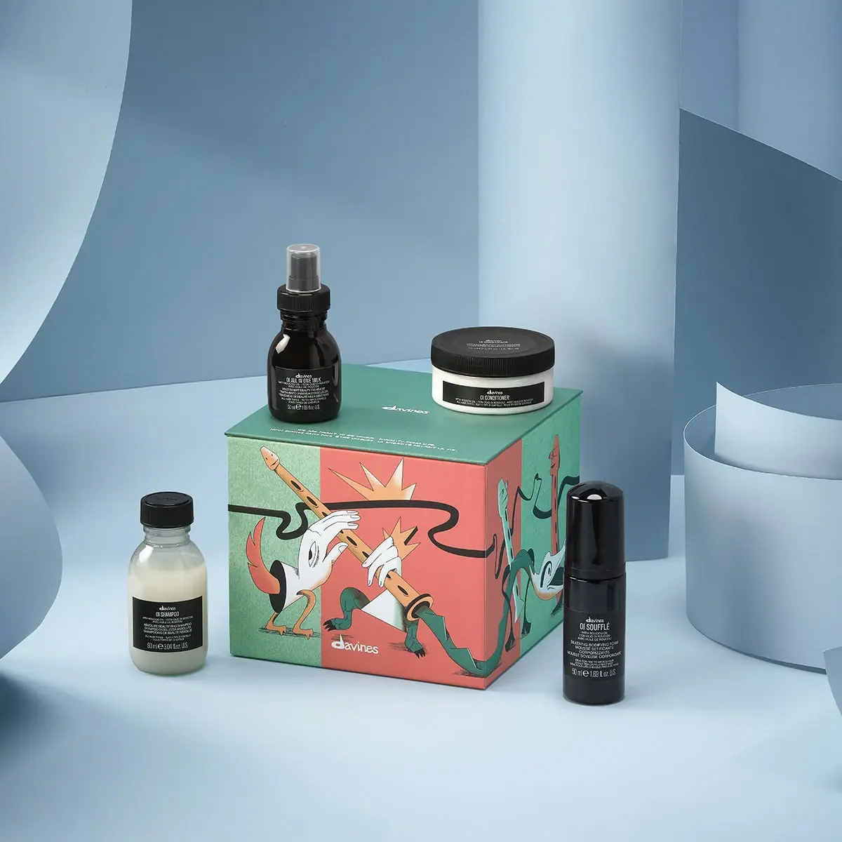
The selected Flute Set is a compact rectangular gift box decorated with a flute illustration, accompanied by four differently shaped OI travel products. It is not a flute-shaped container. Mint-green and coral panels carry surreal hands, an elongated instrument, small creatures and a looping black line that continues around the visible corner. The outer artwork supplies the festive narrative, while the individual bottles and jar retain dense white-on-black product information. The contrast makes the gift edition expressive without requiring the daily-use products to adopt the same illustration.
- Hair
- Light pack
- Retro illustrated
About this study
Selected OI Discovery Flute Set with rectangular illustrated box and four travel products. Flute describes the artwork/theme, not the physical box silhouette.
Sources & evidence · Reviewed 2026-10-19Color Palette
Approximate colours interpreted from photography. These are screen references, not official brand colours or print specifications.
Label
Mint-green carton field
#7DBA9D
Approximate front strip, side and lid colour. The slightly textured photographic appearance does not establish an uncoated paper or a particular ink process.
Coral carton field
#E58D7E
Approximate large warm front panel behind the flute and hands. It contrasts with the green sections while remaining separate from the cool blue stage.
Ink
Near-black lines and product panels
#242925
Heavy looping illustration line, outlines and dark product identity fields. On the containers, deep colour and reflections can obscure the boundary between body and label.
Pale hands and lettering
#F2F0E5
White-to-cream illustration details, box signature and small product copy. Pale shampoo and conditioner contents should not be confused with a separate printed white ink.
Accent
Warm instrument ochre
#DEB178
Approximate flute and burst details within the illustration. This is a minor artwork colour rather than a demonstrated product code.
Typography
Suggested visual alternatives, not confirmed brand typefaces. Any scale below is an illustrative estimate.
The carton gives most of its face to illustration, placing a relatively small white producer signature near the lower edge. A further small signature and short text appear on the green lid. The individual OI containers reverse that priority: compact centred product names and dense supporting lines occupy dark panels or dark body areas. The name OI remains part of each product identifier, but the differing container widths force different line lengths. The bottle and jar typography therefore belongs to one functional system without using identical label proportions.
Fonts
Small producer alternative
Lora
- Looks like
- Lora
- Type
- Serif
- Weight
- Regular 400 / Medium 500
- Case
- Lowercase
- Tracking
- Natural optical spacing
- Fallback
- serif
A proposed small serif voice for an original producer signature on an illustrated box. It is not an attribution of the custom Davines mark; create distinct wording and letterforms.
Narrow product information
Barlow Condensed
- Looks like
- Barlow Condensed
- Type
- Condensed sans serif
- Weight
- Regular 400 / Medium 500
- Case
- Uppercase product lines with mixed-case details
- Tracking
- Neutral to slightly tight
- Fallback
- sans-serif
A proposed compact information face for small travel containers. Keep the product name stronger than multilingual support and proof each format separately rather than shrinking one master label indiscriminately.
Structure & Proportions
Visual proportions and finish previews are illustrative. Confirmed construction details and uncertainties are distinguished in the study notes.
Proportions
| Purpose | Value | Preview |
|---|---|---|
| Outer gift object | A broad front and visible side create a compact box, not an elongated tapered silhouette. Perspective prevents an exact cube or dimension claim. | — |
| Product assortment | The low wide jar, short rounded bottles and taller slim dispenser provide four distinct silhouettes within the same kit. | — |
| Graphic scale | The illustration is much larger than the outer producer signature, while individual product information remains small and concentrated. | — |
Shapes
| Element | Value | Preview |
|---|---|---|
| Gift box | Straight-edged rectangular volume with a flat top and visible corner. | |
| Conditioner jar | Low broad circular vessel with a dark ribbed lid. | |
| Milk spray | Short bottle with an exposed spray assembly beneath a transparent cover. | |
| Looping line | A thick irregular black curve crosses the front and continues around the corner. |
Finishes
Soft illustrated surface
Green and coral paper box; precise coating unverified. · matte
Dark container highlights
Milk bottle and tall Soufflé cap. · gloss
Clear overcap
Visible spray cover on All In One Milk; specific polymer unverified. · transparent
Formats and materials
| Formats | A closed rectangular, approximately cube-like gift box surrounded by a small shampoo bottle, a wide conditioner jar, a short spray bottle and a taller capped Soufflé dispenser., Official contents are OI Shampoo 90 mL, Conditioner 75 mL, All In One Milk 50 mL and Soufflé 50 mL. The image shows all four outside the closed box. |
| Materials | The official component guide lists recycled PET for jar and bottle, mass-balance PP for cap, virgin PP for pump and recycled paper for the box. It separately describes a reusable FSC paper box., These are component-category statements from the set page, not a complete bill of materials for every small part. Liners, springs, clear overcap specification and internal box supports are not itemised here. |
| Closures | The shampoo has a ribbed black cap; the conditioner has a broad ribbed black lid. All In One Milk has a visible spray assembly under a clear overcap. The taller Soufflé dispenser is covered by a glossy black cap. The box has a flat closed top, but its opening mechanism and internal retention system are not demonstrated. |
| Decoration | Surreal flute-playing hands, ochre instruments, small stylised creatures and a continuous black ribbon-like line occupy the green/coral box faces. The four products retain monochrome informational graphics. |
Front Panel
Schematic reading order. The diagram’s zone heights do not represent measured artwork proportions.
The carton front combines vertical colour fields with a diagonal illustrated instrument and a looping black line. The drawing continues onto the right side, encouraging a view around the object. The small white signature sits beneath the main action. Products outside the box use compact black information zones with white text, connecting them through contrast and density rather than through the seasonal art.
| Zone | Content |
|---|---|
| Front illustration | Pale hands play an ochre flute across mint and coral fields, with bursts and stylised forms creating a lively narrative. These are printed graphics, not structural attachments. |
| Corner continuation | The black curve crosses the visible edge into a second illustrated panel. The composition treats adjacent faces as connected surfaces without disguising the box geometry. |
| Outer signature | A small white producer mark sits near the lower front. It supplies attribution while leaving most of the panel available for the seasonal drawing. |
| Green lid | The top is quieter, with a small white signature and short text. Two travel products are staged on it, partly occupying the reading surface. |
| Individual containers | White product names and dense secondary lines sit on dark fields. The jar uses a broad low panel, whereas the bottles organise information into narrower stacks. |
Range System
Within this one set, the four products share OI naming and dark information fields while differing in silhouette, contents and delivery format. The holiday carton introduces a separate musical illustration. Other seasonal boxes are not audited, so the flute motif is treated as this edition’s artwork rather than a universal Davines identity.
- The 90 mL shampoo bottle and 75 mL conditioner jar show why a common typographic hierarchy must adapt to different panel widths. Matching label dimensions would undermine the functional distinction.
- An original gift edition can put expressive artwork on the outer box while preserving established product recognition inside. The image demonstrates that separation without requiring an invented reusable insert or custom instrument-shaped structure.
Back of Pack & Shelf
The left, rear, underside and interior of the box are not visible, and the product containers are predominantly front-facing. Full ingredient and disposal placement cannot be reconstructed.
- Verify the internal fit and supports with an open-box view before describing how the four formats are protected.
- Keep the official component material list separate from claims about a visible recycling mark on an unseen panel.
- Do not infer a magnetic, hinged or lift-off closure from the closed flat top.
On shelf
The mint/coral box would be recognised through illustration before its small producer signature or individual product descriptions. Once opened, the restrained OI products would present a different visual rhythm in daily use. This is an interpretation of the photographed hierarchy, not measured retail behaviour. A catalogue should show both the gift exterior and the product assortment, because neither view alone explains the complete kit.
Imagery
The box serves as a display platform for the milk spray and conditioner jar, while the shampoo and taller Soufflé dispenser stand on either side. Curved blue sheets form a cool theatrical backdrop, contrasting with the warmer illustration. Those blue surfaces are scene elements and are excluded from the package palette. All four products are visible, which makes the assortment understandable even though the closed box conceals its internal arrangement. The illustration remains sufficiently unobstructed to establish the flute theme.
Guidelines
Editorial principles for an original design brief, not official brand guidelines.
Do
- Describe the outer package as a rectangular illustrated box.
- Keep each product size and delivery format distinct in the kit description.
- Separate source-confirmed component materials from unitemised small parts.
- Use front and side artwork as connected surfaces while protecting readable product information.
Don't
- Do not confuse the Flute Set name with a flute-shaped carton.
- Do not recolour the OI containers to match the seasonal box in a factual study.
- Do not treat the blue studio background as a packaging colour.
- Do not invent internal inserts, closure mechanisms or a universal holiday illustration system.
Sources & evidence
How this study was built
edition · Sourced fact
Official page identifies four OI travel products and their individual volumes.Flute Set / OI Discovery Gift Set — Davinesstructure · Sourced fact
Component guide gives recycled PET, mass-balance PP, virgin PP and recycled paper by component category.Flute Set / OI Discovery Gift Set — Davinesstructure · Visual observation
Actual outer object is a compact rectangular box, not a tapered instrument-shaped carton.label · Visual observation
Flute-playing illustration and looping black line continue across the corner.typography · Visual observation
Small outer signature contrasts with dense functional white text on dark inner products.palette · Visual observation
Mint/coral artwork and monochrome containers contrast with blue studio scenery.range · Editorial interpretation
Seasonal outer narrative is separated from the daily-use OI product family.
What remains unverified
- Internal supports, box opening mechanism and hidden panels are unseen.
- Component material guide does not itemise every spring, liner or clear cover.
- Print process, finishes and original fonts are unverified.
- Colours approximate the actual packs; blue scenery is excluded.
Give your AI
packaging taste
Give your design or image tool a packaging study: palette, type, structure, front panel and principles for an original brief.
Export this styleFree with an email. PACK.md works in Claude, ChatGPT, Cursor and image tools.
More like this
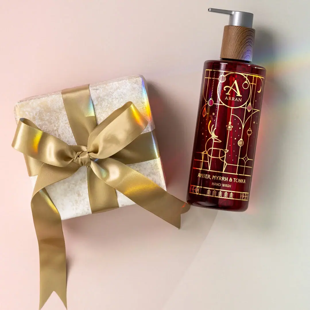
ARRAN
Festive golden linework on garnet with a grain-textured collar
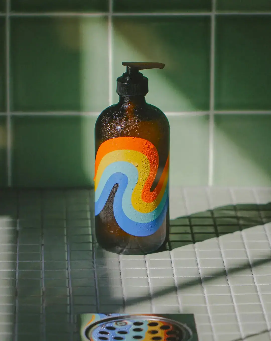
Bathing Culture
Flowing rainbow bands on dark refillable glass

Benamôr
Ornamental lilac medallion suspended above golden botanical oil
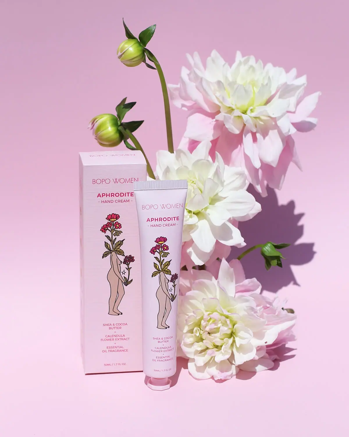
Bopo Women
a botanical figure on a coordinated blush-pink pair
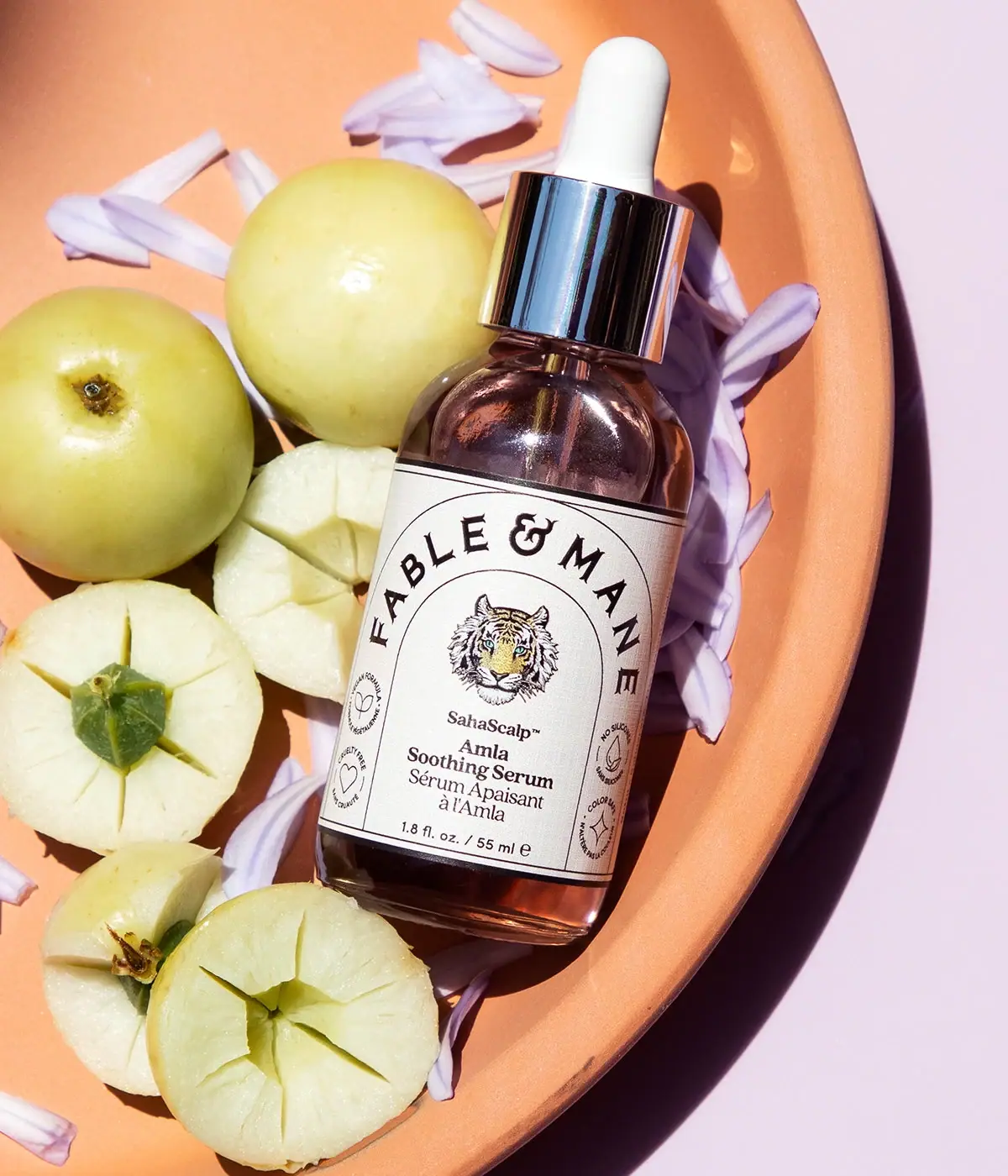
Fable & Mane
Arched serif maker, tiger portrait and amber dropper bottle
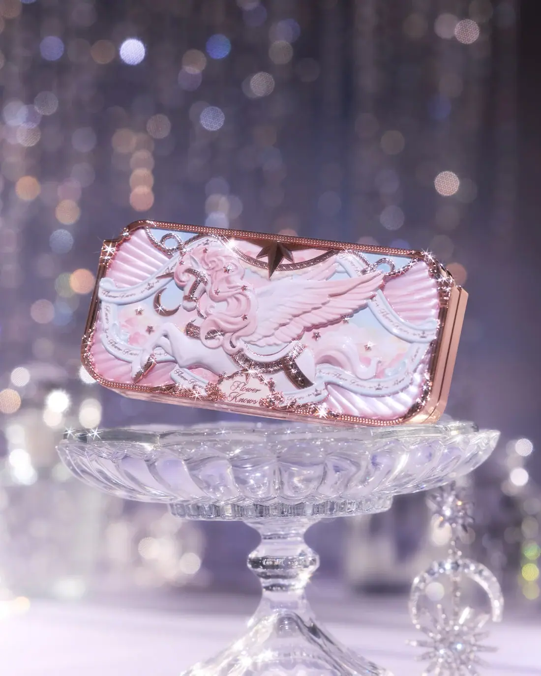
Flower Knows
Winged unicorn relief with pastel ribbons and reflective borders
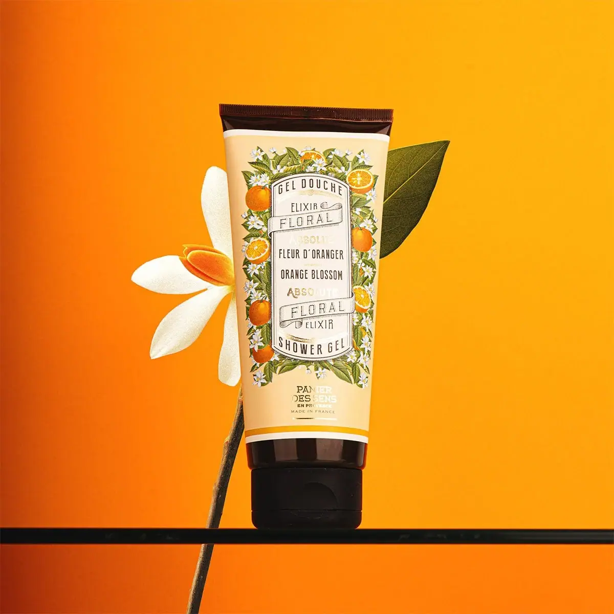
Panier des Sens
Botanical orange-blossom tube with a framed bilingual cartouche
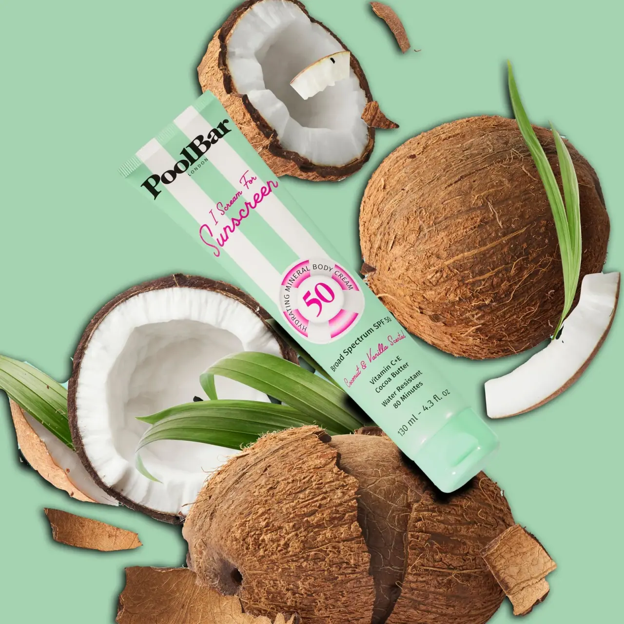
PoolBar London
Mint beach stripes with pink script and a lifebuoy badge