Photography: Sonique Studio — photography, set design and prop styling. Images belong to their respective owners.
Desert Rose Australia

Apricot sunscreen tube with white type and ochre flower
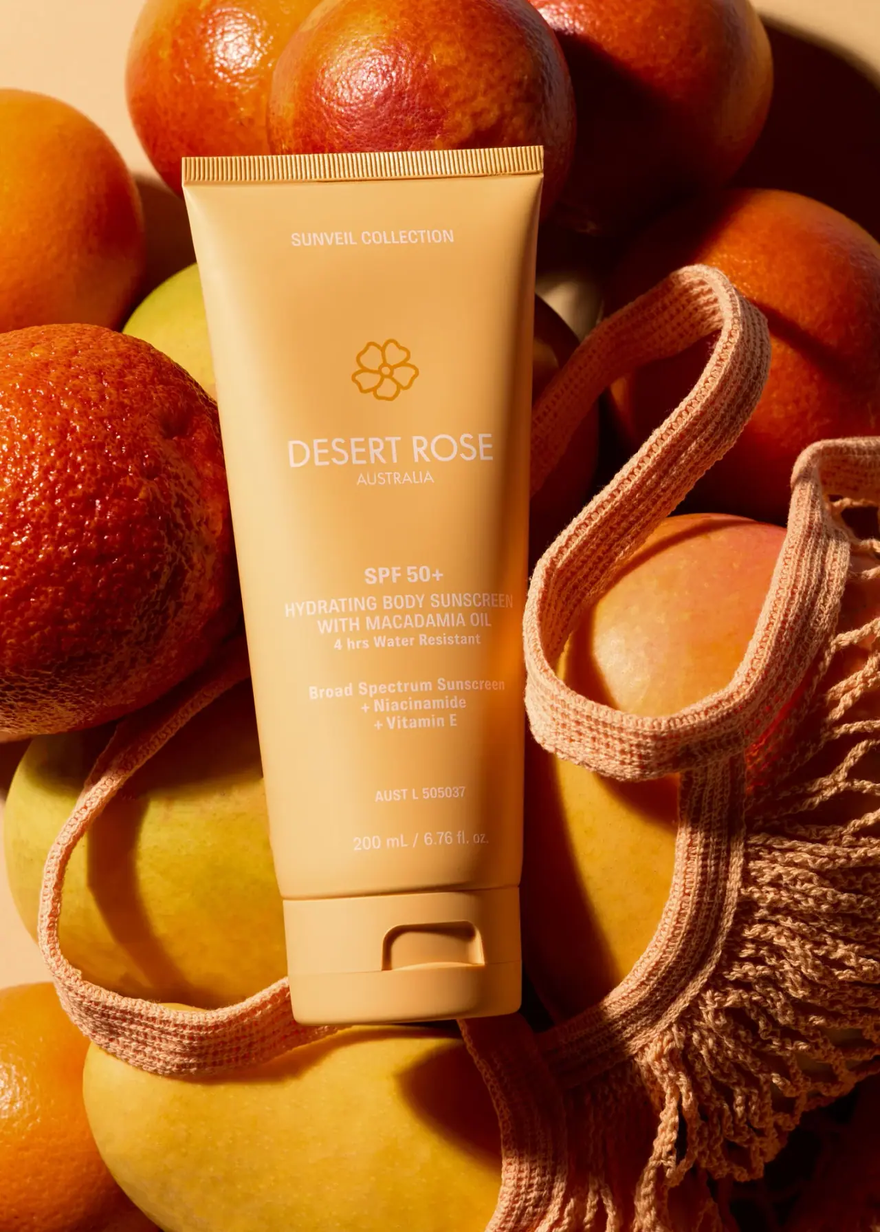
Desert Rose Australia's Sunveil body sunscreen uses a warm apricot tube as a continuous field from crimp to matching flip cap. A small collection line sits near the top; an ochre outline flower and a large white maker name occupy the spacious middle; the SPF and product details form a separate block below. The front balances a relaxed brand presentation with several practical information tiers. Strong directional light and surrounding warm-coloured fruit amplify the tube's colour in the selected photograph. This study keeps those props separate from the package and examines the exact 200 mL body-sunscreen presentation rather than assuming a whole-range colour system.
- Suncare
- Light pack
- Botanical
- Bold typographic
About this study
The approved Sunveil 200 mL body-sunscreen tube photograph. Claims are discussed as visible hierarchy and brand-provided context, not independently tested performance.
Sources & evidence · Reviewed 2026-10-19Color Palette
Approximate colours interpreted from photography. These are screen references, not official brand colours or print specifications.
Pack body
Golden apricot body
#E8AC58
Approximate warm tube and cap colour under directional light. Highlights are considerably paler than the shaded right edge; these are lighting changes rather than separate printed colours.
Ink
Soft white lettering
#F4E5CC
Approximate light maker and information text. Warm scene illumination affects its appearance, and its contrast against the lighter tube areas is gentle rather than uniformly strong.
Accent
Ochre flower outline
#BD7E20
Approximate darker emblem above the maker name. Its tone-on-tone treatment separates the symbol from the white typographic system without introducing a distant hue.
Typography
Suggested visual alternatives, not confirmed brand typefaces. Any scale below is an illustrative estimate.
SUNVEIL COLLECTION appears as a small centred uppercase line near the crimp. Below substantial space, the flower introduces DESERT ROSE, the largest and relatively light-weight name, with AUSTRALIA smaller beneath it. SPF 50+ then starts the lower functional block in a heavier treatment. The uppercase body-sunscreen and macadamia wording follows, with smaller mixed-case water-resistance and supporting lines. The low registration and capacity lines are the quietest elements. The hierarchy therefore leads with maker identity before product protection details; SPF is prominent within its block, not at the very top of the tube.
Fonts
Original maker-name alternative
DM Sans
- Looks like
- Light straightforward uppercase sans
- Type
- Sans serif
- Weight
- Regular, Medium
- Case
- Uppercase
- Tracking
- Normal to slightly open
- Fallback
- Arial, sans-serif
Create a broad but restrained brand line with a smaller geographic or maker descriptor beneath. Keep the name distinct from the heavier functional block lower down.
Information-block alternative
Barlow Condensed
- Looks like
- Compact utilitarian sans serif
- Type
- Condensed sans serif
- Weight
- Medium, SemiBold
- Case
- Uppercase product name with mixed-case supporting details
- Tracking
- Normal
- Fallback
- Arial Narrow, Arial, sans-serif
Organise a longer product descriptor into a compact centred stack. Preserve enough width and stroke weight for practical reading, especially if the ink remains pale against a light warm body.
Structure & Proportions
Visual proportions and finish previews are illustrative. Confirmed construction details and uncertainties are distinguished in the study notes.
Proportions
| Purpose | Value | Preview |
|---|---|---|
| Spacious upper identity | The collection line, emblem and maker occupy a generous upper field, with clear gaps between them rather than a densely packed header. | — |
| Compressed lower information | Several practical text groups share the narrower lower portion, making changes in weight and vertical spacing important for scanning. | — |
| Continuous base colour | The cap follows the tube's colour closely, so the seam and thumb recess define the dispensing end more than a contrasting closure colour would. | — |
Shapes
| Element | Value | Preview |
|---|---|---|
| Tube silhouette | Broad straight crimp tapering gently toward a rounded lower body and cap. | |
| Flower emblem | Simple outlined floral symbol with a small circular centre; an original design should use a different drawing. | |
| Cap opening recess | Rounded rectangular indentation interrupting the smooth front of the closed flip cap. |
Finishes
Low-glare body appearance
Main coloured tube wall · matte
Smooth closure appearance
Matching flip cap · matte
Formats and materials
| Formats | Tall squeeze tube with a straight sealed upper crimp, Matching bottom flip cap with a visible thumb recess, Officially identified 200 mL / 6.76 fl oz body sunscreen |
| Materials | The tube and cap appear as opaque coloured components; exact resin, laminate layers and supplier are not specified in the accessible product text., The official page includes general paper-certification and recyclable-packaging language, but does not identify this photographed tube as paper or provide a component-by-component construction record., The image alone cannot verify recycled content, barrier layers, mono-material construction or local disposal acceptance. |
| Closures | The broad matching cap sits at the bottom, with a recessed opening area visible on its front and a horizontal lid seam. It communicates a flip-open dispensing format while maintaining the tube's warm colour. The cap is closed in the selected image, so the outlet, hinge details and any internal sealing feature are not inspected. |
| Decoration | Centred collection and maker hierarchy, Small five-petal-like outlined flower above the name, Separated lower functional and supporting information groups |
Front Panel
Schematic reading order. The diagram’s zone heights do not represent measured artwork proportions.
The front is a centred vertical sequence with no large separate label border. Its spacing creates several reading moments: collection, emblem and maker, SPF with product name, supporting information, registration line, then capacity. The darker flower is the only clearly separate graphic accent. The appearance suggests decoration integrated with the coloured tube, but the exact print process and presence of any carrier film are not established.
| Zone | Content |
|---|---|
| Near-crimp header | Small SUNVEIL COLLECTION line, separated from the main identity by a broad gap. |
| Maker identity | Ochre floral outline above large white DESERT ROSE and smaller AUSTRALIA. |
| Primary functional block | SPF 50+ above the body-sunscreen and macadamia wording, followed by the printed water-resistance statement. |
| Supporting block | Broad-spectrum wording and niacinamide/Vitamin E lines, kept apart from the primary product name. |
| Lower utility lines | A small AUST L line and the 200 mL / 6.76 fl oz capacity. Their presence is observed without treating the study as an independent regulatory verification. |
Range System
The collection name provides a possible organising level above individual products, but only this body-sunscreen tube is analysed. Apricot may help recognise this selection, yet one image does not prove that every formula has an assigned colour or that the same layout is repeated across all products. The transferable principle is a stable set of information tiers with enough flexibility for different descriptor lengths.
- Collection and maker are separated from the functional product block.
- A hypothetical companion format could preserve the hierarchy while changing the body colour after range-level testing.
- Any comparison should distinguish body products from other formats before claiming a universal tube template.
Back of Pack & Shelf
The reverse, open outlet and any outer carton are absent from the selected photo. Online directions and claims do not establish their exact printed placement.
- Do not reconstruct instructions, ingredient lists or warning panels from the front.
- Treat visible SPF and water-resistance wording as observed packaging information, not independently verified performance.
- For an original commercial sunscreen, develop claims and practical artwork from the actual product's approved information rather than copying this reference.
On shelf
As an interpretation, the broad warm colour field and uncluttered maker area could make this tube easy to group with similarly presented products. The many lower information lines require more deliberate close reading. White text on the pale apricot highlight has softer contrast than the dark emblem, so a design review should test actual-size legibility in diffuse light as well as the dramatic photograph. Neither the large image nor the warm scene proves that all utility copy remains equally readable in a shop or during use.
Imagery
The recorded photographer is Sonique Studio, whose portfolio index lists the Desert Rose sunscreen launch. The local approved image places the tube among orange-red citrus and smooth yellow-orange fruit, with a peach net bag looping beside and below it. Directional sunlight creates dense shadows and emphasises the top crimp, cap recess and curved tube wall. The tube sits within a related warm palette instead of relying on a contrasting background. Fruit and netting communicate a summery setting, but they do not establish ingredients, included accessories or packaging materials.
Guidelines
Editorial principles for an original design brief, not official brand guidelines.
Do
- Separate maker identity from the functional information block.
- Use spacing to organise a long centred front.
- Check pale utility text at actual size and under varied light.
- Describe cap and tube materials only when component evidence supports them.
- Keep scene props separate from ingredients and pack contents.
Don't
- Do not call the flower white when it is darker ochre.
- Do not describe SPF as the topmost or largest element.
- Do not infer a universal variant-colour system from one tube.
- Do not copy SPF, registration numbers or environmental claims into fictional artwork.
Sources & evidence
- SPF 50+ Hydrating Body Sunscreen — Desert Rose Australiaproduct
- Sonique Studio commercial photography portfoliophotographer
How this study was built
edition · Sourced fact
The official page identifies the exact macadamia body sunscreen and 200 mL / 6.76 fl oz size.SPF 50+ Hydrating Body Sunscreen — Desert Rose Australiastructure · Visual observation
A straight ribbed crimp, tapered opaque tube and closed matching flip cap are visible.palette · Visual observation
The flower outline is ochre; the surrounding maker and practical text are pale on apricot.typography · Visual observation
Collection and maker identity precede SPF, which begins a distinct lower information block.imagery · Sourced fact
The photographer's portfolio index explicitly names the Desert Rose sunscreen launch, supporting the recorded image provenance.Sonique Studio commercial photography portfoliorange · Editorial interpretation
A collection header suggests an organising level, but this single tube cannot establish universal variant colours.
What remains unverified
- The photographer's individual campaign page was inaccessible; the portfolio index confirms the named launch project.
- Exact component materials, decoration process and closure interior remain unknown.
- The reverse and any carton are not shown.
- Original fonts, colour standards and exact measurements are unverified.
Give your AI
packaging taste
Give your design or image tool a packaging study: palette, type, structure, front panel and principles for an original brief.
Export this styleFree with an email. PACK.md works in Claude, ChatGPT, Cursor and image tools.
More like this

Bomba Curls
tropical foliage gathered around a bold yellow nameplate
Jorum Studio
Outlined woodland lettering with a quiet label center

ACURE
Iridescent spectacle with practical, tightly ordered type

AKT
Lilac stage directions with a quiet metallic detail

AussieZinc
Sun-yellow numerals on a tall, information-rich white cylinder

Bask
sunny yellow with a playful turquoise signature

Beame
Orange bubble lettering, pink mascot, clear product badge

Benamôr
Ornamental lilac medallion suspended above golden botanical oil