Photography: PSA Creative — Dieux Ethereal campaign. Images belong to their respective owners.
Dieux

Butter-yellow pump bottle with an elongated fine-line emblem
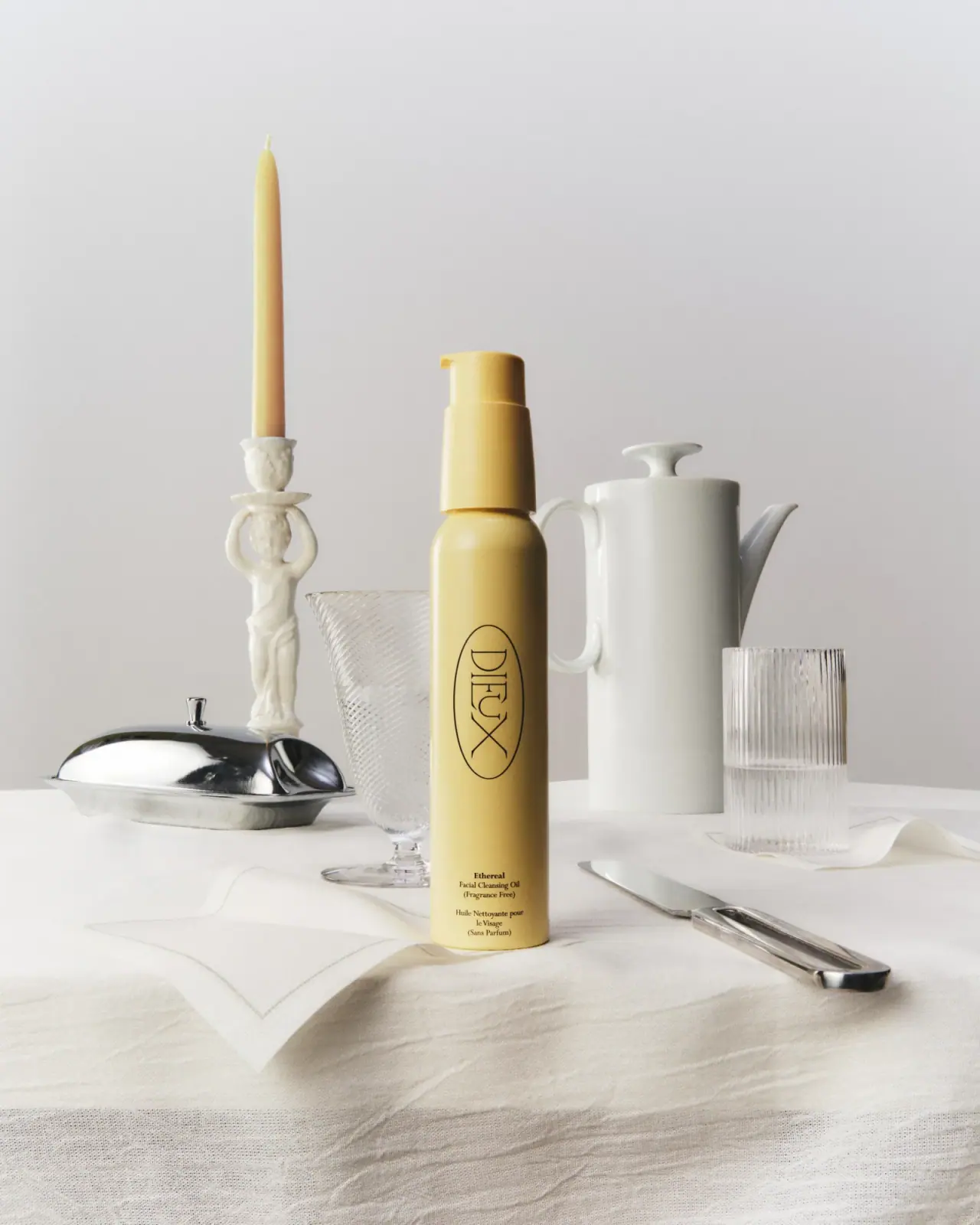
Ethereal's tall yellow bottle uses one large outlined emblem and a much smaller product-information block. The DIEUX lettering turns within an elongated oval, following the vessel's height, while the English and French descriptors remain horizontal near the base. Matching colour across the canister and pump makes the full assembly read as one object. PSA Creative's campaign places it among pale tableware and a yellow candle, extending the warm colour into a domestic still life. This study focuses on that selected pump bottle and distinguishes its graphic simplicity from the more elaborate objects around it.
- Skincare
- Light pack
- Bold typographic
About this study
The approved PSA Ethereal table-setting cover and its yellow pump bottle, connected to the current 100 mL product listing. Unseen carton artwork and other Dieux formats are excluded.
Sources & evidence · Reviewed 2026-10-19Color Palette
Approximate colours interpreted from photography. These are screen references, not official brand colours or print specifications.
Pack body
Butter yellow
#DCC36F
Approximate colour shared by body, pump shroud and actuator. It supplies almost all the package's colour presence; darker side areas are shadows rather than separate colour blocking.
Ink
Warm near-black
#27231A
Approximate oval outline, brand lettering and small descriptor colour. Their fine dark lines contrast with the solid yellow without introducing a second bright accent.
Typography
Suggested visual alternatives, not confirmed brand typefaces. Any scale below is an illustrative estimate.
The slender high-contrast DIEUX wordmark is rotated within a tall oval, so its broad word shape becomes a vertical identity device. The name is visually dominant through scale and isolation rather than heavy strokes. Near the base, Ethereal heads a compact English description, followed by a separate French block. These small lines read horizontally and appear serif-like in the image. The change of orientation and scale divides brand recognition from practical product identification without a rule or coloured panel between them.
Fonts
Original display alternative
Bodoni Moda
- Looks like
- Fine high-contrast serif capitals
- Type
- Display serif
- Weight
- Regular
- Case
- Uppercase for a short new identity
- Tracking
- Close but optically balanced within an original frame
- Fallback
- Didot, Georgia, serif
Explore an elegant narrow-stroke name that can change orientation. Do not reproduce DIEUX's stretched letter geometry, distinctive X or exact oval lockup.
Descriptor alternative
Libre Baskerville
- Looks like
- Compact readable text serif
- Type
- Text serif
- Weight
- Regular, Bold
- Case
- Title and sentence case for bilingual product information
- Tracking
- Normal
- Fallback
- Georgia, serif
Build a small practical block with the product name slightly stronger than its function lines. Keep each language grouped so the reader does not have to alternate between them.
Structure & Proportions
Visual proportions and finish previews are illustrative. Confirmed construction details and uncertainties are distinguished in the study notes.
Proportions
| Purpose | Value | Preview |
|---|---|---|
| Vertical emphasis | The narrow canister is much taller than it is wide. The long pump housing extends this vertical reading instead of ending it with a broad horizontal cap. | — |
| Identity footprint | The oval occupies a substantial middle section but leaves yellow space around its perimeter. It is narrower than the vessel, so the cylindrical body remains visible on both sides. | — |
| Information separation | A conspicuous empty interval separates the bottom of the oval from the small descriptor block. The lower copy has its own space rather than sitting immediately beneath the name. | — |
| Source capacity | The current official product listing identifies 100 mL. That capacity is not a physical height or diameter measurement and does not establish an exact photographed fill level. | — |
Shapes
| Element | Value | Preview |
|---|---|---|
| Canister | Slim cylinder with a rounded shoulder and relatively straight lower wall. | |
| Identity outline | Long vertical oval with a fine dark stroke, acting as a frame around the rotated brand artwork. | |
| Pump | Short side spout above a taller shroud that narrows toward the actuator. | |
| Descriptor area | Compact unboxed stack of centred text near the bottom, leaving the yellow ground uninterrupted. |
Finishes
Quiet yellow surface
Body and pump components; soft photographic highlights do not identify a specific powder coat or soft-touch finish · matte
Fine dark graphic appearance
Outline, identity and descriptor; no foil, raised print or debossing is established · matte
Formats and materials
| Formats | Tall cylindrical cleansing-oil canister with rounded shoulder, Matching pump with a long shroud and short side nozzle |
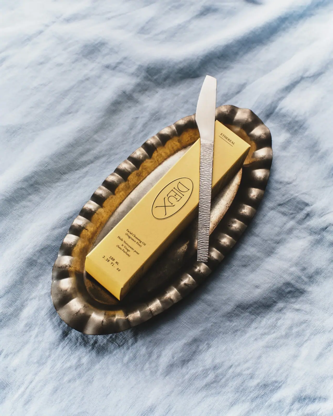
| Materials | The indexed official Ethereal packaging section identifies the canister as 100% recycled aluminium; this is a brand declaration, not a conclusion from the opaque finish., The same source identifies a plastic pump and cap. A separate cap is not visible in the selected photograph., The source describes a 100% recycled paper outer carton, which is not shown here; its artwork and construction are outside this visual study. |
| Closures | The exposed yellow pump actuator sits above a longer tapered shroud. Its short nozzle points left in the photograph. The brand's use instructions confirm pump dispensing, but the image does not establish the internal spring, dip-tube material, locking action or refill compatibility. Current reviewed evidence supports the pump format; it does not establish an Ethereal refill pouch. |
| Decoration | Tall outlined oval enclosing the rotated identity, Small centred bilingual descriptor close to the lower front, No illustrated ingredient, repeating pattern or large claim badge visible; exact printing or labelling technique remains unverified |
Front Panel
Schematic reading order. The diagram’s zone heights do not represent measured artwork proportions.
The front is organised around a central vertical axis but uses two reading directions. The emblem turns the name to take advantage of the tall body, while the bottom information remains in conventional horizontal lines. No rectangular colour panel separates these zones; their scale difference and the yellow interval between them do that work. The emblem's fine outline creates a boundary without filling its interior, allowing the package colour to remain continuous through the identity itself.
| Zone | Content |
|---|---|
| Upper assembly | Yellow actuator and shroud with no legible front text, preserving a clean continuation of the body colour. |
| Central emblem | Fine elongated oval containing rotated DIEUX lettering; it is brand-specific artwork rather than a generic oval label. |
| Lower English block | Ethereal name, facial cleansing oil function and a fragrance-free descriptor in small centred lines. |
| Lower French block | Separate French product and fragrance wording beneath the English group, maintaining the same centred alignment. |
Range System
PSA describes a coordinated Ethereal launch program spanning packaging components and campaign imagery. That supports the product-specific connection between yellow packaging and the warm visual world. This single bottle does not establish a universal Dieux palette or a refill system. Other Dieux products may share identity cues, but their colours, closures and component specifications must be reviewed independently.
- Observed: canister and pump share a yellow appearance despite their different components.
- Observed: the nearby candle echoes the package colour in the campaign, while glassware and ceramics remain largely neutral.
- Original-design interpretation: repeat a controlled body colour and one recognisable identity device across a launch, adapting information placement to each separately verified format.
Back of Pack & Shelf
The selected photograph shows the front only. Ingredient copy, lot marking, capacity placement, barcode and any recycling instructions are not visible. The official component breakdown provides materials context but does not establish their printed arrangement on the actual bottle or unseen carton.
- Review the rear and carton before describing their information architecture.
- Keep canister and pump material declarations separate instead of calling the whole package aluminium.
- Do not treat a recycling pathway as universally available; the brand itself qualifies disposal by local programs.
- Verify a product-specific refill listing before presenting one as part of the packaging system.
On shelf
Interpretation: the narrow yellow silhouette and outlined vertical identity can register before the small product name is readable. The bottom bilingual text rewards closer inspection but needs real-size testing because it carries the function while occupying little area. The campaign's generous empty setting makes this hierarchy easy to see; a crowded shelf may reduce that advantage, so the fine emblem should be evaluated against neighbouring packs and ordinary retail lighting.
Imagery
The bottle stands on a pale cloth beside a sculptural candleholder, yellow taper, clear textured glasses, white lidded pot, reflective metal dish and table knife. The limited surrounding palette makes the yellow stand out without a coloured backdrop. Transparent and reflective props provide small highlights while the bottle remains a comparatively simple opaque surface. PSA's primary case study describes a buttery visual direction; the actual scene expresses that through colour and table associations, not through a printed butter illustration or an ingredient claim.
Guidelines
Editorial principles for an original design brief, not official brand guidelines.
Do
- Use empty space to separate identity from product explanation.
- Coordinate the pump colour when it materially affects the full silhouette.
- Keep bilingual copy in coherent groups.
- Treat declared canister and pump materials as separate components.
- Link campaign colour to packaging without turning props into ingredient claims.
Don't
- Do not infer a refill pouch from another product in the brand's range.
- Do not treat the whole package as metal because the canister is aluminium.
- Do not call the fine graphic a verified direct-print process.
- Do not copy the distinctive DIEUX oval lockup into a new identity.
Sources & evidence
- Ethereal Cleansing Oil — official listing and indexed packaging sectionproduct
- Dieux Ethereal Creative Direction — PSA Creativedesigner
How this study was built
structure · Sourced fact
The official listing identifies a 100 mL pump product; its indexed packaging section declares recycled aluminium canister, plastic pump/cap and recycled-paper carton.Ethereal Cleansing Oil — official listing and indexed packaging sectionimagery · Sourced fact
PSA identifies its role across packaging components and campaign direction, describing the product-specific buttery visual world.Dieux Ethereal Creative Direction — PSA Creativetypography · Visual observation
A rotated identity sits inside a tall fine oval; small bilingual descriptors stay horizontal near the bottom.Dieux Ethereal Creative Direction — PSA Creativepalette · Visual observation
Yellow connects canister and pump; the white table setting and metal props are excluded from the package palette.Dieux Ethereal Creative Direction — PSA Creativelabel · Visual observation
A large empty interval separates the emblem from the lower information block, without a separate coloured label panel.Dieux Ethereal Creative Direction — PSA Creativerange · Editorial interpretation
The coordinated launch supports colour continuity, not an inferred refill program or universal materials for other Dieux products.Ethereal Cleansing Oil — official listing and indexed packaging section · Dieux Ethereal Creative Direction — PSA Creative
What remains unverified
- The component-material section is visible in indexed official product text but absent from the current browser-rendered text extraction.
- No product-specific Ethereal refill was verified; existing refill claims should not be retained without evidence.
- Exact font attribution, print process, coating and physical dimensions are unknown.
- The bottle reverse, carton and separate pump cap are not shown in the selected cover.
Give your AI
packaging taste
Give your design or image tool a packaging study: palette, type, structure, front panel and principles for an original brief.
Export this styleFree with an email. PACK.md works in Claude, ChatGPT, Cursor and image tools.
More like this

ACURE
Iridescent spectacle with practical, tightly ordered type

AKT
Lilac stage directions with a quiet metallic detail

AussieZinc
Sun-yellow numerals on a tall, information-rich white cylinder

Bask
sunny yellow with a playful turquoise signature

Beame
Orange bubble lettering, pink mascot, clear product badge

BioSeivas
Vertical serif identity on a mauve treatment band
Black Girl Sunscreen
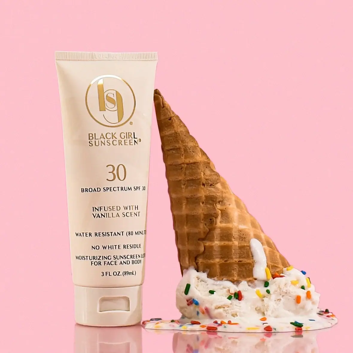
Cream tube with gold crest and an isolated SPF numeral

Bomba Curls
tropical foliage gathered around a bold yellow nameplate